GCSE Maths Box Plots: The Essential Revision Guide

Contents
Most students I teach understand how to draw and read bar charts and even scatter diagrams, but when I ask them about box plots, many of their faces go blank. I’ll let you into a secret: some teachers even forget what they are and need to look them up each year.
Having taught GCSE maths for ten years, I’ve put together my essential revision guide for box plots.
Understanding Box Plots
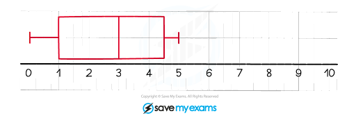
Box plots are also called box-and-whisker diagrams (the whiskers are the two lines sticking out of the box at either end). Imagine a data set (a set of data values) as a list of numbers put into numerical order. This is how I describe a box plot, reading from left to right:
The first vertical dash is the smallest number in the data set, in this case 0
It’s called the minimum value
The start of the rectangular box is at the lower quartile, 1
This is the number that is a quarter of the way into the data set
The vertical line inside the rectangular box is at the median, 3
This is the number halfway into the data set
The end of the rectangular box is at the upper quartile, 4.5
This is the number three-quarters of the way into the data set
The last vertical dash is the largest number in the data set, 5
It’s called the maximum value
Constructing Box Plots
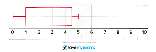
To construct the box plot above, you’d be given a grid to draw on in the exam paper and a set of data, for example: 0, 1, 1, 2, 3, 3, 4, 5, 5.
I’ve seen a lot of students overcomplicate the way to find the median and quartiles. Here is my method:
For the median, I think it’s easiest to cross off numbers from either end until you reach the middle:
0,1,1,2, 3,3,4,5,53 is the median
(If you had ended up with two numbers in the middle, you’d find their midpoint)
For the lower quartile, remove the median, write out the left-hand list, then find the middle value again:
0,1,1,2The lower quartile is between 1 and 1
1 is the lower quartile
Do the same for the upper quartile:
3,4,5,5The upper quartile is between 4 and 5
4.5 is the upper quartile
The last two values you need are the minimum and maximum values in the data set
The minimum value is 0
The maximum value is 5
Now construct the box plot – I recommend using a ruler to keep it neat
When students are drawing box plots, I remind them that mark schemes allow box plots of any vertical height and that your minimum and maximum points can be marked as crosses or large dots instead of vertical lines. That said, I always like to draw mine in exactly the same way as the ones given in the exam.
Interpreting Box Plots
One of the benefits of box plots that I explain to my students is that you can clearly see where the data is centred around, as well as how spread out the data values are.
The median (the vertical line inside the box) shows the centre value
The horizontal length of the box (not including the whiskers) shows the spread of the data values
This is called the interquartile range
It is found by taking the upper quartile and subtracting the lower quartile
One of my favourite ways to interpret box plots (which examiners also like) is by referring to the percentages of the data values, for example:
The median is the middle value, so 50% of data values are below it (and 50% are above it)
The bottom 25% of data values are below the lower quartile
The top 25% of data values are above the upper quartile
The middle 50% of data values are between the lower and upper quartile
The interquartile range measures the spread of the middle 50% of data values
Real-life Examples of Box Plots
In an exam, you may be asked to compare two real-life box plots. This is where I see students lose the most marks, as they write down lots of numerical values but don’t mention anything about the context (the real-life part). Without that, you won’t get full marks.
What exactly do you compare? Always remember to compare these two things: a measure of average (the medians) and a measure of spread (the interquartile ranges).
For example, the number of goals scored by a team in a tournament of matches is shown in the box plots below; the red one is for last year and the green one is for this year.
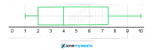
This is how I would compare the box plots to get full marks:
Comparison of average:
The median of goals scored last year is 3, which is less than the median of goals scored this year, 4
Relating to the context:
This shows that, on average, the number of goals scored has increased (the team has improved)
Comparison of spread:
The interquartile range of goals scored last year, 4.5 − 1 = 3.5, is lower than the interquartile range of goals scored this year, 7.5 − 2 = 5.5
Relating to the context:
This show that the number of goals scored this year is more spread out compared to last year
(Other possible interpretations are that there was more variation in goals scored this year, or, alternatively, that they were playing more consistently last year)
Mastering Box Plots
A lot of students and teachers ask me if there are any other tips or tricks that can help them to master box plots, especially for the more difficult questions, so I have put together the following list:
Don’t compare the minimum or maximum values of box plots to see if one data set is higher than the other
You need to look at the medians instead
A disadvantage of box plots is that they don’t show the individual data values
These become lost
An advantage of comparing medians and interquartile ranges is that they are less affected by any extreme values
These are unusually high or low values
Remember that the interquartile range covers the middle 50% of the data
If there are 200 data values, then roughly 100 of them sit between the lower and upper quartile
Copy the exact wording and phrases used in the question when comparing box plots
Don’t forget that box plots also show the range of a data set
This is the length from the minimum to the maximum value
Don’t forget that box plots may have a scale
For example, the units may be measured in kilograms
GCSE Box Plot Exercise
The number of goals scored by a team across nine games in a tournament is 1, 2, 2, 3, 4, 5, 7, 8, 10.
Draw a box plot for the data shown.
Calculate the interquartile range.
If another team has a median of 5 and an interquartile range of 3, compare the two teams.
Answers:
1.
7.5 - 2 = 5.5
The median of the other team (5) is greater than the median of this team (4), so on average the other team scored more goals. The interquartile range of the other team (3) is less than that of this team (5.5), so the other team was more consistent than this team (had less of a spread of goals scored).
Set Yourself Up For GCSE Success
Using my Essential Revision Guide for GCSE box plots, you should now be in a better position to answer any exam questions that come up on box plots.
At Save My Exams, we have more resources to help you revise box plots, including Revision Notes and Topic Questions (you can change the exam board at the top of the page).
In fact, our resources don’t just cover box plots – they cover the entire exam, so be sure to check them out and see how else they can support you!
Sign up for articles sent directly to your inbox
Receive news, articles and guides directly from our team of experts.

Written by Mark Curtis
Maths2 articlesMark graduated twice from the University of Oxford: once in 2009 with a First in Mathematics, then again in 2013 with a PhD (DPhil) in Mathematics. He has had nine successful years as a secondary school teacher, specialising in A-Level Further Maths and running extension classes for Oxbridge Maths applicants. Alongside his teaching, he has written five internal textbooks, introduced new spiralling school curriculums and trained other Maths teachers through outreach programmes.
 written revision resources that improve your