Communicating Mathematical Approaches (AQA Level 3 Mathematical Studies (Core Maths)): Revision Note
Exam code: 1350

Summarising & Report Writing
Why is summarising useful?
Whilst data tables and detailed graphs are thorough and valid, many consumers of data simply require a summary of the data
Summarising is not just applicable to data
You should be able to summarise a longer piece of writing to express the main points or arguments it makes
Summarising data and reports are useful in many contexts:
Casual viewers of news programmes only require high-level, summarised statistics, rather than the detailed data and methodology
Decision-makers in governments may not have time for a detailed analysis or breakdown, so just need the key points that are relevant to them and their role
Sports team coaches when recruiting players may only need to see key statistics, and overall advantages and disadvantages of each player
Consumers purchasing online products may be overwhelmed with detailed product information from competing brands, and would rather see a summarised breakdown of the key points
The key elements of a summary are:
Objectivity: a summary sticks to the facts and is unbiased
Concision: a summary should condense the important information, leaving out unnecessary detail
Structure: a summary should be well-organised, preferably in chronological order, so that it is as clear as possible
Accurate: the information provided in a summary needs to be correct and reliable
What could I be asked to do?
As well as summarising the data, you must be able to communicate mathematics in other ways
In an exam you may be asked to:
Describe, Give a full description of, or Write a report
This is usually in the context of some given data
In these cases, you are expected to give full details of the data
Show you can interpret the data and identify trends and patterns
Forecast
Assuming the current trend continues, find ...
Predict
Use mathematics to give a reasoned estimation of a future or
conditional result
This could be linked to data, or probabilities
Interpret, or Analyse
Determine what the results mean in the context of the question
Compare
Describe the significant similarities or differences between two sets of data or information
Consider or Conclude
Draw a conclusion from given information
I.e. not just describing the trends, but what does this trend mean for the context of the question
Advise or Suggest
What does the person in the question need to know?
What would you tell them?
This should be backed up with evidence
Worked Example
The line chart below shows unemployment rates for men, women, and overall in the UK between December 2020 and February 2024.
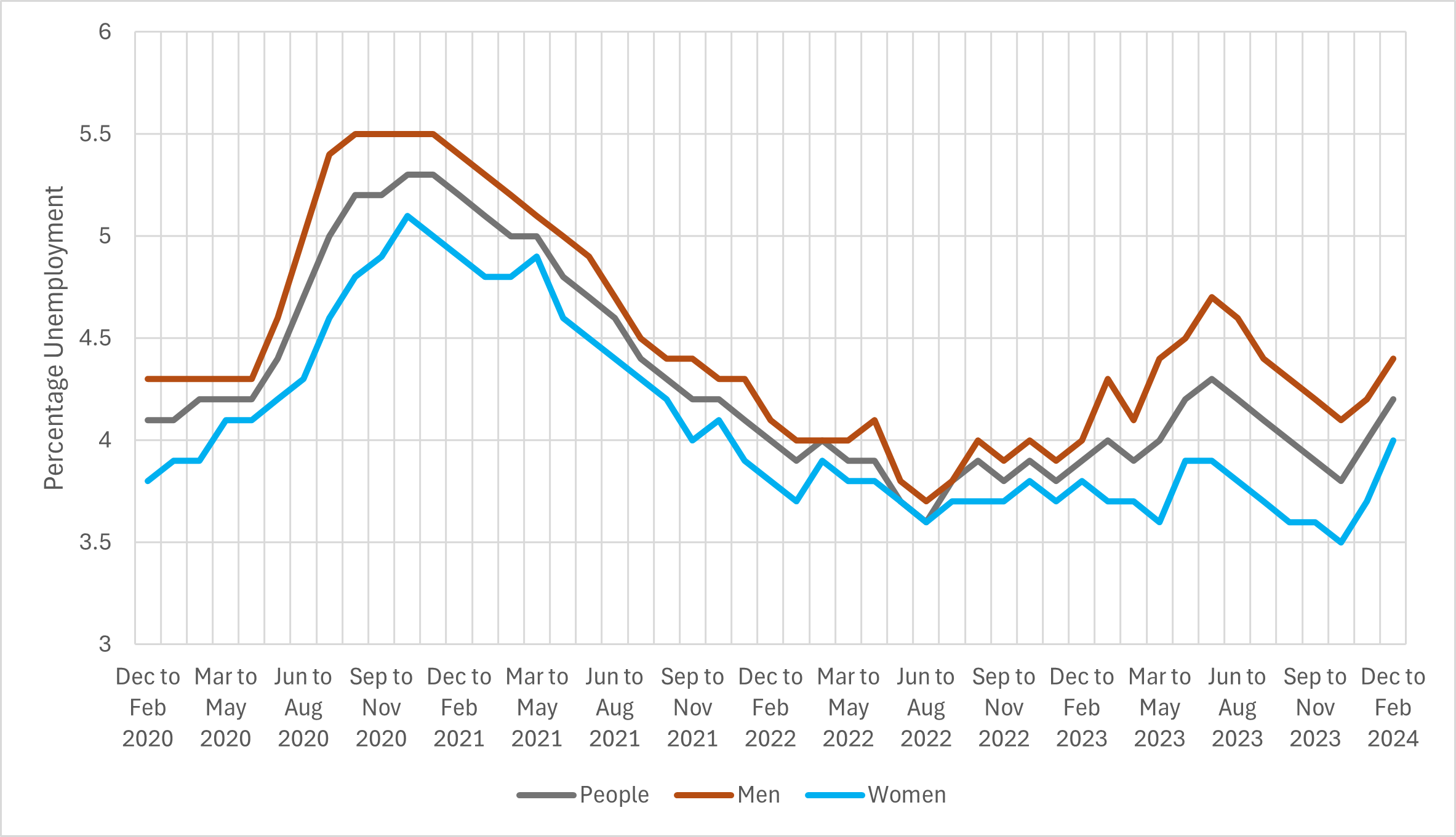
(a) Summarise the trends shown in the graph.
Summarise the overall trends
Remember to quote figures and dates
Note that summarising does not require you to explain why these trends occurred
Between December 2020 and November 2020 unemployment rose for each group. Overall it rose from around 4.1% to around 5.3%. This was the fastest rise in unemployment shown for the period.
It then declined to a low of around 3.6% in July 2022. This is the lowest it reached for the period shown.
From July 2022 to February 2024 the overall unemployment rate rose from 3.6% to 4.2%. However this was not a smooth rise, and included a dip to 3.8% in November 2023.
Summarise any differences between the trends for men and women
Remember to quote figures and dates
For all of the period shown, men have a higher unemployment rate than women. The rate of unemployment for men and women generally follow the same trends, with very similar peaks and troughs.
The largest disparity in the rates of unemployment is when unemployment is high overall. For example in September 2020 when overall unemployment was close to its highest value of 5.3%, the rate for women was 4.8% whilst for men it was 5.5%.
When overall unemployment was lower, for example in July 2022 when the rate was 3.6%, the rates for men and women were much closer. For men the rate was 3.7%, and for women it was 3.6%.
(b) Using the graph, forecast the overall unemployment rate for men and women in January 2025. Explain your reasoning and comment on how certain you are of this forecast.
Consider the trends and the average value
You don't need to calculate the average, just estimate it from the graph
For the most recent 2 years of the graph (February 2022 to February 2024) the average unemployment rate is around 4%.
So the most likely forecast is that unemployment will be close to this figure.
The general shape of the graph is quite "spiky" so there is a high level of uncertainty about forecasting this figure
The graph for this period has many peaks and troughs, so it can be hard to forecast accurately.
Provide some evidence that shows how unpredictable it can be
The early part of the graph (March 2020 to November 2021) shows that there can be large swings in unemployment. In less than 2 years, unemployment rose from 4.1% to 5.3%, and back down to 4.2%, showing that there can be a high level of volatility in the figure.
For these reasons I have a low level of certainty forecasting 4%.
There is not a "correct" answer for the forecast
Marks are awarded for how you evidence and explain your decision
Although if you stated you were very certain of your forecast, that would show a lack of understanding

Unlock more, it's free!
Did this page help you?
