Univariate Data (DP IB Applications & Interpretation (AI)): Revision Note

Did this video help you?

Box Plots

Univariate data is data that is in one variable.

What is a box plot (box and whisker diagram)?

  • A box plot is a graph that clearly shows key statistics from a data set

    • It shows the median, quartiles, minimum and maximum values and outliers

    • It does not show any other individual data items

  • The middle 50% of the data will be represented by the box section of the graph and the lower and upper 25% of the data will be represented by each of the whiskers

  • Any outliers are represented with a cross on the outside of the whiskers

    • If there is an outlier then the whisker will end at the value before the outlier

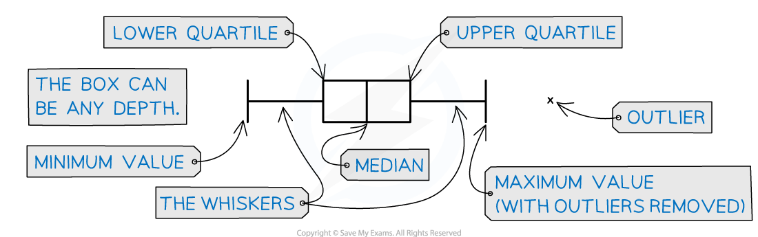
  • Only one axis is used when graphing a box plot

  • It is still important to make sure the axis has a clear, even scale and is labelled with units

2-2-2-box-plot-diagram-1

What are box plots useful for?

  • Box plots can clearly show the shape of the distribution

    • If a box plot is symmetrical about the median then the data could be normally distributed

  • Box plots are often used for comparing two sets of data

    • Two box plots will be drawn next to each other using the same axis

    • They are useful for comparing data because it is easy to see the main shape of the distribution of the data from a box plot

      • You can easily compare the medians and interquartile ranges

Examiner Tips and Tricks

  • In an exam you can use your GDC to draw a box plot if you have the raw data

    • You calculator's box plot can also include outliers so this is a good way to check

Worked Example

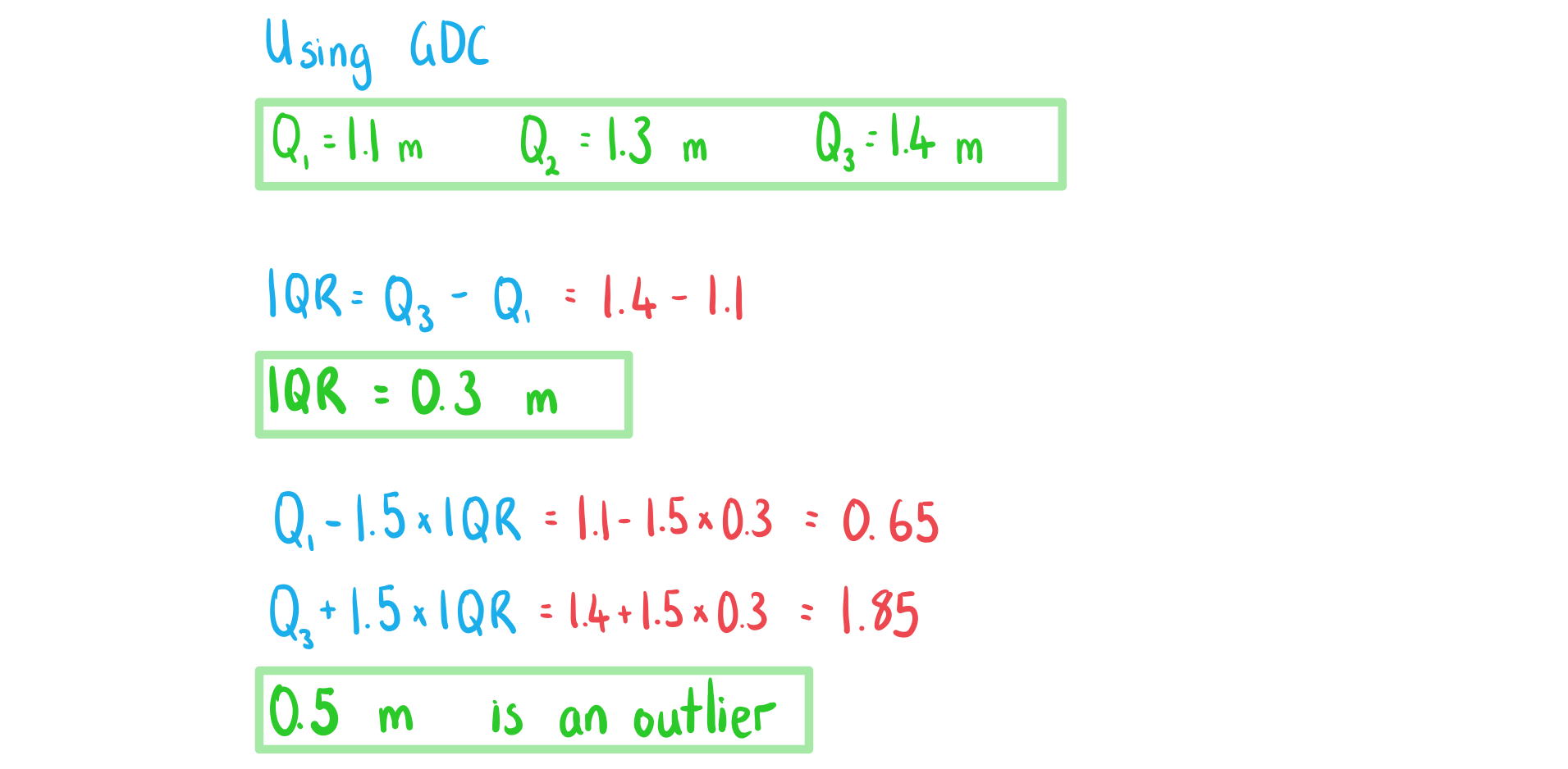
The distances, in metres, travelled by 15 snails in a one-minute period are recorded and shown below: 

0.5,   0.7,   1.0,   1.1,   1.2,   1.2,   1.2,   1.3,   1.4,   1.4,   1.4,   1.4,   1.5,   1.5,   1.6           

a) i) Find the values of Q subscript 1 comma space Q subscript 2 and Q subscript 3.

ii) Find the interquartile range.

iii) Identify any outliers.

4-1-6-ib-ai-aa-sl-box-plots-a-we-solution

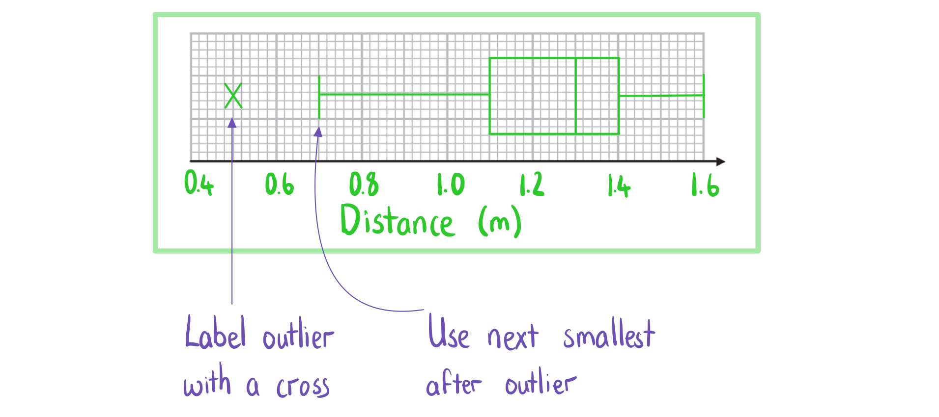
b) Draw a box plot for the data.

4-1-6-ib-ai-aa-sl-box-plots-b-we-solution


Did this video help you?

Cumulative Frequency Graphs

What is cumulative frequency?

  • The cumulative frequency of x is the running total of the frequencies for the values that are less than or equal to x

  • For grouped data you use the upper boundary of a class interval to find the cumulative frequency of that class

What is a cumulative frequency graph?

  • A cumulative frequency graph is used with data that has been organised into a grouped frequency table

  • Some coordinates are plotted

    • The x-coordinates are the upper boundaries of the class intervals

    • The y-coordinates are the cumulative frequencies of that class interval

  • The coordinates are then joined together by hand using a smooth increasing curve

What are cumulative frequency graphs useful for?

  • They can be used to estimate statistical measures

    • Draw a horizontal line from the y-axis to the curve

      • For the median: draw the line at 50% of the total frequency

      • For the lower quartile: draw the line at 25% of the total frequency

      • For the upper quartile: draw the line at 75% of the total frequency

      • For the pth percentile: draw the line at p% of the total frequency

    • Draw a vertical line down from the curve to the x-axis

    • This x-value is the relevant statistical measure

  • They can used to estimate the number of values that are bigger/small than a given value

    • Draw a vertical line from the given value on the x-axis to the curve

    • Draw a horizontal line from the curve to the y-axis

    • This value is an estimate for how many values are less than or equal to the given value

      • To estimate the number that is greater than the value subtract this number from the total frequency

    • They can be used to estimate the interquartile range IQR equals Q subscript 3 minus Q subscript 1

    • They can be used to construct a box plot for grouped data

Worked Example

The cumulative frequency graph below shows the lengths in cm, l, of 30 puppies in a training group.

cumulative-frequency-graph-2-2-2

a) Given that the interval 40 less or equal than l less than 45 was used when collecting data, find the frequency of this class.

4-1-6-ib-ai-aa-sl-cum-freq-a-we-solution

b) Use the graph to find an estimate for the interquartile range of the lengths.

4-1-6-ib-ai-aa-sl-cum-freq-b-we-solution

c) Estimate the percentage of puppies with length more than 51 cm.

4-1-6-ib-ai-aa-sl-cum-freq-c-we-solution

Did this video help you?

Histograms

What is a (frequency) histogram?

  • A frequency histogram clearly shows the frequency of class intervals

    • The classes will have equal class intervals

    • The frequency will be on the y-axis

    • The bar for a class interval will begin at the lower boundary and end at the upper boundary

  • A frequency histogram is similar to a bar chart

    • A bar chart is used for qualitative or discrete data and has gaps between the bars

    • A frequency histogram is used for continuous data and has no gaps between bars

What are (frequency) histograms useful for?

  • They show the modal class clearly

  • They show the shape of the distribution

    • It is important the class intervals are of equal width

  • They can show whether the variable can be modelled by a normal distribution

    • If the shape is symmetrical and bell-shaped

Worked Example

The table below and its corresponding histogram show the mass, in kg, of some new born bottlenose dolphins.

Mass, m kg

Frequency

4 less or equal than m less than 8

4

8 less or equal than m less than 12

15

12 less or equal than m less than 16

19

16 less or equal than m less than 20

10

20 less or equal than m less than 24

6

a) Draw a frequency histogram to represent the data.

4-1-6-ib-ai-aa-sl-histogram-a-we-solution

b) Write down the modal class.

4-1-6-ib-ai-aa-sl-histogram-b-we-solution
👀 You've read 1 of your 5 free revision notes this week
An illustration of students holding their exam resultsUnlock more revision notes. It's free!

By signing up you agree to our Terms and Privacy Policy.

Already have an account? Log in

Did this page help you?

Dan Finlay

Author: Dan Finlay

Expertise: Maths Subject Lead

Dan graduated from the University of Oxford with a First class degree in mathematics. As well as teaching maths for over 8 years, Dan has marked a range of exams for Edexcel, tutored students and taught A Level Accounting. Dan has a keen interest in statistics and probability and their real-life applications.

Download notes on Univariate Data