Representing Data Diagrammatically (AQA Level 3 Mathematical Studies (Core Maths)): Revision Note
Exam code: 1350

Histograms
What is a histogram?
A histogram is a graph used to show frequency distributions, it is similar to a bar chart but there are some significant differences
Histogram | Bar Chart |
Used for quantitative, continuous data | Used for qualitative or discrete quantitative data |
No gaps between bars | Gaps between bars |
Class intervals may be equal or unequal | Class intervals must be equal |
Frequency density on the y-axis | Frequency on the y-axis |
For a histogram:
The bar for a class interval will begin at the lower boundary and end at the upper boundary
The area of each bar in a histogram is proportional to the frequency for that class interval
What is frequency density?
Frequency density is given by the formula
![]()
Frequency density is used with grouped data (class intervals)
it is particularly useful when the class intervals are of unequal width
it provides a measure of how spread out data within its class interval is, relative to its size
How do I draw a histogram?
Identify the size of each class interval
If the class intervals are unequal, calculate the frequency density for each class
As frequency is proportional to frequency density
format('truetype')%3Bfont-weight%3Anormal%3Bfont-style%3Anormal%3B%7Dtext%7Bfill%3A%23000000%3B%3C%2Fstyle%3E%3C%2Fdefs%3E%3Ctext%20font-family%3D%22Times%20New%20Roman%22%20font-size%3D%2218%22%20text-anchor%3D%22middle%22%20x%3D%2293.5%22%20y%3D%2216%22%3Efrequency%3C%2Ftext%3E%3Ctext%20font-family%3D%22math1bda5e80662c4d2e36edaee52ac%22%20font-size%3D%2216%22%20text-anchor%3D%22middle%22%20x%3D%22137.5%22%20y%3D%2216%22%3E%26%23x221D%3B%3C%2Ftext%3E%3Ctext%20font-family%3D%22Times%20New%20Roman%22%20font-size%3D%2218%22%20text-anchor%3D%22middle%22%20x%3D%22181.5%22%20y%3D%2216%22%3Efrequency%3C%2Ftext%3E%3Ctext%20font-family%3D%22Times%20New%20Roman%22%20font-size%3D%2218%22%20text-anchor%3D%22middle%22%20x%3D%22247.5%22%20y%3D%2216%22%3Edensity%3C%2Ftext%3E%3Ctext%20font-family%3D%22Times%20New%20Roman%22%20font-size%3D%2218%22%20text-anchor%3D%22middle%22%20x%3D%2236.5%22%20y%3D%2256%22%3Efrequency%3C%2Ftext%3E%3Ctext%20font-family%3D%22Times%20New%20Roman%22%20font-size%3D%2218%22%20text-anchor%3D%22middle%22%20x%3D%22102.5%22%20y%3D%2256%22%3Edensity%3C%2Ftext%3E%3Ctext%20font-family%3D%22math1bda5e80662c4d2e36edaee52ac%22%20font-size%3D%2216%22%20text-anchor%3D%22middle%22%20x%3D%22136.5%22%20y%3D%2256%22%3E%3D%3C%2Ftext%3E%3Ctext%20font-family%3D%22Times%20New%20Roman%22%20font-size%3D%2218%22%20font-style%3D%22italic%22%20text-anchor%3D%22middle%22%20x%3D%22149.5%22%20y%3D%2256%22%3Ek%3C%2Ftext%3E%3Ctext%20font-family%3D%22math1bda5e80662c4d2e36edaee52ac%22%20font-size%3D%2216%22%20text-anchor%3D%22middle%22%20x%3D%22163.5%22%20y%3D%2256%22%3E%26%23xD7%3B%3C%2Ftext%3E%3Cline%20stroke%3D%22%23000000%22%20stroke-linecap%3D%22square%22%20stroke-width%3D%221%22%20x1%3D%22174.5%22%20x2%3D%22257.5%22%20y1%3D%2249.5%22%20y2%3D%2249.5%22%2F%3E%3Ctext%20font-family%3D%22Times%20New%20Roman%22%20font-size%3D%2218%22%20text-anchor%3D%22middle%22%20x%3D%22216.5%22%20y%3D%2242%22%3Efrequency%3C%2Ftext%3E%3Ctext%20font-family%3D%22Times%20New%20Roman%22%20font-size%3D%2218%22%20text-anchor%3D%22middle%22%20x%3D%22193.5%22%20y%3D%2267%22%3Eclass%3C%2Ftext%3E%3Ctext%20font-family%3D%22Times%20New%20Roman%22%20font-size%3D%2218%22%20text-anchor%3D%22middle%22%20x%3D%22235.5%22%20y%3D%2267%22%3Ewidth%3C%2Ftext%3E%3C%2Fsvg%3E)
In the majority of questions,
format('truetype')%3Bfont-weight%3Anormal%3Bfont-style%3Anormal%3B%7Dtext%7Bfill%3A%23000000%3B%3C%2Fstyle%3E%3C%2Fdefs%3E%3Ctext%20font-family%3D%22Times%20New%20Roman%22%20font-size%3D%2218%22%20font-style%3D%22italic%22%20text-anchor%3D%22middle%22%20x%3D%224.5%22%20y%3D%2216%22%3Ek%3C%2Ftext%3E%3Ctext%20font-family%3D%22math17f39f8317fbdb1988ef4c628eb%22%20font-size%3D%2216%22%20text-anchor%3D%22middle%22%20x%3D%2218.5%22%20y%3D%2216%22%3E%3D%3C%2Ftext%3E%3Ctext%20font-family%3D%22Times%20New%20Roman%22%20font-size%3D%2218%22%20text-anchor%3D%22middle%22%20x%3D%2231.5%22%20y%3D%2216%22%3E1%3C%2Ftext%3E%3C%2Fsvg%3E) , so the frequency density can be found by dividing the frequency by the class width
, so the frequency density can be found by dividing the frequency by the class widthOnce the frequency densities are known:
Draw bars (rectangles) with widths being measured on the x-axis
Make sure the height of each bar is the frequency density for that class and is measured on the y-axis
Examiner Tips and Tricks
Always work out and write down the frequency densities
It is easy to make errors and lose marks by going straight to the graph
You can gain method marks by showing that you are using frequency density rather than frequency
How do I interpret a histogram?
It is important to remember that the frequency density (y-axis) does not tell us frequency
The area of the bar is proportional to the frequency
Most of the time, the frequency will be the area of the bar directly and is found by using
![]()
Occasionally the frequency will be proportional to the area of the bar so use
![]()
You will need to work out the value of k from other information given in the question
You may be asked to estimate the frequency of part of a bar/class interval within a histogram
Find the area of the bar for the part of the interval required
Once area is known, frequency can be found as above
Worked Example
The table below shows information regarding the average speeds travelled by trains in a region of the UK.
Average speed, | Frequency |
| 5 |
| 15 |
| 28 |
| 38 |
| 14 |
Draw a histogram to represent the data.
Add two columns to the table - one for class width, one for frequency density
Writing the calculation in each box helps to keep accuracy
Average speed, | Frequency | Class width | Frequency density |
| 5 | 40 - 20 = 20 | 5 ÷ 20 = 0.25 |
| 15 | 50 - 40 = 10 | 15 ÷ 10 = 1.5 |
| 28 | 55 - 50 = 5 | 28 ÷ 5 = 5.6 |
| 38 | 60 - 55 = 5 | 38 ÷ 5 = 7.6 |
| 14 | 70 - 60 = 10 | 14 ÷ 10 = 1.4 |
Mark on an appropriate scale for the x and y-axes
Draw the bars of the histogram
Making sure that:
The height of each bar is the frequency density
Each bar goes from the lower boundary of its class to the upper boundary
There are no gaps between the bars

Cumulative Frequency Graphs
What is cumulative frequency?
The cumulative frequency of x is the running total of the frequencies for the values that are less than or equal to x
For grouped data you use the upper boundary of a class interval to find the cumulative frequency of that class
What is a cumulative frequency graph?
A cumulative frequency graph is used with data that has been organised into a grouped frequency table
Some coordinates are plotted
The x-coordinates are the upper boundaries of the class intervals
The y-coordinates are the cumulative frequencies of that class interval
The coordinates are then joined together by hand using a smooth increasing curve
What are cumulative frequency graphs useful for?
Cumulative frequency graphs can be used to estimate statistical measures
Draw a horizontal line from the y-axis to the curve
For the median: draw the line at 50% of the total frequency,

For the lower quartile: draw the line at 25% of the total frequency,

For the upper quartile: draw the line at 75% of the total frequency,

For the pth percentile: draw the line at p% of the total frequency
Draw a vertical line down from the curve to the x-axis
This x-value is the relevant statistical measure
Cumulative frequency graphs can also be used to estimate the number of values that are bigger or smaller than a given value
Draw a vertical line from the given value on the x-axis to the curve
Draw a horizontal line from the curve to the y-axis
This value is an estimate for how many values are less than or equal to the given value
To estimate the number that is greater than the value subtract this number from the total frequency
They can be used to estimate the interquartile range
format('truetype')%3Bfont-weight%3Anormal%3Bfont-style%3Anormal%3B%7Dtext%7Bfill%3A%23000000%3B%3C%2Fstyle%3E%3C%2Fdefs%3E%3Ctext%20font-family%3D%22Times%20New%20Roman%22%20font-size%3D%2218%22%20text-anchor%3D%22middle%22%20x%3D%2215.5%22%20y%3D%2216%22%3EIQR%3C%2Ftext%3E%3Ctext%20font-family%3D%22math143f4d31b04031e49f5eb18baba%22%20font-size%3D%2216%22%20text-anchor%3D%22middle%22%20x%3D%2239.5%22%20y%3D%2216%22%3E%3D%3C%2Ftext%3E%3Ctext%20font-family%3D%22Times%20New%20Roman%22%20font-size%3D%2218%22%20font-style%3D%22italic%22%20text-anchor%3D%22middle%22%20x%3D%2254.5%22%20y%3D%2216%22%3EQ%3C%2Ftext%3E%3Ctext%20font-family%3D%22Times%20New%20Roman%22%20font-size%3D%2213%22%20text-anchor%3D%22middle%22%20x%3D%2265.5%22%20y%3D%2224%22%3E3%3C%2Ftext%3E%3Ctext%20font-family%3D%22math143f4d31b04031e49f5eb18baba%22%20font-size%3D%2216%22%20text-anchor%3D%22middle%22%20x%3D%2277.5%22%20y%3D%2216%22%3E%26%23x2212%3B%3C%2Ftext%3E%3Ctext%20font-family%3D%22Times%20New%20Roman%22%20font-size%3D%2218%22%20font-style%3D%22italic%22%20text-anchor%3D%22middle%22%20x%3D%2292.5%22%20y%3D%2216%22%3EQ%3C%2Ftext%3E%3Ctext%20font-family%3D%22Times%20New%20Roman%22%20font-size%3D%2213%22%20text-anchor%3D%22middle%22%20x%3D%22103.5%22%20y%3D%2224%22%3E1%3C%2Ftext%3E%3C%2Fsvg%3E)
They can be used to construct a box plot for grouped data
Worked Example
The cumulative frequency graph below shows the lengths in cm, ![]() , of 30 puppies in a training group.
, of 30 puppies in a training group.

(a) Given that the interval ![]() was used when collecting data, find the frequency of this class.
was used when collecting data, find the frequency of this class.
Draw vertical lines from 40 and 45 on the x-axis until they meet the curve
Draw horizontal lines from the curve to the y-axis and read off the values

Subtract the frequency associated with the lower boundary of the class from the frequency associated with the upper bound of the class
16 - 8 = 8
Frequency = 8
(b) Use the graph to find an estimate for the interquartile range of the lengths.
Find the ![]() th position, this will be the lower quartile,
th position, this will be the lower quartile, ![]()
![]() th position
th position
Find the ![]() th position, this will be the lower quartile,
th position, this will be the lower quartile, ![]()
![]() th position
th position
Draw horizontal lines from these two values on the y-axis until they meet the curve
From these points on the curve draw vertical lines to the x-axis and read off the values

The interquartile range is the difference between the upper and lower quartiles
51.2 - 39.5 = 11.7
11.7 cm
(c) Estimate the percentage of puppies with length more than 49 cm.
Draw a vertical line on the graph from 49 on the x-axis until it meets the curve
Draw a horizontal line from this point on the curve across to the y-axis and read off the value

Subtract this value from the total number of puppies in the class to find the number that are longer than 49 cm
30 - 20 = 10
Divide this value by the total number of puppies and multiply by 100 to turn this value into a percentage
![]()
33.3% (to 3.s.f.) of puppies are longer than 49 cm
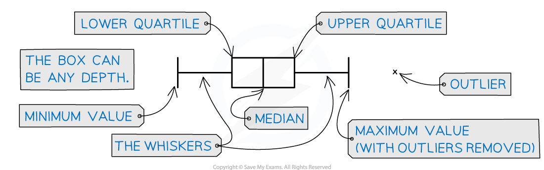
Box and Whisker Plots
What is a box and whisker plot?
A box plot is a graph that clearly shows key statistics from a data set
It shows the median, quartiles, minimum and maximum values and outliers
It does not show any other individual data items
The middle 50% of the data is represented by the box section of the graph
The lower and upper 25% of the data will be represented by each of the whiskers
Any outliers are represented with a cross on the outside of the whiskers
If there is an outlier then the whisker will end at the value before the outlier
Only one axis is used when graphing a box plot
It is still important to make sure the axis has a clear, even scale and is labelled with units
What are box plots useful for?
Box plots can clearly show the shape of the distribution
If a box plot is symmetrical about the median then the data could be normally distributed
Box plots are often used for comparing two sets of data
Two box plots will be drawn next to each other using the same axis
You can easily compare the medians and interquartile ranges
Examiner Tips and Tricks
You may be able to draw a box plot on your calculator if you have the raw data
You calculator's box plot can also include outliers so this is a good way to check
Worked Example
The distances, in metres, travelled by 15 snails in a one-minute period are recorded and shown below:
0.5, 0.7, 1.0, 1.1, 1.2, 1.2, 1.2, 1.3, 1.4, 1.4, 1.4, 1.4, 1.5, 1.5, 1.5
(a)
(i) Find the values of ![]() and
and ![]() .
.
The values in the data set are already in size order
The lower quartile, ![]() will be at position
will be at position ![]()
![]() th position
th position
![]()
The median, ![]() will be at position
will be at position ![]()
![]() th position
th position
![]()
The median, ![]() will be at position
will be at position
![]() th position
th position![]()
format('truetype')%3Bfont-weight%3Anormal%3Bfont-style%3Anormal%3B%7D%3C%2Fstyle%3E%3C%2Fdefs%3E%3Ctext%20font-family%3D%22Times%20New%20Roman%22%20font-size%3D%2218%22%20font-style%3D%22italic%22%20font-weight%3D%22bold%22%20text-anchor%3D%22middle%22%20x%3D%227.5%22%20y%3D%2216%22%3EQ%3C%2Ftext%3E%3Ctext%20font-family%3D%22Times%20New%20Roman%22%20font-size%3D%2213%22%20font-weight%3D%22bold%22%20text-anchor%3D%22middle%22%20x%3D%2218.5%22%20y%3D%2224%22%3E1%3C%2Ftext%3E%3Ctext%20font-family%3D%22math11824c643d1feb4da18b28ed527%22%20font-size%3D%2216%22%20font-weight%3D%22bold%22%20text-anchor%3D%22middle%22%20x%3D%2231.5%22%20y%3D%2216%22%3E%3D%3C%2Ftext%3E%3Ctext%20font-family%3D%22Times%20New%20Roman%22%20font-size%3D%2218%22%20font-weight%3D%22bold%22%20text-anchor%3D%22middle%22%20x%3D%2245.5%22%20y%3D%2216%22%3E1%3C%2Ftext%3E%3Ctext%20font-family%3D%22math11824c643d1feb4da18b28ed527%22%20font-size%3D%2216%22%20font-weight%3D%22bold%22%20text-anchor%3D%22middle%22%20x%3D%2253.5%22%20y%3D%2216%22%3E.%3C%2Ftext%3E%3Ctext%20font-family%3D%22Times%20New%20Roman%22%20font-size%3D%2218%22%20font-weight%3D%22bold%22%20text-anchor%3D%22middle%22%20x%3D%2261.5%22%20y%3D%2216%22%3E1%3C%2Ftext%3E%3Ctext%20font-family%3D%22Times%20New%20Roman%22%20font-size%3D%2218%22%20font-weight%3D%22bold%22%20text-anchor%3D%22middle%22%20x%3D%2278.5%22%20y%3D%2216%22%3Em%3C%2Ftext%3E%3Ctext%20font-family%3D%22Times%20New%20Roman%22%20font-size%3D%2218%22%20font-style%3D%22italic%22%20font-weight%3D%22bold%22%20text-anchor%3D%22middle%22%20x%3D%227.5%22%20y%3D%2248%22%3EQ%3C%2Ftext%3E%3Ctext%20font-family%3D%22Times%20New%20Roman%22%20font-size%3D%2213%22%20font-weight%3D%22bold%22%20text-anchor%3D%22middle%22%20x%3D%2218.5%22%20y%3D%2256%22%3E2%3C%2Ftext%3E%3Ctext%20font-family%3D%22math11824c643d1feb4da18b28ed527%22%20font-size%3D%2216%22%20font-weight%3D%22bold%22%20text-anchor%3D%22middle%22%20x%3D%2231.5%22%20y%3D%2248%22%3E%3D%3C%2Ftext%3E%3Ctext%20font-family%3D%22Times%20New%20Roman%22%20font-size%3D%2218%22%20font-weight%3D%22bold%22%20text-anchor%3D%22middle%22%20x%3D%2245.5%22%20y%3D%2248%22%3E1%3C%2Ftext%3E%3Ctext%20font-family%3D%22math11824c643d1feb4da18b28ed527%22%20font-size%3D%2216%22%20font-weight%3D%22bold%22%20text-anchor%3D%22middle%22%20x%3D%2253.5%22%20y%3D%2248%22%3E.%3C%2Ftext%3E%3Ctext%20font-family%3D%22Times%20New%20Roman%22%20font-size%3D%2218%22%20font-weight%3D%22bold%22%20text-anchor%3D%22middle%22%20x%3D%2261.5%22%20y%3D%2248%22%3E3%3C%2Ftext%3E%3Ctext%20font-family%3D%22Times%20New%20Roman%22%20font-size%3D%2218%22%20font-weight%3D%22bold%22%20text-anchor%3D%22middle%22%20x%3D%2278.5%22%20y%3D%2248%22%3Em%3C%2Ftext%3E%3Ctext%20font-family%3D%22Times%20New%20Roman%22%20font-size%3D%2218%22%20font-style%3D%22italic%22%20font-weight%3D%22bold%22%20text-anchor%3D%22middle%22%20x%3D%227.5%22%20y%3D%2280%22%3EQ%3C%2Ftext%3E%3Ctext%20font-family%3D%22Times%20New%20Roman%22%20font-size%3D%2213%22%20font-weight%3D%22bold%22%20text-anchor%3D%22middle%22%20x%3D%2218.5%22%20y%3D%2288%22%3E3%3C%2Ftext%3E%3Ctext%20font-family%3D%22math11824c643d1feb4da18b28ed527%22%20font-size%3D%2216%22%20font-weight%3D%22bold%22%20text-anchor%3D%22middle%22%20x%3D%2231.5%22%20y%3D%2280%22%3E%3D%3C%2Ftext%3E%3Ctext%20font-family%3D%22Times%20New%20Roman%22%20font-size%3D%2218%22%20font-weight%3D%22bold%22%20text-anchor%3D%22middle%22%20x%3D%2245.5%22%20y%3D%2280%22%3E1%3C%2Ftext%3E%3Ctext%20font-family%3D%22math11824c643d1feb4da18b28ed527%22%20font-size%3D%2216%22%20font-weight%3D%22bold%22%20text-anchor%3D%22middle%22%20x%3D%2253.5%22%20y%3D%2280%22%3E.%3C%2Ftext%3E%3Ctext%20font-family%3D%22Times%20New%20Roman%22%20font-size%3D%2218%22%20font-weight%3D%22bold%22%20text-anchor%3D%22middle%22%20x%3D%2261.5%22%20y%3D%2280%22%3E4%3C%2Ftext%3E%3Ctext%20font-family%3D%22Times%20New%20Roman%22%20font-size%3D%2218%22%20font-weight%3D%22bold%22%20text-anchor%3D%22middle%22%20x%3D%2278.5%22%20y%3D%2280%22%3Em%3C%2Ftext%3E%3C%2Fsvg%3E)
(ii) Find the interquartile range.
The interquartile range is the difference between the upper quartile and the lower quartile
![]()
![]()
(iii) Identify any outliers.
Identify the bounds for outliers
An outlier is ![]() above the upper quartile or below the lower quartile
above the upper quartile or below the lower quartile
format('truetype')%3Bfont-weight%3Anormal%3Bfont-style%3Anormal%3B%7D%3C%2Fstyle%3E%3C%2Fdefs%3E%3Ctext%20font-family%3D%22Times%20New%20Roman%22%20font-size%3D%2218%22%20font-style%3D%22italic%22%20text-anchor%3D%22middle%22%20x%3D%226.5%22%20y%3D%2216%22%3EQ%3C%2Ftext%3E%3Ctext%20font-family%3D%22Times%20New%20Roman%22%20font-size%3D%2213%22%20text-anchor%3D%22middle%22%20x%3D%2217.5%22%20y%3D%2224%22%3E1%3C%2Ftext%3E%3Ctext%20font-family%3D%22math16f56f47a24e2a656e96001fef5%22%20font-size%3D%2216%22%20text-anchor%3D%22middle%22%20x%3D%2229.5%22%20y%3D%2216%22%3E%26%23x2212%3B%3C%2Ftext%3E%3Ctext%20font-family%3D%22Times%20New%20Roman%22%20font-size%3D%2218%22%20text-anchor%3D%22middle%22%20x%3D%2242.5%22%20y%3D%2216%22%3E1%3C%2Ftext%3E%3Ctext%20font-family%3D%22math16f56f47a24e2a656e96001fef5%22%20font-size%3D%2216%22%20text-anchor%3D%22middle%22%20x%3D%2249.5%22%20y%3D%2216%22%3E.%3C%2Ftext%3E%3Ctext%20font-family%3D%22Times%20New%20Roman%22%20font-size%3D%2218%22%20text-anchor%3D%22middle%22%20x%3D%2256.5%22%20y%3D%2216%22%3E5%3C%2Ftext%3E%3Ctext%20font-family%3D%22math16f56f47a24e2a656e96001fef5%22%20font-size%3D%2216%22%20text-anchor%3D%22middle%22%20x%3D%2269.5%22%20y%3D%2216%22%3E%26%23xD7%3B%3C%2Ftext%3E%3Ctext%20font-family%3D%22Times%20New%20Roman%22%20font-size%3D%2218%22%20text-anchor%3D%22middle%22%20x%3D%2293.5%22%20y%3D%2216%22%3EIQR%3C%2Ftext%3E%3Ctext%20font-family%3D%22math16f56f47a24e2a656e96001fef5%22%20font-size%3D%2216%22%20text-anchor%3D%22middle%22%20x%3D%22117.5%22%20y%3D%2216%22%3E%3D%3C%2Ftext%3E%3Ctext%20font-family%3D%22Times%20New%20Roman%22%20font-size%3D%2218%22%20text-anchor%3D%22middle%22%20x%3D%22130.5%22%20y%3D%2216%22%3E1%3C%2Ftext%3E%3Ctext%20font-family%3D%22math16f56f47a24e2a656e96001fef5%22%20font-size%3D%2216%22%20text-anchor%3D%22middle%22%20x%3D%22137.5%22%20y%3D%2216%22%3E.%3C%2Ftext%3E%3Ctext%20font-family%3D%22Times%20New%20Roman%22%20font-size%3D%2218%22%20text-anchor%3D%22middle%22%20x%3D%22144.5%22%20y%3D%2216%22%3E1%3C%2Ftext%3E%3Ctext%20font-family%3D%22math16f56f47a24e2a656e96001fef5%22%20font-size%3D%2216%22%20text-anchor%3D%22middle%22%20x%3D%22157.5%22%20y%3D%2216%22%3E%26%23x2212%3B%3C%2Ftext%3E%3Ctext%20font-family%3D%22Times%20New%20Roman%22%20font-size%3D%2218%22%20text-anchor%3D%22middle%22%20x%3D%22170.5%22%20y%3D%2216%22%3E1%3C%2Ftext%3E%3Ctext%20font-family%3D%22math16f56f47a24e2a656e96001fef5%22%20font-size%3D%2216%22%20text-anchor%3D%22middle%22%20x%3D%22177.5%22%20y%3D%2216%22%3E.%3C%2Ftext%3E%3Ctext%20font-family%3D%22Times%20New%20Roman%22%20font-size%3D%2218%22%20text-anchor%3D%22middle%22%20x%3D%22184.5%22%20y%3D%2216%22%3E5%3C%2Ftext%3E%3Ctext%20font-family%3D%22math16f56f47a24e2a656e96001fef5%22%20font-size%3D%2216%22%20text-anchor%3D%22middle%22%20x%3D%22197.5%22%20y%3D%2216%22%3E%26%23xD7%3B%3C%2Ftext%3E%3Ctext%20font-family%3D%22Times%20New%20Roman%22%20font-size%3D%2218%22%20text-anchor%3D%22middle%22%20x%3D%22210.5%22%20y%3D%2216%22%3E0%3C%2Ftext%3E%3Ctext%20font-family%3D%22math16f56f47a24e2a656e96001fef5%22%20font-size%3D%2216%22%20text-anchor%3D%22middle%22%20x%3D%22217.5%22%20y%3D%2216%22%3E.%3C%2Ftext%3E%3Ctext%20font-family%3D%22Times%20New%20Roman%22%20font-size%3D%2218%22%20text-anchor%3D%22middle%22%20x%3D%22224.5%22%20y%3D%2216%22%3E3%3C%2Ftext%3E%3Ctext%20font-family%3D%22math16f56f47a24e2a656e96001fef5%22%20font-size%3D%2216%22%20text-anchor%3D%22middle%22%20x%3D%22237.5%22%20y%3D%2216%22%3E%3D%3C%2Ftext%3E%3Ctext%20font-family%3D%22Times%20New%20Roman%22%20font-size%3D%2218%22%20text-anchor%3D%22middle%22%20x%3D%22250.5%22%20y%3D%2216%22%3E0%3C%2Ftext%3E%3Ctext%20font-family%3D%22math16f56f47a24e2a656e96001fef5%22%20font-size%3D%2216%22%20text-anchor%3D%22middle%22%20x%3D%22257.5%22%20y%3D%2216%22%3E.%3C%2Ftext%3E%3Ctext%20font-family%3D%22Times%20New%20Roman%22%20font-size%3D%2218%22%20text-anchor%3D%22middle%22%20x%3D%22269.5%22%20y%3D%2216%22%3E65%3C%2Ftext%3E%3Ctext%20font-family%3D%22Times%20New%20Roman%22%20font-size%3D%2218%22%20font-style%3D%22italic%22%20text-anchor%3D%22middle%22%20x%3D%226.5%22%20y%3D%2248%22%3EQ%3C%2Ftext%3E%3Ctext%20font-family%3D%22Times%20New%20Roman%22%20font-size%3D%2213%22%20text-anchor%3D%22middle%22%20x%3D%2217.5%22%20y%3D%2256%22%3E3%3C%2Ftext%3E%3Ctext%20font-family%3D%22math16f56f47a24e2a656e96001fef5%22%20font-size%3D%2216%22%20text-anchor%3D%22middle%22%20x%3D%2229.5%22%20y%3D%2248%22%3E%2B%3C%2Ftext%3E%3Ctext%20font-family%3D%22Times%20New%20Roman%22%20font-size%3D%2218%22%20text-anchor%3D%22middle%22%20x%3D%2242.5%22%20y%3D%2248%22%3E1%3C%2Ftext%3E%3Ctext%20font-family%3D%22math16f56f47a24e2a656e96001fef5%22%20font-size%3D%2216%22%20text-anchor%3D%22middle%22%20x%3D%2249.5%22%20y%3D%2248%22%3E.%3C%2Ftext%3E%3Ctext%20font-family%3D%22Times%20New%20Roman%22%20font-size%3D%2218%22%20text-anchor%3D%22middle%22%20x%3D%2256.5%22%20y%3D%2248%22%3E5%3C%2Ftext%3E%3Ctext%20font-family%3D%22math16f56f47a24e2a656e96001fef5%22%20font-size%3D%2216%22%20text-anchor%3D%22middle%22%20x%3D%2269.5%22%20y%3D%2248%22%3E%26%23xD7%3B%3C%2Ftext%3E%3Ctext%20font-family%3D%22Times%20New%20Roman%22%20font-size%3D%2218%22%20text-anchor%3D%22middle%22%20x%3D%2293.5%22%20y%3D%2248%22%3EIQR%3C%2Ftext%3E%3Ctext%20font-family%3D%22math16f56f47a24e2a656e96001fef5%22%20font-size%3D%2216%22%20text-anchor%3D%22middle%22%20x%3D%22117.5%22%20y%3D%2248%22%3E%3D%3C%2Ftext%3E%3Ctext%20font-family%3D%22Times%20New%20Roman%22%20font-size%3D%2218%22%20text-anchor%3D%22middle%22%20x%3D%22130.5%22%20y%3D%2248%22%3E1%3C%2Ftext%3E%3Ctext%20font-family%3D%22math16f56f47a24e2a656e96001fef5%22%20font-size%3D%2216%22%20text-anchor%3D%22middle%22%20x%3D%22137.5%22%20y%3D%2248%22%3E.%3C%2Ftext%3E%3Ctext%20font-family%3D%22Times%20New%20Roman%22%20font-size%3D%2218%22%20text-anchor%3D%22middle%22%20x%3D%22144.5%22%20y%3D%2248%22%3E4%3C%2Ftext%3E%3Ctext%20font-family%3D%22math16f56f47a24e2a656e96001fef5%22%20font-size%3D%2216%22%20text-anchor%3D%22middle%22%20x%3D%22157.5%22%20y%3D%2248%22%3E%2B%3C%2Ftext%3E%3Ctext%20font-family%3D%22Times%20New%20Roman%22%20font-size%3D%2218%22%20text-anchor%3D%22middle%22%20x%3D%22170.5%22%20y%3D%2248%22%3E1%3C%2Ftext%3E%3Ctext%20font-family%3D%22math16f56f47a24e2a656e96001fef5%22%20font-size%3D%2216%22%20text-anchor%3D%22middle%22%20x%3D%22177.5%22%20y%3D%2248%22%3E.%3C%2Ftext%3E%3Ctext%20font-family%3D%22Times%20New%20Roman%22%20font-size%3D%2218%22%20text-anchor%3D%22middle%22%20x%3D%22184.5%22%20y%3D%2248%22%3E5%3C%2Ftext%3E%3Ctext%20font-family%3D%22math16f56f47a24e2a656e96001fef5%22%20font-size%3D%2216%22%20text-anchor%3D%22middle%22%20x%3D%22197.5%22%20y%3D%2248%22%3E%26%23xD7%3B%3C%2Ftext%3E%3Ctext%20font-family%3D%22Times%20New%20Roman%22%20font-size%3D%2218%22%20text-anchor%3D%22middle%22%20x%3D%22210.5%22%20y%3D%2248%22%3E0%3C%2Ftext%3E%3Ctext%20font-family%3D%22math16f56f47a24e2a656e96001fef5%22%20font-size%3D%2216%22%20text-anchor%3D%22middle%22%20x%3D%22217.5%22%20y%3D%2248%22%3E.%3C%2Ftext%3E%3Ctext%20font-family%3D%22Times%20New%20Roman%22%20font-size%3D%2218%22%20text-anchor%3D%22middle%22%20x%3D%22224.5%22%20y%3D%2248%22%3E3%3C%2Ftext%3E%3Ctext%20font-family%3D%22math16f56f47a24e2a656e96001fef5%22%20font-size%3D%2216%22%20text-anchor%3D%22middle%22%20x%3D%22237.5%22%20y%3D%2248%22%3E%3D%3C%2Ftext%3E%3Ctext%20font-family%3D%22Times%20New%20Roman%22%20font-size%3D%2218%22%20text-anchor%3D%22middle%22%20x%3D%22250.5%22%20y%3D%2248%22%3E1%3C%2Ftext%3E%3Ctext%20font-family%3D%22math16f56f47a24e2a656e96001fef5%22%20font-size%3D%2216%22%20text-anchor%3D%22middle%22%20x%3D%22257.5%22%20y%3D%2248%22%3E.%3C%2Ftext%3E%3Ctext%20font-family%3D%22Times%20New%20Roman%22%20font-size%3D%2218%22%20text-anchor%3D%22middle%22%20x%3D%22269.5%22%20y%3D%2248%22%3E85%3C%2Ftext%3E%3C%2Fsvg%3E)
Identify any items in the data set that are outliers
![]()
![]() is an outlier
is an outlier
(b) Draw a box plot for the data.
Label the axis with a scale that covers the range of the data
Mark the outlier value with a cross
Draw vertical lines for the Maximum value as well as for ![]() ,
, ![]() and
and ![]()
Draw a vertical line for the minimum value that is not an outlier
Connect ![]() ,
, ![]() and
and ![]() with two horizontal lines to form the box
with two horizontal lines to form the box
Connect the maximum value and the minimum value that is not an outlier to the box with a single horizontal line to form the whiskers

Stem and Leaf Diagrams
What is a stem and leaf diagram?
A stem-and-leaf diagram is a simple way to display an ordered list of data using digits
It can show the shape of the distribution of the data
Two-digit numbers are split into a tens digit (the stem) and a units digit (the leaf)
25 becomes 2 | 5
The stem is written vertically and the leaves are written horizontally (in size order)
The following diagram shows the ages below
11, 18, 20, 21, 25, 28, 29, 35, 36, 40
Age | |
1 | 1 8 |
2 | 0 1 5 8 9 |
3 | 5 6 |
4 | 0 |
Key: 1|8 means 18 years old
What is the key on a stem and leaf diagram?
The key shows how values are formed from digits
It should include units
Other keys are possible
2 | 5 represents 2.5 degrees
2 | 5 represents 2005 people
What is a back to back stem and leaf diagram?
Occasionally you may encounter a back to back stem and leaf diagram
These display two series of data, both using the same variable, on one diagram
For example, the number of ice-creams sold each day for 10 particular days in August compared to September
Pay close attention to the key
Note that the leaves on the left increase from the centre outwards
Ice creams sold each day in August |
| Ice creams sold each day in September |
| 0 | 1 8 |
5 3 | 1 | 0 1 5 8 9 |
9 7 2 | 2 | 5 6 |
9 7 6 5 2 | 3 | 0 |
Key: 2|1|8 represents 12 ice creams sold on a day in August, and 18 sold on a day in September
How do I find the mean, median and mode from a stem and leaf diagram?
The mean is the sum of the values divided by the number of values
Add up all of the values in the stem-and-leaf diagram and divide by the total number of items
The median is the middle number
Data values are already in order
The median will be at position
format('truetype')%3Bfont-weight%3Anormal%3Bfont-style%3Anormal%3B%7D%3C%2Fstyle%3E%3C%2Fdefs%3E%3Cline%20stroke%3D%22%23000000%22%20stroke-linecap%3D%22square%22%20stroke-width%3D%221%22%20x1%3D%222.5%22%20x2%3D%2241.5%22%20y1%3D%2223.5%22%20y2%3D%2223.5%22%2F%3E%3Ctext%20font-family%3D%22Times%20New%20Roman%22%20font-size%3D%2218%22%20font-style%3D%22italic%22%20text-anchor%3D%22middle%22%20x%3D%228.5%22%20y%3D%2216%22%3En%3C%2Ftext%3E%3Ctext%20font-family%3D%22math117e62166fc8586dfa4d1bc0e17%22%20font-size%3D%2216%22%20text-anchor%3D%22middle%22%20x%3D%2222.5%22%20y%3D%2216%22%3E%2B%3C%2Ftext%3E%3Ctext%20font-family%3D%22Times%20New%20Roman%22%20font-size%3D%2218%22%20text-anchor%3D%22middle%22%20x%3D%2235.5%22%20y%3D%2216%22%3E1%3C%2Ftext%3E%3Ctext%20font-family%3D%22Times%20New%20Roman%22%20font-size%3D%2218%22%20text-anchor%3D%22middle%22%20x%3D%2222.5%22%20y%3D%2241%22%3E2%3C%2Ftext%3E%3C%2Fsvg%3E)
Count up from the first data value until you reach the correct position
Remember that the numbers increase in size from the value closest to the stem to the value furthest from the stem on each line
If the position given is not an integer value find the midpoint of the values that lie either side of it
The mode is the value that appears the most often
Identify the data value that appears in the diagram the greatest number of times
How do I find the quartiles and range from a stem and leaf diagram?
You can find the quartiles using a method similar to that for finding the median
The lower quartile,
 , will be at position
 format('truetype')%3Bfont-weight%3Anormal%3Bfont-style%3Anormal%3B%7D%3C%2Fstyle%3E%3C%2Fdefs%3E%3Cline%20stroke%3D%22%23000000%22%20stroke-linecap%3D%22square%22%20stroke-width%3D%221%22%20x1%3D%222.5%22%20x2%3D%2241.5%22%20y1%3D%2223.5%22%20y2%3D%2223.5%22%2F%3E%3Ctext%20font-family%3D%22Times%20New%20Roman%22%20font-size%3D%2218%22%20font-style%3D%22italic%22%20text-anchor%3D%22middle%22%20x%3D%228.5%22%20y%3D%2216%22%3En%3C%2Ftext%3E%3Ctext%20font-family%3D%22math117e62166fc8586dfa4d1bc0e17%22%20font-size%3D%2216%22%20text-anchor%3D%22middle%22%20x%3D%2222.5%22%20y%3D%2216%22%3E%2B%3C%2Ftext%3E%3Ctext%20font-family%3D%22Times%20New%20Roman%22%20font-size%3D%2218%22%20text-anchor%3D%22middle%22%20x%3D%2235.5%22%20y%3D%2216%22%3E1%3C%2Ftext%3E%3Ctext%20font-family%3D%22Times%20New%20Roman%22%20font-size%3D%2218%22%20text-anchor%3D%22middle%22%20x%3D%2222.5%22%20y%3D%2241%22%3E4%3C%2Ftext%3E%3C%2Fsvg%3E)
The upper quartile,
 , will be at position
 format('truetype')%3Bfont-weight%3Anormal%3Bfont-style%3Anormal%3B%7D%40font-face%7Bfont-family%3A'round_brackets18549f92a457f2409'%3Bsrc%3Aurl(data%3Afont%2Ftruetype%3Bcharset%3Dutf-8%3Bbase64%2CAAEAAAAMAIAAAwBAT1MvMjwHLFQAAADMAAAATmNtYXDf7xCrAAABHAAAADxjdnQgBAkDLgAAAVgAAAASZ2x5ZmAOz2cAAAFsAAABJGhlYWQOKih8AAACkAAAADZoaGVhCvgVwgAAAsgAAAAkaG10eCA6AAIAAALsAAAADGxvY2EAAARLAAAC%2BAAAABBtYXhwBIgEWQAAAwgAAAAgbmFtZXHR30MAAAMoAAACOXBvc3QDogHPAAAFZAAAACBwcmVwupWEAAAABYQAAAAHAAAGcgGQAAUAAAgACAAAAAAACAAIAAAAAAAAAQIAAAAAAAAAAAAAAAAAAAAAAAAAAAAAAAAAAAAAACAgICAAAAAo8AMGe%2F57AAAHPgGyAAAAAAACAAEAAQAAABQAAwABAAAAFAAEACgAAAAGAAQAAQACACgAKf%2F%2FAAAAKAAp%2F%2F%2F%2F2f%2FZAAEAAAAAAAAAAAFUAFYBAAAsAKgDgAAyAAcAAAACAAAAKgDVA1UAAwAHAAA1MxEjEyMRM9XVq4CAKgMr%2FQAC1QABAAD%2B0AIgBtAACQBNGAGwChCwA9SwAxCwAtSwChCwBdSwBRCwANSwAxCwBzywAhCwCDwAsAoQsAPUsAMQsAfUsAoQsAXUsAoQsADUsAMQsAI8sAcQsAg8MTAREAEzABEQASMAAZCQ%2FnABkJD%2BcALQ%2FZD%2BcAGQAnACcAGQ%2FnAAAQAA%2FtACIAbQAAkATRgBsAoQsAPUsAMQsALUsAoQsAXUsAUQsADUsAMQsAc8sAIQsAg8ALAKELAD1LADELAH1LAKELAF1LAKELAA1LADELACPLAHELAIPDEwARABIwAREAEzAAIg%2FnCQAZD%2BcJABkALQ%2FZD%2BcAGQAnACcAGQ%2FnAAAQAAAAEAAPW2NYFfDzz1AAMIAP%2F%2F%2F%2F%2FVre7u%2F%2F%2F%2F%2F9Wt7u4AAP7QA7cG0AAAAAoAAgABAAAAAAABAAAHPv5OAAAXcAAA%2F%2F4DtwABAAAAAAAAAAAAAAAAAAAAAwDVAAACIAAAAiAAAAAAAAAAAAAkAAAAowAAASQAAQAAAAMACgACAAAAAAACAIAEAAAAAAAEAABNAAAAAAAAABUBAgAAAAAAAAABAD4AAAAAAAAAAAACAA4APgAAAAAAAAADAFwATAAAAAAAAAAEAD4AqAAAAAAAAAAFABYA5gAAAAAAAAAGAB8A%2FAAAAAAAAAAIABwBGwABAAAAAAABAD4AAAABAAAAAAACAA4APgABAAAAAAADAFwATAABAAAAAAAEAD4AqAABAAAAAAAFABYA5gABAAAAAAAGAB8A%2FAABAAAAAAAIABwBGwADAAEECQABAD4AAAADAAEECQACAA4APgADAAEECQADAFwATAADAAEECQAEAD4AqAADAAEECQAFABYA5gADAAEECQAGAB8A%2FAADAAEECQAIABwBGwBSAG8AdQBuAGQAIABiAHIAYQBjAGsAZQB0AHMAIAB3AGkAdABoACAAYQBzAGMAZQBuAHQAIAAxADgANQA0AFIAZQBnAHUAbABhAHIATQBhAHQAaABzACAARgBvAHIAIABNAG8AcgBlACAAUgBvAHUAbgBkACAAYgByAGEAYwBrAGUAdABzACAAdwBpAHQAaAAgAGEAcwBjAGUAbgB0ACAAMQA4ADUANABSAG8AdQBuAGQAIABiAHIAYQBjAGsAZQB0AHMAIAB3AGkAdABoACAAYQBzAGMAZQBuAHQAIAAxADgANQA0AFYAZQByAHMAaQBvAG4AIAAyAC4AMFJvdW5kX2JyYWNrZXRzX3dpdGhfYXNjZW50XzE4NTQATQBhAHQAaABzACAARgBvAHIAIABNAG8AcgBlAAAAAAMAAAAAAAADnwHPAAAAAAAAAAAAAAAAAAAAAAAAAAC5B%2F8AAY2FAA%3D%3D)format('truetype')%3Bfont-weight%3Anormal%3Bfont-style%3Anormal%3B%7D%3C%2Fstyle%3E%3C%2Fdefs%3E%3Cline%20stroke%3D%22%23000000%22%20stroke-linecap%3D%22square%22%20stroke-width%3D%221%22%20x1%3D%222.5%22%20x2%3D%2262.5%22%20y1%3D%2223.5%22%20y2%3D%2223.5%22%2F%3E%3Ctext%20font-family%3D%22Times%20New%20Roman%22%20font-size%3D%2218%22%20text-anchor%3D%22middle%22%20x%3D%228.5%22%20y%3D%2216%22%3E3%3C%2Ftext%3E%3Ctext%20font-family%3D%22round_brackets18549f92a457f2409%22%20font-size%3D%2218%22%20text-anchor%3D%22middle%22%20x%3D%2216.5%22%20y%3D%2216%22%3E(%3C%2Ftext%3E%3Ctext%20font-family%3D%22round_brackets18549f92a457f2409%22%20font-size%3D%2218%22%20text-anchor%3D%22middle%22%20x%3D%2257.5%22%20y%3D%2216%22%3E)%3C%2Ftext%3E%3Ctext%20font-family%3D%22Times%20New%20Roman%22%20font-size%3D%2218%22%20font-style%3D%22italic%22%20text-anchor%3D%22middle%22%20x%3D%2223.5%22%20y%3D%2216%22%3En%3C%2Ftext%3E%3Ctext%20font-family%3D%22math117e62166fc8586dfa4d1bc0e17%22%20font-size%3D%2216%22%20text-anchor%3D%22middle%22%20x%3D%2237.5%22%20y%3D%2216%22%3E%2B%3C%2Ftext%3E%3Ctext%20font-family%3D%22Times%20New%20Roman%22%20font-size%3D%2218%22%20text-anchor%3D%22middle%22%20x%3D%2250.5%22%20y%3D%2216%22%3E1%3C%2Ftext%3E%3Ctext%20font-family%3D%22Times%20New%20Roman%22%20font-size%3D%2218%22%20text-anchor%3D%22middle%22%20x%3D%2232.5%22%20y%3D%2241%22%3E4%3C%2Ftext%3E%3C%2Fsvg%3E)
Count up from the first data value until you reach the correct position
Remember that the numbers increase in size from the value closest to the stem to the value furthest from the stem on each line
If the position given is not an integer value find the midpoint of the values that lie either side of it
The range is the largest value of the data minus the smallest value of the data
The largest value will be the value furthest from the stem on the final line
The smallest value will be the value closest to the stem on the first line
How do I find the standard deviation from a stem and leaf diagram?
You can find the standard deviation using the individual values from the stem and leaf diagram
You can use the formula,
format('truetype')%3Bfont-weight%3Anormal%3Bfont-style%3Anormal%3B%7D%40font-face%7Bfont-family%3A'math1ee17c3992feea139ce35cdf62e'%3Bsrc%3Aurl(data%3Afont%2Ftruetype%3Bcharset%3Dutf-8%3Bbase64%2CAAEAAAAMAIAAAwBAT1MvMi7iBBMAAADMAAAATmNtYXDEvmKUAAABHAAAAERjdnQgDVUNBwAAAWAAAAA6Z2x5ZoPi2VsAAAGcAAABhWhlYWQQC2qxAAADJAAAADZoaGVhCGsXSAAAA1wAAAAkaG10eE2rRkcAAAOAAAAAEGxvY2EAHTwYAAADkAAAABRtYXhwBT0FPgAAA6QAAAAgbmFtZaBxlY4AAAPEAAABn3Bvc3QB9wD6AAAFZAAAACBwcmVwa1uragAABYQAAAAUAAADSwGQAAUAAAQABAAAAAAABAAEAAAAAAAAAQEAAAAAAAAAAAAAAAAAAAAAAAAAAAAAAAAAAAAAACAgICAAAAAg1UADev96AAAD6ACWAAAAAAACAAEAAQAAABQAAwABAAAAFAAEADAAAAAIAAgAAgAAAD0iESIS%2F%2F8AAAA9IhEiEv%2F%2F%2F8Td8d3xAAEAAAAAAAAAAAAAAVQDLACAAQAAVgAqAlgCHgEOASwCLABaAYACgACgANQAgAAAAAAAAAArAFUAgACrANUBAAErAAcAAAACAFUAAAMAA6sAAwAHAAAzESERJSERIVUCq%2F2rAgD%2BAAOr%2FFVVAwAAAgCAAOsC1QIVAAMABwBlGAGwCBCwBtSwBhCwBdSwCBCwAdSwARCwANSwBhCwBzywBRCwBDywARCwAjywABCwAzwAsAgQsAbUsAYQsAfUsAcQsAHUsAEQsALUsAYQsAU8sAcQsAQ8sAEQsAA8sAIQsAM8MTATITUhHQEhNYACVf2rAlUBwFXVVVUAAQCAAAADKwMrAA8AShgBsBAQsQQD9rAAPLEJA%2FWwCzyxBgv1sA48sRED5rEHBv2wDTwAsQQAP7EIBf2xAwk8PLEGBe2xAAI%2FsQwF%2FbELATw8sQ4F%2FTEwExUJARUhNSMVIQkBIRUzNYABK%2F7VAqsr%2FgABK%2F7VAgArAytV%2Fv%2F%2BgFWrVgGAAQFWqwABAIABVQLVAasAAwAwGAGwBBCxAAP2sAM8sQIH9bABPLEFA%2BYAsQAAExCxAAblsQABExCwATyxAwX1sAI8EyEVIYACVf2rAatWAAAAAAEAAAABAADVeM5BXw889QADBAD%2F%2F%2F%2F%2F1joTc%2F%2F%2F%2F%2F%2FWOhNzAAD%2FIASAA6sAAAAKAAIAAQAAAAAAAQAAA%2Bj%2FagAAF3AAAP%2B2BIAAAQAAAAAAAAAAAAAAAAAAAAQDUgBVA1YAgAOsAIADVgCAAAAAAAAAACgAAACyAAABOwAAAYUAAQAAAAQAXgAFAAAAAAACAIAEAAAAAAAEAADeAAAAAAAAABUBAgAAAAAAAAABABIAAAAAAAAAAAACAA4AEgAAAAAAAAADADAAIAAAAAAAAAAEABIAUAAAAAAAAAAFABYAYgAAAAAAAAAGAAkAeAAAAAAAAAAIABwAgQABAAAAAAABABIAAAABAAAAAAACAA4AEgABAAAAAAADADAAIAABAAAAAAAEABIAUAABAAAAAAAFABYAYgABAAAAAAAGAAkAeAABAAAAAAAIABwAgQADAAEECQABABIAAAADAAEECQACAA4AEgADAAEECQADADAAIAADAAEECQAEABIAUAADAAEECQAFABYAYgADAAEECQAGAAkAeAADAAEECQAIABwAgQBNAGEAdABoACAARgBvAG4AdABSAGUAZwB1AGwAYQByAE0AYQB0AGgAcwAgAEYAbwByACAATQBvAHIAZQAgAE0AYQB0AGgAIABGAG8AbgB0AE0AYQB0AGgAIABGAG8AbgB0AFYAZQByAHMAaQBvAG4AIAAxAC4AME1hdGhfRm9udABNAGEAdABoAHMAIABGAG8AcgAgAE0AbwByAGUAAAMAAAAAAAAB9AD6AAAAAAAAAAAAAAAAAAAAAAAAAAC5BxEAAI2FGACyAAAAFRQTsQABPw%3D%3D)format('truetype')%3Bfont-weight%3Anormal%3Bfont-style%3Anormal%3B%7D%40font-face%7Bfont-family%3A'round_brackets18549f92a457f2409'%3Bsrc%3Aurl(data%3Afont%2Ftruetype%3Bcharset%3Dutf-8%3Bbase64%2CAAEAAAAMAIAAAwBAT1MvMjwHLFQAAADMAAAATmNtYXDf7xCrAAABHAAAADxjdnQgBAkDLgAAAVgAAAASZ2x5ZmAOz2cAAAFsAAABJGhlYWQOKih8AAACkAAAADZoaGVhCvgVwgAAAsgAAAAkaG10eCA6AAIAAALsAAAADGxvY2EAAARLAAAC%2BAAAABBtYXhwBIgEWQAAAwgAAAAgbmFtZXHR30MAAAMoAAACOXBvc3QDogHPAAAFZAAAACBwcmVwupWEAAAABYQAAAAHAAAGcgGQAAUAAAgACAAAAAAACAAIAAAAAAAAAQIAAAAAAAAAAAAAAAAAAAAAAAAAAAAAAAAAAAAAACAgICAAAAAo8AMGe%2F57AAAHPgGyAAAAAAACAAEAAQAAABQAAwABAAAAFAAEACgAAAAGAAQAAQACACgAKf%2F%2FAAAAKAAp%2F%2F%2F%2F2f%2FZAAEAAAAAAAAAAAFUAFYBAAAsAKgDgAAyAAcAAAACAAAAKgDVA1UAAwAHAAA1MxEjEyMRM9XVq4CAKgMr%2FQAC1QABAAD%2B0AIgBtAACQBNGAGwChCwA9SwAxCwAtSwChCwBdSwBRCwANSwAxCwBzywAhCwCDwAsAoQsAPUsAMQsAfUsAoQsAXUsAoQsADUsAMQsAI8sAcQsAg8MTAREAEzABEQASMAAZCQ%2FnABkJD%2BcALQ%2FZD%2BcAGQAnACcAGQ%2FnAAAQAA%2FtACIAbQAAkATRgBsAoQsAPUsAMQsALUsAoQsAXUsAUQsADUsAMQsAc8sAIQsAg8ALAKELAD1LADELAH1LAKELAF1LAKELAA1LADELACPLAHELAIPDEwARABIwAREAEzAAIg%2FnCQAZD%2BcJABkALQ%2FZD%2BcAGQAnACcAGQ%2FnAAAQAAAAEAAPW2NYFfDzz1AAMIAP%2F%2F%2F%2F%2FVre7u%2F%2F%2F%2F%2F9Wt7u4AAP7QA7cG0AAAAAoAAgABAAAAAAABAAAHPv5OAAAXcAAA%2F%2F4DtwABAAAAAAAAAAAAAAAAAAAAAwDVAAACIAAAAiAAAAAAAAAAAAAkAAAAowAAASQAAQAAAAMACgACAAAAAAACAIAEAAAAAAAEAABNAAAAAAAAABUBAgAAAAAAAAABAD4AAAAAAAAAAAACAA4APgAAAAAAAAADAFwATAAAAAAAAAAEAD4AqAAAAAAAAAAFABYA5gAAAAAAAAAGAB8A%2FAAAAAAAAAAIABwBGwABAAAAAAABAD4AAAABAAAAAAACAA4APgABAAAAAAADAFwATAABAAAAAAAEAD4AqAABAAAAAAAFABYA5gABAAAAAAAGAB8A%2FAABAAAAAAAIABwBGwADAAEECQABAD4AAAADAAEECQACAA4APgADAAEECQADAFwATAADAAEECQAEAD4AqAADAAEECQAFABYA5gADAAEECQAGAB8A%2FAADAAEECQAIABwBGwBSAG8AdQBuAGQAIABiAHIAYQBjAGsAZQB0AHMAIAB3AGkAdABoACAAYQBzAGMAZQBuAHQAIAAxADgANQA0AFIAZQBnAHUAbABhAHIATQBhAHQAaABzACAARgBvAHIAIABNAG8AcgBlACAAUgBvAHUAbgBkACAAYgByAGEAYwBrAGUAdABzACAAdwBpAHQAaAAgAGEAcwBjAGUAbgB0ACAAMQA4ADUANABSAG8AdQBuAGQAIABiAHIAYQBjAGsAZQB0AHMAIAB3AGkAdABoACAAYQBzAGMAZQBuAHQAIAAxADgANQA0AFYAZQByAHMAaQBvAG4AIAAyAC4AMFJvdW5kX2JyYWNrZXRzX3dpdGhfYXNjZW50XzE4NTQATQBhAHQAaABzACAARgBvAHIAIABNAG8AcgBlAAAAAAMAAAAAAAADnwHPAAAAAAAAAAAAAAAAAAAAAAAAAAC5B%2F8AAY2FAA%3D%3D)format('truetype')%3Bfont-weight%3Anormal%3Bfont-style%3Anormal%3B%7D%3C%2Fstyle%3E%3C%2Fdefs%3E%3Ctext%20font-family%3D%22Times%20New%20Roman%22%20font-size%3D%2218%22%20font-style%3D%22italic%22%20text-anchor%3D%22middle%22%20x%3D%225.5%22%20y%3D%2240%22%3E%26%23x3C3%3B%3C%2Ftext%3E%3Ctext%20font-family%3D%22Times%20New%20Roman%22%20font-size%3D%2213%22%20font-style%3D%22italic%22%20text-anchor%3D%22middle%22%20x%3D%2214.5%22%20y%3D%2248%22%3En%3C%2Ftext%3E%3Ctext%20font-family%3D%22math1ee17c3992feea139ce35cdf62e%22%20font-size%3D%2212%22%20text-anchor%3D%22middle%22%20x%3D%2225.5%22%20y%3D%2248%22%3E%26%23x2212%3B%3C%2Ftext%3E%3Ctext%20font-family%3D%22Times%20New%20Roman%22%20font-size%3D%2213%22%20text-anchor%3D%22middle%22%20x%3D%2234.5%22%20y%3D%2248%22%3E1%3C%2Ftext%3E%3Ctext%20font-family%3D%22math1ee17c3992feea139ce35cdf62e%22%20font-size%3D%2216%22%20text-anchor%3D%22middle%22%20x%3D%2246.5%22%20y%3D%2240%22%3E%3D%3C%2Ftext%3E%3Cpolyline%20fill%3D%22none%22%20points%3D%2214%2C-51%2013%2C-51%206%2C0%202%2C-20%22%20stroke%3D%22%23000000%22%20stroke-linecap%3D%22square%22%20stroke-width%3D%221%22%20transform%3D%22translate(55.5%2C54.5)%22%2F%3E%3Cpolyline%20fill%3D%22none%22%20points%3D%226%2C0%202%2C-20%201%2C-18%22%20stroke%3D%22%23000000%22%20stroke-linecap%3D%22square%22%20stroke-width%3D%221%22%20transform%3D%22translate(55.5%2C54.5)%22%2F%3E%3Cline%20stroke%3D%22%23000000%22%20stroke-linecap%3D%22square%22%20stroke-width%3D%221%22%20x1%3D%2269.5%22%20x2%3D%22158.5%22%20y1%3D%223.5%22%20y2%3D%223.5%22%2F%3E%3Cline%20stroke%3D%22%23000000%22%20stroke-linecap%3D%22square%22%20stroke-width%3D%221%22%20x1%3D%2273.5%22%20x2%3D%22154.5%22%20y1%3D%2233.5%22%20y2%3D%2233.5%22%2F%3E%3Ctext%20font-family%3D%22math1ee17c3992feea139ce35cdf62e%22%20font-size%3D%2224%22%20text-anchor%3D%22middle%22%20x%3D%2286.5%22%20y%3D%2227%22%3E%26%23x2211%3B%3C%2Ftext%3E%3Ctext%20font-family%3D%22round_brackets18549f92a457f2409%22%20font-size%3D%2218%22%20text-anchor%3D%22middle%22%20x%3D%22100.5%22%20y%3D%2224%22%3E(%3C%2Ftext%3E%3Ctext%20font-family%3D%22round_brackets18549f92a457f2409%22%20font-size%3D%2218%22%20text-anchor%3D%22middle%22%20x%3D%22142.5%22%20y%3D%2224%22%3E)%3C%2Ftext%3E%3Ctext%20font-family%3D%22Times%20New%20Roman%22%20font-size%3D%2218%22%20font-style%3D%22italic%22%20text-anchor%3D%22middle%22%20x%3D%22107.5%22%20y%3D%2224%22%3Ex%3C%2Ftext%3E%3Ctext%20font-family%3D%22math1ee17c3992feea139ce35cdf62e%22%20font-size%3D%2216%22%20text-anchor%3D%22middle%22%20x%3D%22121.5%22%20y%3D%2224%22%3E%26%23x2212%3B%3C%2Ftext%3E%3Ctext%20font-family%3D%22horizontalbf65417dcecc7f2b0006e%22%20font-size%3D%2213%22%20text-anchor%3D%22middle%22%20x%3D%22133.5%22%20y%3D%2216%22%3E%26%23x23AF%3B%3C%2Ftext%3E%3Ctext%20font-family%3D%22horizontalbf65417dcecc7f2b0006e%22%20font-size%3D%2213%22%20text-anchor%3D%22middle%22%20x%3D%22137.5%22%20y%3D%2216%22%3E%26%23x23AF%3B%3C%2Ftext%3E%3Ctext%20font-family%3D%22Times%20New%20Roman%22%20font-size%3D%2218%22%20font-style%3D%22italic%22%20text-anchor%3D%22middle%22%20x%3D%22134.5%22%20y%3D%2224%22%3Ex%3C%2Ftext%3E%3Ctext%20font-family%3D%22Times%20New%20Roman%22%20font-size%3D%2213%22%20text-anchor%3D%22middle%22%20x%3D%22149.5%22%20y%3D%2218%22%3E2%3C%2Ftext%3E%3Ctext%20font-family%3D%22Times%20New%20Roman%22%20font-size%3D%2218%22%20font-style%3D%22italic%22%20text-anchor%3D%22middle%22%20x%3D%22100.5%22%20y%3D%2251%22%3En%3C%2Ftext%3E%3Ctext%20font-family%3D%22math1ee17c3992feea139ce35cdf62e%22%20font-size%3D%2216%22%20text-anchor%3D%22middle%22%20x%3D%22114.5%22%20y%3D%2251%22%3E%26%23x2212%3B%3C%2Ftext%3E%3Ctext%20font-family%3D%22Times%20New%20Roman%22%20font-size%3D%2218%22%20text-anchor%3D%22middle%22%20x%3D%22127.5%22%20y%3D%2251%22%3E1%3C%2Ftext%3E%3C%2Fsvg%3E)
Or you can input the values into your calculator and use the stats calculation options to calculate the standard deviation of a data set
Examiner Tips and Tricks
Make sure that you write down the entire data value including the stem, e.g. median = 26
It is a common mistake to write down the leaf only, e.g. median = 6
Worked Example
A hospital is investigating a new drug that claims to reduce blood pressure.
The reductions in blood pressure, measured in mmHg (millimetres of mercury), for 11 patients are shown below.
12 31 24 18 21 34 40 19 23 17 16
(a) Draw a stem and leaf diagram to show these results.
Split each value into its tens digit (stem) and units digit (leaf)
The values are not yet in order
Blood pressure reduction | |
1 | 2 8 9 7 6 |
2 | 4 1 3 |
3 | 1 4 |
4 | 0 |
Put the values in order
Write down the key
| Blood pressure reduction |
1 | 2 6 7 8 9 |
2 | 1 3 4 |
3 | 1 4 |
4 | 0 |
Key: 1|2 means a blood pressure reduction of 12 mmHg
(b) Use your stem and leaf diagram to find the median blood pressure reduction.
Find the middle value
This is the 6th patient
| Blood pressure reduction |
1 | 2 6 7 8 9 |
2 |
|
3 | 1 4 |
4 | 0 |
The median has a leaf of 1 and a stem of 2
The median is 21 mmHg

Unlock more, it's free!
Did this page help you?
