Ecosystems, Nutrient Cycles & Human Impact on the Environment (WJEC GCSE Biology): Exam Questions

Exam code: 3400

2 hours13 questions
1a5 marks

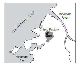
Image 4.1 shows the area of Minamata in Japan, which has many fishing villages on the coast.

Image 4.1

Map showing the Shiranui Sea area with Minamata River and Bay. The Chisso Factory is marked near the river's mouth by an industrial icon.
  • In the mid-1950s, the villagers in Minamata noticed their cats began to lose their balance and some died.

  • Soon after, the villagers reported having difficulty hearing, seeing and walking. Some of the villagers died following these symptoms.

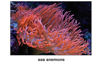
  • Fish caught in Minamata bay were a large part of the diet of cats and humans.

  • Scientists suspected that the fish being eaten had been poisoned.

  • By 1959, scientists discovered that the illness was caused by high levels of mercury found in the bodies of villagers.

  • A large factory in Minamata was dumping mercury into the sea.

  • Mercury is a heavy metal which accumulates in living tissues.

  • Mercury is taken up by algae in the sea and then passed along the food chain.

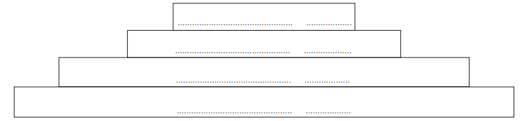
(i) Use the information above to complete Table 4.2 by writing True or False next to each statement.

[3]

Table 4.2

Statement

True or False

The fish that were caught died of mercury poisoning.

Symptoms of the illness included difficulty walking.

Humans and cats had a similar diet.

Cats and humans were dying because of air pollution.

(ii) Use the information above to explain how mercury entered the food chain in Minamata.

[2]

1b4 marks

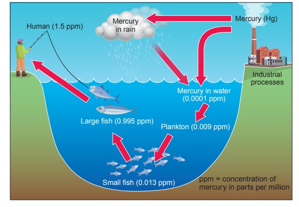
Image 4.3 shows a food chain and the concentration of mercury found inside the tissues of each organism.

Image 4.3

Diagram showing biomagnification: algae at 50 ppb, small fish at 100 ppb, large fish at 1200 ppb, and cat at 15,000 ppb; ppb means parts per billion.

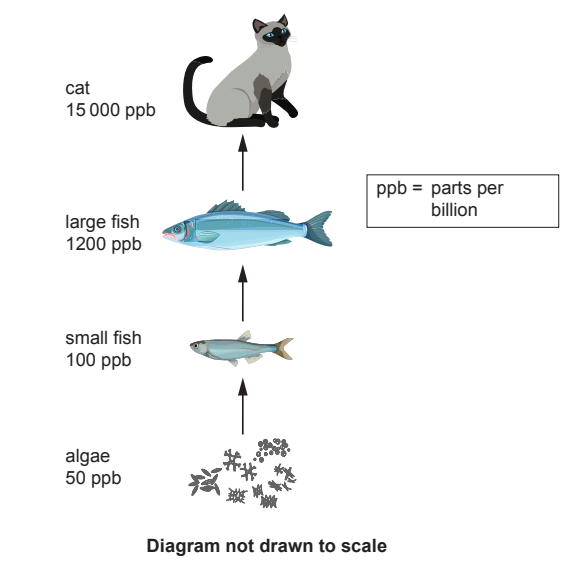
(i) Mercury is twice as concentrated in the small fish than in the algae.

Calculate how many times more concentrated the mercury is in the large fish than in the small fish.

[2]

Answer = …. . . . . . . . . . . . . . . . . . . . .…… times more concentrated

(ii) Explain why the cats were dying from mercury poisoning.

[2]

26 marks

Image 5 shows the carbon cycle.

Image 5

Diagram illustrating the carbon cycle with labelled processes: combustion, absorption by plants, respiration, and decomposition involving animals and plants.

Use Image 5 to describe the carbon cycle.

Your answer should include:

  • the names of the processes represented by the arrows W, X, Y and Z

  • the names of two types of decomposers.

38 marks

Image 7 shows a pyramid of numbers in African grassland.

Image 7

Flowchart of a food chain: grass at the bottom, zebra in the middle, lion on top, and fleas at the apex. Connections show the feeding hierarchy.

(i) State the producer in this pyramid.

[1]

(ii) Underline two terms from the list below that can be used to describe the zebra.

[1]

Producer

Secondary consumer

Carnivore

Herbivore

Primary consumer

(iii) Write the food chain that is represented by the pyramid of numbers in Image 7.

[1]

(iv) State the source of energy for a food chain.

[1]

(v) State one reason why not all of the energy is passed from one stage of the food chain to the next.

[1]

(vi) Suggest why this pyramid of numbers is not pyramid-shaped.

[1]

(vii) In the space below draw a labelled pyramid of biomass for the organisms shown in Image 7. Your pyramid of biomass does not need to be to scale.

[2]

4a3 marks

Image 1.1 shows a food web from an area of grassland.

Image 1.1

Food web diagram showing owls at the top, followed by small birds, shrews, insects, earthworms, rabbits, and grasses at the bottom.

(i) Use Image 1.1 to state the organisms which are present in the highest numbers.

[1]

(ii) Name the third stage (tertiary) consumers shown in the food web in Image 1.1.

Give the reason for your choice.

[2]

Name ........................................................................

Reason ......................................................................

4b5 marks

One food chain from the food web is shown below. The images are not to scale.

Grass to insect to shrew to owl food chain, showing the flow of energy through different organisms in a natural ecosystem.

Table 1.2 shows the results of an investigation of the organisms in this food chain in the area of grassland habitat.

Table 1.2

Organism

Number of individuals counted

Mass of one individual (g)

Total biomass (g)

shrew

90

10

..........................

owl

1

350

..........................

grasses

10000

2

20000

insect

3000

4

..........................

(i) Complete Table 1.2 by calculating the total biomass for each of the organisms in this food chain. One has been done for you.

[2]

Space for working.

(ii) Use Table 1.2 to complete the pyramid of numbers in Image 1.3 by writing the names of the organisms in this food chain and the numbers of each.

[1]

Image 1.3

Diagram of a four-tiered pyramid with the top tier being the smallest. Each tier has an empty text box for labelling purposes.

(iii) State one way in which energy can be lost from a food chain and explain how this loss of energy is shown in the pyramid.

[2]

5a3 marks

Sea anemones are animals which are often found in rock pools along the seashore. Image 5.1 shows a sea anemone.

Image 5.1

Close-up of a vibrant orange sea anemone with long, flowing tentacles set against a dark, blurred underwater background.

On warm sunny days:
• the water temperature in rock pools increases.
• evaporation occurs, so the concentration of salts in the water increases
• the water becomes acidic (pH lower than 7).
• concentration of salt in sea water is HIGHER than anemone cells.
• concentration of water in sea water is LOWER than anemone cells

Image 5.2 shows a rock pool at the end of a warm day.

Image 5.2

Diagram of a rock pool with labelled sea anemone, containing various seaweeds and corals, surrounded by rocky edges under a blue water surface.

Fact file – Conditions required for sea anemones to survive.

Table showing oxygen concentration greater than 9.9 mg/dm³ and pH level between 8.1 and 9.7.

Table 5.3 shows how the sea water temperature affects its oxygen concentration.

Table 5.3

Table showing sea water temperature in degrees Celsius versus oxygen concentration in mg per dm³, with values ranging from 0°C/14.5 to 40°C/4.5.

Use the information to answer the following questions.

(i) State how the oxygen concentration of sea water changes when the temperature increases. [1]

(ii) Calculate the mean change in oxygen concentration per degree when the temperature rises from 10ºC to 30ºC. [2]

Mean change in oxygen concentration per degree = ............................................... mg/dm3

5b4 marks

The statements in Table 5.4 refer to conditions in a rock pool at the end of a warm, sunny day when the sea water temperature was 24ºC. Write true or false for each statement. [4]

Table 5.4

Statements

True or False

Water vapour has been lost from the rock pool.

The sea anemone has lost salt by diffusion.

There is enough oxygen in the water for the sea anemone to survive.

The pH of the water is suitable for the sea anemone.

Water will pass out of the sea anemone by osmosis.

66 marks

The increasing level of carbon dioxide in the air is causing global warming. Image 7.1 shows one effect of global warming

Image 7.1

Polar bear walking on melting ice in Arctic waters, illustrating habitat loss due to climate change and global warming impacts.

Image 7.2 shows part of the carbon cycle.

Image 7.2

Flowchart depicting the carbon cycle, showing carbon dioxide in air interacting with fossil fuels, green plants, and animals through various processes.

Explain how the processes of photosynthesis, respiration and combustion each affect global warming. Suggest how humans could try to reduce the levels of carbon dioxide in the air.

7a3 marks

Image 9.1 shows chickens in two different farming systems.

Image 9.1

Side-by-side comparison of two farms: left shows chickens roaming green grass, right shows chickens crowded indoors with automated feeders.

In 1950 chicken was an expensive food and most adults in the UK, on average, ate only 1100g each year. By 2000 they ate 25kg per year as intensive farming had made chicken much cheaper.

In intensive farming, large numbers of chickens are reared indoors. Environmental conditions and food supply are constantly controlled. The chickens grow faster than free-range chickens and use less energy as their movement is restricted.

The farmer can monitor the chickens more easily than on a free-range farm. Much less land is used and labour costs are lower but larger amounts of concentrated waste are produced.

(i) Use the information given to calculate the increase in mass in the annual consumption of chicken for a family of four adults in the UK between 1950 and 2000.

[2]

Increase in mass = ......................................................... kg/family / year

During an investigation, the growth of chickens from different farm systems was compared. The results are shown in Graph 9.2 and Tables 9.3 and 9.4.

Graph 9.2

Graph comparing body muscle mass of chickens aged 0-7 weeks, showing higher growth in intensive farming versus free-range conditions.

Table 9.3

Organ mass in chickens at six weeks

Organ

Mass (g)

Free-range

Intensively farmed

Heart

6.5

4.8

Lungs

4.0

3.5

Liver

20.0

15.0

Table 9.4

Bone quality in chickens at six weeks

Free-range

Intensively farmed

Bone density (g/cm3)

1.29

0.79

Presence of broken bones (%)

2.5

37

Length of leg bones (mm)

73

118

(ii) Use Graph 9.2 to calculate the difference in the body muscle mass at 5 weeks between intensively farmed chicken and a free–range chicken.

[1]

Difference = ......................................................... g

7b2 marks

(i) Use the information on page 23 to suggest one advantage to farmers of farming chickens intensively.

[1]

(ii) State one feature of intensive farming which is an environmental disadvantage.

[1]

7c3 marks

Some groups of people have ethical objections to intensive farming because of animal welfare concerns.

Using the information in Tables 9.3 and 9.4, state three features of intensive farming which support this point of view.

8a2 marks

Image 7 shows the total amount of energy entering a grassland habitat in kilojoules per square metre during a year. The transfer of energy in a food chain is shown, as well as the energy that is lost from it as heat.

Image 7

Flowchart showing energy transfer: Sun to producers to three consumer stages with energy loss via decomposers and heat, values marked for each stage.

(i) State the name of the stage in Image 7 which represents the herbivores.

[1]

(ii) State the name of one type of decomposer.

[1]

8b3 marks

(i) Use the data from Image 7 to calculate the percentage of energy transferred from the first stage consumer to the second stage consumer. Give your answer to three significant figures.

[2]

Percentage of energy transferred = .........................................................

(ii) Suggest why the food chain shown in Image 7 would be unable to support a fourth stage consumer.

[1]

8c1 mark

In the space below, use a ruler to draw a labelled pyramid of biomass to represent the food chain shown in Image 7. The pyramid does not need to be to scale.

8d1 mark

State which process is responsible for the heat loss in Image 7.

9a2 marks

Graph 8 shows the percentage change in global food production, human population and the land used for food production between 1960 and 2014.

Graph 8

Graph showing percentage changes since 1960 in global food production, human population, and land use for food, with production rising significantly.

Use the information in Graph 8 to state one conclusion about the efficiency of food production. Explain your answer.

9b6 marks

Use your knowledge of the nitrogen cycle to explain how farmers can increase the nitrogen available to their crops and so increase their yield. Diagrams will not gain credit.

10a2 marks

Image 1.1 shows a marine food web.

Image 1.1

Marine food chain diagram showing algae eaten by krill, krill by blue whale and squid, squid by penguin and seals, seals by killer whale, and crab by squid.

Images are not to scale.

From the food web in Image 1.1, state the name of:

(i) the producer;

[1]

(ii) the tertiary (third-stage) consumer.

[1]

10b1 mark

State what the arrows in the food web in Image 1.1 represent.

10c2 marks

A disease caused the number of squid to decrease. Suggest what would happen to the numbers of penguins and crabs by underlining the correct word in each of the following sentences.

(i) The number of penguins would (increase / decrease).

[1]

(ii) The number of crabs would (increase / decrease).

[1]

11a4 marks

The amount of pollution in water can be determined by measuring oxygen levels, pH levels or by using indicator species. Polluted water will have low oxygen levels, as bacteria use up oxygen. The water will become more acidic.

Air pollution can be assessed using indicator species, such as lichens. Lichens are organisms that consist of fungi and algae living together. Lichens can grow on tree bark and rocks. There are many species of lichen which can be grouped into three main types: bushy, leafy and crusty. The number of types of lichens present can indicate the level of air pollution.

  • Bushy lichens can only survive in unpolluted air.

  • Leafy lichens can survive a small amount of air pollution.

  • Crusty lichens can survive in more polluted air.

  • The more types of lichen growing in an area, the lower the level of air pollution.

Use the information above to complete Table 5.1 by writing true or false next to each statement.

[4]

Table 5.1

Statement

True/False

Bacteria use oxygen for respiration

Polluted water will be pH 7 (neutral)

Lichens are plants

There will be a higher number of different types of lichen in polluted areas

Bushy lichens can survive in more polluted areas

11b8 marks

(i) In 2019, a study rated the air quality in the centre of Cardiff as being worse than the centre of London.

Image 5.2 shows the three main types of lichen.

In Image 5.2 circle the letter (A, B, C) of the type of lichen you may expect to find growing in Cardiff city centre if there was a lot of air pollution present.

[1]

Image 5.2

Three types of lichens: A is bushy and green on wood, B is leafy and green on stone, C is crusty and orange on brick.

A scientist counted the number of species of lichens growing at different distances from the centre of Cardiff. Her results are shown in Table 5.3.

Table 5.3

Distance from Cardiff centre (km)

Number of species of lichen

0

2

1

5

2

8

3

10

4

15

5

..............

6

26

7

30

8

48

9

56

10

60

(ii) Complete Table 5.3 by estimating the number of species of lichen likely to be found 5km from Cardiff centre.

[1]

(iii) State the independent and dependent variables in this investigation.

[2]

Independent variable ..................................................................................................

Dependent variable ..................................................................................................

(iv) I. State the relationship between the number of lichen species and the distance from the centre of Cardiff.

[1]

II. Use the information given to explain the relationship between the number of species of lichen and the distance from the centre of Cardiff.

[2]

(v) State how the scientist could improve her confidence in these results.

[1]

12a5 marks

Nitrate Vulnerable Zones (NVZ) are areas where nitrate concentrations are a risk to human health, or harmful to the aquatic environment.

Llangorse lake is the largest natural lake in south Wales. Approximately two-thirds of the surrounding land is used for intensive farming. Natural Resources Wales (NRW) has calculated that 99% of the nitrate found in Llangorse lake comes from intensive farming.

Table 6.1 is used by NRW to estimate the risk from nitrate levels in water.

Table 6.1

Nitrate concentration (mol/dm3 )

Risk

< 0.5

very low

0.5 – 1.0

low

>1.0 – 1.7

low – medium

>1.7 – 3.5

medium

>3.5 – 6.0

medium – high

>6.0

high

Between December 2011 and July 2014, water samples were taken from Llangorse lake and the nitrate concentration analysed.

The results are shown in Graph 6.2.

Graph 6.2

Line graph showing nitrate concentration from Jan 2012 to July 2014, peaking in Jan 2013 and Jan 2014, with valleys around July each year.

Algal blooms were observed in Llangorse lake between April and October for each year shown in Graph 6.2.

(i) Using the information above, state the risk level for nitrates in Llangorse lake in January 2013.

[1]

(ii) Describe the annual trend common to all years shown in Graph 6.2.

[2]

(iii) Suggest a possible explanation for the common annual decrease in the nitrate levels in Llangorse lake.

[2]

12b6 marks

Explain how intensive farming leads to the formation of algal blooms and how these algal blooms can be harmful to aquatic animals.

13a6 marks

The United Nations Minamata Convention on Mercury is a global treaty to protect human health and the environment from the toxic effects of the heavy metal mercury.

In 2010, combustion of fossil fuels by industrial processes produced 24% of the total global emissions of mercury. Image 8.1 shows how this mercury is cycled in the environment.

Image 8.1

Diagram of mercury bioaccumulation: industrial emissions, rain, water, plankton, small fish, large fish, human. Mercury levels in parts per million.

(i) Calculate the percentage increase in mercury from the plankton to humans. Give your answer to two significant figures.

[3]

Percentage increase = ........................................................

(ii) Using Image 8.1 and your own knowledge, explain how the mercury released during the combustion of fossil fuels by industrial processes becomes harmful to humans.

[3]

13b1 mark

Apart from reducing mercury pollution, explain how reducing the combustion of fossil fuels can benefit the environment.