Quantitative & Qualitative skills (AQA AS Geography): Exam Questions

Exam code: 7036

4 hours37 questions
1
6 marks

Figure 1a is from the current Ordnance Survey 1:50 000 series and shows part of south east Oxford.

Figure 1b is taken from the Ordnance Survey map of that same area, published in 1899. The 1899 map has been enlarged to the same scale as the current map.

Detailed map showing Oxfordshire area, including Horspath and Garsington. Features roads, railway, schools, and elevation contours. Grid references and copyright noted.
Historical map showing Cowley, Littlemore, Oxfordshire, with roads, railways, and landmarks like Cowley Industrial School; grid coordinates 53-59, 02-05.

Using evidence from Figures 1a and 1b, analyse the main changes to the human geography of the area that have occurred in the period shown.

2
9 marks

Name one source of quantitative data that you used to study your distant place.

Evaluate the usefulness of that source in helping you to understand the place, by comparing it with the qualitative sources used to study that place.

3
2 marks

Explain why some form of sampling is almost always used when students are carrying out fieldwork to collect data for a geographical investigation.

4a
4 marks

Study Figure 2, an aerial photograph of an area where a geographical investigation is to be undertaken.

Using evidence from the photograph, explain why this area is suitable for a variety of geographical investigations

Aerial view of a coastal town with sandy beaches, rocky cliffs, and turquoise sea. Green fields and rural landscape stretch into the distance.
4b
2 marks

State, using evidence from Figure 2, two appropriate hypotheses or questions for geographical investigation in this area. One should be based on physical geography. The other should be based on human geography.

5
6 marks

You have experienced geography fieldwork as part of your course. Use that experience to answer the following questions.

State the aim of your fieldwork investigation.

Explain how the investigation helped you develop your geographical understanding of the place studied.

6
9 marks

Evaluate the success of your data collection methods and explain how you would make use of an opportunity to revisit the location to develop your enquiry further.

7
4 marks

A group of students was carrying out an investigation into the effects of globalisation on the small town where they lived. The local chemical factory was closed down 18 months previously and production was transferred to the company’s factory in Hungary. The students’ aim was to discover whether people in different parts of the town felt that the closure had made the town a better or a worse place to live. Their hypothesis was ‘People are more pleased with the factory closure as distance from the old factory site increases’.

They carried out a questionnaire survey in ten places at varying distances from the old factory site. Figure 3 shows one of the tables of data that they produced. It shows responses to the question ‘Has the closure of the ChemMan factory made this town a better place to live?’

Figure 3

Sample area

Distance from site (in km)

Yes (%)

1

4.5

56

2

3.5

38

3

2.5

14

4

1.5

12

5

0.5

14

6

1

47

7

2

53

8

3

58

9

4

61

10

5

70

The site of their survey is shown on the map, Figure 4.

Map showing Central Business District (CBD) outline with ten numbered sample areas and a ChemMan (CM) site at location 5. Key and scale bar included.

One of the students tested for a correlation between the two sets of data in Figure 3, using a Spearman’s rank correlation test. Figure 5 shows how she set out the data and started her calculations.

Table showing calculation of Spearman's rank correlation coefficient with columns for sample distance, rank, percentage, differences, and squared differences.

Complete the calculation of Rs (show your working).

8
2 marks

Figure 6 shows an extract from the table of critical values for Rs.

Figure 6

Critical values of Rs for Spearman’s rank correlation coefficient.

n

Level of significance

0.05

0.01

8

0.643

0.833

9

0.600

0.783

10

0.564

0.746

12

0.506

0.712

How confident can you be that the student’s hypothesis, ‘People are more pleased with the factory closure as distance from the old factory site increases’ is supported by the data?

9
2 marks

The student thought that using a scatter graph to show the data would help her analysis. She drew the graph shown in Figure 7.

Scatter plot titled "Figure 7" showing percentage of "Yes" responses versus distance from site in km, with points scattered across the grid.

Draw a best fit line on the graph, Figure 7.

10
9 marks

Figure 3 shows one of the tables of data that they produced. It shows responses to the question ‘Has the closure of the ChemMan factory made this town a better place to live?’

Figure 3

Sample area

Distance from site (in km)

Yes (%)

1

4.5

56

2

3.5

38

3

2.5

14

4

1.5

12

5

0.5

14

6

1

47

7

2

53

8

3

58

9

4

61

10

5

70

The site of their survey is shown on the map, Figure 4.

Map showing Central Business District (CBD) outline with ten numbered sample areas and a ChemMan (CM) site at location 5. Key and scale bar included.
Scatter plot titled "Figure 7" showing percentage of "Yes" responses against distance from site in km, ranging from 0 to 100% and 0 to 5 km.

‘People are more pleased with the factory closure as distance from the old factory site increases.’

To what extent does the evidence in Figures 3, 4 and 7 support this hypothesis?

11
6 marks

Figure 1a shows ethnic groups as a percentage of population in rural and urban box areas in England, 2016 and 2020.

Figure 1b shows detail for all minority ethnic group populations in rural and urban areas in England, 2016 and 2020.

Bar chart titled "Figure 1a" shows population percentages of White and minority ethnic groups in rural and urban areas for 2016 and 2020.
Stacked bar chart showing ethnic group percentages in rural and urban areas for 2016 and 2020. Categories: Black, Mixed, Asian, and Others.

Analyse the data shown in Figure 1a and Figure 1b.

12
2 marks

Outline one ethical issue that must be considered when collecting data from an interview.

13a
2 marks

Figure 2 is a transcript of a recent on-line interview between a Geography student and a resident of Forest Gate, East London.

Figure 2

Text describing a family's migration from Kenya to East London in the 1990s, noting community changes and redevelopment impacts over time.

Using Figure 2, suggest how one type of map could be used to prepare for a geographical investigation in this place.

13b
4 marks

With reference to Figure 2, suggest one aim for a geographical fieldwork investigation and outline one method of primary data collection.

Aim.........................................................................................................................

Primary data collection method.............................................................................

You have experienced geography fieldwork as part of your course. Use that experience to answer the following questions.

State the aim of your fieldwork investigation.

14
9 marks

Evaluate the usefulness of secondary data sources in meeting the aim of your enquiry.

15
6 marks

Assess how useful the data presentation method(s) you used in your investigation were for data analysis.

16a
2 marks

A student was planning fieldwork to investigate if there were significant differences in the social and economic characteristics of two similar sized towns in the region of North East England where they lived.

Figure 3 outlines the background to the investigation, relevant theory and secondary data collection.

Figure 3

Student research explores social and economic differences in two towns, focusing on house ownership using 2011 census data, testing owner-occupancy rates.

Figure 4 shows the percentage of owner-occupied housing in each electoral ward.

Figure 4

Town A

Town B

Electoral Ward

% Owner-occupied housing

Electoral Ward

% Owner-occupied housing

1

76.4

1

67.3

2

88.6

2

82.6

3

82.6

3

83.4

4

51.7

4

69.1

5

73.0

5

78.7

6

55.7

6

79.3

7

65.4

7

78.1

8

72.8

8

79.2

9

59.3

9

78.1

10

60.5

10

67.4

11

88.2

11

64.1

12

81.4

12

69.8

Calculate the median value for Town A.

Median value =..............

16b
2 marks

The student decided to present the data on a dispersion diagram to show the spread box of data for each town.

This is shown in Figure 5.

Scatter plot comparing percentage of owner-occupied housing in Town A and Town B, ranging from 50% to 90%, with data points spread across both towns.

Two values are missing on the dispersion diagram in Figure 5.

Plot the values from the table below onto Figure 5.

% Owner-occupied housing

Town A

55.7

Town B

64.1

16c
4 marks

To analyse the data the student calculated the mean values for Town A and Town B.

The student then calculated the standard deviation for Town A.

Figure 6 shows how they set out the data and started their calculations.

Table titled "Figure 6" showing a calculation of standard deviation for Town A's owner-occupied housing percentages, including values, deviations, and formula.

Complete Figure 6 and calculate the standard deviation to two decimal places.

Show your working in the space provided in Figure 6.

The student then repeated the standard deviation calculation for Town B. The result is shown below.

Standard deviation

σ = 6.42

16d
9 marks

Using Figures 3, 4, 5 and 6, evaluate the usefulness of these statistics for data analysis in this investigation.

17
1 mark

In which of the following do both pieces of data show the economic characteristics of a place using quantitative sources?

A

A newspaper article with a list of the top 10 local employers.

A land use map showing areas of green space and recreation.

B

A website documenting community groups and activities.

A GIS map of local crime statistics and life expectancy.

C

Old photographs showing industrial and religious buildings.

Census data about people living with long-term health conditions.

D

House price data from property websites and the Land Registry.

Census data showing employment structure of the local population.

    18
    6 marks

    Figure 1 shows changes to London’s population between 1931 and 2020.

    Bar chart showing population of Inner and Outer London from 1931 to 2020. Inner London in green, Outer London in blue, totals range from 6 to 9 million.

    Analyse the data shown in Figure 1.

    19
    2 marks

    Suggest why it is good practice to evaluate sources of secondary data used in a geography fieldwork investigation.

    20
    2 marks

    Suggest how qualitative data collected from an interview can be analysed.

    21
    6 marks

    You have experienced geography fieldwork as part of your course. Use that experience to answer the following questions.

    State the aim of your fieldwork investigation.

    To what extent did health and safety considerations influence your choice of site(s) for primary data collection?

    22
    9 marks

    ‘Thorough planning always leads to reliable data collection in the field.’

    With reference to your own experience, to what extent do you agree with this statement?

    23
    2 marks

    A student has carried out an investigation into changes in urban land use in a medium-sized town in the south of England.

    Figure 4 outlines the aim, the background theory, the hypothesis and the method used for the investigation.

    Figure 4 shows a study on how land use changes with distance from a town centre, examining retail, industrial, and residential areas through systematic sampling.

    Figure 5 is a sketch diagram of the urban transect the student drew using his local knowledge and Ordnance Survey maps. He added his sampling points.

    Image showing a linear illustration from open country to town centre, highlighting housing types, trading estates, and shops at 10 sampling points.

    Suggest why the student decided to collect data using a systematic sample.

    24
    4 marks

    The student tested for a correlation between the two sets of data in Figure 6, using a Spearman’s rank correlation test.

    Figure 7 shows how he set out the data and started his calculations.

    Table showing sampling points with distance from town centre, shops percentage, rankings, and calculations for Spearman's rank correlation.

    Figure 8 shows critical values of Rs for Spearman’s rank correlation coefficient.

    Table with heading Figure 8 shows significance levels. Row: n=10, significance 0.05 is 0.564, significance 0.01 is 0.746.

    Complete the calculation of Rs in Figure 7 to two decimal places and use Figure 8 to interpret these findings.

    25
    6 marks

    Figure 1a is an OS map of Great Chesterford, a village in north west Essex in 1950.

    Figure 1b is an OS map of Great Chesterford in 2021.

    Historical map depicting Great Chesterford with roads, railways, river Cam, and a site labelled "Roman Town". Contour lines and grid references are shown.
    Map detailing Great Chesterford and surroundings, featuring Roman fort sites, M11 motorway, roads, water bodies, and landmarks like hotels and cottages.

    Analyse the continuity and change over time shown between Figure 1a and Figure 1b.

    26
    2 marks

    Suggest one reason why background reading is useful preparation for any fieldwork investigation.

    27a
    4 marks

    Figure 2 is an aerial photograph of Diss, a small town in Norfolk.

    Aerial view of a town featuring residential areas, a central lake, fields, industrial buildings, and roads surrounded by green countryside.

    Suggest how Figure 2 could be used to help devise a sampling strategy for a human geography fieldwork investigation.

    27b
    2 marks

    Suggest how geo-located data collected by a student could be presented on Figure 2.

    28a
    2 marks

    A student was planning fieldwork to investigate whether a housing development had altered the place character of a village.

    Figure 3 outlines the background to the investigation, the aim, relevant theory and hypothesis for primary data collection.

    Figure 3

    Student project analysing a 2010 housing development's impact on village character, with hypothesis stating a difference from the rest of the village.

    Figure 4 is the student’s sketch map of the fieldwork site.

    Map showing village layout with pre-2010 housing, 2010 housing development, key road routes, main road to town, and farmland, scale 0-200m.

    The student decided to use secondary data to show the number of houses sold and the number of crimes reported between 2010 and 2019. He wanted to compare the data to see whether there were any significant differences in the mobility of the population and the safety of the two areas, which both have a similar number of houses.

    Figure 5 shows the secondary data the student used in the investigation.

    Figure 5

    Old village

    New estate

    Year

    Number of houses sold

    Number of crimes reported

    Number of houses sold

    Number of crimes reported

    2010

    12

    6

    45

    8

    2011

    4

    10

    10

    9

    2012

    5

    7

    8

    7

    2013

    4

    4

    7

    10

    2014

    6

    10

    7

    8

    2015

    3

    15

    4

    5

    2016

    2

    6

    10

    6

    2017

    10

    5

    6

    7

    2018

    4

    5

    6

    8

    2019

    3

    4

    8

    6

    Sources

    Houses sold – accessed from a property website which uses the government’s Land Registry to source information about houses sold.

    Crimes reported – accessed from a police website which records all crimes reported in a local area.

    The student decided to compare the number of houses sold by calculating the median, a measure of central tendency.

    Explain why he chose to calculate the median number of houses sold and not the mean.

    28b
    4 marks

    Suggest how the student could present this secondary data to aid his analysis.

    28c
    2 marks

    Suggest why the student’s secondary data on crime may be more reliable than the house sale data.

    28d
    9 marks

    The student decided to write a plan for how he would collect his primary data.

    Figure 6 shows his plan for primary data collection.

    Figure 6

    Plan for Primary Data Collection

    Method to collect data on place character
    A survey tool was designed by the student. It included five key characteristics of place character with four words to describe possible aspects of each of these. At each site surveyed a decision would be made about which of the four words for each place characteristic is a ‘best fit’ based on the student’s observations.

    Sampling strategy
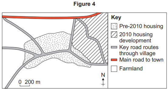
    The data collection sites will be situated 200 m apart along a line transect that follows the main access road through each of the areas of the village. Six sites would be surveyed for ‘place character’ in each area on one day in September.

    Risk assessment
    The data collection will be done in daylight and a first-aid kit carried at all times in the event of slips and trips. A mobile phone will be carried in case of an emergency.

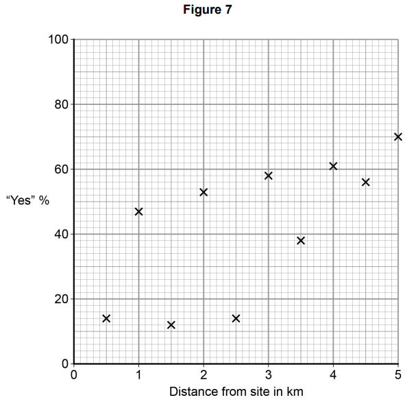
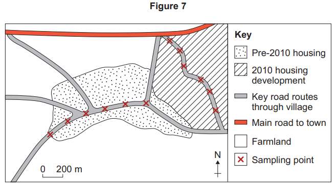
    Figure 7 shows his sketch map of planned sampling points.

    Map showing roads, housing, and farmland. Key indicates pre-2010 and 2010 housing, main road, routes, farmland, and sampling points. Scale bar included.

    Figure 8 shows the survey tool that the student designed to collect primary data. He would complete this survey at each site.

    Figure 8

    Site 1 Circle the word in each category that best describes this place

    Characteristic

    Visual

    monotonous

    varied

    striking

    historical

    Security

    comfortable

    safe

    unsettling

    threatening

    Tranquillity

    peaceful

    vacant

    busy

    noisy

    Pleasure

    pleasant

    attractive

    beautiful

    unpleasant

    Building form

    varied

    historical

    modern

    similar

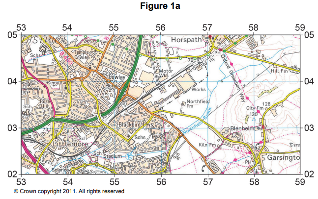
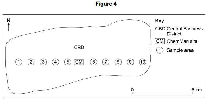
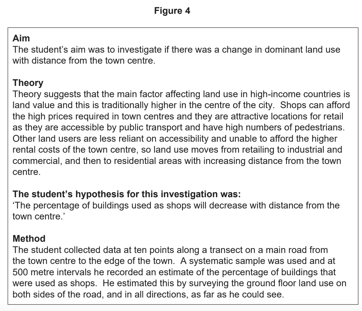
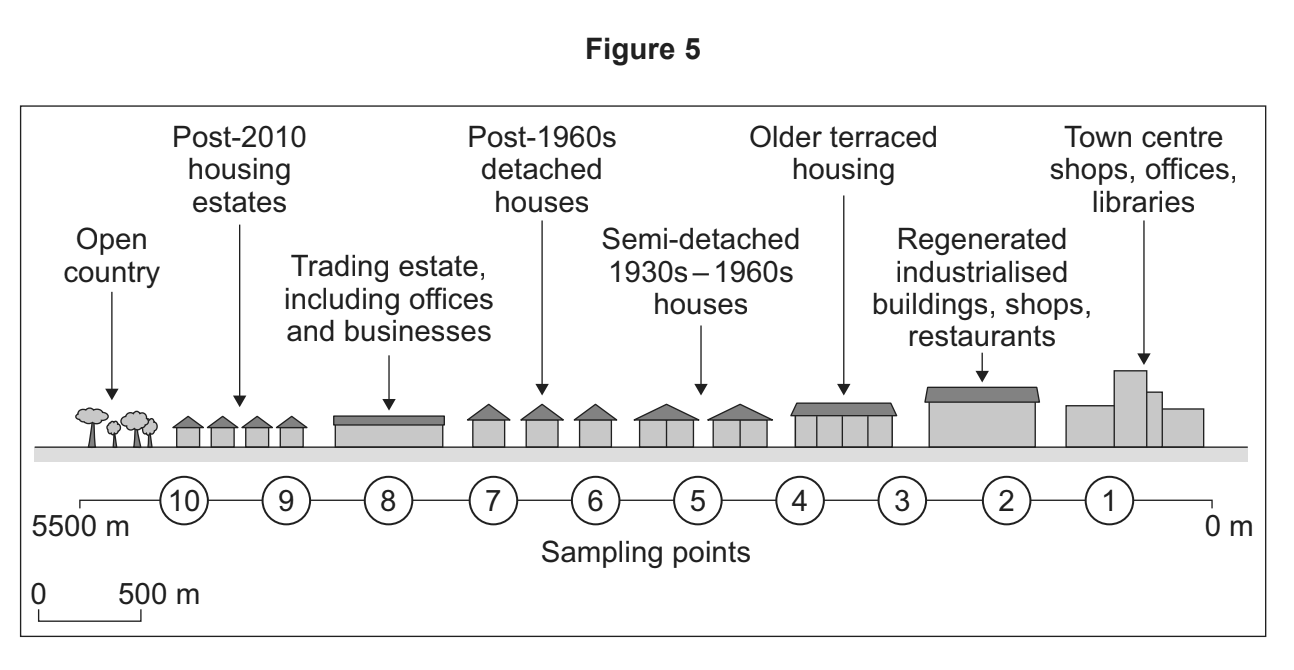
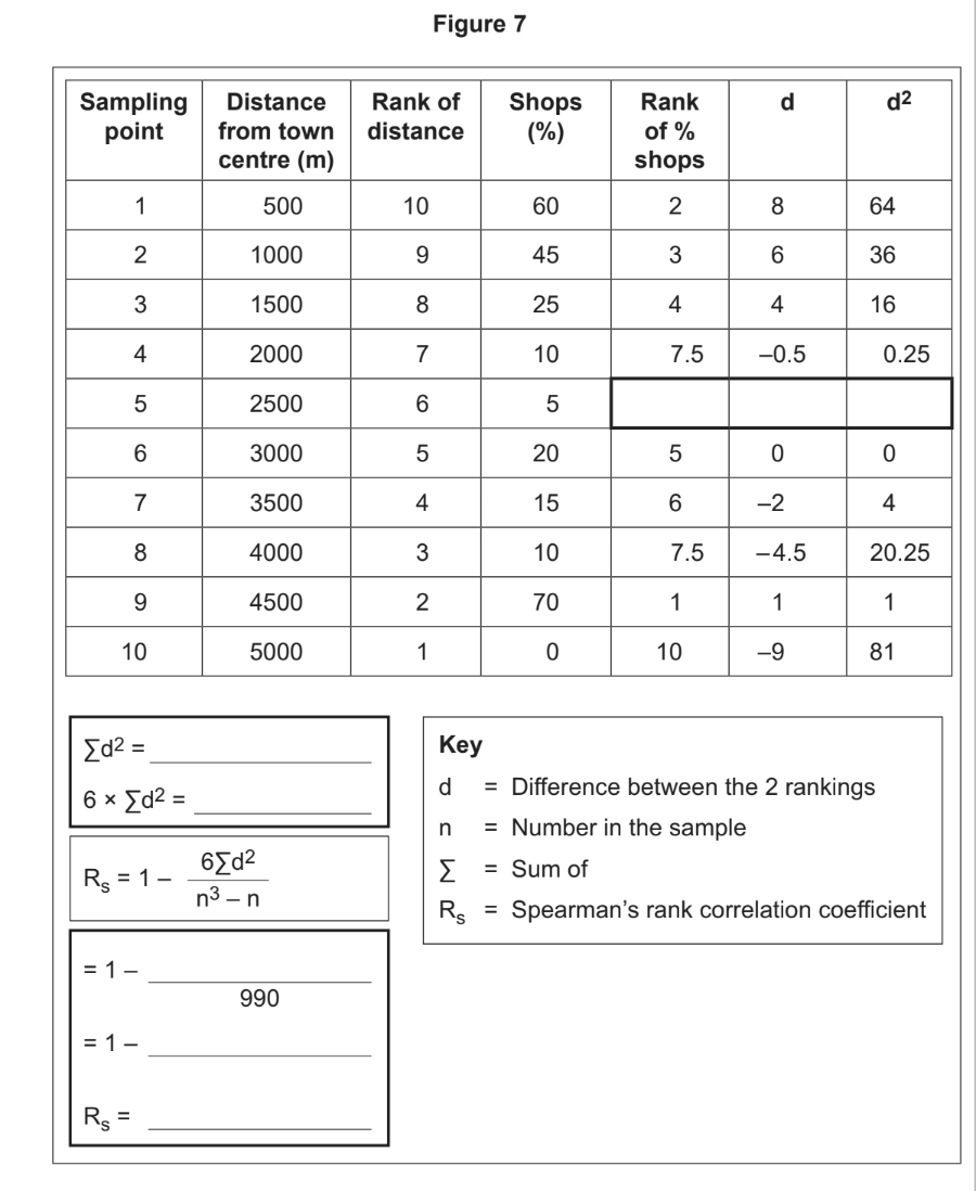
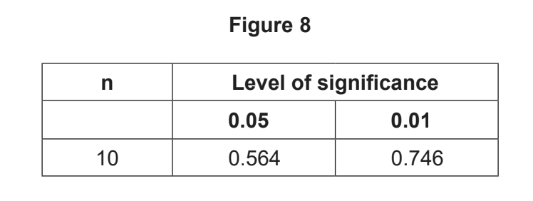
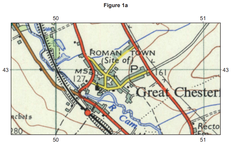
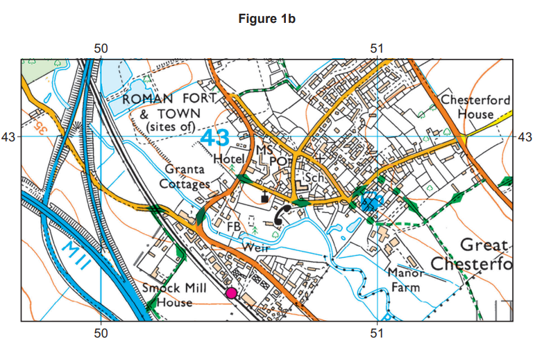
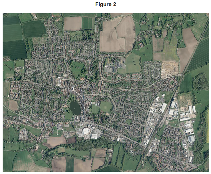
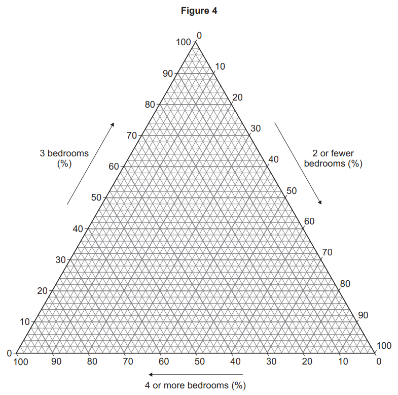
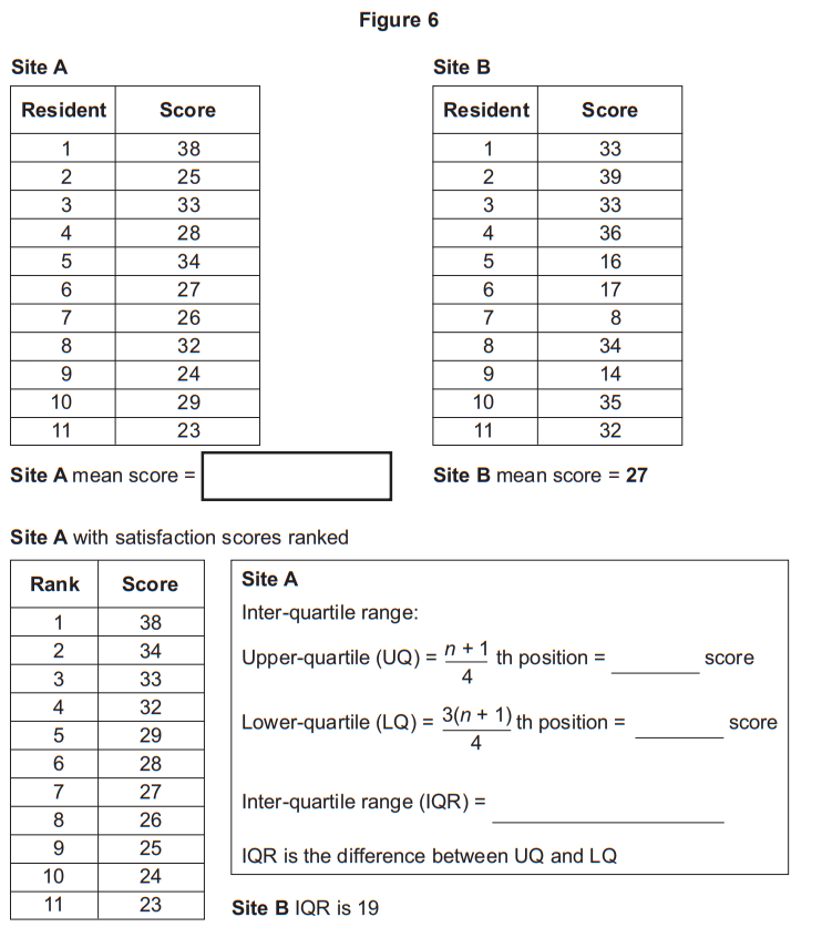
    Using Figures 3, 4, 6, 7 and 8, evaluate the student’s plan for primary data collection.

    29
    1 mark

    In which of the following lists are two pieces of qualitative secondary data that would show change over time in a place being studied?

    A

    A film showing the changes to the textile industry in the city over the twentieth century.

    Old photographs of the city from before the Second World War right up to the start of the 1990s.

    B

    A poem about how the city had changed over the last fifty years.

    A piece of music that was written for an international sporting event in 2020.

    C

    A short story about a woman who revisited the city after living overseas for twenty years.

    Graphs showing population structure from the 1961 and 2011 censuses.

    D

    Council statistics on how the population might change over the next thirty years.

    GIS maps of the city showing the Index of Multiple Deprivation at Output Area level dating back ten years.

      30
      20 marks

      With reference to a place you have studied, evaluate the usefulness of quantitative data sources such as statistics and maps in representing the lived experience of a place.

      31
      2 marks

      Outline an example of when qualitative data collection may be suitable for a human geography fieldwork enquiry.

      32a
      4 marks

      Figure 2 shows the index of multiple deprivation across selected districts of Manchester, England in 2015.

      Map showing Manchester areas by deprivation levels. Key indicates darker shades are more deprived. Areas labelled include City Centre, Hulme, and Didsbury.

      Using Figure 2, suggest how this GIS map could be useful for planning primary data collection in a local human geography fieldwork enquiry.

      32b
      2 marks

      Using Figure 2, suggest limitations of this map for planning fieldwork.

      33
      6 marks

      You have experienced geography fieldwork as part of your course. Use that experience to answer the following questions.

      State the aim of your fieldwork investigation.

      Outline how data processing or presentation helped with the analysis of primary data.

      34
      9 marks

      Evaluate the usefulness of background reading in developing the aim of your investigation.

      35a
      2 marks

      A student was planning a fieldwork investigation into place satisfaction in her local town.

      Figure 3 outlines the background to this investigation and the secondary data she collected.

      Figure 3

      Student surveys two housing estates, one greenfield and one brownfield, for satisfaction. Table shows size of houses by bedrooms at each site.

      Referring to Figure 3, plot and label the data for Site A and Site B onto the triangular graph in Figure 4 (opposite).

      Triangular graph illustrating the percentage distribution of bedrooms in homes; axes show 2 or fewer, 3, and 4 or more bedrooms.
      35b
      4 marks

      Figure 5 outlines how the student carried out the investigation.

      Figure 5

      Summary of student-collected survey data from 11 residents on local surroundings, community, noise, air quality, and qualitative feedback.

      Complete Figure 6 (opposite) by calculating the mean and the inter-quartile range (IQR) for Site A.

      Table comparing resident satisfaction scores for Sites A and B, with mean scores, rankings for Site A, and data to calculate interquartile ranges.
      35c
      2 marks

      Interpret the findings from Figure 6.

      35d
      9 marks

      Using Figures 3, 4, 5 and 6, evaluate how far the data collected and the way it was processed would be useful for proving her hypothesis:

      The residents of the housing estate on the greenfield site will have greater place satisfaction than those living on the brownfield housing estate.’

      36
      1 mark

      Which would be the best type of map to show cultural and social differences within a place that you have studied?

      • Trip line map

      • Flow line map

      • Choropleth map

      • Desire line map

      37a
      2 marks

      Outline one ethical consideration you should think about when collecting geographical data.

      37b
      4 marks

      Using Figure 2, suggest how the map could be a useful starting point for fieldwork investigations into both the physical and human geography in this area.

      Map of Norfolk, UK, shows towns and roads, with Norwich central. Includes Norfolk Broads and nearby towns like Cromer, Holt, and Wells-next-the-Sea.
      37c
      2 marks

      Using Figure 2, suggest two limitations of using this map as a planning tool for fieldwork.

      37d
      6 marks

      You have experienced geography fieldwork as part of your course. Use that experience to answer the following questions.

      State the aim of your fieldwork investigation.

      Justify how you analysed your data in order to achieve the aims and objectives of the enquiry.

      37e
      9 marks

      To what extent did the use of secondary sources of data in your investigation contribute to the conclusions you reached?