Quantitative & Qualitative skills (AQA AS Geography): Exam Questions

Exam code: 7036

29 mins3 questions
1
6 marks

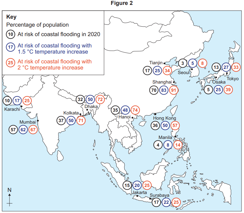
Figures 3 and 4 show information about areas at risk of flooding.
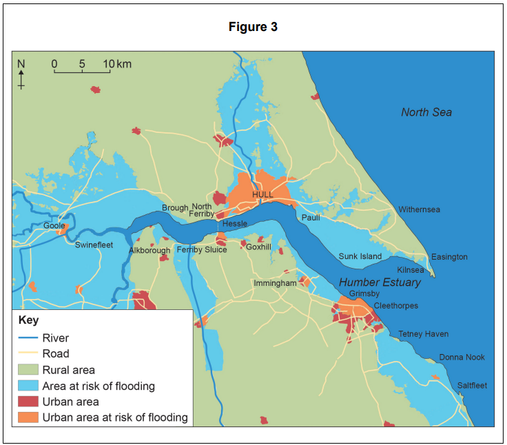
Map of the Humber Estuary area showing rivers, roads, urban and rural areas, and regions at risk of flooding, including Hull and Grimsby.

Figure 4

Area

Total population

Number at high risk of flooding

Number at medium risk of flooding

Number at low risk of flooding

Humber catchment

11 713 119

58 210

299 985

632 211

Grimsby

275 657

3 908

16 419

22 638

Hull

566 322

1 434

64 500

258 763

Using Figure 3 and Figure 4, assess the extent of the flood risk in the area shown.

2
6 marks

Figure 2 shows the percentages of populations at risk from coastal flooding in selected cities in Asia in 2020 and in future climate change scenarios.

Map of Asia showing coastal cities with percentages at risk of flooding in 2020, and with 1.5°C and 2°C temperature increases.

Analyse the information shown in Figure 2.

3a
2 marks

A student carried out an investigation into changes in plant succession on sand dunes in North Wales.

Figure 9 outlines the aim, the background theory, the hypothesis and the method used for the investigation.

Figure 9

Text summarising a student's plant species diversity investigation on sand dunes, focusing on marram grass coverage and distance from the sea.

Figure 10 is a sketch diagram of the dune system the student drew using theory from her textbook and aerial photographs of her chosen site. She added her sampling points.

Diagram showing plant distribution across sampling points from high tide to inland. Features include sand, marram grass, water-loving, and diverse plants.

Suggest why the student decided to collect data using a systematic sample.

3b
2 marks

Figure 11 shows the results of her survey.

Figure 11

Sampling point

Distance from high-tide mark (m)

Marram grass (%)

1

20

60

2

40

45

3

60

25

4

80

10

5

100

5

6

120

20

7

140

15

8

160

10

9

180

70

10

200

0

Suggest how the student could present the data in Figure 11 to help show the relationship between distance from the high-tide mark and the percentage of marram grass.

3c
4 marks

The student tested for a correlation between the two sets of data in Figure 11, using a Spearman’s rank correlation test.

Figure 12 shows how she set out the data and started her calculations.

Table of sampling points with distance, rank of distance, marram grass percentage, rank, and calculations related to Spearman's rank correlation.

Figure 13 shows critical values of Rs for Spearman’s rank correlation coefficient.

Figure 13

n

Level of significance

0.05

0.01

10

0.564

0.746

Complete the calculation of Rs in Figure 12 to two decimal places and use Figure 13 to interpret these findings.

3d
9 marks

Aim
The student’s aim was to investigate if there was a wider variety of plant species as you move inland and away from the sea.

Hypothesis
‘The percentage of species that is marram grass will decrease with distance from the sea.’

The student concluded that her data collection and processing had enabled her to reliably test her hypothesis and meet the aim of her enquiry.

Using Figures 9, 10, 11, 12 and 13, to what extent do you agree?