Quantitative & Qualitative skills (AQA AS Geography): Exam Questions

Exam code: 7036

1 hour8 questions
1
6 marks

Figure 1 is a storm hydrograph taken over a period of three days.

Graph with precipitation bars for Storm 1 and Storm 2 on three days; red line shows run-off/discharge peaking after Storm 1 then gradually decreasing.

Complete Figure 1 by adding the data shown in Figure 2 below, and then analyse the impact of the rainfall upon the discharge.

Figure 2

Discharge

Precipitation

Day 3 – 0800–75 cumecs

Storm 2 – 1900–12 mm

Day 3 – 0000–45 cumecs

_ _ _ _ _ _ _ _ _ _ _ _ _

2
4 marks

A group of students was carrying out an investigation into rates of infiltration at different points on a transect down a valley side. Their aim was to test the hypothesis that ‘The rate of infiltration will be faster on the higher land than it is on the lower land that is on or close to the flood plain.’

They timed how long it took for a measured volume of water to infiltrate into the soil at ten points along the transect. They also measured the angle of slope and the altitude at each of the ten points.

Figure 8 shows the table of data that they produced.

Figure 8

Sample site altitude (in metres)

Time taken for infiltration (in seconds)

Angle of slope (in degrees)

155 (top of valley side)

55

3

150

33

8

145

28

10

140

26

12

135

22

11

130

20

8

125

20

5

120

40

5

115

82

4

110 (on river bank)

120

2

Figure 9 is a cross section showing the locations of the sampling points.

Line graph titled 'Figure 9' showing a decreasing slope from 160m to 110m with a river labelled at a lower point, indicating height changes.

One of the students tested for a correlation between the two sets of data in Figure 8, using a Spearman’s rank correlation test. Figure 10 shows how she set out the data and started her calculations.

Table calculating Spearman's rank correlation with sample site altitudes, infiltration times, ranks, differences, and squared differences, including Rs formula.

Complete the calculation of Rs (show your working).

3
2 marks

Figure 11 shows an extract from the table of critical values for Rs.

Figure 11

n

Level of significance

0.05

0.01

8

0.643

0.833

9

0.600

0.783

10

0.564

0.746

12

0.506

0.712

How confident can you be that the student’s hypothesis, ‘The rate of infiltration will be faster on the high land than it is on the lower land that is on or close to the flood plain’ is supported by the data?

4
2 marks

The student thought that using a scatter graph to show the data would help her analysis. She drew the graph shown in Figure 12.

Scatter plot titled Figure 12 shows data points of height in metres versus time in seconds, varying from 0 to 120 seconds and 100 to 160 metres.

Draw a best fit line on the graph, Figure 12.

5
9 marks

Figure 8 shows the table of data that they produced.

Figure 8

Sample site altitude (in metres)

Time taken for infiltration (in seconds)

Angle of slope (in degrees)

155 (top of valley side)

55

3

150

33

8

145

28

10

140

26

12

135

22

11

130

20

8

125

20

5

120

40

5

115

82

4

110 (on river bank)

120

2

Figure 9 is a cross section showing the locations of the sampling points.

Line graph titled 'Figure 9' showing a decreasing slope from 160m to 110m with a river labelled at a lower point, indicating height changes.

The student thought that using a scatter graph to show the data would help her analysis. She drew the graph shown in Figure 12.

Scatter plot titled Figure 12 shows data points of height in metres versus time in seconds, varying from 0 to 120 seconds and 100 to 160 metres.

‘The rate of infiltration will be faster on the high land than it is on the lower land that is on or close to the flood plain.’

To what extent does the evidence in Figures 8, 9 and 12 support the hypothesis?

6a
2 marks

A student was planning fieldwork to investigate if there were significant differences in the depth of peat in two areas of moorland in the region of North East England where they lived.

Figure 7 outlines the background to the investigation, relevant theory and primary data collection.

Figure 7

Text describing a student's study comparing peat depth in two moorland areas, with methods, theory, and hypothesis on peat as a carbon store.

Figure 8 shows the peat depth measurements for each area sampling point.

Figure 8

Area A

Area B

Site

Depth (cm)

Site

Depth (cm)

1

26.4

1

27.3

2

38.2

2

32.6

3

32.6

3

33.4

4

11.7

4

19.1

5

23.0

5

28.7

6

15.7

6

29.3

7

15.4

7

28.1

8

22.8

8

29.3

9

19.3

9

28.2

10

20.5

10

17.4

11

38.2

11

14.1

12

31.4

12

19.8

Calculate the median value for Area A.

Median value......................

6b
2 marks

The student decided to present the data on a dispersion diagram to show the spread of data for each area. This is shown in Figure 9.

Graph comparing peat depth in centimetres across Areas A and B, showing greater depth variation in Area A, with most measurements between 15-35 cm.

Two values are missing from the dispersion diagram in Figure 9.

Plot the values from the table below onto Figure 9.

Peat depth (cm)

Area A

11.7

Area B

17.4

6c
4 marks

To analyse the data the student calculated the mean values for Area A and Area B.

The student then calculated the standard deviation for Area A.

Figure 10 shows how they set out the data and started their calculations.

Table of peat depths for Area A with deviations and squared deviations, alongside a key for symbols and a formula for standard deviation calculation.

Complete Figure 10 and calculate the standard deviation to two decimal places.

Show your working in the space provided in Figure 10.

The student then repeated the standard deviation calculation for Area B. The result is shown below.

Standard deviation

σ = 6.04

6d
9 marks

Using Figures 7, 8, 9 and 10, evaluate the usefulness of these statistics for data analysis in this investigation.

7a
2 marks

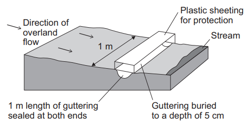
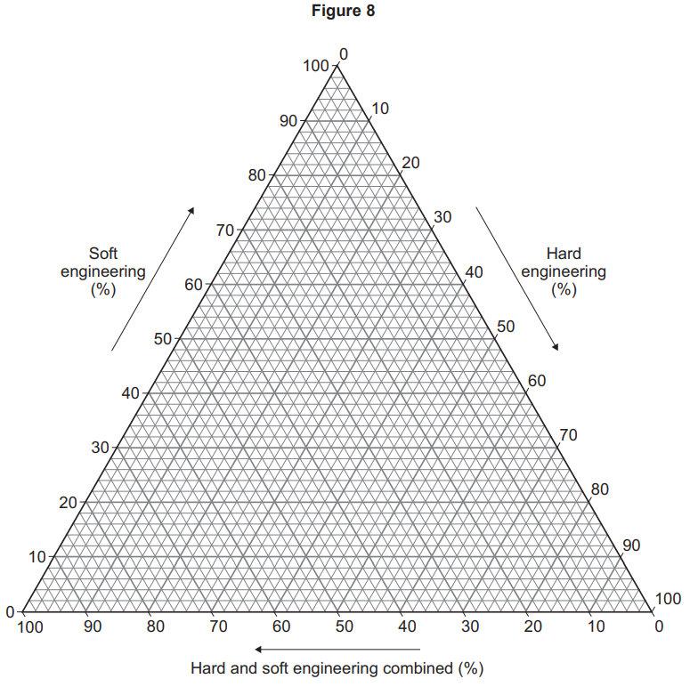
A student was planning fieldwork to investigate whether a new housing development had altered the drainage of water into a local stream after a storm event.

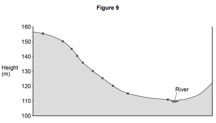
Figure 9 outlines the background to the investigation, the aim, relevant theory and hypothesis for primary data collection.
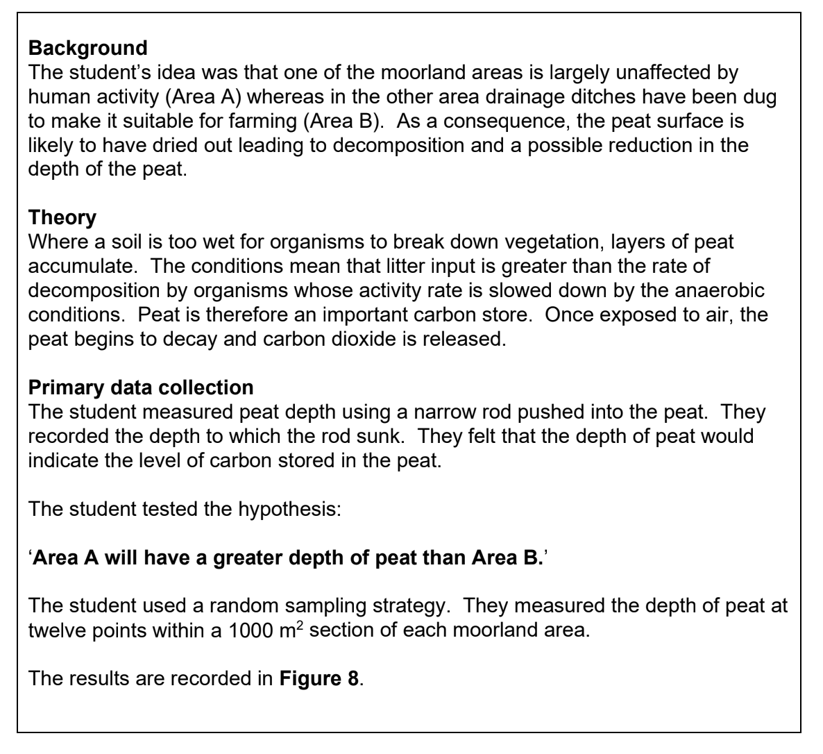
Figure 9

Text discussing a student's investigation on how a 2020 housing development affects stormwater flow into a local stream, causing rapid water level rises.

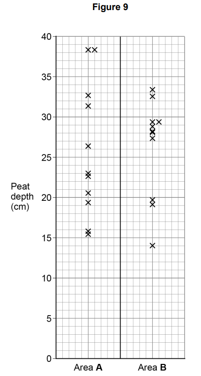
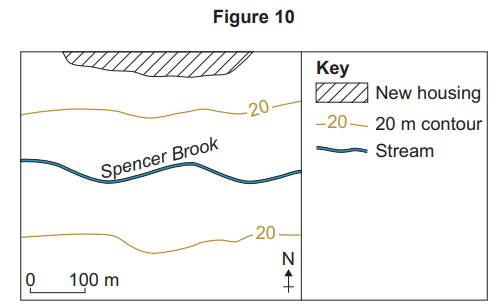
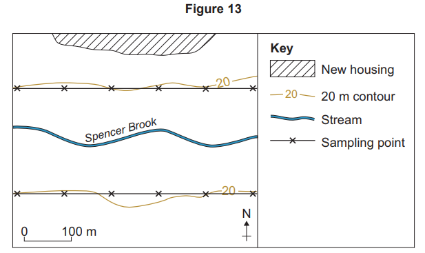
Figure 10 is the student’s sketch map of the fieldwork site.

Map showing Spencer Brook with contour lines at 20 metres. A new housing area is marked. A scale bar indicates 0 to 100 metres. North points up.

The student decided to use some secondary data. She decided to look at rainfall and river discharge data for selected days in September for the year before and after the housing development was built. She wanted to compare the data to see if she would see any differences in discharge between the two years.

Figure 11 shows the secondary data the student used in the investigation.

Figure 11

2019

2021

Day

Rainfall
(mm)

Discharge
(cumecs)

Rainfall
(mm)

Discharge
(cumecs)

1

4.20

0.94

2.33

0.30

2

2.40

0.37

0.00

0.28

3

1.80

0.32

2.10

0.26

4

0.00

0.29

1.30

0.25

5

0.00

0.27

0.00

0.24

6

4.30

0.26

0.00

0.23

7

0.00

0.84

0.00

0.22

8

2.70

0.25

2.10

0.21

9

1.80

0.34

6.00

0.23

10

0.00

0.25

0.00

2.43

Sources

Rainfall – accessed from a website publishing data collected from a weather station operated by an amateur weather enthusiast in the area local to Spencer Brook.

Discharge – river flow data from a gauging station on Spencer Brook. The station sends live data on river discharge to the Environment Agency, which is checked and published on a government website.

The student decided to compare the discharge by calculating the median, a measure of central tendency.

Explain why she chose to calculate the median discharge and not the mean.

7b
4 marks

Suggest ways the student could present this secondary data to aid her analysis.

7c
2 marks

Suggest why the student’s secondary data on discharge may be more reliable than the rainfall data.

7d
9 marks

The student decided to write a plan for how she would collect her primary data.

Figure 12 shows her plan for primary data collection.

Figure 12

Plan for Primary Data Collection

Method to collect overland flow samples
A one-metre-long length of guttering with both ends closed will be buried in the soil to a depth of 5 cm so the upper edge is parallel with the soil surface. A small plastic roof will be erected over the guttering to avoid direct precipitation into the gutter. Water levels will be measured after a significant storm event.

Diagram showing a cross-section of land with a stream, illustrating guttering buried 5 cm deep and sealed for overland flow measurement, with plastic sheeting.

Sampling strategy
The data collection sites will be situated 100 m apart along a line transect that approximately follows the 20 m contour line above the river. Six sites would be constructed either side of the river. The amount of run-off will be measured 2 hours after a significant rainfall event on one day in September.

Risk assessment
The data collection will be done in daylight and a first-aid kit carried at all times in the event of slips and trips. A mobile phone will be carried in case of an emergency.

Figure 13 shows her sketch map of planned sampling points.

Map showing contour lines, Spencer Brook stream, sampling points marked with 'X', new housing area, and scale in metres; north indicated.

Using Figures 9, 10, 12 and 13, evaluate the student’s plan for primary data collection.

8a
2 marks

A student was planning a fieldwork investigation into the quality of flood management strategies for two rivers in the north west of England.

Figure 7 outlines the background to this investigation and the secondary data he collected.

Figure 7

Hypothesis on flood management strategies with a data table showing percentages for hard, soft, and combined engineering for River A and River B.

Referring to Figure 7, plot and label the data for River A and River B onto the triangular graph in Figure 8 (opposite).

Ternary diagram labelled Figure 8, showing percentages of soft and hard engineering and their combination, with a triangular grid and axes.
8b
4 marks

Figure 9 outlines how the student carried out the investigation.

Figure 9

Student surveyed 11 sites for flood management, collecting quantitative and qualitative data through scoring and resident interviews about strategies.

Complete Figure 10 (opposite) by calculating the mean and the inter-quartile range (IQR) for River A.

Table comparing River A and B scores at various sites. River A mean score is blank; River B mean is 27. Includes inter-quartile range calculations.
8c
2 marks

Interpret the findings from Figure 10.

8d
9 marks

Using Figures 7, 8, 9 and 10, evaluate how far the data collected and the way it was processed would be useful for proving his hypothesis:

‘The quality of flood management strategies would be more effective on the river where there were more hard engineering strategies used to reduce flood risk than the river that was managed by soft engineering strategies.’