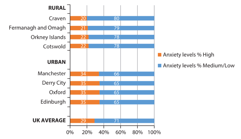
1
2 marks
Study Figure 5.
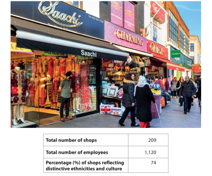
Figure 5
The Broadway, Southall, London, a high street that has changed due to
international migration
Calculate the mean number of employees per shop.
You must show your working.
Give your answer to one decimal place.
Answer ...............................
Was this exam question helpful?