Fieldwork Enquiry Skills (WJEC Eduqas GCSE Geography B): Exam Questions

Exam code: C112

3 hours45 questions
1
2 marks

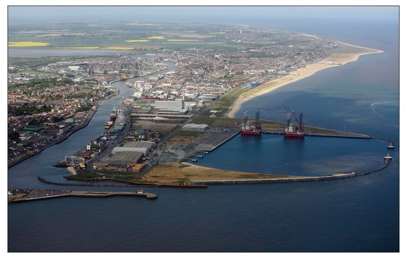
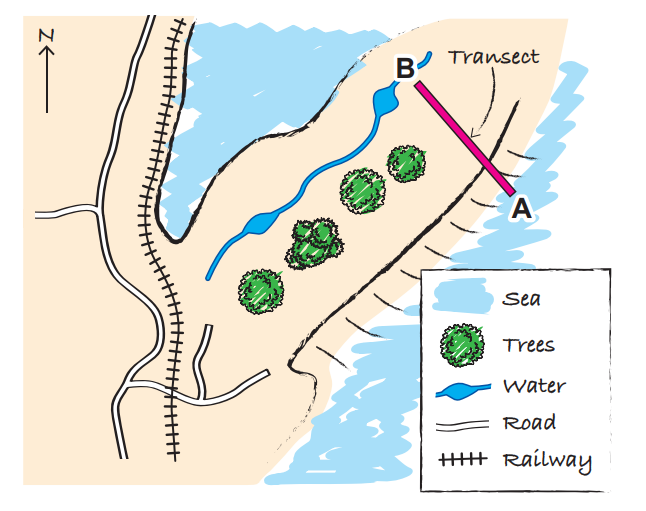
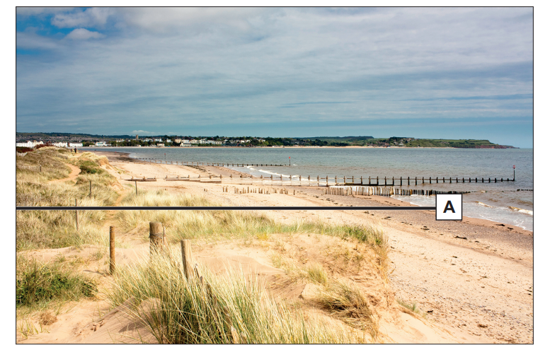
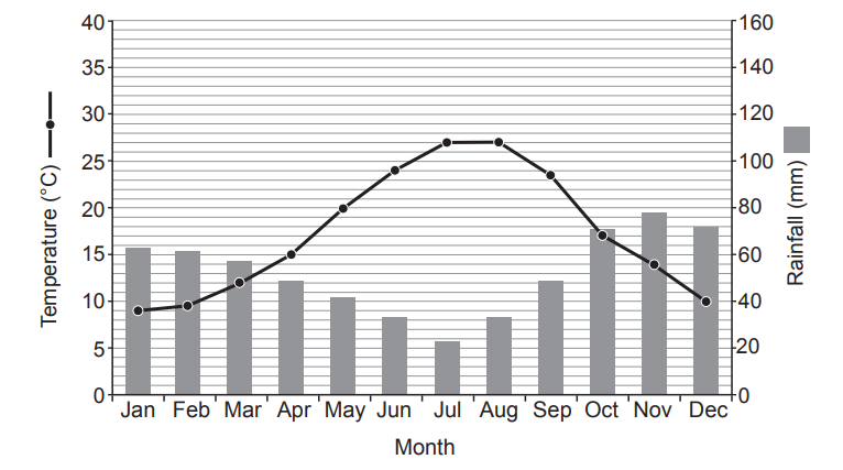
Students decided to investigate if UK weather conditions in summer are changing. Study Map 1.1.

Map of the UK showing temperature ranges from 15°C to 25°C with darker shades indicating warmer regions. Areas labelled: Scotland, England, Wales, Northern Ireland.
Map 1.1: Mean daytime summer temperatures in the UK between 1991 and 2019

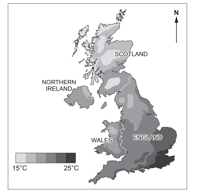
Tick (√) two correct statements in the table below. Use Map 1.1.

  • Scotland has many of the lowest temperatures.

  • The coolest places are all along the coastline.

  • The highest temperatures are in Wales.

  • The hottest places are inland,

  • The south-east of the UK has the highest temperatures.

  • The highest temperatures are in the south-west of the UK.

2
2 marks

Study Diagram 1.2.

Table with columns for date and temperature in Celsius. Rows list dates from 1st to 5th July 2022, with a blank location field above.
Diagram 1.2: A recording sheet for temperatures in July 2022

Give two strengths of this recording sheet.

3
4 marks

Students collected data at Heathrow, south-east England, in July 2022. The data they collected is shown in Graphs 1.3 and 1.4.

Bar and line chart showing daily rainfall and temperature in July. Rainfall peaks on 3rd, temperature rises steadily from 1st to 10th.
Graph 1.3: Temperature and rainfall at Heathrow, July 2022
Wind rose chart showing prevailing wind speeds from SW, W, and S directions; key indicates speeds from 3 to 15 m/s in varying blue shades.
Graph 1.4: Wind speed and direction at Heathrow for the same 10 days of July 2022

Use Graph 1.3 and Graph 1.4.

Circle the correct options in the following statements.

The highest rainfall in one day is ( 0.05 / 0.03 / 0.02 ) millimetres and the temperature

( increases / decreases / stays the same ) throughout the first 10 days of July.

The ( south / north-east / south-west ) has the most days of wind.

The wind speed is the fastest from the ( south-west / south-east / south ).

4
2 marks

Study Table 1.5.

Table 1.5: Mean temperatures for the UK, in July, over two 10-year periods

Mean July temperature 1911 – 1921

Mean July temperature 2011 – 2021

13°C

15°C

Calculate the percentage increase in mean temperature for the two time periods. Show your working.

Answer .................................................... %

5
2 marks

Study Graph 1.6.

Horizontal bar chart showing 10 hottest years since 1884; 2018 is hottest at 15.76°C, followed by 2006 and 2003. X-axis: Temperature, Y-axis: Year.
Graph 1.6: Top ten warmest UK summers by year, excluding 2023

*Temperatures shown are the mean for June to August across the whole UK.

Suggest one conclusion about how UK summer temperatures are changing. Use data from Graph 1.6 in your answer.

6a
2 marks

This question is about your own experience of investigating change over time in fieldwork.

You should support your answers by referring to actual examples from your own fieldwork.

Give one reason why your primary data collection was accurate.

Name of equipment or survey you used to collect your primary data:.........

Reason why it was accurate...........................................................................

6b
4 marks

Explain why secondary data was useful in your investigation.

Secondary data you used in your investigation into change over time: ......................................................................................................................

Why it was useful: .........................................................................................

7
3 marks

Study Photograph 2.1.

Aerial view of a coastal town with a prominent port area, featuring industrial buildings, cranes, two large ships, and a sandy beach lining the shoreline.
Photograph 2.1: Great Yarmouth, Norfolk, east England

Tick (√) three enquiry questions that could be chosen in an investigation of mitigating risk in Great Yarmouth.

  • Have retail opportunities in Great Yarmouth changed in recent years?

  • To what extent are the coastal erosion management strategies effective?

  • Is counter-urbanisation occurring in Great Yarmouth?

  • Is Great Yarmouth a safe place to install a new wind farm?

  • How do the house prices vary between north and south Great Yarmouth?

  • How are residents in Great Yarmouth being affected by climate change?

8
3 marks

Draw one line from each sampling technique to a strength of that technique.

Table comparing sampling techniques with strengths: Systematic, Stratified, Random. Strengths include equal chance, measuring features, and varying land use analysis.
9a
2 marks

Study Table 2.3.

Table comparing air pollution levels at sites A and B on a 0-20 scale, with A ranging from 2.3 to 14.5 and B from 3.4 to 8.5.
Table 2.3: Air pollution data for two sample sites in Luton

Complete the table below for sample site B. Use Table 2.3.

Site A

Site B

Median

6.7

Range

12.2

9b
1 mark

Which graph would be suitable to present the data in Table 2.3? Tick (√) one.

  • Dispersion graph

  • Pie chart

  • Line graph

9c
1 mark

Give one reason why the graph you have chosen is suitable to present this data.

10a
2 marks

This question is about your own experience of investigating mitigating risk in fieldwork.

You should support your answers by referring to actual examples from your own fieldwork.

Suggest one strength of your enquiry question.

Your enquiry question: ..........................................................................................

Strength:................................................................................................................

10b
4 marks

Evaluate one strength and one weakness of your conclusions.

11a
2 marks

Study Diagram 3.2. It shows people at risk from flooding in the UK.

Three groups of four people stand on wavy blue lines, labelled "Now," "2050s," and "Later," depicting rising populations: 2.4M, 3.6M, 5M.

Give two improvements to Diagram 3.2 that would show the data more clearly.

11b
2 marks

Give two additional pieces of data that could be included in Diagram 3.2 to help show which people are most at risk from flooding.

12
2 marks

Study Sketch Map 1.2.

Map depicting a coastal area with a sea, labelled transect line from A to B, trees, a waterway, roads, and a railway line with a north arrow.
Sketch Map 1.2 – Location of the vegetation transect

Give one strength and one weakness of Sketch Map 1.2 to show the location of the transect.

13
2 marks

Study Photograph 1.3.

Coastal scene with sandy dunes in the foreground, grassy patches, a beach stretching along the shoreline, and wooden groynes extending into the sea.
Photograph 1.3 – Location of the start (point A) of the transect along Dawlish Warren

Students used systematic sampling to select where to measure the vegetation along the transect.

State one advantage of using systematic sampling to measure vegetation along this transect

14a
2 marks

Study Table 1.4. It shows part of the students’ results.

Table 1.4 – Vegetation found along a sand dune transect, in percentage (%)

Sample Point

1 (Closest to the sea (A))

2

3

4

5

6

7

8

9

10 (Furthest away from the sea (B))

Bare sand

100

85

65

45

15

5

5

5

5

5

Marram Grass

0

10

20

40

50

80

60

30

20

0

Gorse

0

0

0

0

5

10

20

25

30

40

Bramble

0

0

0

0

0

0

0

25

30

40

Other

0

5

15

15

30

5

15

15

15

15

Complete Diagram 1.5 below. Use the data in Table 1.4.

Line graph with two data series intersecting, showing percentage changes across sample points 1 to 10, with values ranging from 0% to 50%.
Diagram 1.5 – Kite diagram to show percentage of Marram Grass found along transect
14b
1 mark

Tick (√) two correct statements in the table below. Use the information in Table 1.4.

  • The maximum percentage of Marram Grass in a quadrat is 80%.

  • Gorse and Bramble are the most common plants in the middle of the transect.

  • Bare sand is only found in 6 of the sample points.

  • Gorse only grows close to the sea at a maximum of 30%.

  • Brambles are only found further away from the sea.

15a
2 marks

This question is about your own fieldwork experience of using transects.

I used a transect when investigating...........................................................

Give one strength and one weakness of using a transect to collect your data.

15b
4 marks

Strengths of data presentation methods include:

  1. Clear to interpret

  2. Location is shown

  3. Relevant data is displayed.

Explain why a presentation method for your transect data showed some of these strengths.

16
3 marks

A group of students decided to investigate inequality in the city of York, North Yorkshire, England. Study Photograph 2.1.

Aerial view of a historic city featuring a large cathedral at its centre, surrounded by densely packed buildings and a river with several bridges.
Photograph 2.1 – City of York, North Yorkshire, England

Tick (√) three enquiry questions that could be chosen in an investigation of inequality in York.

  • How does the microclimate vary within York city?

  • To what extent do tourist visits influence the provision of car parking spaces in York?

  • How does access to services vary between different suburbs of York?

  • How does the standard of living compare between central York and the suburbs?

  • How effective are the river defences in York in protecting the cathedral?

  • To what extent do York’s historic buildings influence its identity?

  • To what extent is the quality of life for families better than for students in York?

17a
1 mark

Study Table 2.2. It shows part of the students’ Environmental Quality Survey. It shows the impact of litter and graffiti in York.

GRAFFITI

LOW IMPACT

MEDIUM IMPACT

HIGH IMPACT

Every 10 metres

1 item

2 to 10 items

Over 10 items

Tally

III

II

None

Weighting

5

5

5

Score

15

10

0

LITTER

LOW IMPACT

MEDIUM IMPACT

HIGH IMPACT

Every 10 metres

1 piece

2 to 10 pieces

Over 10 pieces

Tally

IIII

III

IIII III

Weighting

5

5

5

Score

20

15

..........................

Complete Table 2.2 to show the high impact score for litter.

17b
1 mark

Some local people feel that litter has a greater impact than graffiti on environmental quality. How would you adapt the survey to show this?

18
4 marks

Study Table 2.3. It shows the students’ scores for environmental quality from the centre of York.

Table 2.3 – Transect data showing environmental quality in York

Distance from York City Centre (m)

Environmental Quality Index (EQI) Score (1 = low, 100 = high)

0

20

200

30

400

65

600

55

800

50

1000

90

Sketch an appropriate graph to display the data in Table 2.3. Use the outline below.

A graph to show distance and EQI from York City Centre

Black L-shaped line on a white background forming a right angle, resembling two axes meeting in the bottom left corner.
A graph to show distance and EQI from York City Centre
19
3 marks

A student wrote some statements in their investigation report. Circle the correct term for each statement.

Statement

Term

I completed the environmental quality survey myself, it was my own opinion only.

Bias

Secondary data

Conclusion

When I looked at my recording sheet back at school, I realised I couldn’t read my writing for all the readings, so I had to guess some.

Accuracy

Control group

Evaluation

I measured the litter along one street before and after the football match and I compared my results.

Bias

Secondary data

Control group

20a
2 marks

This question is about your own fieldwork experience of investigating inequality.

Title of investigation on inequality .................................................................

Give one reason why your data collection was reliable.

20b
4 marks

Evaluate one strength and one limitation of your conclusions.

21
3 marks

Study the climate graph below.

Line graph showing monthly average temperature and bar graph of rainfall in mm. Temperature peaks in July; rainfall highest in Jan, Nov, Dec.
Climate graph for Grottole, Italy

Describe the climate of Grottole. Use figures in your answer.

22
2 marks

Study Map 1.1.

Map showing Robin Hood's Bay with contour lines, paths, and symbols for parking and visitor sites. Includes a map legend for water features.
Map 1.1 – OS Map of Robin Hood’s Bay, North Yorkshire

Students carried out an investigation into the risk of coastal erosion. They used a sampling technique to select specific locations to collect data along the coastline.

Give one advantage of using a sampling technique to select fieldwork sites in the area shown on Map 1.1.

..................................................................................................................

Diagram 1.2 – Bipolar survey investigating the risk of coastal erosion

Increases erosion

Risk level

Decreases erosion

Rock Structure

Evidence of rock weakness, lots of cracks/joints

No evidence of rock weakness and no obvious cracks/joints

Coastal Protection

23
1 mark

Students used a bipolar survey to evaluate the risk of coastal erosion at 4 fieldwork sites. Diagram 1.2 below shows part of their recording sheet.

Diagram 1.2 – Bipolar survey investigating the risk of coastal erosion

Increases erosion

Risk level

Decreases erosion

Rock Structure

Evidence of rock weakness, lots of cracks/joints

No evidence of rock weakness and no obvious cracks/joints

Coastal Protection

Select the correct pair of statements to complete Diagram 1.2. Tick (√) one box.

Increases erosion risk

Decreases erosion risk

Tick (√) one box

Sea defences present.

Sea defences broken or non-existent.

Sea defences broken or non-existent.

Sea defences present.

Sea defences look ugly.

Sea defences look attractive.

24
3 marks

Twenty-two students used the bipolar survey to record their own views on how rock structure affects risk of coastal erosion at the 4 fieldwork sites.

Radar chart depicting risk levels from student responses across four sites: A, B, C, and D. Key indicates line styles for each site.
Graph 1.3 – shows all 22 students’ results.

Study Graph 1.3. Circle the correct site letters in the table below

Risk of erosion due to rock structure

Circle the correct site(s)

Which site has a very high risk? Circle one site.

A B C D

Which site did 8 students think had no risk? Circle one site.

A B C D

Which two sites have similar levels of risk? Circle two sites.

A B C D

25
2 marks

The students used a questionnaire to investigate whether local people viewed coastal erosion differently based on how far away they live from the sea.

One part of the students’ questionnaire is shown below:

How far do you live from the sea?

1–5

5–10

10–15

15–20

Suggest two improvements that could be made to this part of the questionnaire.

26
4 marks

Field sketches were used by the students as part of their fieldwork.

Sketch of a coastal scene with a concrete sea wall, rip rap boulders, buildings near the sea, eroded cliffs, and an old stone wall with cracks.
Diagram 1.4 – shows an example of one of these field sketches.

Evaluate one strength and one weakness of this field sketch as a method of showing coastal erosion issues.

27
1 mark

A group of students decided to investigate place using the town of Lowestoft in Suffolk. Study Photograph 2.1 below.

Aerial view of a coastal town with a river, marina, and surrounding residential areas set in a flat landscape under a clear blue sky.
Photograph 2.1 – Lowestoft, Suffolk. East of England

Tick (√) two enquiry questions that could be chosen in an investigation of place in Lowestoft.

  • Do flood levels in Lowestoft increase in winter?

  • Does living near the river influence how positively people view Lowestoft?

  • Is farming economically sustainable in this area?

  • Does the length of time residents have lived in Lowestoft affect how they view the city?

  • Does the velocity of the river change downstream?

28
4 marks

A student has written a description of the location of Lowestoft, which contains two only mistakes. Study Text box 2.2, which shows part of their description, and the maps 1 , 2 and 3.

Text on a torn paper background: "Lowestoft is a coastal town in Suffolk, England, north-east of London, near Lake Lothing (5692) and Oulton Broad (5192)."
Text box 2.2 – Location of Lowestoft

Maps to show the location of Lowestoft, Suffolk, East England

Two maps showing Lowestoft's location in England; one national, showing its placement northeast of London, and one regional, detailing nearby counties.
Ordnance Survey map of Lowestoft area, showing roads, parks, rivers, and coastline. Key landmarks include Oulton Broad and Carlton Colville.

Identify and correct the two mistakes in the student’s description of the location of Lowestoft. Complete the table below.

Mistake 1 ..................................--->

Correction 1 ..................................

Mistake 2 .................................--->

Correction 1 ...................................

29
4 marks

The students designed a fieldwork recording sheet to compare the environment of East Lowestoft and West Lowestoft.

Study the recording sheet which is given below. Explain one strength and one weakness of this data recording sheet.

Survey report with three sections detailing house types, crime opportunities with ticks, environment quality ratings, and a graffiti survey scoring.
Completed recording sheet to compare East and West Lowestoft
30a
1 mark

Students collect secondary data from the National Census. Study the Map 2.3 below.

Map showing deprivation scores for 2019, with areas shaded from light to dark indicating increasing deprivation. Areas A and B are labelled.
Map 2.3 – Choropleth map showing Deprivation levels in Lowestoft in 2019

In 2019 Area B had a deprivation score of 72. Complete Map 2.3 for Area B.

30b
1 mark

Tick (√) one correct conclusion that can be drawn from Map 2.3.

  • Area A is a more deprived area than Area B, so that people are likely to have less income, employment and education.

  • Area B is a more deprived area than Area A, so people are likely to suffer more crime, barriers to housing and health challenges.

  • Area A is the most deprived area in Lowestoft, so people are likely to have less income and suffer more crime than the rest of Lowestoft.

31a
3 marks

Crompton Place is Bolton’s central retail area. Study the information below.

Calculate the percentage of vacant retail premises in Crompton Place’s ground floor. Show your working.

Percentage of vacant retail premises in Crompton Place’s ground floor ........................................ %

Ground floor map showing retail units. Vacant areas are shaded blue. Key stores include Boots, Primark, New Look, and multiple empty units.
Ground floor plan for Crompton Place: a shopping centre in Bolton, Lancashire

Data for Crompton Place

  • The ground floor area covers a total area of 6300 square metres.

31b
1 mark

The number of vacant retail premises in the UK is 9% of all available retail premises.

Compare the percentage of vacant retail premises in Crompton Place’s ground floor to the rest of the UK.

32
2 marks

Crompton Place is undergoing proposed changes. Study Diagram 3.2 and Table 3.3 below.

Give two ways that Diagram 3.2 could be improved to represent the data in Table 3.3 more clearly.

Icons of six houses, a fork and knife, three beds, and two shopping bags, all aligned vertically with a ruler on the left side for measurement.
Diagram 3.2 – Proposed new additions to Crompton Place’s retail area

Table 3.3

Homes

150

Food Units

25

Hotel beds

75

Retail Units

50

33a
1 mark

Study Table 3.4

Table 3.4

Leisure space (m2)

12000

Office space (m2)

10000

Events space (m2)

15000

Select one correct numerical method to compare the amount of office space with events space shown in Table 3.4.

  • Inter-quartile range

  • Ratio

  • Mean

33b
1 mark

Suggest why a pie chart would be a suitable graph to show the data for Leisure, Office and Events space in Table 3.4.

34
2 marks

Study Table 3.5 below.

Activity

Average spend (£)

Entertainment

87.50

Banking

75.16

Refreshments

74.63

Visiting parks

34.48

Average

67.94

Suggest why a bar chart is a suitable way to represent this data.

35
1 mark

Students decided to investigate the impact of counter-urbanisation on a local village shown in Photograph 2.1.

Aerial view of a small English village surrounded by green fields and farmland, showing winding streets with houses and a visible industrial area.
Photograph 2.1 – An aerial photograph of the village

Tick (√) one enquiry question that could be chosen to study cycles and flows in this area.

  • Is the quality of life better in the village than the local city?

  • What is the age profile of this place?

  • How has the population in this village changed in the last 20 years?

36a
3 marks

Students wanted to investigate the perceptions of local people about counter-urbanisation in the village. They used questionnaires.

Name a suitable sampling strategy that they could have used.

Name of sampling strategy .............................................................

What are the strengths of this sampling strategy?

36b
2 marks

The students decided to also use an online questionnaire using social media. (ii)

Give two advantages of using an online questionnaire.

37a
2 marks

The students also used a bi-polar survey to investigate people’s perceptions of counter-urbanisation in the village. Table 2.2 shows a section of the bi-polar survey.

Table 2.2

Over the last five years the village has become…

2

1

–1

-2

Quieter

Noisier

Less congested

More congested

More friendly

Less friendly

..................

..................

Complete Table 2.2 above by adding a suitable pair of statements.

37b
1 mark

Give one reason why the students gave an even number, rather than an odd number, of possible responses.

38a
2 marks

The students also collected primary data on the time it took 75 local people to commute to work. The data is shown in the table below.

Number of people

Less than 10 minutes

12

11–30 minutes

23

31–60 minutes

36

More than 61 minutes

4

Calculate the percentage of people who travel between 31 and 60 minutes. Show your working.

Answer ............................. %

38b
1 mark

Suggest why collecting the data in time intervals is a suitable method for this data collection.

39a
2 marks

Some students were investigating people’s perceptions of a brownfield development in a city centre. Study the photograph below.

Modern bus station with glass facade, surrounded by a paved plaza and seating, construction site on the left, under a partly cloudy sky.
Photograph 1.1 – Brownfield development in a city centre

Tick (√) the two correct statements to show people’s perceptions of this brownfield development.

  • Modern style building is welcoming and attractive to some visitors

  • Air and noise pollution is caused by the building site

  • Pedestrianised area is safer and friendly for families and shoppers

  • Grey slate pavement and small amount of greenery

39b
4 marks

The students collected qualitative data using questionnaires. They sampled at the entrance to the bus station at point X on the photograph.

Give one advantage and one disadvantage of using this location.

40a
1 mark

The students asked 55 people whether they thought the development would have a positive or negative impact. Table 1.2 shows some of their questionnaire data.

Table 1.2 – Questionnaire data table

The impact the development will have on:

Positive

Negative

The economy

25

30

The environment

39

16

Tourism

11

44

Locals

13

42

Suggest a suitable technique to represent the data in Table 1.2.

40b
2 marks

Using the data from Table 1.2, calculate the percentage of people who thought the development will have a positive impact on the environment.

Show your working

Answer ..................................

40c
3 marks

Suggest three conclusions that you could make from the data in Table 1.2.

41
6 marks

This question is about using your own fieldwork experience to collect qualitative data. Choose one primary data collection sheet you used.

My primary data collection sheet was about .......................................................

Evaluate the success of the design of your fieldwork data collection sheet.

42
2 marks

Students decided to investigate sustainable flood management strategies for a town. Below is a photograph of a past flood event in the town.

Flooded street in a town with row of brick buildings partially submerged, reflecting in the water under a clear blue sky. Clock tower visible in background.
Photograph 2.1 – Flood event 2015

Tick (√) two enquiry questions that could be chosen to investigate the sustainability of flood defences in this area.

  • To what extent do flood defences protect residential areas?

  • To what extent do the flood defences have a negative impact on tourism to the town?

  • Is the highest risk of flooding always in winter?

  • Should the flood defences be managed by national or local authorities?

43a
3 marks

The students collected local residents’ opinions of the existing flood defences. Some of their data is shown in Table 2.2 below.

Percentage (%) responses

Strongly disagree

Disagree

Neutral

Agree

Strongly agree

The flood defences make me feel safer.

14

8

10

26

42

The defences are good value for money.

20

22

30

16

12

The defences reduce the risk of flooding to my house.

8

12

8

30

42

The defences will last a long time.

4

26

20

30

20

The defences do not put off tourists.

18

24

18

28

12

Complete Graph 2.3 below using the data in Table 2.2.

Stacked bar chart showing public opinions on flood defences. Categories: safety, value, risk reduction, longevity, tourist impact. Key: strongly agree to strongly disagree.
Graph 2.3
43b
3 marks

Tick (√) the three statements that accurately describe the data shown in Table 2.2 and Graph 2.3.

  • 28% of people agree and strongly agree that the defences are good value for money.

  • Over 60% of people agree that the defences will last a long time.

  • 42% of people disagree and strongly disagree that the defences make them feel safer.

  • 68% of people agree and strongly agree that the defences make them feel safer.

  • Overall, more residents feel that flood defences have a positive impact.

  • Overall, more residents feel that flood defences have a negative impact.

43c
4 marks

People such as business owners and tourists also have opinions about flood defences.

Suggest how the results were influenced by just asking local residents.

44
6 marks

This question is about your own fieldwork on sustainability.

Evaluate the strengths and weaknesses of using secondary data in your investigation on sustainability.

You should support your answer by referring directly to your own fieldwork.

Aim of your investigation ..............................................................................

Evaluation....................................................................................................

45a
2 marks

Study Map 1.1 below. It shows survey points where students collected data on traffic flows in Taunton, a town in Somerset.

Map showing a town centre with roads marked in magenta, labelled A to E. Includes geographic features, grid lines, and a scale bar at the bottom right.
Map 1.1 - Traffic survey points in Taunton

The students collected data on the number and types of traffic on a Monday morning.

Suggest two ways the students could improve their data collection of traffic flows

45b
2 marks

Some results for one traffic survey point are shown in Table 1.2 below.

Table 1.2 - Types of traffic at one survey point

Type of traffic

Vehicle count at 7.30 am (counted for one minute)

Vehicle count at 8.30 am (counted for one minute)

Motorcycles

2

3

Cars

10

25

Buses / Coaches

5

9

Vans

8

5

Calculate the percentage increase in the number of cars between the 7.30 am count and the 8.30 am count. Show your working.