Tabulation, Diagrams & Representation (Edexcel GCSE Statistics: Foundation): Exam Questions

Exam code: 1ST0

4 hours36 questions
1a
1 mark

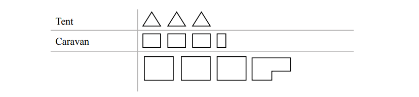
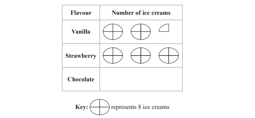
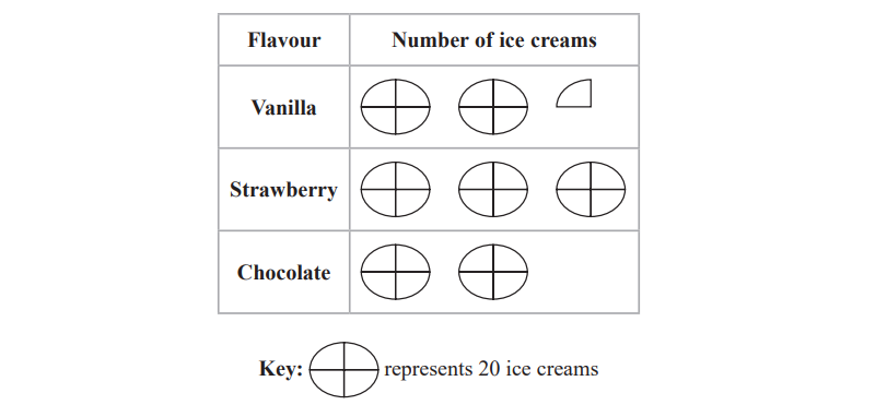
The incomplete pictogram shows the numbers of hours that Milly spent studying Biology, English and French.

Chart showing study hours: Biology 6, English 8, French 2, Maths 0. Each box equals 2 hours, key displayed on the right.

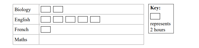
Milly spent 6 hours studying Maths.

Complete the pictogram for Maths.

1b
2 marks

Milly spent more hours studying English than she spent studying Biology.

Work out how many more hours.

1c
2 marks

Milly’s teacher wants her to spend a total of more than 20 hours studying.

Has Milly spent a total of more than 20 hours studying?
Give a reason for your answer.

2a
2 marks

Leyla wants to find out how often people in her town eat in a restaurant.

She asked a sample of 30 people how many times they had eaten in a restaurant during the last week.

Here are Leyla’s results.

3

4

2

1

1

5

1

1

1

2

2

1

2

1

1

2

5

1

3

1

1

4

3

3

1

4

2

1

1

2

Fill in the tally chart for this information and complete the frequency column.

Number of times

Tally

Frequency

1

2

3

4

5

2b
1 mark

Write down the mode.

2c
2 marks

Work out the number of people in Leyla’s sample who had eaten in a restaurant fewer than 4 times during the last week.

2d
1 mark

Suggest a suitable diagram that Leyla could use to represent her data.

3a
2 marks

Richard works in an animal rescue centre.

Richard has collected data on the weights, in kilograms, of 10 male cats and the weights, in kilograms, of 10 female cats at the centre.

1

2

3

4

5

6

7

8

9

10

Male

3.0

3.2

3.3

3.5

3.6

3.8

3.9

4.2

4.4

4.9

Female

3.0

3.1

3.1

3.2

3.3

3.3

3.5

3.7

3.9

9.5

Richard wants to compare the average weight of the male cats with the average weight of the female cats.

Richard thinks that he should use either the mean or the median.

Which one of the mean or the median do you think he should use?
Give a reason for your answer.

3b
2 marks

Richard plans to use a scatter diagram in order to compare the weights of the male cats with the weights of the female cats.

Discuss whether or not a scatter diagram would be a suitable diagram to use.

4a
2 marks

The incomplete multiple bar chart shows information about the numbers of UK films first shown in 2013 and in 2014 for some types of film.

Bar chart shows frequency of five film types in 2013 and 2014. Documentaries had highest frequency both years; thrillers and actions were least frequent.

9 UK action films were first shown in 2013

7 UK action films were first shown in 2014

Complete the multiple bar chart.

4b
1 mark

The number of UK films first shown in 2013 was 17 for two types of film.

Which two types of film?

4c
1 mark

Work out the total number of drama films that were first shown in these two years.

4d
2 marks

Compare the numbers of UK films of the different types that were first shown in 2013 with those first shown in 2014

4e
1 mark

Explain why it would not be appropriate to display the information from the multiple bar chart in a time series graph.

5a
1 mark

The bar chart gives information about the amounts of different types of fuel, in Mtoe (millions of tonnes of oil equivalent), that were used in the United Kingdom in the year 2000

Bar chart showing fuel amounts in Mtoe: coal (40), natural gas (90), petrol (30), diesel (20), other fuels (50). Data by Dept of Energy and Climate Change.

Ignoring ‘other fuels’,

write down the type of fuel that used the least amount of Mtoe in the year 2000

5b
1 mark

One type of fuel used one quarter of the amount of Mtoe used by natural gas in the year 2000

Which type of fuel was this?

5c
1 mark

The pie chart shows information about the amounts of different types of fuel, in Mtoe, that were used in the United Kingdom in the year 2013

Pie chart showing fuel sources: coal, natural gas, petrol, diesel, and other fuels. Coal is the largest segment, with petrol and diesel smaller.

The amount of natural gas used, in Mtoe, was the greatest in both 2000 and 2013

Explain how the bar chart and the pie chart show this.

5d
2 marks

Juanita says that more diesel was used in 2013 than in 2000

Explain whether or not the information given in the two diagrams can be used to support this statement.

6a
1 mark

Razwan collected data about the methods used to get to work that morning by the 25 people who work at his company.

The bar chart shows information about the methods used.

Bar chart showing transport frequency: bike 4, bus 6, walk 4, car 8, train 3. Car usage is highest, train lowest.

Which method was used by the greatest number of people?

6b
1 mark

Which method was used by half as many of the people who got to work by bus?

6c
1 mark

Razwan concludes that travelling to work by car is the most popular method used to get to work in his city.

Give one limitation of Razwan's conclusion.

7
3 marks

Rebecca collected information about the type of accommodation that 30 people stayed in the last time they went on holiday.

She drew this diagram to show her results.

Table with two rows: "Tent" row has four triangles; "Caravan" row has three squares and one L-shaped figure.

Write down three things that could be misleading or that are wrong in Rebecca's diagram.

8a
Sme Calculator
2 marks

The time series graphs show information about the numbers of students taking A Level Physics and A Level French in each of the years from 2008 to 2016

Line graph showing A Level Physics student numbers rising from 2008 to 2016, while A Level French student numbers decline over the same period.

Work out an estimate for the difference in the number of students taking A Level Physics and the number of students taking A Level French in the year 2008

8b
1 mark

Explain why the answer to part (a) is an estimate.

8c
1 mark

Describe the trend in the number of students taking A Level French from 2008 to 2016

8d
1 mark

Alizee is going to give a presentation to students at a school. She wants to show her target audience that Physics is the most popular subject at A Level.

Explain whether or not it would be appropriate for Alizee to use the time series graph to show this.

8e
1 mark

Ivan is going to give a presentation to students at a school. He wants to show his target audience that the number of students taking A Level Physics is decreasing.

Explain how Ivan can use information from the time series graph to show this.

8f
2 marks

Lionel wants to use the time series graphs to predict the number of students taking A Level Physics and the number of students taking A Level French in 2020

Discuss whether or not it would be appropriate to do so.

9a
2 marks

27 adults were each asked to count the number of times they could bounce a ball on a bat.

Here are the results.

5

8

13

5

7

23

30

6

21

24

23

22

13

9

12

6

12

34

22

20

35

22

12

16

24

13

12

Complete the stem and leaf diagram for this information.

Graph with horizontal lines numbered 0-3 on the left. Key box reads: "0 | 5 represents 5 bounces" at the bottom left.
9b
Sme Calculator
2 marks

Work out the interquartile range of the results.

9c
3 marks

The median of the results for 27 children is 9.

The interquartile range of the results for these children is 6.

Alex thinks these results show that adults are better than children at bouncing a ball on a bat.

Do you agree with Alex?
You must give reasons for your answer.

10
2 marks

Archaeologists divided a field into 36 squares of equal size.

The number of Roman roof tiles found in each square was recorded.

The choropleth map below was drawn using this information.

Grid with shaded tiles indicating quantities. Key: Light grey for less than 5, dotted for 5-8, striped for 9-15, dark grey for 16-24 tiles.

Use the choropleth map to describe where in the field the greatest number of roof tiles was found.

Give a statistical reason for your answer.

11a
2 marks

Tomoyo found the weight, in grams, of each of 100 cherries.

Circle the two words from the list that best describe the data Tomoyo found.

quantitative    qualitative    discrete    continuous    bivariate    ordinal    categorical

11b
Sme Calculator
5 marks

Tomoyo grouped the weights and she then drew this diagram for her results.

Bar chart showing frequency distribution of weights in grams; x-axis ranges 0-9 grams, y-axis shows frequency; bars at 2, 4, 6 units high.

The incomplete frequency table shows some information about her results.

Weight (w grams)

Frequency

1 less or equal than w less than 3

10

3 less or equal than w less than 5

5 less or equal than w less than 7

7 less or equal than w less than 9


(i) Complete the frequency column in the table.

(2)

(ii) Calculate an estimate of the mean weight of the 100 cherries.

........................ g

(3)

12
3 marks

The editor of a home magazine collects information about the types of washing machines people use.

She uses statistical software to represent the results in three different ways.

Way 1: Table.

Type of washing machine

Top loading

Front loading

Hybrid

Number owned

150

425

25

Way 2: Bar chart.

Bar chart showing the number of washing machines owned: Top loading (100), Front loading (500), Hybrid (50).

Way 3: Pie chart.

Bar chart titled "Type of washing machine" comparing ownership: Top loading 100, Front loading 400, Hybrid 50. Vertical axis labeled "Number owned."

For each of the ways, comment on why the editor might choose this way to represent the results in the magazine.

Way 1 ..........................

Way 2 ..........................

Way 3 ..........................

13a
1 mark

The incomplete pictogram gives information about the flavour and number of ice creams sold at Pradeep’s cafe one Saturday morning.

Table showing ice cream preferences: Vanilla has 18, Strawberry has 16, and Chocolate has 0, with each circle representing 8 ice creams.

20 chocolate ice creams were sold on Saturday morning.

Complete the pictogram for the number of chocolate ice creams sold.

13b
2 marks

Work out the total number of ice creams sold on Saturday morning.

13c
Sme Calculator
2 marks

The pictogram below gives information about the flavour and number of ice creams sold at Pradeep’s cafe one Sunday morning.

Pictogram showing ice cream flavours: Vanilla 45, Strawberry 40, Chocolate 60. A circle with a cross represents 20 ice creams; a quarter circle represents 5.

Compare the number of vanilla ice creams sold in the cafe on Saturday morning with the number of vanilla ice creams sold in the cafe on Sunday morning.

Give a reason for your answer.

13d
2 marks

Pradeep wants to use the collected data to estimate how many ice creams of each flavour she will sell for the whole of next week.

Considering Pradeep’s data decide if this is appropriate.

14a
2 marks

The incomplete multiple bar chart gives information about the home country of visitors to a theme park in 2003 and in 2013

Bar chart showing visitor numbers to France, UK, Germany, Belgium, Netherlands, Italy/Spain, Others in 2003 and 2013. France leads in both years.

In 2003, 39% of the visitors were from France.

(i) On the multiple bar chart complete the label for the horizontal axis.

(1)

(ii) On the multiple bar chart complete the label for the vertical axis.

(1)

14b
2 marks

In 2003, 6% of the visitors were from Germany.
In 2013, 3% of the visitors were from Germany.

Complete the multiple bar chart for visitors from Germany.

14c
2 marks

Compare the change in the percentage of visitors to the theme park from France in 2003 and in 2013 with the change in the percentage of visitors to the theme park from the United Kingdom in 2003 and in 2013

14d
2 marks

John is investigating how the total number of visitors to the theme park has changed from 2003 to 2013

Comment on whether or not it is appropriate to use this multiple bar chart for his investigation.

15a
2 marks

The pie charts give information about the different types of properties that were for sale in July 2020 in Harrogate and in July 2020 in South Shields.

Two pie charts compare housing types in Harrogate and South Shields, showing proportions of houses, flats, bungalows, and other, with a key included.

Compare the proportion of different types of properties for sale in Harrogate in July 2020 with the proportion of different types of properties for sale in South Shields in July 2020

15b
2 marks

Adam also drew two pie charts showing the different types of properties that were for sale in July 2021 in Harrogate and in July 2021 in South Shields.

Both pie charts have the same size angle for bungalows.
Adam uses this information to reach the following conclusion.

“The numbers of bungalows for sale in Harrogate in July 2021 and in South Shields in July 2021 were the same.”

Assess the validity of Adam’s conclusion.

16a
2 marks

A fjord is a deep and narrow part of a sea with steep land on three sides.

Emily is investigating the length of fjords in Norway. She collects some data from the internet and puts the data into a grouped frequency table.

The grouped frequency table below shows information about the results she collected.

Length of fjord (l km)

Frequency

0 less or equal than l less than 50

199

50 less or equal than l less than 100

17

100 less or equal than l less than 150

12

150 less or equal than l less than 200

3

200 less or equal than l less than 250

1

(Source: https://en.wikipedia.org/wiki/List_of_Norwegian_fjords (opens in a new tab))

Work out the number of fjords that have a length of at least 100km.

16b
Sme Calculator
5 marks

(i) Calculate an estimate of the mean length of these fjords.
Give your answer to 1 decimal place.

......................... km (3)

(ii) Explain why your answer to part (b)(i) is only an estimate.

(1)

(iii) How could Emily have improved the accuracy of her answer to part (b)(i)?

(1)

16c
2 marks

Emily plans to use a frequency polygon to represent the lengths of the fjords.

Discuss whether or not a frequency polygon would be an appropriate diagram to use.

17
Sme Calculator
5 marks

The two population pyramids give information about the percentage of the population who are male and who are female for each age group in France and in Italy in 2010

2010 France population pyramid showing age groups for males and females, with percentages from 0% to over 10%, totalling 62,444,566 people.
Population pyramid of Italy in 2010, showing age distribution by gender. Narrow top for older ages, wider middle representing ages 35-54.

Tommy is investigating how the populations of Italy and France differ in 2010. He uses the two population pyramids to reach the following two conclusions.

  • The percentage of people aged 50–54 was lower in France than the percentage of people aged 50–54 in Italy.

  • The number of males aged 40–44 in France was greater than the number of males aged 40–44 in Italy.

Assess Tommy's two conclusions.
You should show clearly the value of any statistics you use in your answer.

18a
Sme Calculator
2 marks

The time taken, in minutes, for some runners to complete a 5 km run was recorded. The incomplete histogram and incomplete grouped frequency table give information about the times taken, in minutes, for these runners to complete the 5 km run.

Bar chart showing frequency of run times for 5km: 15-20 min has lowest, 20-25 highest, 25-30 medium, 30-35 lower, and 35-40 lowest.

Time taken to run 5 km (t minutes)

Frequency

15 less than t less or equal than 20

5

25

25 less than t less or equal than 30

30 less than t less or equal than 35

4

35 less than t less or equal than 40

3

(Source: www.parkrun.org.uk (opens in a new tab))

Use the information in the histogram to complete the table.

18b
Sme Calculator
2 marks

Estimate the number of runners that took less than or equal to 23 minutes to complete the race.

18c
2 marks

Identify and interpret the skew shown on the histogram.

19a
1 mark

Jenny is investigating how many days per week people use a gym.

She asks the 40 people in her fitness group how often they use the gym each week. Jenny draws this bar chart for her data.

Bar chart showing gym usage frequency: 0 days (6), 1 day (4), 2 days (7), 3 days (8), 4 days (5), 5 days (5), 6 days (3), 7 days (2).

One of these people is chosen at random.

Find the probability that this person uses the gym exactly 2 days per week.

19b
1 mark

What is the modal number of days to use the gym each week?

19c
1 mark

Jenny thinks that there are a lot of people in her fitness group who are exercising less than 2 days per week as there is a total of 10 people who used the gym on 0 days or 1 day per week.

Explain why Jenny might not be correct.

20a
2 marks

Ben is researching information about the number of British swimming medals won at the Olympics.

Here are his results, giving the number of British swimming medals won at the Olympics from 1900 to 2016

3

0

7

6

2

4

4

2

0

1

1

2

3

1

1

1

3

5

5

3

1

2

0

2

3

3

6

(Source: www.teamgb.com (opens in a new tab))

Fill in the tally chart for Ben’s results and complete the frequency column.

Number of Olympic medals won

Tally

Frequency

0

1

2

3

4

5

6

7

20b
1 mark

Suggest a suitable diagram that could be used for Ben’s results.

20c
1 mark

Write down the mode or modes.

20d
2 marks

Work out the median.

20e
2 marks

Ben wants to use an average to summarise the data.

Which of the mode or the median would be more appropriate?
Give a reason for your answer.

21a
2 marks

Ana collected information about the Scottish Football Championship results for the 2021/2022 season.

The composite bar chart gives some information about the number of points scored by nine of the teams.

Points are scored from wins or draws.

Bar chart showing football teams' points from wins and draws. Arbroath leads, followed by Inverness CT and Kilmarnock. Points range from 10 to 64.

Raith Rovers scored 36 points from wins and 14 points from draws.

Complete the composite bar chart for Raith Rovers.

21b
1 mark

What does the overall height of each bar represent?

21c
3 marks

Compare the points scored by Dunfermline Athletic with the points scored by Queen of the South.

22a
1 mark

Chris is a manager at a theme park.

He wants to find out what food options visitors would like to be able to buy in the theme park.

State the population for this investigation.

22b
1 mark

Chris decides that he will take a convenience sample of visitors in the section of the park selling food.

Explain what is meant by a convenience sample.

22c
1 mark

Give one disadvantage of using a convenience sample.

22d
2 marks

Chris plans to use the data collection sheet below.

Type of food

Tally

Pizza

Chinese

Curry

Fish and chips

Discuss whether this data collection sheet is appropriate.

You should consider how Chris might use the data and describe any problems he might have when he uses the data collection sheet.

22e
2 marks

Chris suggests using a stem and leaf diagram to represent the data that he collects.

Discuss whether or not this would be a suitable diagram to represent his data.

23a
2 marks

Mobeen is investigating whether there is a difference in the amount of time spent reading by pupils in Green Park school and pupils at Golden Plains school.

He uses a census of all of the pupils at each school.
Each pupil is asked to record the amount of time spent reading in a week.

Mobeen then collects this information from each student through an online database.

Part of the database is shown below.

School

Time spent reading

1

Green Park

3 hours and 10 minutes

2

Golden

2.5 hours

3

GP

45

4

GREEN PARK

1h30

5

Golden Plains

3½ h

6

Green park

About 5 hours

7

Green park school

None

8

90

9

Golden plains

1.5h

Give two reasons why the data should be cleaned before processing.

23b
1 mark

Mobeen wants to compare the data for Green Park school with the data for Golden Plains school.

Once the data has been cleaned Mobeen plans to use all of the times to draw a single box plot.

Explain why this is not an appropriate thing to do.

24a
1 mark

Matthew is investigating average household income for different states in the USA.

Give a reason why it is appropriate to use secondary data for this.

24b
1 mark

Matthew creates a choropleth map giving information about the mean household income by state for the USA in 2023

Mean annual household income in $ thousands.

US map with states shaded based on a key: white for <70, dotted for 70-80, striped for 80-90, grey for 90-100, and black for >100.

Which three states have the lowest mean household income?

24c
2 marks

Matthew concludes that the mean household incomes are highest on the West coast and the East coast.

Does the choropleth map support this conclusion?
Give a reason for your answer.

25a
1 mark

Some researchers investigated the hand span, in centimetres, of adult pianists by their level – international, national and amateur.

The box plots below give information about the hand spans for national level and amateur level pianists.

Box plot comparing hand spans at amateur, national, and international levels, ranging from 16 to 28 cm, with sources cited below the graph.

Circle the word in the list below that describes hand span, in centimetres, as a type of data.

qualitative     ordinal     continuous     bivariate

25b
3 marks

The table gives information about the hand spans of the international level pianists.

Greatest hand span

27.4 cm

Median hand span

23.9 cm

Lower quartile

23.2 cm

Range

5.1 cm

Interquartile range

1.1 cm

Using the information in the table, draw on the grid above a box plot for the hand spans of the international level pianists.

25c
5 marks

Compare the three distributions of hand spans.
Give three comparisons and interpret two of your comparisons.

25d
Sme Calculator
3 marks

Pavel owns a music shop.
He wants to investigate the keyboard sizes used by pianists with different hand spans.
He collects data about the hand spans of the pianists who use his shop.

The table gives information about the number of these pianists with hand spans in each of four size categories.

Hand span (cm)

A
(less than 19)

B
(19 ≤ span < 22)

C
(22 ≤ span < 24)

D
(24 or more)

Number of pianists

24

65

57

14

Pavel plans to sample 20 of these pianists stratified by hand span size.

Explain how Pavel can obtain his stratified sample.
You should include details of any calculations he should use.

26a
1 mark

The cumulative frequency graph gives information about the ages, in years, of the 650 members of the UK Parliament in 2017

Graph showing cumulative frequency increasing with age, from 0 at 20 years to 700 at 70 years, with axes labelled age and frequency.

Using the cumulative frequency diagram, find an estimate of the median age for the members of the UK Parliament in 2017

................... years

26b
Sme Calculator
4 marks

In 2017 the German Parliament had 51.6% of members of Parliament aged between 45 and 60 years old.

(Source: https://www.dw.com/en/germanys-new-bundestag-who-is-who-inparliament/a-41082379 (opens in a new tab))

Compare this figure to the percentage of members of the UK Parliament with ages between 45 and 60 years in 2017

27a
1 mark

The table shows the average heights, to the nearest cm, of Adult Males and Adult Females who were born in the year 1996 in some countries of the world.

Country

Average height 9cm)

Adult Males

Adult Females

Philippines

163

150

Latvia

181

170

Italy

178

165

Zimbabwe

169

158

Australia

180

166

Write down the average height of Adult Males in Italy.

27b
1 mark

Write down the country in the table in which the Adult Females have the greatest average height.

27c
2 marks

Afzal thinks that the country in the table with the greatest difference in average heights between Adult Males and Adult Females is Italy.

Is Afzal correct?
Give a reason for your answer.

27d
2 marks

Using the table, compare the average height of Adult Males in Australia, with the average height of Adult Males in Zimbabwe.

27e
1 mark

Afzal suggests drawing a time series graph to represent the data in the table.

Explain whether or not this is an appropriate graph to use.

28
2 marks

A newspaper reporter completed some research into the percentage of household waste that was recycled in the London Borough of Hackney in 2018 and 2019

The newspaper reporter drew the following bar chart to show this information.

Bar chart showing percentage increase from 27.3% in 2018 to 27.9% in 2019. Source: consultation.hackney.gov.uk.

Give two reasons why the bar chart could be misleading or wrong

29a
1 mark

Kyle is investigating the heights and the weights of professional basketball players.

He found the weight, in kilograms, of some professional basketball players from 1950 to 1959

Choose the word in the list below that describes weight, in kilograms, as a type of data.

  • discrete

  • continuous

  • ordinal

  • categorical

29b
2 marks

The incomplete histogram and incomplete grouped frequency table give information about the weights, in kilograms, of the professional basketball players from 1950 to 1959

Histogram displaying weight distribution in kilograms, ranging from 60 to 120. Peaks between 80-90 kg. Frequency is plotted on the y-axis. Source: kaggle.com.

Weight (w kilograms)

Frequency

65 less than w less or equal than 70

5

70 less than w less or equal than 75

15

75 less than w less or equal than 80

61

80 less than w less or equal than 85

81

85 less than w less or equal than 90

___

90 less than w less or equal than 95

___

95 less than w less or equal than 100

35

100 less than w less or equal than 105

14

105 less than w less or equal than 110

9

110 less than w less or equal than 115

1

Use the information in the histogram to complete the table.

29c
2 marks

Use the information in the table to complete the histogram.

29d
1 mark

Kyle also drew a histogram for the weights of professional basketball players from 2000 to 2009
This histogram was negatively skewed.

Interpret the negative skew of the weights of professional basketball players from 2000 to 2009

29e
4 marks

Kyle also collected data about the heights of professional basketball players from 1950 to 1959 and the heights of professional basketball players from 2000 to 2009

The grouped frequency table below gives information about the heights of professional basketball players from 2000 to 2009

Height (h centimetres)

Frequency

170 less than h less or equal than 180

12

180 less than h less or equal than 190

146

190 less than h less or equal than 200

175

200 less than h less or equal than 210

323

210 less than h less or equal than 220

146

220 less than h less or equal than 230

8

Total

810

The estimate of the mean height for professional basketball players from 1950 to 1959 is calculated to be 190.9cm to one decimal place.

(i) Calculate an estimate of the mean height of basketball players from 2000 to 2009

....................................................... cm

[3]

(ii) Comment on how the mean height of professional basketball players has changed between the two sets of data.

[1]

30a
1 mark

The incomplete comparative bar chart shows the total number of medals won by three of the countries that took part in the 2014 and 2018 Winter Olympics.

Bar chart showing medals won by Sweden, Great Britain, and Switzerland in 2014 and 2018 Winter Olympics; Sweden leads in 2018 with 14 medals.

The total number of medals won by Sweden in the 2018 Winter Olympics was 14

Complete the comparative bar chart for Sweden.

30b
2 marks

Work out how many more medals were won by Sweden than Great Britain in the 2014 Winter Olympics.

30c
2 marks

Compare the total number of medals won by Sweden, Great Britain and Switzerland in the 2014 Winter Olympics.

30d
1 mark

Thomas says that the data displayed in the comparative bar chart is quantitative data.

Explain what is meant by quantitative data.

31a
2 marks

Norbert asked each of the students in his class to name their favourite fruit from Apple, Banana, Orange or Pear.

The results are shown below.

Banana

Orange

Apple

Banana

Pear

Apple

Apple

Banana

Orange

Pear

Apple

Banana

Apple

Apple

Apple

Orange

Apple

Pear

Banana

Banana

Fill in the tally chart for this information and complete the frequency column.

Fruit

Tally

Frequency

Apple


Banana


Orange


Pear


31b
1 mark

How many students are in the class?

31c
1 mark

Find the probability that this student’s favourite fruit is Orange.

31d
1 mark

Compare the number of students whose favourite fruit is Apple to the number of students whose favourite fruit is Pear.

31e
1 mark

Norbert decides to find the favourite fruit that is the mode.

Explain why the mode is an appropriate average for Norbert to find for this type of data.

31f
1 mark

Give one advantage of the tally chart over the raw data.

31g
1 mark

Norbert wants to draw a diagram to represent his results.

Choose the type of diagram from the list below that is most suitable for him to draw.

  • Scatter diagram

  • Bar chart

  • Line graph

  • Time series

32a
1 mark

Rose is investigating the number of brothers and sisters that students in her secondary school have.

To investigate this she asks 10 students in Year 8 and 10 students in Year 11 how many brothers and sisters they each have.

Assess Rose’s method for her data collection.

32b
2 marks

The vertical line graph shows the data that she collected.

Bar chart showing the frequency of siblings. The most common number is 1 sibling, frequency 7. Other frequencies: 0 (3), 2 (3), 3 (2), 4 (1), 5+ (0).

How many students have 2 or more brothers and sisters?

32c
1 mark

Write down the mode.

32d
1 mark

Rose uses her vertical line graph to conclude that no student in her school has 5 or more brothers or sisters.

Assess whether or not Rose’s conclusion is appropriate.

33a
2 marks

Linzi is the owner of a coffee shop and makes afternoon teas for customers.

The customers have an option of egg or ham sandwiches and an option of plain or fruit scones.

The incomplete two‑way table shows information about the number of afternoon teas she makes one Saturday

Fruit scone

Plain scone

Total

Ham sandwich

35


41

Egg sandwich

20

19


Total


25

80

Complete the two‑way table.

33b
4 marks

Write down the probability that this customer

(i) ordered a plain scone,

[1]

(ii)ordered an egg sandwich and a fruit scone,

[1]

(iii) did not order a ham sandwich.

[2]

33c
2 marks

Linzi needs to place an order for scones for the next Saturday.

Use the information in the table to help her decide if she should order more fruit scones than plain scones. Give a reason for your answer

34a
5 marks

Grace asked a sample of 60 people in her town if they had ever visited France or Spain.
17 people visited both France and Spain
23 people visited Spain only
33 people visited France

Draw a Venn diagram to represent this information.

34b
3 marks

Grace says

  • more than half of the people in her sample have visited France

  • therefore more than half of the people in her town have visited France

Discuss the validity of each of Grace’s comments.

35a
1 mark

The cumulative frequency step polygon shows information about the number of goals scored in each of 28 matches played by the German women’s national football team.

Graph showing cumulative frequency of goals scored, ranging from 0 to 12 on the x-axis and 0 to 28 on the y-axis, with a step-like line.

(Source: www.worldfootball.net/teams/deutschland‑frauen‑team/)

Give a reason why a cumulative frequency step polygon is used to represent this information rather than a cumulative frequency curve.

35b
1 mark

Find the mode of the number of goals scored.

35c
3 marks

Find the number of these matches where

(i) exactly 6 goals were scored,

[1]

(ii) more than 6 goals were scored.

[2]

35d
1 mark

In 24 matches fewer than n goals were scored.

Find the value of n

35e
1 mark

Klara tries to calculate the interquartile range of the number of goals scored.

She gets an answer of 14

Explain how you know that her answer is incorrect.

36a
3 marks

The choropleth map below represents a park that has been divided into 25 squares of equal area.

Arthur has collected data about litter in the park.

The number of pieces of litter collected in each square on one Saturday morning is shown.

Grid map showing litter distribution. Key indicates litter amounts: white 0, striped 1, dotted 2, light grey 3-5, dark grey 6-8 pieces.

Use the information in the choropleth map to calculate an estimate of the total number of pieces of litter that were collected that day.

36b
2 marks

Arthur works in this park. He has been asked to decide where a new bin should be placed in the park to help reduce the amount of litter. He concludes that the new bin should be placed in the corner of the park represented by the bottom right of the choropleth map.

Assess the validity of Arthur’s conclusion with reference to the choropleth map.

36c
1 mark

Ian suggests that the method Arthur used to collect his data is not suitable to reach a reliable conclusion.

Assess whether Ian’s suggestion is correct.

Give a reason for your answer.