Time Series (Edexcel GCSE Statistics: Foundation): Exam Questions

Exam code: 1ST0

50 mins6 questions
1a
Sme Calculator
3 marks

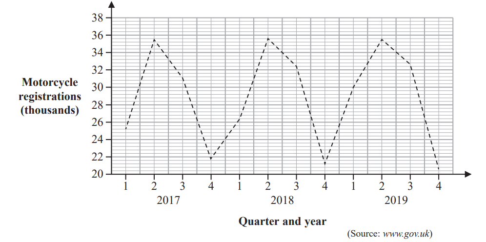
The table and the time series graph give some information about the numbers of visits abroad (in millions) made by UK residents for the years 2013 to 2015.

Year

Quarter

Number of visits (millions)

4-point moving average (millions)

2013

1

10.2

2

15.9

3

20.1

14.45

4

11.6

14.55

2014

1

10.6

14.75

2

16.7

14.85

3

20.5

15.00

4

12.2

15.225

2015

1

11.5

15.55

2

18.0

16.00

3

22.3

4

13.4

(Source: Office for National Statistics)

The last 4-point moving average is missing from the table and from the time series graph.

(i) Calculate this 4-point moving average. Write your answer in the table.

(ii) Plot this 4-point moving average on the time series graph.

1b
1 mark
Line graph depicting quarterly visits in millions from 2013 to 2015, with peaks in Q2 2013, Q3 2014, and Q3 2015, and lowest in Q1 2014.

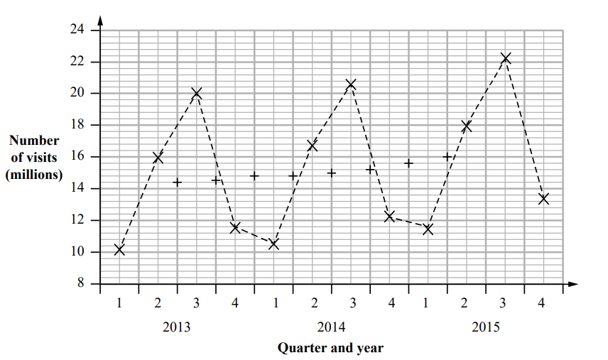
For which quarter was the number of visits abroad by UK residents the greatest?

1c
2 marks

Describe and interpret the trend in the number of visits abroad made by UK residents for the years 2013 to 2015

1d
2 marks

Compare and interpret the seasonal variation for each quarter in the number of visits abroad made by UK residents for the years 2013 to 2015

2a
3 marks

Diane recorded the number of hours that she watched television each day last week.

Monday

Tuesday

Wednesday

Thursday

Friday

Saturday

Sunday

Number of hours

2

1

2

0

4

6

6

Draw a line graph for this data.

Label each axis.

Blank line graph with a horizontal axis labelled Monday to Sunday and a vertical axis numbered 0 to 7, both with gridlines for plotting data.
2b
Sme Calculator
2 marks

Calculate the mean number of hours.

2c
2 marks

Find the median.

2d
2 marks

Noah recorded the number of hours that he watched television each day last week.

He calculated the mean and the median of his results.

Mean

Median

Number of hours

4

1

Use your answers to part (b) and part (c) to compare the average amount of television watched by Diane and by Noah last week.

3a
Sme Calculator
2 marks

The time series graphs show information about the numbers of students taking A Level Physics and A Level French in each of the years from 2008 to 2016

Line graph showing A Level Physics student numbers rising from 2008 to 2016, while A Level French student numbers decline over the same period.

Work out an estimate for the difference in the number of students taking A Level Physics and the number of students taking A Level French in the year 2008

3b
1 mark

Explain why the answer to part (a) is an estimate.

3c
1 mark

Describe the trend in the number of students taking A Level French from 2008 to 2016

3d
1 mark

Alizee is going to give a presentation to students at a school. She wants to show her target audience that Physics is the most popular subject at A Level.

Explain whether or not it would be appropriate for Alizee to use the time series graph to show this.

3e
1 mark

Ivan is going to give a presentation to students at a school. He wants to show his target audience that the number of students taking A Level Physics is decreasing.

Explain how Ivan can use information from the time series graph to show this.

3f
2 marks

Lionel wants to use the time series graphs to predict the number of students taking A Level Physics and the number of students taking A Level French in 2020

Discuss whether or not it would be appropriate to do so.

4a
2 marks

The tables show information about the number of episodes and viewing figures for two television programs, Emmerdale and Eastenders, for the years 2015 to 2018

Emmerdale

Total number of episodes

Highest viewing figure (millions)

Lowest viewing figure (millions)

Year

2015

291

6.53

4.04

2016

308

8.03

4.95

2017

302

7.54

5.01

2018

119

7.72

5.72

Eastenders

Total number of episodes

Highest viewing figure (millions)

Lowest viewing figure (millions)

Year

2015

209

9.87

5.43

2016

210

9.47

4.83

2017

209

8.41

4.19

2018

206

7.81

4.56

(i) In which of these years did Eastenders have its greatest number of episodes?

(1)

(ii) What was the highest viewing figure for Emmerdale between 2015 and 2018?

................... million

(1)

4b
1 mark

Explain why the viewing figures in the table may not be accurate.

4c
Sme Calculator
2 marks

Compare the number of episodes for Emmerdale in 2016 with the number of episodes for Eastenders in 2016
Give a reason for your answer.

4d
2 marks

The incomplete graph shows the highest viewing figures for Emmerdale and for Eastenders between 2015 and 2018

Use the values for the highest viewing figures for Emmerdale from the table to complete the graph.

Line graph showing the highest TV viewing figures for Emmerdale and EastEnders from 2015 to 2018, ranging from 7 to 10 million viewers.
4e
1 mark

Describe the trend for the highest viewing figures for Eastenders between 2015 and 2018

5a
1 mark

The table shows the average heights, to the nearest cm, of Adult Males and Adult Females who were born in the year 1996 in some countries of the world.

Country

Average height 9cm)

Adult Males

Adult Females

Philippines

163

150

Latvia

181

170

Italy

178

165

Zimbabwe

169

158

Australia

180

166

Write down the average height of Adult Males in Italy.

5b
1 mark

Write down the country in the table in which the Adult Females have the greatest average height.

5c
2 marks

Afzal thinks that the country in the table with the greatest difference in average heights between Adult Males and Adult Females is Italy.

Is Afzal correct?
Give a reason for your answer.

5d
2 marks

Using the table, compare the average height of Adult Males in Australia, with the average height of Adult Males in Zimbabwe.

5e
1 mark

Afzal suggests drawing a time series graph to represent the data in the table.

Explain whether or not this is an appropriate graph to use.

6a
1 mark

Claire is investigating sales of different types of vehicle over time.
She plans to collect data on the numbers of motorcycles first registered in the UK over time.

Write down a suitable hypothesis for this investigation.

6b
2 marks

The time series graph shows some information about the numbers of motorcycles first registered in the UK from 2017 to 2019

Line graph showing UK motorcycle registrations from 2017 to 2019, peaking in Q2 each year and dropping to a low in Q4. Data source: gov.uk.

Identify and interpret one example of seasonal trend shown by the time series graph.

6c
1 mark

Claire calculated 4-point moving averages for the information shown in the time series graph.

Explain why this is appropriate.

6d
1 mark

Claire also collected data on the numbers of cars first registered in the UK from 2017 to 2019

The time series graph shows some information about the numbers of cars first registered in the UK from 2017 to 2019 together with the first seven 4-point moving averages.

Line graph showing UK car registrations from 2017 to 2019 in thousands, displaying fluctuating trends across quarters, data from gov.uk.

Compare the seasonal trend shown for the numbers of motorcycles first registered in the UK with the seasonal trend for the numbers of cars first registered in the UK.

6e
3 marks

The last three 4-point moving averages (thousands) for the number of cars registered in the UK from 2017 to 2019 are

576.0 575.3 573.9

Plot these three moving averages on the time series graph and draw a trend line.

6f
2 marks

Describe and interpret the trend in the numbers of cars first registered in the UK from 2017 to 2019