Using Summary Statistics (Edexcel GCSE Statistics: Foundation): Exam Questions

Exam code: 1ST0

2 hours18 questions
1a
2 marks

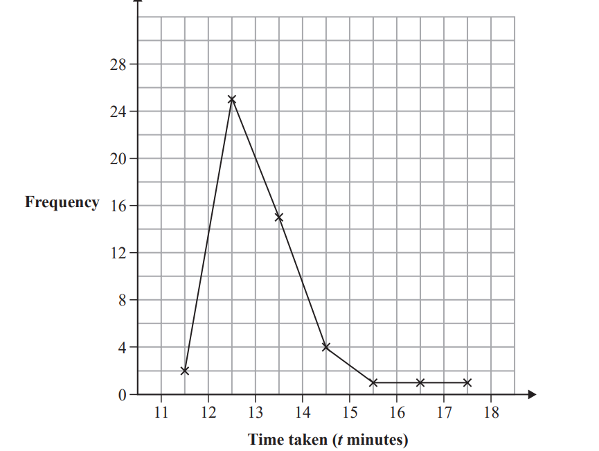
Richard works in an animal rescue centre.

Richard has collected data on the weights, in kilograms, of 10 male cats and the weights, in kilograms, of 10 female cats at the centre.

1

2

3

4

5

6

7

8

9

10

Male

3.0

3.2

3.3

3.5

3.6

3.8

3.9

4.2

4.4

4.9

Female

3.0

3.1

3.1

3.2

3.3

3.3

3.5

3.7

3.9

9.5

Richard wants to compare the average weight of the male cats with the average weight of the female cats.

Richard thinks that he should use either the mean or the median.

Which one of the mean or the median do you think he should use?
Give a reason for your answer.

1b
2 marks

Richard plans to use a scatter diagram in order to compare the weights of the male cats with the weights of the female cats.

Discuss whether or not a scatter diagram would be a suitable diagram to use.

2a
2 marks

The incomplete multiple bar chart shows information about the numbers of UK films first shown in 2013 and in 2014 for some types of film.

Bar chart shows frequency of five film types in 2013 and 2014. Documentaries had highest frequency both years; thrillers and actions were least frequent.

9 UK action films were first shown in 2013

7 UK action films were first shown in 2014

Complete the multiple bar chart.

2b
1 mark

The number of UK films first shown in 2013 was 17 for two types of film.

Which two types of film?

2c
1 mark

Work out the total number of drama films that were first shown in these two years.

2d
2 marks

Compare the numbers of UK films of the different types that were first shown in 2013 with those first shown in 2014

2e
1 mark

Explain why it would not be appropriate to display the information from the multiple bar chart in a time series graph.

3
Sme Calculator
1 mark

The table shows information about the ages, when elected, of French presidents and UK prime ministers for the years 1850 to 2015

Lowest value

Lower quartile

Median

Upper quartile

Highest value

French presidents

40

53

60.5

65

74

UK prime ministers

43

53

56.5

63

70

(Source: Wikipedia)

Compare and interpret the spread of ages of French presidents with UK prime ministers for the years 1850 to 2015

4a
3 marks

Diane recorded the number of hours that she watched television each day last week.

Monday

Tuesday

Wednesday

Thursday

Friday

Saturday

Sunday

Number of hours

2

1

2

0

4

6

6

Draw a line graph for this data.

Label each axis.

Blank line graph with a horizontal axis labelled Monday to Sunday and a vertical axis numbered 0 to 7, both with gridlines for plotting data.
4b
Sme Calculator
2 marks

Calculate the mean number of hours.

4c
2 marks

Find the median.

4d
2 marks

Noah recorded the number of hours that he watched television each day last week.

He calculated the mean and the median of his results.

Mean

Median

Number of hours

4

1

Use your answers to part (b) and part (c) to compare the average amount of television watched by Diane and by Noah last week.

5a
2 marks

Claire collected data on the weights of the England football team and the weights of the England rugby team from the internet.

She calculated the mean and range of the weights of each team. Her results are shown in this table.

Mean

Range

Football team

77.0 kg

30 kg

Rugby team

104.6 kg

42 kg

(Sources: thefa.com (opens in a new tab) and englandrugby.com (opens in a new tab))

State two possible problems with obtaining data from the internet

5b
3 marks

Use the information in the table to compare the distribution of weights of the England football team with the weights of the England rugby team. Interpret your comparison.

5c
1 mark

Suggest a possible problem with collecting primary data in this situation.

6a
2 marks

27 adults were each asked to count the number of times they could bounce a ball on a bat.

Here are the results.

5

8

13

5

7

23

30

6

21

24

23

22

13

9

12

6

12

34

22

20

35

22

12

16

24

13

12

Complete the stem and leaf diagram for this information.

Graph with horizontal lines numbered 0-3 on the left. Key box reads: "0 | 5 represents 5 bounces" at the bottom left.
6b
Sme Calculator
2 marks

Work out the interquartile range of the results.

6c
3 marks

The median of the results for 27 children is 9.

The interquartile range of the results for these children is 6.

Alex thinks these results show that adults are better than children at bouncing a ball on a bat.

Do you agree with Alex?
You must give reasons for your answer.

7a
2 marks

The tables show information about the number of episodes and viewing figures for two television programs, Emmerdale and Eastenders, for the years 2015 to 2018

Emmerdale

Total number of episodes

Highest viewing figure (millions)

Lowest viewing figure (millions)

Year

2015

291

6.53

4.04

2016

308

8.03

4.95

2017

302

7.54

5.01

2018

119

7.72

5.72

Eastenders

Total number of episodes

Highest viewing figure (millions)

Lowest viewing figure (millions)

Year

2015

209

9.87

5.43

2016

210

9.47

4.83

2017

209

8.41

4.19

2018

206

7.81

4.56

(i) In which of these years did Eastenders have its greatest number of episodes?

(1)

(ii) What was the highest viewing figure for Emmerdale between 2015 and 2018?

................... million

(1)

7b
1 mark

Explain why the viewing figures in the table may not be accurate.

7c
Sme Calculator
2 marks

Compare the number of episodes for Emmerdale in 2016 with the number of episodes for Eastenders in 2016
Give a reason for your answer.

7d
2 marks

The incomplete graph shows the highest viewing figures for Emmerdale and for Eastenders between 2015 and 2018

Use the values for the highest viewing figures for Emmerdale from the table to complete the graph.

Line graph showing the highest TV viewing figures for Emmerdale and EastEnders from 2015 to 2018, ranging from 7 to 10 million viewers.
7e
1 mark

Describe the trend for the highest viewing figures for Eastenders between 2015 and 2018

8a
1 mark

A basketball team played 9 matches at the start of a season.

The total number of points they scored in each match is listed below.

80

64

87

64

42

81

89

138

68

Here are some words used to describe data.

grouped    discrete    categorical    continuous

Select a word from the list to complete the sentence.

The total number of points scored in a match is an example of ___________ data.

8b
2 marks

Work out the median score for these 9 matches.

8c
1 mark

Give one advantage of using the median to summarise this data.

8d
Sme Calculator
2 marks

Work out the range of points for these 9 matches.

8e
4 marks

The median and range for the final 9 matches of the season are shown in the table below.

Median

Range

90

25

Use your answers to part (b) and part (d) to compare the performance of the basketball team in the first 9 matches with the performance in the final 9 matches.

Give two comparisons and interpret both in context.

9a
Sme Calculator
2 marks

The time taken, in minutes, for some runners to complete a 5 km run was recorded. The incomplete histogram and incomplete grouped frequency table give information about the times taken, in minutes, for these runners to complete the 5 km run.

Bar chart showing frequency of run times for 5km: 15-20 min has lowest, 20-25 highest, 25-30 medium, 30-35 lower, and 35-40 lowest.

Time taken to run 5 km (t minutes)

Frequency

15 less than t less or equal than 20

5

25

25 less than t less or equal than 30

30 less than t less or equal than 35

4

35 less than t less or equal than 40

3

(Source: www.parkrun.org.uk (opens in a new tab))

Use the information in the histogram to complete the table.

9b
Sme Calculator
2 marks

Estimate the number of runners that took less than or equal to 23 minutes to complete the race.

9c
2 marks

Identify and interpret the skew shown on the histogram.

10a
2 marks

Ben is researching information about the number of British swimming medals won at the Olympics.

Here are his results, giving the number of British swimming medals won at the Olympics from 1900 to 2016

3

0

7

6

2

4

4

2

0

1

1

2

3

1

1

1

3

5

5

3

1

2

0

2

3

3

6

(Source: www.teamgb.com (opens in a new tab))

Fill in the tally chart for Ben’s results and complete the frequency column.

Number of Olympic medals won

Tally

Frequency

0

1

2

3

4

5

6

7

10b
1 mark

Suggest a suitable diagram that could be used for Ben’s results.

10c
1 mark

Write down the mode or modes.

10d
2 marks

Work out the median.

10e
2 marks

Ben wants to use an average to summarise the data.

Which of the mode or the median would be more appropriate?
Give a reason for your answer.

11a
2 marks

Ana collected information about the Scottish Football Championship results for the 2021/2022 season.

The composite bar chart gives some information about the number of points scored by nine of the teams.

Points are scored from wins or draws.

Bar chart showing football teams' points from wins and draws. Arbroath leads, followed by Inverness CT and Kilmarnock. Points range from 10 to 64.

Raith Rovers scored 36 points from wins and 14 points from draws.

Complete the composite bar chart for Raith Rovers.

11b
1 mark

What does the overall height of each bar represent?

11c
3 marks

Compare the points scored by Dunfermline Athletic with the points scored by Queen of the South.

12a
1 mark

Some researchers investigated the hand span, in centimetres, of adult pianists by their level – international, national and amateur.

The box plots below give information about the hand spans for national level and amateur level pianists.

Box plot comparing hand spans at amateur, national, and international levels, ranging from 16 to 28 cm, with sources cited below the graph.

Circle the word in the list below that describes hand span, in centimetres, as a type of data.

qualitative     ordinal     continuous     bivariate

12b
3 marks

The table gives information about the hand spans of the international level pianists.

Greatest hand span

27.4 cm

Median hand span

23.9 cm

Lower quartile

23.2 cm

Range

5.1 cm

Interquartile range

1.1 cm

Using the information in the table, draw on the grid above a box plot for the hand spans of the international level pianists.

12c
5 marks

Compare the three distributions of hand spans.
Give three comparisons and interpret two of your comparisons.

12d
Sme Calculator
3 marks

Pavel owns a music shop.
He wants to investigate the keyboard sizes used by pianists with different hand spans.
He collects data about the hand spans of the pianists who use his shop.

The table gives information about the number of these pianists with hand spans in each of four size categories.

Hand span (cm)

A
(less than 19)

B
(19 ≤ span < 22)

C
(22 ≤ span < 24)

D
(24 or more)

Number of pianists

24

65

57

14

Pavel plans to sample 20 of these pianists stratified by hand span size.

Explain how Pavel can obtain his stratified sample.
You should include details of any calculations he should use.

13a
1 mark

The table shows the average heights, to the nearest cm, of Adult Males and Adult Females who were born in the year 1996 in some countries of the world.

Country

Average height 9cm)

Adult Males

Adult Females

Philippines

163

150

Latvia

181

170

Italy

178

165

Zimbabwe

169

158

Australia

180

166

Write down the average height of Adult Males in Italy.

13b
1 mark

Write down the country in the table in which the Adult Females have the greatest average height.

13c
2 marks

Afzal thinks that the country in the table with the greatest difference in average heights between Adult Males and Adult Females is Italy.

Is Afzal correct?
Give a reason for your answer.

13d
2 marks

Using the table, compare the average height of Adult Males in Australia, with the average height of Adult Males in Zimbabwe.

13e
1 mark

Afzal suggests drawing a time series graph to represent the data in the table.

Explain whether or not this is an appropriate graph to use.

14a
1 mark

David asked 15 of his friends about the number of pets they each have. Here is the data he collected.

0   0   0   0   0   1   1   2   2   2   4   4   4   4   8

Choose the word in the list below that describes this type of data.

  • continuous

  • qualitative

  • discrete

  • grouped

14b
1 mark

Write down the modal number of pets.

14c
1 mark

Find the median number of pets.

14d
1 mark

State which average, the mode or the median, best represents these data. Give a reason for your answer.

14e
1 mark

Find the interquartile range of the number of pets.

14f
4 marks

Wanda asked some of her friends about the number of pets they each have.

The table below is a summary of the data she collected.

Lower quartile

Median

Upper quartile

1

3

6

Compare the distribution of the numbers of pets for David with the distribution of the numbers of pets for Wanda.

Give two comparisons and interpret each of your comparisons.

14g
1 mark

Wanda recorded the highest number of pets as 15

She says that this must be an outlier and concludes that it should be removed from her data.

(i) Give one reason why Wanda’s conclusion may be appropriate.

[1]

(ii) Give one reason why Wanda’s conclusion may not be appropriate.

[1]

15a
1 mark

Kyle is investigating the heights and the weights of professional basketball players.

He found the weight, in kilograms, of some professional basketball players from 1950 to 1959

Choose the word in the list below that describes weight, in kilograms, as a type of data.

  • discrete

  • continuous

  • ordinal

  • categorical

15b
2 marks

The incomplete histogram and incomplete grouped frequency table give information about the weights, in kilograms, of the professional basketball players from 1950 to 1959

Histogram displaying weight distribution in kilograms, ranging from 60 to 120. Peaks between 80-90 kg. Frequency is plotted on the y-axis. Source: kaggle.com.

Weight (w kilograms)

Frequency

65 less than w less or equal than 70

5

70 less than w less or equal than 75

15

75 less than w less or equal than 80

61

80 less than w less or equal than 85

81

85 less than w less or equal than 90

___

90 less than w less or equal than 95

___

95 less than w less or equal than 100

35

100 less than w less or equal than 105

14

105 less than w less or equal than 110

9

110 less than w less or equal than 115

1

Use the information in the histogram to complete the table.

15c
2 marks

Use the information in the table to complete the histogram.

15d
1 mark

Kyle also drew a histogram for the weights of professional basketball players from 2000 to 2009
This histogram was negatively skewed.

Interpret the negative skew of the weights of professional basketball players from 2000 to 2009

15e
4 marks

Kyle also collected data about the heights of professional basketball players from 1950 to 1959 and the heights of professional basketball players from 2000 to 2009

The grouped frequency table below gives information about the heights of professional basketball players from 2000 to 2009

Height (h centimetres)

Frequency

170 less than h less or equal than 180

12

180 less than h less or equal than 190

146

190 less than h less or equal than 200

175

200 less than h less or equal than 210

323

210 less than h less or equal than 220

146

220 less than h less or equal than 230

8

Total

810

The estimate of the mean height for professional basketball players from 1950 to 1959 is calculated to be 190.9cm to one decimal place.

(i) Calculate an estimate of the mean height of basketball players from 2000 to 2009

....................................................... cm

[3]

(ii) Comment on how the mean height of professional basketball players has changed between the two sets of data.

[1]

16a
2 marks

Norbert asked each of the students in his class to name their favourite fruit from Apple, Banana, Orange or Pear.

The results are shown below.

Banana

Orange

Apple

Banana

Pear

Apple

Apple

Banana

Orange

Pear

Apple

Banana

Apple

Apple

Apple

Orange

Apple

Pear

Banana

Banana

Fill in the tally chart for this information and complete the frequency column.

Fruit

Tally

Frequency

Apple


Banana


Orange


Pear


16b
1 mark

How many students are in the class?

16c
1 mark

Find the probability that this student’s favourite fruit is Orange.

16d
1 mark

Compare the number of students whose favourite fruit is Apple to the number of students whose favourite fruit is Pear.

16e
1 mark

Norbert decides to find the favourite fruit that is the mode.

Explain why the mode is an appropriate average for Norbert to find for this type of data.

16f
1 mark

Give one advantage of the tally chart over the raw data.

16g
1 mark

Norbert wants to draw a diagram to represent his results.

Choose the type of diagram from the list below that is most suitable for him to draw.

  • Scatter diagram

  • Bar chart

  • Line graph

  • Time series

17a
2 marks

Sam used the internet to collect the times, in minutes, it took for 50 cyclists to compete in a hill climb competition. He used a group frequency table to record the results he collected.

(i) Give one advantage of using grouped data rather than raw data.

[1]

(ii) Give one disadvantage of using grouped data rather than raw data.

[1]

17b
1 mark

Sam used this grouped frequency table to show the results for the hill climb.

Time (t minutes)

Frequency

11 less or equal than t less than 12

2

12 less or equal than t less than 13

25

13 less or equal than t less than 14

15

14 less or equal than t less than 15

4

15 less or equal than t less than 16

1

16 less or equal than t less than 17

1

17 less or equal than t less than 18

1

(Source: cyclinguphill.com (opens in a new tab))

Before Sam collected the data he did not know what the longest time would be. The longest time in the hill climb was 28.3 minutes.

Explain why this table cannot be used to show the data for all 50 riders.

17c
1 mark

Sam drew this frequency polygon for the hill climb results.

Line graph showing frequency versus time taken in minutes, peaking at 24 frequency for 13 minutes, then declining to 2 frequency by 17 minutes.

Sam decided not to include the value of 28.3 minutes on his frequency polygon.

Suggest a reason why Sam’s decision might be appropriate.

17d
2 marks

(i) Describe the skew of the distribution

[1]

(ii) Interpret the skew of the distribution in context.

[1]

18
5 marks

Logan is investigating the heights of male adult giraffes and the heights of female adult giraffes.

He records the height, in metres, of each of a sample of male adult giraffes and the height, in metres, of each of a sample of female adult giraffes.

He draws the box plot below for the recorded heights of the male adult giraffes.

Box plot of male adult giraffe height in metres, showing a range from 4.5 to 6.5, with median at 5.8 and interquartile range from 5.2 to 6.1.

The table gives information about the recorded heights of the female adult giraffes.

Summary statistic

Mean

Median

Minimum

Maximum

Lower quartile

Upper quartile

Height (metres)

4.8

4.9

3.9

5.9

4.2

5.4

Logan makes the following two conclusions.

  1. Male adult giraffes are generally taller than female adult giraffes.

  2. The heights of the female adult giraffes are more consistent than the heights of the male adult giraffes.

Assess Logan’s two conclusions.
You should show clearly the values of any statistics you use in your answer.