Graphs & Diagrams (SQA National 5 Geography): Revision Note
Exam code: X833 75

Written by: Bridgette Barrett
Updated on
Interpreting and presenting graphs
Examiner Tips and Tricks
Graphs will be part of the exam, and you will be expected to describe and interpret them. You will also use graphs in your fieldwork assignment. The information below outlines the strengths and limitations of each type of graph so you can judge where best to use them.
Types of data
Continuous data is numerical data that can take any value within a given range, e.g. heights and weights
Discrete data is numerical data that can only take certain values, e.g. shoe size
Quantitative data is where the results can be expressed using numerical values
Qualitative data is where the results can’t be expressed as numbers, e.g. opinions
Line graph
One of the simplest ways to display continuous data
Both axes are numerical and continuous
Used to show changes over time and space
Strengths | Limitations |
|---|---|
|
|
Example
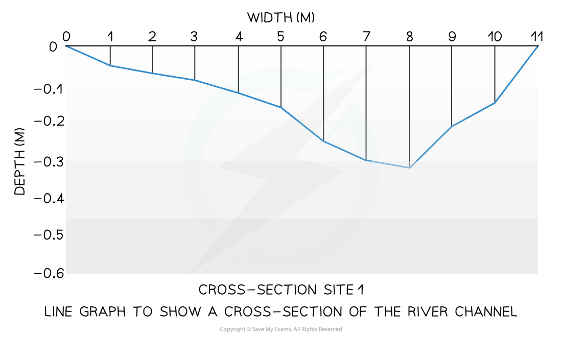
A river cross-section is a particular form of line graph because it is not continuous data, but the plots can be joined to show the shape of the river channel
Bar chart
A bar chart is the simplest form of displaying data
Each bar is the same width but can have varying lengths
Each bar is drawn an equal distance apart (equidistant)
The data is discrete data
Bar graphs are useful for:
Comparing classes or groups of data
Changes over time
Strengths | Limitations |
|---|---|
|
|
Example

Worked Example
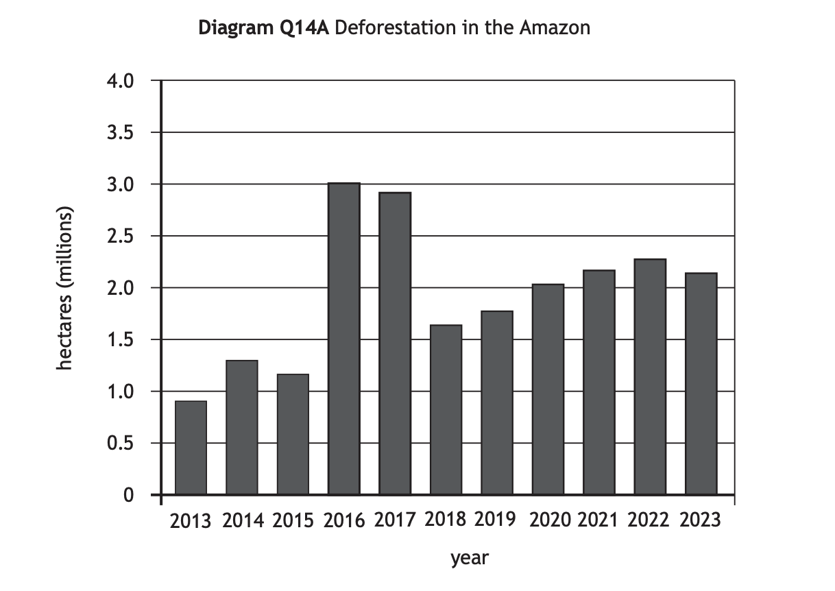
Study Diagram Q14A. Describe, in detail, the changes in deforestation in the Amazon.
[4 marks]
Answer
Overall, deforestation has increased. [1] Between 2014 and 2016 it increased by 1.7 million hectares. [1] Whereas between 2017 and 2018 deforestation decreased by 1.4 milllion hectares. [1] It then increased again between 2013 and 2023 by 1.2 million hectares. [1]
Examiner Tips and Tricks
When describing a graph, start with the overall trend, is it:
Increasing
Decreasing
Fluctuating
Then look for the most significant changes. What is highest/lowest? Where/when have the biggest changes happened?
Don't forget to include figures in your answer.
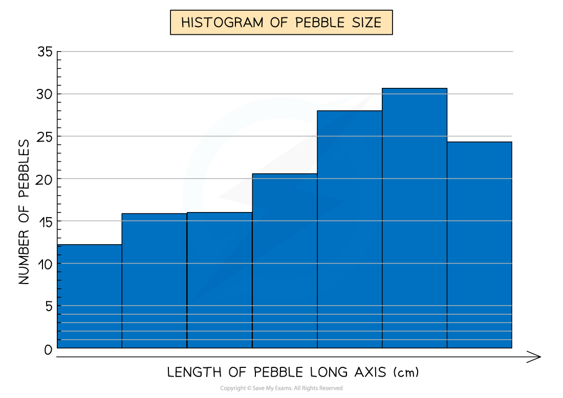
Histograms
Histograms show continuous data
Always use a ruler to draw the bars
All bars should be the same width
The top of the bar should reach the number on the side of the graph that is being represented
There should be no gaps; all bars should be touching
Ensure all axes are labelled and that the graph has a title
Strengths | Limitations |
|---|---|
|
|
Example
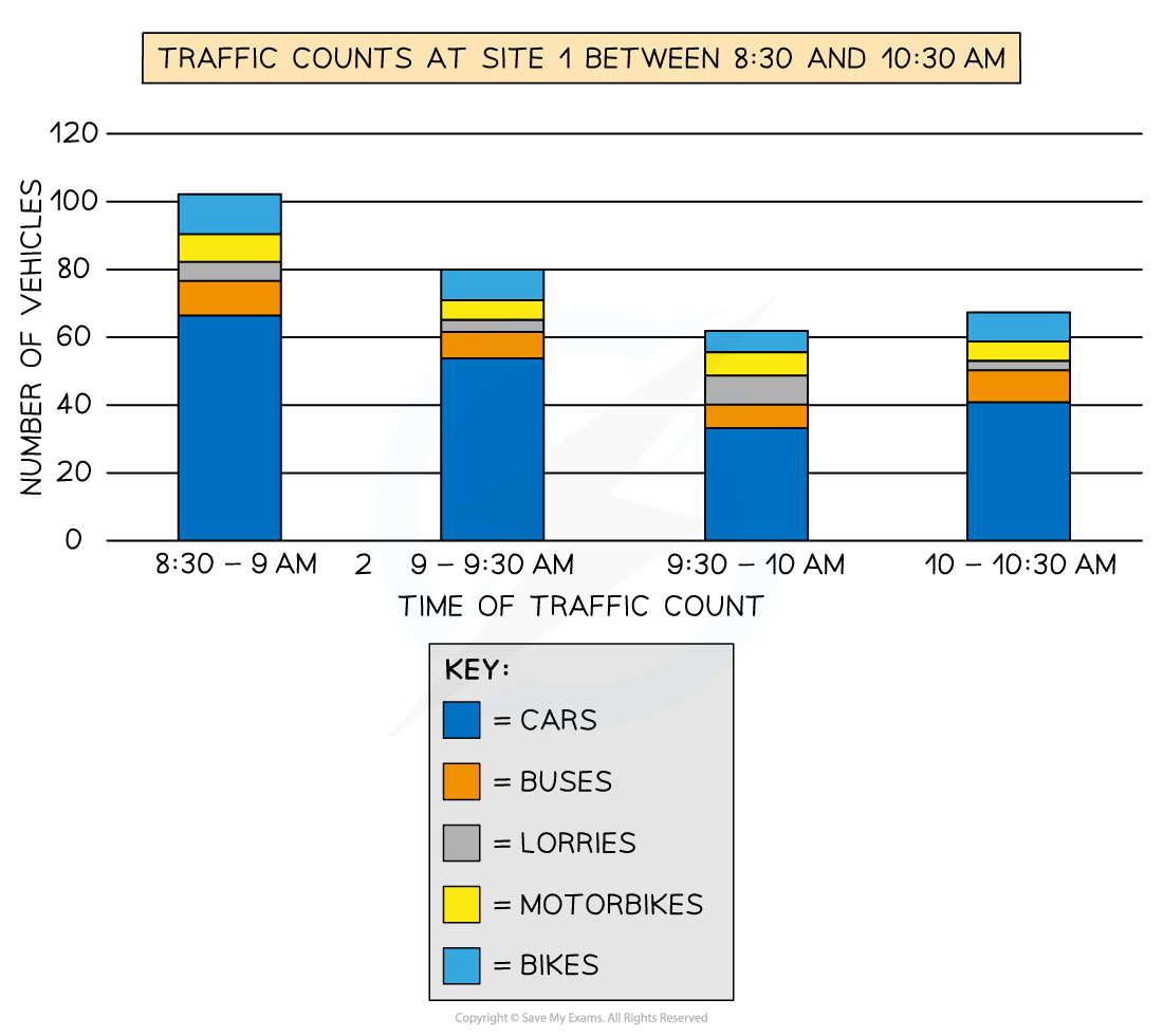
Compound or divided bar chart
The bars are subdivided to show the information, with all bars totalling 100%
Divided bar charts show a variety of categories
They can show percentages and frequencies
Strengths | Limitations |
|---|---|
|
|
Example
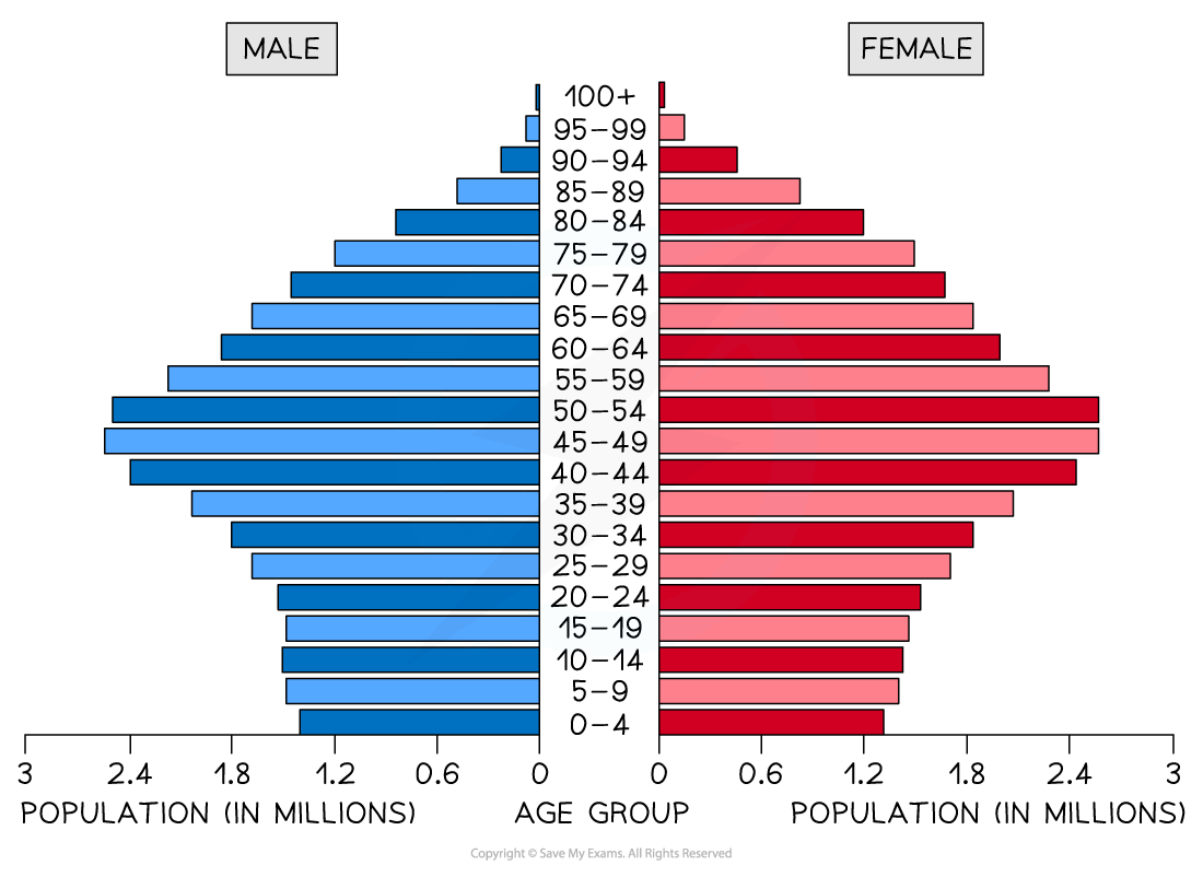
Population pyramid
This is a type of histogram
Used to show the age-sex of a population
It can be used to show the structure of an area/country
Patterns are easy to identify
Strengths | Limitations |
|---|---|
|
|
Example
Worked Example
Study Diagram Q9.
Give reasons for the differences between the population structures of Italy and Mozambique.
You should refer to both birth rates and death rates in your answer.
[6 marks]
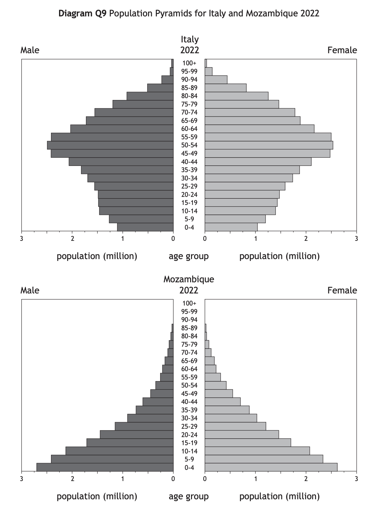
Answer
Birth rates are higher in Mozambique, where many women lack health education [1] and there is less access to contraception. [1] Families in Mozambique may be larger as they need children to work to help support the family [1] or to care for parents in their old age because there is less access to pensions. [1] In Italy there is a longer life expectancy due to better access to health care [1] and better diets. [1]
Pie chart
Used to show proportions, the area of the circle segment represents the proportion
A pie chart can also be drawn as a proportional circle
Pie charts can be located on maps to show variations at different sample sites
The percentage of the pie chart must add up to 100%
To calculate degrees of the pie chart (which totals 360°), divide the percentage by 100 and then multiply by 360
Each segment should be a different colour
Strengths | Limitations |
|---|---|
|
|
Example

Examiner Tips and Tricks
To work out the percentage increase/decrease, work out the difference between the two numbers, divide the difference by the first number, then multiply this number by 100.
For example, the difference between 37 and 43 is 6. Then 6 / 37 x 100 = 16.21.
The percentage increase is therefore 16.21%.
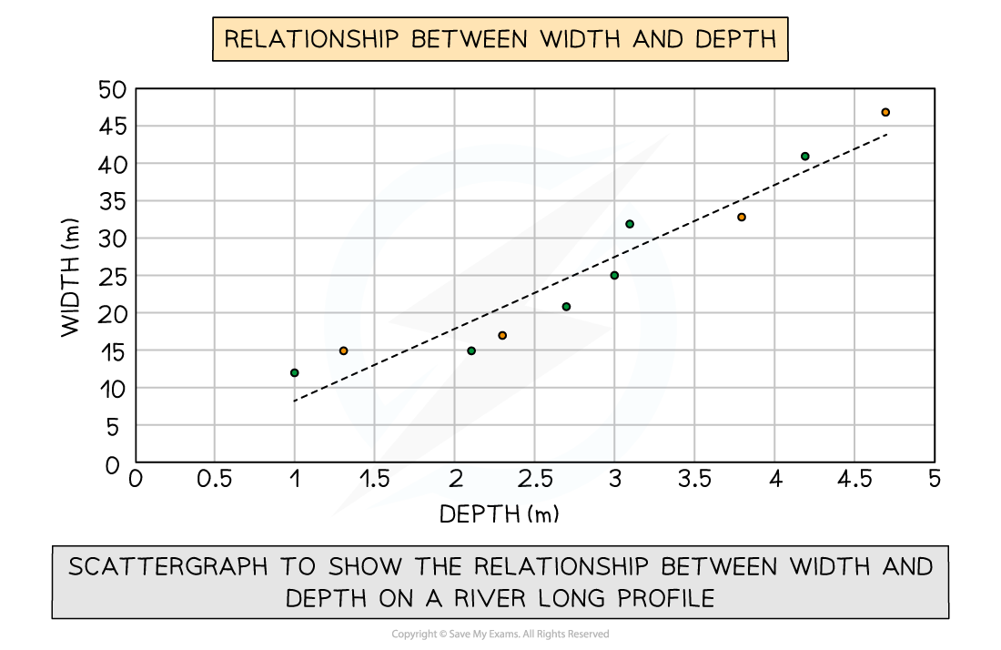
Scatter graph
Points should not be connected
The best fit line can be added to show the relations
Used to show the relationship between two variables
In a river study, they are used to show the relationship between different river characteristics, such as the relationship between the width and depth of the river channel
Strengths | Limitations |
|---|---|
|
|
Example
Types of correlation
Positive correlation
As one variable increases, so too does the other
The line of best fit goes from bottom left to top right of the graph
Negative correlation
As one variable increases, the other decreases
The line of best fit goes from the top left to the bottom right of the graph
No correlation
Data points will have a scattered distribution
There is no relationship between the variables


Unlock more, it's free!
Join the 100,000+ Students that ❤️ Save My Exams
the (exam) results speak for themselves:

Was this revision note helpful?