Interpreting Marketing Data (AQA AS Business): Revision Note
Exam code: 7131

Interpreting graphs and charts
Data contained in graphs and charts can be important sources of marketing research
Data may be presented in a range of forms
Bar charts
Bar charts show data that are independent of each other, such as sales per store
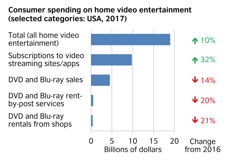
(Source: British Council (opens in a new tab))
Pie charts
Pie charts show how a whole is divided into different elements, such as total sales divided amongst different product types
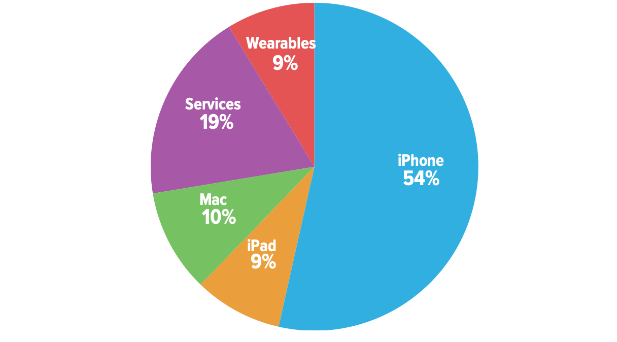
(Source: Six Colours (opens in a new tab))
Scatter graphs
Scatter graphs allow businesses to compare two variables, such as sales volume and advertising, to establish if there is any correlation between them
Infographics
Infographics are easy-to-understand visual representations of data

Correlation
A correlation exists where there is a relationship or connection between two variables
A positive correlation means that as one variable increases, so does the other variable
A line of best fit that slopes upwards can be identified
A negative correlation means that as one variable increases, the other variable decreases
A line of best fit that slopes downwards can be identified
No correlation means that there is no connection between the two variables
It is not possible to identify a line of best fit
Diagrams of correlation types
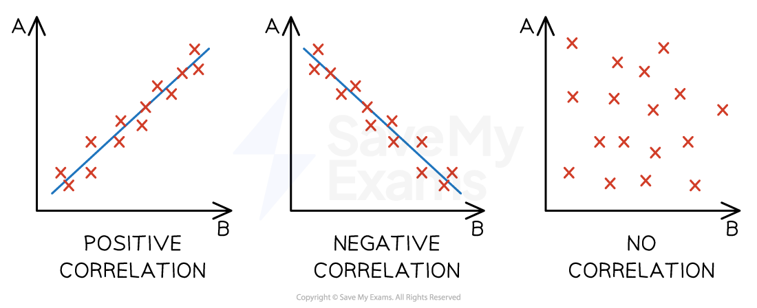
Correlation does not always indicate a relationship or causation between two sets of variables
Businesses must conduct research to determine whether a relationship exists and the strength of that relationship
Examiner Tips and Tricks
When you forecast sales, use historic data to spot the trend, then project it forward — that’s extrapolation
Don’t confuse this with correlation, which only shows a link between two variables
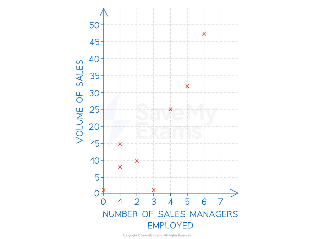
Extrapolation
Extrapolation is the assumption that what has happened in the past will be the same as what will happen in the future
Where a line of best fit can be identified and when causation is determined, a business can extrapolate data to make predictions around changes to either of the variables
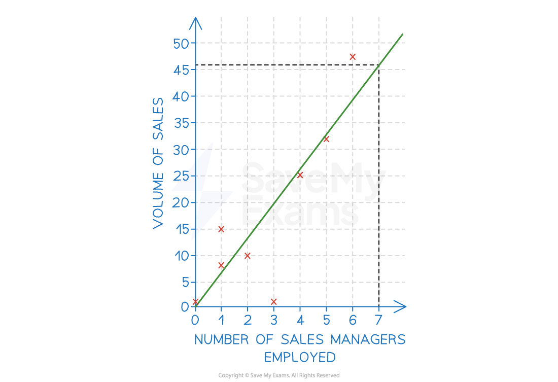
E.g. extrapolation of the line of best fit in the example below means that the business could predict that employing seven sales managers would likely result in sales of 46 units
Extrapolation using a line of best fit
Examiner Tips and Tricks
When drawing a line of best fit, you should try to include as many data points above the line as below the line
Watch out for outlying data — if there is more than one outlier above the line, adjust your line of best fit upwards
Similarly, if there is more than one outlier below the line, adjust your line of best fit downwards. Just one outlier should not influence your line of best fit
Confidence intervals
The confidence level is the amount of certainty a business can have that its marketing research data results are accurate
E.g. a 95% confidence level means that if the same survey were repeated 20 times, the results would be the same on 19 occasions
The confidence interval is the range of values possible for a given confidence level
E.g. a 98% confidence level that the level of sales will be somewhere between £1.2m and £1.3m
Examples of confidence intervals
The Office for Budget Responsibility (OBR) publishes regular predictions of economic performance, such as GDP growth, inflation and interest rates
Here is the actual GDP growth from 2015 to 2024, with a prediction of UK GDP growth up to 2029
The lighter the shading, the more confident the OBR is that the actual level of GDP growth will fall between these values
In this case, the OBR is 100% certain that GDP growth will be between -2.9% and 5.8% in 2029
The confidence interval is
format('truetype')%3Bfont-weight%3Anormal%3Bfont-style%3Anormal%3B%7D%3C%2Fstyle%3E%3C%2Fdefs%3E%3Ctext%20font-family%3D%22math1b1be7c3362b8e59490dedc5e28%22%20font-size%3D%2216%22%20text-anchor%3D%22middle%22%20x%3D%228.5%22%20y%3D%2216%22%3E%3D%3C%2Ftext%3E%3Ctext%20font-family%3D%22Times%20New%20Roman%22%20font-size%3D%2218%22%20text-anchor%3D%22middle%22%20x%3D%2225.5%22%20y%3D%2216%22%3E5%3C%2Ftext%3E%3Ctext%20font-family%3D%22math1b1be7c3362b8e59490dedc5e28%22%20font-size%3D%2216%22%20text-anchor%3D%22middle%22%20x%3D%2232.5%22%20y%3D%2216%22%3E.%3C%2Ftext%3E%3Ctext%20font-family%3D%22Times%20New%20Roman%22%20font-size%3D%2218%22%20text-anchor%3D%22middle%22%20x%3D%2239.5%22%20y%3D%2216%22%3E8%3C%2Ftext%3E%3Ctext%20font-family%3D%22Times%20New%20Roman%22%20font-size%3D%2218%22%20text-anchor%3D%22middle%22%20x%3D%2252.5%22%20y%3D%2216%22%3E%25%3C%2Ftext%3E%3Ctext%20font-family%3D%22math1b1be7c3362b8e59490dedc5e28%22%20font-size%3D%2216%22%20text-anchor%3D%22middle%22%20x%3D%2273.5%22%20y%3D%2216%22%3E%26%23x2212%3B%3C%2Ftext%3E%3Ctext%20font-family%3D%22math1b1be7c3362b8e59490dedc5e28%22%20font-size%3D%2216%22%20text-anchor%3D%22middle%22%20x%3D%2294.5%22%20y%3D%2216%22%3E%26%23x2212%3B%3C%2Ftext%3E%3Ctext%20font-family%3D%22Times%20New%20Roman%22%20font-size%3D%2218%22%20text-anchor%3D%22middle%22%20x%3D%22107.5%22%20y%3D%2216%22%3E2%3C%2Ftext%3E%3Ctext%20font-family%3D%22math1b1be7c3362b8e59490dedc5e28%22%20font-size%3D%2216%22%20text-anchor%3D%22middle%22%20x%3D%22114.5%22%20y%3D%2216%22%3E.%3C%2Ftext%3E%3Ctext%20font-family%3D%22Times%20New%20Roman%22%20font-size%3D%2218%22%20text-anchor%3D%22middle%22%20x%3D%22121.5%22%20y%3D%2216%22%3E9%3C%2Ftext%3E%3Ctext%20font-family%3D%22Times%20New%20Roman%22%20font-size%3D%2218%22%20text-anchor%3D%22middle%22%20x%3D%22134.5%22%20y%3D%2216%22%3E%25%3C%2Ftext%3E%3Ctext%20font-family%3D%22math1b1be7c3362b8e59490dedc5e28%22%20font-size%3D%2216%22%20text-anchor%3D%22middle%22%20x%3D%228.5%22%20y%3D%2263%22%3E%3D%3C%2Ftext%3E%3Ctext%20font-family%3D%22math1b1be7c3362b8e59490dedc5e28%22%20font-size%3D%2216%22%20text-anchor%3D%22middle%22%20x%3D%2229.5%22%20y%3D%2263%22%3E%26%23xB1%3B%3C%2Ftext%3E%3Ctext%20font-family%3D%22Times%20New%20Roman%22%20font-size%3D%2218%22%20text-anchor%3D%22middle%22%20x%3D%2241.5%22%20y%3D%2263%22%3E8%3C%2Ftext%3E%3Ctext%20font-family%3D%22math1b1be7c3362b8e59490dedc5e28%22%20font-size%3D%2216%22%20text-anchor%3D%22middle%22%20x%3D%2248.5%22%20y%3D%2263%22%3E.%3C%2Ftext%3E%3Ctext%20font-family%3D%22Times%20New%20Roman%22%20font-size%3D%2218%22%20text-anchor%3D%22middle%22%20x%3D%2255.5%22%20y%3D%2263%22%3E7%3C%2Ftext%3E%3Ctext%20font-family%3D%22Times%20New%20Roman%22%20font-size%3D%2218%22%20text-anchor%3D%22middle%22%20x%3D%2268.5%22%20y%3D%2263%22%3E%25%3C%2Ftext%3E%3C%2Fsvg%3E)
A high confidence level

A lower confidence level
The darker the shading, the less confident the OBR is that the actual level of GDP growth will fall between these values
In this case, the OBR is 80% certain that GDP growth will be between -1.0% and 4.6% in 2029
The confidence interval is
format('truetype')%3Bfont-weight%3Anormal%3Bfont-style%3Anormal%3B%7D%3C%2Fstyle%3E%3C%2Fdefs%3E%3Ctext%20font-family%3D%22math1b1be7c3362b8e59490dedc5e28%22%20font-size%3D%2216%22%20text-anchor%3D%22middle%22%20x%3D%228.5%22%20y%3D%2216%22%3E%3D%3C%2Ftext%3E%3Ctext%20font-family%3D%22Times%20New%20Roman%22%20font-size%3D%2218%22%20text-anchor%3D%22middle%22%20x%3D%2225.5%22%20y%3D%2216%22%3E4%3C%2Ftext%3E%3Ctext%20font-family%3D%22math1b1be7c3362b8e59490dedc5e28%22%20font-size%3D%2216%22%20text-anchor%3D%22middle%22%20x%3D%2232.5%22%20y%3D%2216%22%3E.%3C%2Ftext%3E%3Ctext%20font-family%3D%22Times%20New%20Roman%22%20font-size%3D%2218%22%20text-anchor%3D%22middle%22%20x%3D%2239.5%22%20y%3D%2216%22%3E6%3C%2Ftext%3E%3Ctext%20font-family%3D%22Times%20New%20Roman%22%20font-size%3D%2218%22%20text-anchor%3D%22middle%22%20x%3D%2252.5%22%20y%3D%2216%22%3E%25%3C%2Ftext%3E%3Ctext%20font-family%3D%22math1b1be7c3362b8e59490dedc5e28%22%20font-size%3D%2216%22%20text-anchor%3D%22middle%22%20x%3D%2273.5%22%20y%3D%2216%22%3E%26%23x2212%3B%3C%2Ftext%3E%3Ctext%20font-family%3D%22math1b1be7c3362b8e59490dedc5e28%22%20font-size%3D%2216%22%20text-anchor%3D%22middle%22%20x%3D%2294.5%22%20y%3D%2216%22%3E%26%23x2212%3B%3C%2Ftext%3E%3Ctext%20font-family%3D%22Times%20New%20Roman%22%20font-size%3D%2218%22%20text-anchor%3D%22middle%22%20x%3D%22107.5%22%20y%3D%2216%22%3E1%3C%2Ftext%3E%3Ctext%20font-family%3D%22math1b1be7c3362b8e59490dedc5e28%22%20font-size%3D%2216%22%20text-anchor%3D%22middle%22%20x%3D%22114.5%22%20y%3D%2216%22%3E.%3C%2Ftext%3E%3Ctext%20font-family%3D%22Times%20New%20Roman%22%20font-size%3D%2218%22%20text-anchor%3D%22middle%22%20x%3D%22121.5%22%20y%3D%2216%22%3E0%3C%2Ftext%3E%3Ctext%20font-family%3D%22Times%20New%20Roman%22%20font-size%3D%2218%22%20text-anchor%3D%22middle%22%20x%3D%22134.5%22%20y%3D%2216%22%3E%25%3C%2Ftext%3E%3Ctext%20font-family%3D%22math1b1be7c3362b8e59490dedc5e28%22%20font-size%3D%2216%22%20text-anchor%3D%22middle%22%20x%3D%228.5%22%20y%3D%2263%22%3E%3D%3C%2Ftext%3E%3Ctext%20font-family%3D%22math1b1be7c3362b8e59490dedc5e28%22%20font-size%3D%2216%22%20text-anchor%3D%22middle%22%20x%3D%2229.5%22%20y%3D%2263%22%3E%26%23xB1%3B%3C%2Ftext%3E%3Ctext%20font-family%3D%22Times%20New%20Roman%22%20font-size%3D%2218%22%20text-anchor%3D%22middle%22%20x%3D%2241.5%22%20y%3D%2263%22%3E5%3C%2Ftext%3E%3Ctext%20font-family%3D%22math1b1be7c3362b8e59490dedc5e28%22%20font-size%3D%2216%22%20text-anchor%3D%22middle%22%20x%3D%2248.5%22%20y%3D%2263%22%3E.%3C%2Ftext%3E%3Ctext%20font-family%3D%22Times%20New%20Roman%22%20font-size%3D%2218%22%20text-anchor%3D%22middle%22%20x%3D%2255.5%22%20y%3D%2263%22%3E6%3C%2Ftext%3E%3Ctext%20font-family%3D%22Times%20New%20Roman%22%20font-size%3D%2218%22%20text-anchor%3D%22middle%22%20x%3D%2268.5%22%20y%3D%2263%22%3E%25%3C%2Ftext%3E%3C%2Fsvg%3E)

Why confidence levels and intervals help businesses
These show how much to trust the marketing research data
Managers see the possible error, not just one headline figure
Office for National Statistics (ONS) household surveys publish 95% confidence intervals
Marketing planners know where results may vary and can take this into account when making decisions
Guide the sample size
If the interval is too wide, the firm can survey more people to narrow it
Bigger samples shrink the interval, giving clearer answers upon which to make marketing decisions
Support decisions
A narrow interval gives managers the confidence to make a key marketing decision, such as launching or dropping a product
Using data to plan and make marketing decisions
Using data from marketing research turns marketing guesses into facts a business can act upon
Examples of data informing marketing decisions
Decision | Example |
|---|---|
Designing the right product |
|
Setting a price customers will pay |
|
Targeting promotions |
|
Choosing the best place to sell |
|

Unlock more, it's free!
Join the 100,000+ Students that ❤️ Save My Exams
the (exam) results speak for themselves:

Was this revision note helpful?