Graphical Skills (WJEC Eduqas GCSE Geography B): Exam Questions

Exam code: C112

47 mins17 questions
1
1 mark

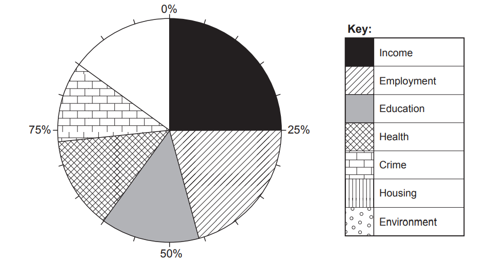
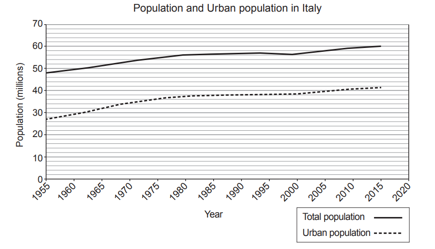
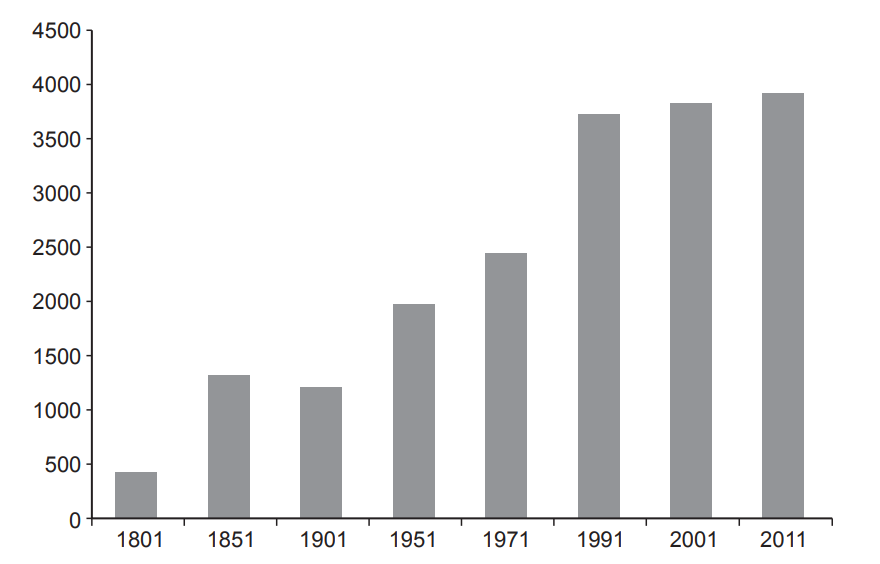
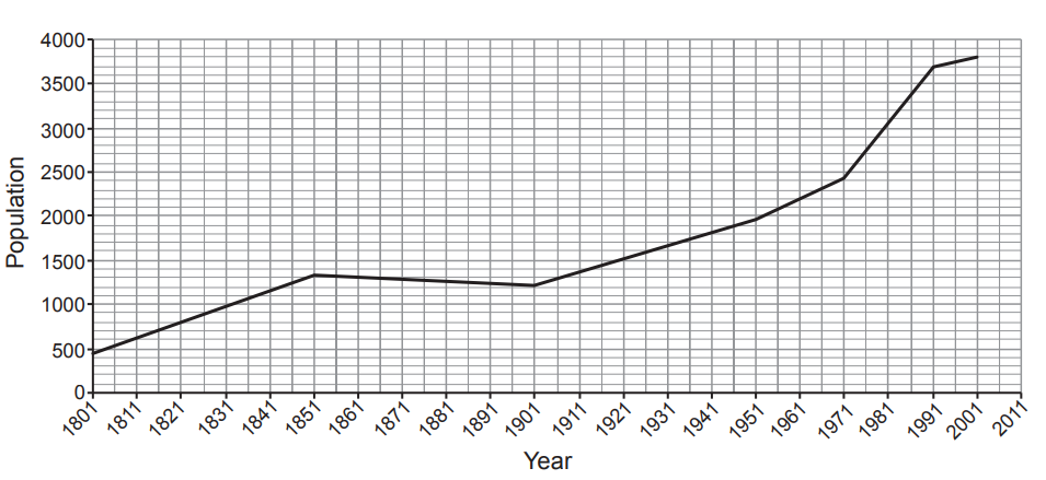
Study the graphs on page 2 of the Resource Folder.

Line graph showing population growth from 1951 to 2041, with estimates until 2021 and projections onward, reaching 80 million by 2041.
The UK’s population estimates and projections
Bar chart displaying percentage growth: Inner London 27%, Outer London 19%, all cities except London 16%, all towns 11%.
Percentage growth of population for selected urban areas in the UK between 2001 and 2019

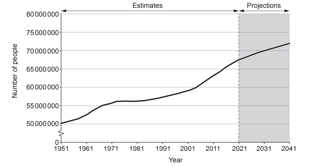
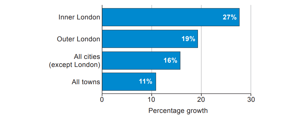
Tick (√) three correct statements in the table below. Use page 2 of the Resource Folder

  • The UK’s population is projected to reach 70 million by 2031.

  • Most people in the UK live in towns.

  • Town populations have a higher % growth than city populations.

  • The UK’s population has declined since 1951.

  • The highest urban percentage growth in population, between 2001 and 2019, was in inner London.

  • 11 million people lived in the UK in 2019.

  • The UK’s population grew by over 15 million people between 1951 and 2021.

2a
2 marks

The Index of Deprivation is a way of measuring several different inequalities in an area. Study the table below.

Category

Percentage each category contributes to the Index of Deprivation

Income

25%

Employment

21%

Education

14%

Health

13%

Crime

12%

Housing

10%

Environment

5%

Complete the pie chart with the data for Housing and Environment. Use data from the above table.

Pie chart with segments for income, employment, education, health, crime, housing, environment. Key indicates patterns for each category.
2b
1 mark

Give one way a pie chart is a suitable chart to present this data.

3a
1 mark

There are many strategies to improve the lives of people in the UK. The UK Government sets a minimum hourly wage, by age, that employers must pay anyone who works for them. This is the lowest amount of wage per hour people get. Study the below figure.

Rows of pound coins show hourly wages: £9.50 for 23+, £9.18 for 21-22, £6.83 for 18-20, and £4.81 for 16-17-year-olds.
Minimum wage per hour in the UK, April 2022

Name an alternative graph that you could use to represent the data on above figure.

3b
1 mark

Graphs should be easy to draw and understand. Give one other way the graph you have chosen is suitable.

4
3 marks

Study the map in Figure 2.

Map highlighting Italy in yellow, showing major cities Rome and Naples. Grottole is marked in the south, bordered by the Mediterranean and Adriatic Seas.
Figure 2 – A map of the the location of Grottole, Italy.

Describe the location of Grottole by circling the three correct answers from the box below.

Southern Italy Northern Italy West of Naples On the Adriatic coast

East of Naples On the island of Sicily North of Croatia

On the coast of the Ionian Sea 350km from Rome 200km from Rome

5
2 marks
Line graph showing Italy's total and urban population growth from 1955 to 2020. Total rises from 47m to 60m; urban increases from 27m to 44m.

The graph above shows the population of Italy over recent years.

Use the information in the table below to complete the line graph

2020

Total population

60.5 m

Urban population

42 m

6
2 marks

The way people shop is changing, which might change our towns and cities. Study Graph 3.1 below.

Line graph showing internet sales as a percentage of total retail sales, increasing from 7% in 2010 to 19% in 2019, with yearly data points.
Graph 3.1 – Internet sales as a percentage of total retail sales (2010 to 2019)

Complete the statements below to describe the trend. Use Graph 3.1.

Internet sales have ............................................................. from 2010 to 2019 as a percentage of all retail sales.

In 2019 internet sales are ............................................................. percent of all retail sales.

7
1 mark

The students collected secondary data of the rates of more recent erosion along the same stretch of coastline. This data is shown in Table 1.2 below.

Year

Coastal erosion (m)

2009

1.83

2010

6.93

2011

10.32

2012

9.05

2013

4.39

2014

1.74

2015

5.78

2016

6.03

2017

6.30

2018

3.80

Tick (√) the only appropriate graph that could be used to present the data in Table 1.2.

  • Line graph

  • Radial graph

  • Scatter graph

8a
1 mark

Table 3.1 below and Graph 3.2 opposite show population data for a village in the UK.

Table 3.1 – Population data for a UK village between 1801 and 2011

Year

1801

1851

1901

1951

1971

1991

2001

2011

Population

445

1325

1216

1963

2435

3695

3800

3900

Bar chart showing population growth from 1801 to 2011, with bars increasing steadily from 1801 to 2011, reaching about 4000 in 2011.
Graph 3.2 – Population data for a UK village between 1801 and 2011

Suggest one improvement to Graph 3.2 to show the data more effectively.

8b
1 mark

Graph 3.3 shows the population data from Table 3.1 in a line graph. Complete Graph 3.3 for the year 2011. Use the data in Table 3.1.

Line graph showing population growth from 1801 to 2011, with steady increases, a dip between 1901 and 1951, and significant rise from 1981 onwards.
population data for a UK village between 1801 and 2011
8c
2 marks

Give two reasons why a line graph is a more suitable method of data presentation for this data than a bar chart.

9
3 marks

Use Table 3.1 and Graph 3.3.

Year

1801

1851

1901

1951

1971

1991

2001

2011

Population

445

1325

1216

1963

2435

3695

3800

3900

Line graph showing population growth from 1801 to 2011, with an initial rise, plateau mid-century, decline, then a steep increase post-1971.
Graph 3.3 – population data for a UK village between 1801 and 2011

Tick (√) the three statements that are correct.

  • The graph shows a decreasing population.

  • The mean growth per year between 1971 and 1991 was 63 people.

  • There was a decrease in population between 1851 and 1901.

  • The slowest growth was between 1801 and 1851.

  • Between 1991 and 2011 the population grew by 205 people.

10
1 mark

Study Figures 2 and 3 on page 3 of the Resource Folder.

Bar chart showing monthly precipitation and line graph showing temperature. Precipitation peaks in March, declines to July, and rises in December. Temperature peaks in July.
Figure 2 -The Climate of San Diego, USA
Graph showing average monthly precipitation with blue bars and temperature with a red line. Rain peaks in July; temps peak in July and dip in January.
Figure 3- The Climate of Perth, Australia

San Diego (Figure 2) records its lowest rainfall figure and its highest temperature in August.

Identify the month that this pattern occurs in Perth (Figure 3).

11
2 marks

A geography student decides to represent the 1979 and 2019 population data for each city as proportional circles.

Suggest one advantage and one disadvantage of using this graphical technique.

12a
1 mark

The population growth in some rural areas has led to a growth in numbers of people commuting for work. Below is some data for Cambridge, a city in eastern England.

Table 3.2 – Commuting data 2018

Method of transport

Number of people commuting to the city of Cambridge

Private transport

Car

45702

Bicycle

18409

Foot

8564

Public transport

Bus

7193

Rail

3717

Chart showing commuter transport modes: 1 rail, 2 buses, 2 pedestrians, 5 bicycles, 10 cars. Key indicates each symbol represents 5,000 commuters.
Pictogram of data in Table 3.2

Identify two disadvantages of showing this data as a pictogram.

12b
2 marks

Give one reason why a pie chart may be a more effective method of presentation for this data.

13a
1 mark

One student presented their traffic count results on the flow line Map 1.3 below.

Map illustrating vehicle flow with labelled points A to G. Line thickness varies to indicate vehicle count per minute. Incomplete line at point F. North arrow included.
Map 1.3 - Flow line map showing traffic flows in Taunton

The vehicle count at survey point F was 37 vehicles per minute. How wide should the flow line be for survey point F? Tick (√) one box only.

  • 4 mm

  • 6 mm

  • 8 mm

13b
2 marks

Suggest two ways that Map 1.3 could be improved.

14
4 marks

Students in another school investigated commuter flows into the city of Birmingham. They used secondary data about bus routes. This information is shown on Map 1.4 below.

Diagram showing the number of buses per hour from Birmingham City Centre to Walsall, Castle Vale, Airport, Shirley, Kitwell, Stourbridge, and Wednesbury.
Map 1.4 - All bus routes into Birmingham city centre during Monday to Friday before 9.30 am

What are the limitations of this secondary data in understanding commuter flows into Birmingham?

15
6 marks

This question is about your own fieldwork experience of collecting data about geographical flows.

Evaluate the strengths and weaknesses of one method you used to present your data on geographical flows.

The data presentation method I used was:............................................

16
4 marks

Keswick experienced flooding in November of 2017. Study Graph 3.5 below.

Graph showing river level rising from 1m to over 2m, peaking on 22 Nov. Red line at 1.5m indicating flood level, surpassed on 22-23 Nov.
Graph 3.5 - River levels for the River Derwent at Keswick in 2017

Complete the sentences below by adding the correct information from the box.

Tuesday 21st Wednesday 22nd 0.6

0.8 1.5 2.5

2.4 Thursday 23rd 2.0

The River Derwent first flooded on ………................................November. When it first flooded the River Derwent was at ………........................…. ......metres. The highest level that the River Derwent reached was ………......................... . During Tuesday the River Derwent rose by ………...............................metres.

17a
2 marks

In 2017 a national survey asked UK households whether they agreed with the following statement:

‘I believe the area where I live is at risk of flooding.’

The results are shown below

Strongly agree

Tend to agree

Neither

Tend to disagree

Strongly disagree

30

25

10

15

20

Use the data in the table to complete the remaining parts of the pie chart.

Pie chart with five segments: strongly agree (grey), tend to agree (dots), neither (grid), tend to disagree (horizontal lines), and strongly disagree (diagonal lines).
17b
1 mark

What is the total percentage of people that agree the area they live is at risk of flooding.

………......................................……. %