Mathematical Skills (WJEC Eduqas GCSE Geography B): Revision Note
Exam code: C112

Specification link
Mathematics and statistics in WJEC Eduqas GCSE Geography B
This page covers part of the techniques required by Appendix A in the WJEC Eduqas specification (opens in a new tab).
The weighting for the assessment of maths and statistics skills will be at least 10%
1 Numerical skills
1.1 Demonstrate an understanding of numbers, areas, and scales, as well as the quantitative and qualitative relationships between units
1.3 Understand and correctly use proportions and ratios, magnitudes, and frequencies
2 Statistical skills
2.1 Use appropriate measures for central tendency, spread, and cumulative frequency
2.2 Calculate percentage increase or decrease and understand the use of percentiles
2.3 Describe relationships in bivariate data
2.4 Identify weaknesses in selective statistical presentation of data
Key terminology
Bivariate data
Bivariate data is data which is collected on two variables, and it is used to look at how one of the variables affects the other
Continuous data
Numerical data that can take any value within a given range, e.g. heights and weights
Discrete data
Numerical data that can only take certain values, e.g. shoe size
Quantitative data
Results that can be expressed using numerical values
Qualitative data
Results that can’t be expressed as numbers, e.g. opinions
Percentages
Percentages are frequently used in geography
'Percent' simply means 'out of one hundred'
For example, 25 of 360 homes in a town were burgled. What is the percentage (to the nearest whole number)?
Percentages can be used in many ways, for example, literacy rates or the numbers of people in different age groups in a country
Percentages can be converted into fractions and back again
If 20% of the population cannot read or write, this is 1/5th of the population
Worked Example
28 of 180 homes in a village do not have internet access. Convert into a fraction.
[1 mark]
Simplify 28/180 by dividing by 4 = 7/45 [1 mark]
Calculate the fraction of homes as a percentage (to the nearest whole number). Show your workings.
[2 marks]
7 divided by 45 = 0.1555
Round to two decimal places 0.16
To turn into a percentage 0.16 x 100 = 16% [1 mark]
16% of homes do not have internet access [1 mark]
Rounding
In the example above, the answer to 7 divided by 45 is 0.1555
In geography, significant figures can be used to make the numbers easier to work with
In the example, 0.15555 was rounded up to 0.16 to make the calculations easier
To round up:
Identify the digit in the required place value
Circle the number to the right of the required place value
If the circled number is 5 or more, then you round to the bigger number
If the circled number is less than 5, then you round to the smaller number
Put a zero in any following place values before the decimal point
Examiner Tips and Tricks
Always check when making calculations what the question has asked you to do. Does the question ask you to state or calculate units to the nearest whole number or quote to two decimal places?
Significant figures
To find the first significant figure when reading from left to right, find the biggest place value that has a non-zero digit
The first significant figure of 3097 is 3
The first significant figure of 0.0062070 is 6
The zeros before the 6 are not significant
The zero after the 2 but before the 7 is significant
The zero after the 7 is not significant
Count along to the right from the first significant figure to identify the position of the required significant figure
Do count zeros that are between other non-zero digits
E.g. 0 is the second significant figure of 3097
9 is the third significant figure of 3097
Use the normal rules for rounding
For large numbers, complete places up to the decimal point with zeros
E.g. 34 568 to 2 significant figures is 35 000
For decimals, complete places between the decimal point and the first significant figure with zeros
E.g. 0.003 435 to 3 significant figures is 0.003 44
Proportion
Direct proportion
As one quantity increases/decreases by a certain rate (factor)
The other quantity will increase/decrease by the same rate
The ratio of the two quantities is constant
A map has a scale of 1:25,000. This means that 1 unit on the map (e.g. 1 cm) represents 25,000 units (25,000 cm or 0.25km) in real life
An inverse proportion means that as one variable increases, the other decreases by a proportionate amount
As urban populations increase, rural populations decrease
Ratio
A ratio is a way of comparing one part of a whole to another
Ratios are used to compare one part to another part
What do ratios look like?
Ratios involve two or three different numbers separated using a colon
E.g. 2 : 5, 3 : 1, 4 : 2 : 3
Dependency ratios compare the number of dependents (individuals aged 0-14 and over 65) to the working-age population (aged 15-64)
In the ratio 2:1, when referring to the dependency ratio, this means that for every 2 working-age people, there is one dependent person
Magnitude
In geography, the term 'magnitude' has two meanings
In mathematical skills, it is the relative size or scale of a quantity when comparing different geographical data
For example, if Country A has a population of 40 million and Country B has a population of 10 million, we can say that Country A's population is four times greater than Country B's
This means Country A's population is greater by a magnitude of 4.
Magnitude can also refer to the amount of energy released in an earthquake
Frequency
Frequency refers to how often a particular value or category appears within a set of data
In a traffic survey, the number of times each type of vehicle (car, bus, bicycle) passes by is recorded
The count of each vehicle type represents its frequency.
To organise and interpret this data effectively, geographers use frequency tables
These tables list each category alongside its corresponding frequency, making it easier to identify patterns and trends
For example, a frequency table can help to identify the most common mode of transport used in a particular area
Statistics
This is the study and handling of data, which includes ways of gathering, reviewing, analysing, and drawing conclusions from data
Mean, median and mode
These are measures of central tendency
Mean = average value
The mean is calculated by adding up all of the values in the data set and then dividing by the total number of values in the data set
The median is the middle value of a set of data
Arrange the numbers in rank order, and then select the middle value
If there are an even number of data sets
First, order the numbers from lowest to highest
Find the two middle numbers and calculate their average by adding them together and dividing by two
E.g. the following are sample sizes; find the median: 90 64 98 142 159 95 184 64
After reordering by size 64 64 90 [95 98] 142 159 184, (95 and 98) are the middle values
format('truetype')%3Bfont-weight%3Anormal%3Bfont-style%3Anormal%3B%7D%3C%2Fstyle%3E%3C%2Fdefs%3E%3Cline%20stroke%3D%22%23000000%22%20stroke-linecap%3D%22square%22%20stroke-width%3D%221%22%20x1%3D%222.5%22%20x2%3D%2273.5%22%20y1%3D%2223.5%22%20y2%3D%2223.5%22%2F%3E%3Ctext%20font-family%3D%22Times%20New%20Roman%22%20font-size%3D%2218%22%20font-weight%3D%22bold%22%20text-anchor%3D%22middle%22%20x%3D%2214.5%22%20y%3D%2216%22%3E95%3C%2Ftext%3E%3Ctext%20font-family%3D%22math105e3f444b77fd674ead956ad23%22%20font-size%3D%2216%22%20font-weight%3D%22bold%22%20text-anchor%3D%22middle%22%20x%3D%2238.5%22%20y%3D%2216%22%3E%2B%3C%2Ftext%3E%3Ctext%20font-family%3D%22Times%20New%20Roman%22%20font-size%3D%2218%22%20font-weight%3D%22bold%22%20text-anchor%3D%22middle%22%20x%3D%2262.5%22%20y%3D%2216%22%3E98%3C%2Ftext%3E%3Ctext%20font-family%3D%22Times%20New%20Roman%22%20font-size%3D%2218%22%20font-weight%3D%22bold%22%20text-anchor%3D%22middle%22%20x%3D%2238.5%22%20y%3D%2241%22%3E2%3C%2Ftext%3E%3Ctext%20font-family%3D%22math105e3f444b77fd674ead956ad23%22%20font-size%3D%2216%22%20font-weight%3D%22bold%22%20text-anchor%3D%22middle%22%20x%3D%2289.5%22%20y%3D%2230%22%3E%3D%3C%2Ftext%3E%3Ctext%20font-family%3D%22Times%20New%20Roman%22%20font-size%3D%2218%22%20font-weight%3D%22bold%22%20text-anchor%3D%22middle%22%20x%3D%22118.5%22%20y%3D%2230%22%3E96%3C%2Ftext%3E%3Ctext%20font-family%3D%22math105e3f444b77fd674ead956ad23%22%20font-size%3D%2216%22%20font-weight%3D%22bold%22%20text-anchor%3D%22middle%22%20x%3D%22131.5%22%20y%3D%2230%22%3E.%3C%2Ftext%3E%3Ctext%20font-family%3D%22Times%20New%20Roman%22%20font-size%3D%2218%22%20font-weight%3D%22bold%22%20text-anchor%3D%22middle%22%20x%3D%22139.5%22%20y%3D%2230%22%3E5%3C%2Ftext%3E%3C%2Fsvg%3E) is the median figure
is the median figure
The mode is the value which occurs most frequently in a set of data
When a dataset has two or more numbers that appear with the same highest frequency, those numbers are the mode
To find the mode, first count how many times each number appears; then identify the two numbers with the highest counts
For example, if the set was [64 64] 90 [95 95] 142 159 184, the modes are (64) and (95) because each appears twice, which is more than any other number in the set
Worked Example
Site | 1 | 2 | 3 | 4 | 5 | 6 | 7 |
No. pebbles | 184 | 90 | 159 | 142 | 64 | 64 | 95 |
Mean:
format('truetype')%3Bfont-weight%3Anormal%3Bfont-style%3Anormal%3B%7D%3C%2Fstyle%3E%3C%2Fdefs%3E%3Cline%20stroke%3D%22%23000000%22%20stroke-linecap%3D%22square%22%20stroke-width%3D%221%22%20x1%3D%222.5%22%20x2%3D%22300.5%22%20y1%3D%2223.5%22%20y2%3D%2223.5%22%2F%3E%3Ctext%20font-family%3D%22Times%20New%20Roman%22%20font-size%3D%2218%22%20text-anchor%3D%22middle%22%20x%3D%2217.5%22%20y%3D%2216%22%3E184%3C%2Ftext%3E%3Ctext%20font-family%3D%22math12ed72e0d2d50af08c235c494fe%22%20font-size%3D%2216%22%20text-anchor%3D%22middle%22%20x%3D%2243.5%22%20y%3D%2216%22%3E%2B%3C%2Ftext%3E%3Ctext%20font-family%3D%22Times%20New%20Roman%22%20font-size%3D%2218%22%20text-anchor%3D%22middle%22%20x%3D%2265.5%22%20y%3D%2216%22%3E90%3C%2Ftext%3E%3Ctext%20font-family%3D%22math12ed72e0d2d50af08c235c494fe%22%20font-size%3D%2216%22%20text-anchor%3D%22middle%22%20x%3D%2286.5%22%20y%3D%2216%22%3E%2B%3C%2Ftext%3E%3Ctext%20font-family%3D%22Times%20New%20Roman%22%20font-size%3D%2218%22%20text-anchor%3D%22middle%22%20x%3D%22108.5%22%20y%3D%2216%22%3E159%3C%2Ftext%3E%3Ctext%20font-family%3D%22math12ed72e0d2d50af08c235c494fe%22%20font-size%3D%2216%22%20text-anchor%3D%22middle%22%20x%3D%22134.5%22%20y%3D%2216%22%3E%2B%3C%2Ftext%3E%3Ctext%20font-family%3D%22Times%20New%20Roman%22%20font-size%3D%2218%22%20text-anchor%3D%22middle%22%20x%3D%22160.5%22%20y%3D%2216%22%3E142%3C%2Ftext%3E%3Ctext%20font-family%3D%22math12ed72e0d2d50af08c235c494fe%22%20font-size%3D%2216%22%20text-anchor%3D%22middle%22%20x%3D%22186.5%22%20y%3D%2216%22%3E%2B%3C%2Ftext%3E%3Ctext%20font-family%3D%22Times%20New%20Roman%22%20font-size%3D%2218%22%20text-anchor%3D%22middle%22%20x%3D%22208.5%22%20y%3D%2216%22%3E64%3C%2Ftext%3E%3Ctext%20font-family%3D%22math12ed72e0d2d50af08c235c494fe%22%20font-size%3D%2216%22%20text-anchor%3D%22middle%22%20x%3D%22229.5%22%20y%3D%2216%22%3E%2B%3C%2Ftext%3E%3Ctext%20font-family%3D%22Times%20New%20Roman%22%20font-size%3D%2218%22%20text-anchor%3D%22middle%22%20x%3D%22247.5%22%20y%3D%2216%22%3E64%3C%2Ftext%3E%3Ctext%20font-family%3D%22math12ed72e0d2d50af08c235c494fe%22%20font-size%3D%2216%22%20text-anchor%3D%22middle%22%20x%3D%22268.5%22%20y%3D%2216%22%3E%2B%3C%2Ftext%3E%3Ctext%20font-family%3D%22Times%20New%20Roman%22%20font-size%3D%2218%22%20text-anchor%3D%22middle%22%20x%3D%22290.5%22%20y%3D%2216%22%3E95%3C%2Ftext%3E%3Ctext%20font-family%3D%22Times%20New%20Roman%22%20font-size%3D%2218%22%20text-anchor%3D%22middle%22%20x%3D%22151.5%22%20y%3D%2241%22%3E7%3C%2Ftext%3E%3Ctext%20font-family%3D%22math12ed72e0d2d50af08c235c494fe%22%20font-size%3D%2216%22%20text-anchor%3D%22middle%22%20x%3D%22315.5%22%20y%3D%2230%22%3E%3D%3C%2Ftext%3E%3Cline%20stroke%3D%22%23000000%22%20stroke-linecap%3D%22square%22%20stroke-width%3D%221%22%20x1%3D%22330.5%22%20x2%3D%22360.5%22%20y1%3D%2223.5%22%20y2%3D%2223.5%22%2F%3E%3Ctext%20font-family%3D%22Times%20New%20Roman%22%20font-size%3D%2218%22%20text-anchor%3D%22middle%22%20x%3D%22345.5%22%20y%3D%2216%22%3E798%3C%2Ftext%3E%3Ctext%20font-family%3D%22Times%20New%20Roman%22%20font-size%3D%2218%22%20text-anchor%3D%22middle%22%20x%3D%22345.5%22%20y%3D%2241%22%3E7%3C%2Ftext%3E%3Ctext%20font-family%3D%22math12ed72e0d2d50af08c235c494fe%22%20font-size%3D%2216%22%20text-anchor%3D%22middle%22%20x%3D%22375.5%22%20y%3D%2230%22%3E%3D%3C%2Ftext%3E%3Ctext%20font-family%3D%22Times%20New%20Roman%22%20font-size%3D%2218%22%20text-anchor%3D%22middle%22%20x%3D%22401.5%22%20y%3D%2230%22%3E114%3C%2Ftext%3E%3C%2Fsvg%3E)
Median: reordering by size =
format('truetype')%3Bfont-weight%3Anormal%3Bfont-style%3Anormal%3B%7D%40font-face%7Bfont-family%3A'brack_sm4e06b854ad106cdec1d8cc9'%3Bsrc%3Aurl(data%3Afont%2Ftruetype%3Bcharset%3Dutf-8%3Bbase64%2CAAEAAAAMAIAAAwBAT1MvMi7PH4UAAADMAAAATmNtYXA3kjw6AAABHAAAAFxjdnQgAQYDiAAAAXgAAAASZ2x5ZkyYQ7YAAAGMAAABqmhlYWQLyR8fAAADOAAAADZoaGVhAq0XCAAAA3AAAAAkaG10eDEjA%2FUAAAOUAAAAHGxvY2EAAEKZAAADsAAAACBtYXhwBJsEcQAAA9AAAAAgbmFtZW7QvZAAAAPwAAAB5XBvc3QArQBVAAAF2AAAACBwcmVwu5WEAAAABfgAAAAHAAACDAGQAAUAAAQABAAAAAAABAAEAAAAAAAAAQEAAAAAAAAAAAAAAAAAAAAAAAAAAAAAAAAAAAAAACAgICAAAAAg9AMD%2FP%2F8AAABVAABAAAAAAACAAEAAQAAABQAAwABAAAAFAAEAEgAAAAOAAgAAgAGI6EjoiOjI6QjpSOm%2F%2F8AACOhI6IjoyOkI6Ujpv%2F%2F3GDcYNxg3GDcYNxgAAEAAAAAAAAAAAAAAAAAAAAAAVQAVAEAACsAjACAAKgABwAAAAIAAAAAANUBAQADAAcAADEzESMXIzUz1dWrgIABAdarAAEAAAAAAQABVAAFACkYAbAGELAA1LAAELAF1LAFELAD1ACwBhCwANSwABCwA9SwAxCwAdQwMTERIRUjFQEAqwFUVf8AAQAAAAAAVQFUAAMAIRgBsAEvsQcCPDyxAwL1sAA8ALEDAD%2BwAjx8sQAG9bABPBEzESNVVQFU%2FqwAAQAAAAABAAFUAAUAKRgBsAYQsADUsAAQsAXUsAUQsAPUALAGELAA1LAAELAD1LADELAB1DAxGQEhNSM1AQCrAVT%2BrFX%2FAAEAAAAAAQABVAAFACkYAbAGELAB1LABELAA1LAAELAE1ACwBhCwAdSwARCwBNSwBBCwAtQwMTsBESEVM6tV%2FwCrAVRVAAEAqgAAAQABVAADACEYAbABL7EHAjw8sQMC9bAAPACxAwA%2FsAI8fLEABvWwATwTMxEjqlZWAVT%2BrAABAAAAAAEAAVQABQApGAGwBhCwAdSwARCwANSwABCwBNQAsAYQsAHUsAEQsATUsAQQsALUMDETMxEhNTOrVf8AqwFU%2FqxVAAAAAQAAAAEAAIsesexfDzz1AAMEAP%2F%2F%2F%2F%2FVre5k%2F%2F%2F%2F%2F9Wt7mT%2FgP%2F%2FAdYBWAAAAAoAAgABAAAAAAABAAABVP%2F%2FAAAXcP%2BA%2F4AB1gABAAAAAAAAAAAAAAAAAAAABwDVAAABAAAAAQAAAAEAAAABAAAAAQAAqgEAAAAAAAAAAAAAIQAAAGUAAACeAAAA5AAAASkAAAFjAAABqgABAAAABwAKAAIAAAAAAAIAgAQAAAAAAAQAAGUAAAAAAAAAFQECAAAAAAAAAAEAJgAAAAAAAAAAAAIADgAmAAAAAAAAAAMARAA0AAAAAAAAAAQAJgB4AAAAAAAAAAUAFgCeAAAAAAAAAAYAEwC0AAAAAAAAAAgAHADHAAEAAAAAAAEAJgAAAAEAAAAAAAIADgAmAAEAAAAAAAMARAA0AAEAAAAAAAQAJgB4AAEAAAAAAAUAFgCeAAEAAAAAAAYAEwC0AAEAAAAAAAgAHADHAAMAAQQJAAEAJgAAAAMAAQQJAAIADgAmAAMAAQQJAAMARAA0AAMAAQQJAAQAJgB4AAMAAQQJAAUAFgCeAAMAAQQJAAYAEwC0AAMAAQQJAAgAHADHAEIAcgBhAGMAawBlAHQAcwAgAHMAbQBhAGwAbAAgAHMAaQB6AGUAUgBlAGcAdQBsAGEAcgBNAGEAdABoAHMAIABGAG8AcgAgAE0AbwByAGUAIABCAHIAYQBjAGsAZQB0AHMAIABzAG0AYQBsAGwAIABzAGkAegBlAEIAcgBhAGMAawBlAHQAcwAgAHMAbQBhAGwAbAAgAHMAaQB6AGUAVgBlAHIAcwBpAG8AbgAgADIALgAwQnJhY2tldHNfc21hbGxfc2l6ZQBNAGEAdABoAHMAIABGAG8AcgAgAE0AbwByAGUAAAAAAwAAAAAAAACqAFUAAAAAAAAAAAAAAAAAAAAAAAAAALkH%2FwACjYUA)format('truetype')%3Bfont-weight%3Anormal%3Bfont-style%3Anormal%3B%7D%3C%2Fstyle%3E%3C%2Fdefs%3E%3Ctext%20font-family%3D%22Times%20New%20Roman%22%20font-size%3D%2218%22%20text-anchor%3D%22middle%22%20x%3D%229.5%22%20y%3D%2216%22%3E64%3C%2Ftext%3E%3Ctext%20font-family%3D%22Times%20New%20Roman%22%20font-size%3D%2218%22%20text-anchor%3D%22middle%22%20x%3D%2231.5%22%20y%3D%2216%22%3E64%3C%2Ftext%3E%3Ctext%20font-family%3D%22Times%20New%20Roman%22%20font-size%3D%2218%22%20text-anchor%3D%22middle%22%20x%3D%2253.5%22%20y%3D%2216%22%3E90%3C%2Ftext%3E%3Ctext%20font-family%3D%22brack_sm4e06b854ad106cdec1d8cc9%22%20font-size%3D%2218%22%20font-weight%3D%22bold%22%20text-anchor%3D%22start%22%20x%3D%2267.5%22%20y%3D%228%22%3E%26%23x23A1%3B%3C%2Ftext%3E%3Ctext%20font-family%3D%22brack_sm4e06b854ad106cdec1d8cc9%22%20font-size%3D%2218%22%20font-weight%3D%22bold%22%20text-anchor%3D%22start%22%20x%3D%2267.5%22%20y%3D%2214%22%3E%26%23x23A2%3B%3C%2Ftext%3E%3Ctext%20font-family%3D%22brack_sm4e06b854ad106cdec1d8cc9%22%20font-size%3D%2218%22%20font-weight%3D%22bold%22%20text-anchor%3D%22start%22%20x%3D%2267.5%22%20y%3D%2220%22%3E%26%23x23A3%3B%3C%2Ftext%3E%3Ctext%20font-family%3D%22Times%20New%20Roman%22%20font-size%3D%2218%22%20font-weight%3D%22bold%22%20text-anchor%3D%22middle%22%20x%3D%2283.5%22%20y%3D%2216%22%3E95%3C%2Ftext%3E%3Ctext%20font-family%3D%22brack_sm4e06b854ad106cdec1d8cc9%22%20font-size%3D%2218%22%20font-weight%3D%22bold%22%20text-anchor%3D%22start%22%20x%3D%2294.5%22%20y%3D%228%22%3E%26%23x23A4%3B%3C%2Ftext%3E%3Ctext%20font-family%3D%22brack_sm4e06b854ad106cdec1d8cc9%22%20font-size%3D%2218%22%20font-weight%3D%22bold%22%20text-anchor%3D%22start%22%20x%3D%2294.5%22%20y%3D%2214%22%3E%26%23x23A5%3B%3C%2Ftext%3E%3Ctext%20font-family%3D%22brack_sm4e06b854ad106cdec1d8cc9%22%20font-size%3D%2218%22%20font-weight%3D%22bold%22%20text-anchor%3D%22start%22%20x%3D%2294.5%22%20y%3D%2220%22%3E%26%23x23A6%3B%3C%2Ftext%3E%3Ctext%20font-family%3D%22Times%20New%20Roman%22%20font-size%3D%2218%22%20text-anchor%3D%22middle%22%20x%3D%22117.5%22%20y%3D%2216%22%3E142%3C%2Ftext%3E%3Ctext%20font-family%3D%22Times%20New%20Roman%22%20font-size%3D%2218%22%20text-anchor%3D%22middle%22%20x%3D%22148.5%22%20y%3D%2216%22%3E159%3C%2Ftext%3E%3Ctext%20font-family%3D%22Times%20New%20Roman%22%20font-size%3D%2218%22%20text-anchor%3D%22middle%22%20x%3D%22179.5%22%20y%3D%2216%22%3E184%3C%2Ftext%3E%3Ctext%20font-family%3D%22math17f39f8317fbdb1988ef4c628eb%22%20font-size%3D%2216%22%20text-anchor%3D%22middle%22%20x%3D%22205.5%22%20y%3D%2216%22%3E%3D%3C%2Ftext%3E%3Ctext%20font-family%3D%22Times%20New%20Roman%22%20font-size%3D%2218%22%20text-anchor%3D%22middle%22%20x%3D%22227.5%22%20y%3D%2216%22%3E95%3C%2Ftext%3E%3C%2Fsvg%3E) is the middle value
is the middle valueMode: only
 appears more than once
Modal class
In a grouped frequency distribution, the modal class is the class/group interval that shows up most often
It shows the range or group where most of the data points are found
To find it, just look for the class/group with the most observations or occurrences
How to find the modal class
Look for the highest frequency:
Examine the frequency column of a grouped frequency table
Identify the corresponding class interval:
The class/group interval that lines up with the highest frequency is the modal class
Worked Example
Consider this grouped frequency table:
Amount Spent (nearest £) | Frequency (f) |
|---|---|
1-20 | 10 |
21-40 | 16 |
41-60 | 26 |
61-80 | 22 |
81-100 | 13 |
101-120 | 10 |
121-140 | 3 |
The highest frequency is 26
This frequency is in the class/group interval '41-60'
Therefore, the modal class is 41-60
Range
A measure of dispersion: the spread of data around the average
Range is the distance between the highest and lowest value
The interquartile range is the part of the range that covers the middle 50% of the data
Worked Example
Site | 1 | 2 | 3 | 4 | 5 | 6 | 7 |
No. pebbles | 184 | 90 | 159 | 142 | 64 | 64 | 95 |
Range =
format('truetype')%3Bfont-weight%3Anormal%3Bfont-style%3Anormal%3B%7D%3C%2Fstyle%3E%3C%2Fdefs%3E%3Ctext%20font-family%3D%22Times%20New%20Roman%22%20font-size%3D%2218%22%20text-anchor%3D%22middle%22%20x%3D%2213.5%22%20y%3D%2216%22%3E184%3C%2Ftext%3E%3Ctext%20font-family%3D%22math135b31cfba37a56451b4768509d%22%20font-size%3D%2216%22%20text-anchor%3D%22middle%22%20x%3D%2235.5%22%20y%3D%2216%22%3E%26%23x2212%3B%3C%2Ftext%3E%3Ctext%20font-family%3D%22Times%20New%20Roman%22%20font-size%3D%2218%22%20text-anchor%3D%22middle%22%20x%3D%2253.5%22%20y%3D%2216%22%3E64%3C%2Ftext%3E%3Ctext%20font-family%3D%22math135b31cfba37a56451b4768509d%22%20font-size%3D%2216%22%20text-anchor%3D%22middle%22%20x%3D%2270.5%22%20y%3D%2216%22%3E%3D%3C%2Ftext%3E%3Ctext%20font-family%3D%22Times%20New%20Roman%22%20font-size%3D%2218%22%20text-anchor%3D%22middle%22%20x%3D%2292.5%22%20y%3D%2216%22%3E120%3C%2Ftext%3E%3C%2Fsvg%3E)
Percentage change
A percentage change shows by how much something has either increased or decreased
A percentage change shows by how much something has either increased or decreased
format('truetype')%3Bfont-weight%3Anormal%3Bfont-style%3Anormal%3B%7Dtext%7Bfill%3A%23000000%3B%3C%2Fstyle%3E%3C%2Fdefs%3E%3Ctext%20font-family%3D%22Times%20New%20Roman%22%20font-size%3D%2222%22%20font-style%3D%22italic%22%20text-anchor%3D%22middle%22%20x%3D%226.5%22%20y%3D%2236%22%3EP%3C%2Ftext%3E%3Ctext%20font-family%3D%22Times%20New%20Roman%22%20font-size%3D%2222%22%20font-style%3D%22italic%22%20text-anchor%3D%22middle%22%20x%3D%2217.5%22%20y%3D%2236%22%3Ee%3C%2Ftext%3E%3Ctext%20font-family%3D%22Times%20New%20Roman%22%20font-size%3D%2222%22%20font-style%3D%22italic%22%20text-anchor%3D%22middle%22%20x%3D%2225.5%22%20y%3D%2236%22%3Er%3C%2Ftext%3E%3Ctext%20font-family%3D%22Times%20New%20Roman%22%20font-size%3D%2222%22%20font-style%3D%22italic%22%20text-anchor%3D%22middle%22%20x%3D%2234.5%22%20y%3D%2236%22%3Ec%3C%2Ftext%3E%3Ctext%20font-family%3D%22Times%20New%20Roman%22%20font-size%3D%2222%22%20font-style%3D%22italic%22%20text-anchor%3D%22middle%22%20x%3D%2244.5%22%20y%3D%2236%22%3Ee%3C%2Ftext%3E%3Ctext%20font-family%3D%22Times%20New%20Roman%22%20font-size%3D%2222%22%20font-style%3D%22italic%22%20text-anchor%3D%22middle%22%20x%3D%2254.5%22%20y%3D%2236%22%3En%3C%2Ftext%3E%3Ctext%20font-family%3D%22Times%20New%20Roman%22%20font-size%3D%2222%22%20font-style%3D%22italic%22%20text-anchor%3D%22middle%22%20x%3D%2263.5%22%20y%3D%2236%22%3Et%3C%2Ftext%3E%3Ctext%20font-family%3D%22Times%20New%20Roman%22%20font-size%3D%2222%22%20font-style%3D%22italic%22%20text-anchor%3D%22middle%22%20x%3D%2271.5%22%20y%3D%2236%22%3Ea%3C%2Ftext%3E%3Ctext%20font-family%3D%22Times%20New%20Roman%22%20font-size%3D%2222%22%20font-style%3D%22italic%22%20text-anchor%3D%22middle%22%20x%3D%2281.5%22%20y%3D%2236%22%3Eg%3C%2Ftext%3E%3Ctext%20font-family%3D%22Times%20New%20Roman%22%20font-size%3D%2222%22%20font-style%3D%22italic%22%20text-anchor%3D%22middle%22%20x%3D%2292.5%22%20y%3D%2236%22%3Ee%3C%2Ftext%3E%3Ctext%20font-family%3D%22Times%20New%20Roman%22%20font-size%3D%2222%22%20font-style%3D%22italic%22%20text-anchor%3D%22middle%22%20x%3D%22108.5%22%20y%3D%2236%22%3Ec%3C%2Ftext%3E%3Ctext%20font-family%3D%22Times%20New%20Roman%22%20font-size%3D%2222%22%20font-style%3D%22italic%22%20text-anchor%3D%22middle%22%20x%3D%22118.5%22%20y%3D%2236%22%3Eh%3C%2Ftext%3E%3Ctext%20font-family%3D%22Times%20New%20Roman%22%20font-size%3D%2222%22%20font-style%3D%22italic%22%20text-anchor%3D%22middle%22%20x%3D%22129.5%22%20y%3D%2236%22%3Ea%3C%2Ftext%3E%3Ctext%20font-family%3D%22Times%20New%20Roman%22%20font-size%3D%2222%22%20font-style%3D%22italic%22%20text-anchor%3D%22middle%22%20x%3D%22139.5%22%20y%3D%2236%22%3En%3C%2Ftext%3E%3Ctext%20font-family%3D%22Times%20New%20Roman%22%20font-size%3D%2222%22%20font-style%3D%22italic%22%20text-anchor%3D%22middle%22%20x%3D%22150.5%22%20y%3D%2236%22%3Eg%3C%2Ftext%3E%3Ctext%20font-family%3D%22Times%20New%20Roman%22%20font-size%3D%2222%22%20font-style%3D%22italic%22%20text-anchor%3D%22middle%22%20x%3D%22161.5%22%20y%3D%2236%22%3Ee%3C%2Ftext%3E%3Ctext%20font-family%3D%22math1c1c4b4ae53f75347cab9713082%22%20font-size%3D%2219%22%20text-anchor%3D%22middle%22%20x%3D%22182.5%22%20y%3D%2236%22%3E%3D%3C%2Ftext%3E%3Cline%20stroke%3D%22%23000000%22%20stroke-linecap%3D%22square%22%20stroke-width%3D%221%22%20x1%3D%22195.5%22%20x2%3D%22443.5%22%20y1%3D%2228.5%22%20y2%3D%2228.5%22%2F%3E%3Ctext%20font-family%3D%22Times%20New%20Roman%22%20font-size%3D%2222%22%20font-style%3D%22italic%22%20text-anchor%3D%22middle%22%20x%3D%22200.5%22%20y%3D%2220%22%3Ef%3C%2Ftext%3E%3Ctext%20font-family%3D%22Times%20New%20Roman%22%20font-size%3D%2222%22%20font-style%3D%22italic%22%20text-anchor%3D%22middle%22%20x%3D%22209.5%22%20y%3D%2220%22%3Ei%3C%2Ftext%3E%3Ctext%20font-family%3D%22Times%20New%20Roman%22%20font-size%3D%2222%22%20font-style%3D%22italic%22%20text-anchor%3D%22middle%22%20x%3D%22217.5%22%20y%3D%2220%22%3En%3C%2Ftext%3E%3Ctext%20font-family%3D%22Times%20New%20Roman%22%20font-size%3D%2222%22%20font-style%3D%22italic%22%20text-anchor%3D%22middle%22%20x%3D%22228.5%22%20y%3D%2220%22%3Ea%3C%2Ftext%3E%3Ctext%20font-family%3D%22Times%20New%20Roman%22%20font-size%3D%2222%22%20font-style%3D%22italic%22%20text-anchor%3D%22middle%22%20x%3D%22236.5%22%20y%3D%2220%22%3El%3C%2Ftext%3E%3Ctext%20font-family%3D%22Times%20New%20Roman%22%20font-size%3D%2222%22%20font-style%3D%22italic%22%20text-anchor%3D%22middle%22%20x%3D%22250.5%22%20y%3D%2220%22%3Ev%3C%2Ftext%3E%3Ctext%20font-family%3D%22Times%20New%20Roman%22%20font-size%3D%2222%22%20font-style%3D%22italic%22%20text-anchor%3D%22middle%22%20x%3D%22261.5%22%20y%3D%2220%22%3Ea%3C%2Ftext%3E%3Ctext%20font-family%3D%22Times%20New%20Roman%22%20font-size%3D%2222%22%20font-style%3D%22italic%22%20text-anchor%3D%22middle%22%20x%3D%22269.5%22%20y%3D%2220%22%3El%3C%2Ftext%3E%3Ctext%20font-family%3D%22Times%20New%20Roman%22%20font-size%3D%2222%22%20font-style%3D%22italic%22%20text-anchor%3D%22middle%22%20x%3D%22277.5%22%20y%3D%2220%22%3Eu%3C%2Ftext%3E%3Ctext%20font-family%3D%22Times%20New%20Roman%22%20font-size%3D%2222%22%20font-style%3D%22italic%22%20text-anchor%3D%22middle%22%20x%3D%22288.5%22%20y%3D%2220%22%3Ee%3C%2Ftext%3E%3Ctext%20font-family%3D%22math1c1c4b4ae53f75347cab9713082%22%20font-size%3D%2219%22%20text-anchor%3D%22middle%22%20x%3D%22309.5%22%20y%3D%2220%22%3E%26%23x2212%3B%3C%2Ftext%3E%3Ctext%20font-family%3D%22Times%20New%20Roman%22%20font-size%3D%2222%22%20font-style%3D%22italic%22%20text-anchor%3D%22middle%22%20x%3D%22324.5%22%20y%3D%2220%22%3Eo%3C%2Ftext%3E%3Ctext%20font-family%3D%22Times%20New%20Roman%22%20font-size%3D%2222%22%20font-style%3D%22italic%22%20text-anchor%3D%22middle%22%20x%3D%22333.5%22%20y%3D%2220%22%3Er%3C%2Ftext%3E%3Ctext%20font-family%3D%22Times%20New%20Roman%22%20font-size%3D%2222%22%20font-style%3D%22italic%22%20text-anchor%3D%22middle%22%20x%3D%22340.5%22%20y%3D%2220%22%3Ei%3C%2Ftext%3E%3Ctext%20font-family%3D%22Times%20New%20Roman%22%20font-size%3D%2222%22%20font-style%3D%22italic%22%20text-anchor%3D%22middle%22%20x%3D%22348.5%22%20y%3D%2220%22%3Eg%3C%2Ftext%3E%3Ctext%20font-family%3D%22Times%20New%20Roman%22%20font-size%3D%2222%22%20font-style%3D%22italic%22%20text-anchor%3D%22middle%22%20x%3D%22357.5%22%20y%3D%2220%22%3Ei%3C%2Ftext%3E%3Ctext%20font-family%3D%22Times%20New%20Roman%22%20font-size%3D%2222%22%20font-style%3D%22italic%22%20text-anchor%3D%22middle%22%20x%3D%22365.5%22%20y%3D%2220%22%3En%3C%2Ftext%3E%3Ctext%20font-family%3D%22Times%20New%20Roman%22%20font-size%3D%2222%22%20font-style%3D%22italic%22%20text-anchor%3D%22middle%22%20x%3D%22376.5%22%20y%3D%2220%22%3Ea%3C%2Ftext%3E%3Ctext%20font-family%3D%22Times%20New%20Roman%22%20font-size%3D%2222%22%20font-style%3D%22italic%22%20text-anchor%3D%22middle%22%20x%3D%22384.5%22%20y%3D%2220%22%3El%3C%2Ftext%3E%3Ctext%20font-family%3D%22Times%20New%20Roman%22%20font-size%3D%2222%22%20font-style%3D%22italic%22%20text-anchor%3D%22middle%22%20x%3D%22398.5%22%20y%3D%2220%22%3Ev%3C%2Ftext%3E%3Ctext%20font-family%3D%22Times%20New%20Roman%22%20font-size%3D%2222%22%20font-style%3D%22italic%22%20text-anchor%3D%22middle%22%20x%3D%22409.5%22%20y%3D%2220%22%3Ea%3C%2Ftext%3E%3Ctext%20font-family%3D%22Times%20New%20Roman%22%20font-size%3D%2222%22%20font-style%3D%22italic%22%20text-anchor%3D%22middle%22%20x%3D%22417.5%22%20y%3D%2220%22%3El%3C%2Ftext%3E%3Ctext%20font-family%3D%22Times%20New%20Roman%22%20font-size%3D%2222%22%20font-style%3D%22italic%22%20text-anchor%3D%22middle%22%20x%3D%22425.5%22%20y%3D%2220%22%3Eu%3C%2Ftext%3E%3Ctext%20font-family%3D%22Times%20New%20Roman%22%20font-size%3D%2222%22%20font-style%3D%22italic%22%20text-anchor%3D%22middle%22%20x%3D%22436.5%22%20y%3D%2220%22%3Ee%3C%2Ftext%3E%3Ctext%20font-family%3D%22Times%20New%20Roman%22%20font-size%3D%2222%22%20font-style%3D%22italic%22%20text-anchor%3D%22middle%22%20x%3D%22263.5%22%20y%3D%2251%22%3Eo%3C%2Ftext%3E%3Ctext%20font-family%3D%22Times%20New%20Roman%22%20font-size%3D%2222%22%20font-style%3D%22italic%22%20text-anchor%3D%22middle%22%20x%3D%22272.5%22%20y%3D%2251%22%3Er%3C%2Ftext%3E%3Ctext%20font-family%3D%22Times%20New%20Roman%22%20font-size%3D%2222%22%20font-style%3D%22italic%22%20text-anchor%3D%22middle%22%20x%3D%22279.5%22%20y%3D%2251%22%3Ei%3C%2Ftext%3E%3Ctext%20font-family%3D%22Times%20New%20Roman%22%20font-size%3D%2222%22%20font-style%3D%22italic%22%20text-anchor%3D%22middle%22%20x%3D%22287.5%22%20y%3D%2251%22%3Eg%3C%2Ftext%3E%3Ctext%20font-family%3D%22Times%20New%20Roman%22%20font-size%3D%2222%22%20font-style%3D%22italic%22%20text-anchor%3D%22middle%22%20x%3D%22296.5%22%20y%3D%2251%22%3Ei%3C%2Ftext%3E%3Ctext%20font-family%3D%22Times%20New%20Roman%22%20font-size%3D%2222%22%20font-style%3D%22italic%22%20text-anchor%3D%22middle%22%20x%3D%22304.5%22%20y%3D%2251%22%3En%3C%2Ftext%3E%3Ctext%20font-family%3D%22Times%20New%20Roman%22%20font-size%3D%2222%22%20font-style%3D%22italic%22%20text-anchor%3D%22middle%22%20x%3D%22315.5%22%20y%3D%2251%22%3Ea%3C%2Ftext%3E%3Ctext%20font-family%3D%22Times%20New%20Roman%22%20font-size%3D%2222%22%20font-style%3D%22italic%22%20text-anchor%3D%22middle%22%20x%3D%22323.5%22%20y%3D%2251%22%3El%3C%2Ftext%3E%3Ctext%20font-family%3D%22Times%20New%20Roman%22%20font-size%3D%2222%22%20font-style%3D%22italic%22%20text-anchor%3D%22middle%22%20x%3D%22337.5%22%20y%3D%2251%22%3Ev%3C%2Ftext%3E%3Ctext%20font-family%3D%22Times%20New%20Roman%22%20font-size%3D%2222%22%20font-style%3D%22italic%22%20text-anchor%3D%22middle%22%20x%3D%22348.5%22%20y%3D%2251%22%3Ea%3C%2Ftext%3E%3Ctext%20font-family%3D%22Times%20New%20Roman%22%20font-size%3D%2222%22%20font-style%3D%22italic%22%20text-anchor%3D%22middle%22%20x%3D%22356.5%22%20y%3D%2251%22%3El%3C%2Ftext%3E%3Ctext%20font-family%3D%22Times%20New%20Roman%22%20font-size%3D%2222%22%20font-style%3D%22italic%22%20text-anchor%3D%22middle%22%20x%3D%22364.5%22%20y%3D%2251%22%3Eu%3C%2Ftext%3E%3Ctext%20font-family%3D%22Times%20New%20Roman%22%20font-size%3D%2222%22%20font-style%3D%22italic%22%20text-anchor%3D%22middle%22%20x%3D%22375.5%22%20y%3D%2251%22%3Ee%3C%2Ftext%3E%3Ctext%20font-family%3D%22math1c1c4b4ae53f75347cab9713082%22%20font-size%3D%2219%22%20text-anchor%3D%22middle%22%20x%3D%22457.5%22%20y%3D%2236%22%3E%26%23xD7%3B%3C%2Ftext%3E%3Ctext%20font-family%3D%22Times%20New%20Roman%22%20font-size%3D%2222%22%20text-anchor%3D%22middle%22%20x%3D%22483.5%22%20y%3D%2236%22%3E100%3C%2Ftext%3E%3C%2Fsvg%3E)
In 2020, 25 out of 360 homes in a town were burgled. In 2021, 21 houses were burgled. What is the percentage change?
format('truetype')%3Bfont-weight%3Anormal%3Bfont-style%3Anormal%3B%7Dtext%7Bfill%3A%23000000%3B%3C%2Fstyle%3E%3C%2Fdefs%3E%3Cline%20stroke%3D%22%23000000%22%20stroke-linecap%3D%22square%22%20stroke-width%3D%221%22%20x1%3D%223.5%22%20x2%3D%2270.5%22%20y1%3D%2228.5%22%20y2%3D%2228.5%22%2F%3E%3Ctext%20font-family%3D%22Times%20New%20Roman%22%20font-size%3D%2222%22%20text-anchor%3D%22middle%22%20x%3D%2216.5%22%20y%3D%2220%22%3E21%3C%2Ftext%3E%3Ctext%20font-family%3D%22math1e005713ad92b2779a51fe4a253%22%20font-size%3D%2219%22%20text-anchor%3D%22middle%22%20x%3D%2237.5%22%20y%3D%2220%22%3E%26%23x2212%3B%3C%2Ftext%3E%3Ctext%20font-family%3D%22Times%20New%20Roman%22%20font-size%3D%2222%22%20text-anchor%3D%22middle%22%20x%3D%2258.5%22%20y%3D%2220%22%3E25%3C%2Ftext%3E%3Ctext%20font-family%3D%22Times%20New%20Roman%22%20font-size%3D%2222%22%20text-anchor%3D%22middle%22%20x%3D%2237.5%22%20y%3D%2251%22%3E25%3C%2Ftext%3E%3Ctext%20font-family%3D%22math1e005713ad92b2779a51fe4a253%22%20font-size%3D%2219%22%20text-anchor%3D%22middle%22%20x%3D%2284.5%22%20y%3D%2236%22%3E%26%23xD7%3B%3C%2Ftext%3E%3Ctext%20font-family%3D%22Times%20New%20Roman%22%20font-size%3D%2222%22%20text-anchor%3D%22middle%22%20x%3D%22110.5%22%20y%3D%2236%22%3E100%3C%2Ftext%3E%3Ctext%20font-family%3D%22math1e005713ad92b2779a51fe4a253%22%20font-size%3D%2219%22%20text-anchor%3D%22middle%22%20x%3D%22137.5%22%20y%3D%2236%22%3E%3D%3C%2Ftext%3E%3Ctext%20font-family%3D%22math1e005713ad92b2779a51fe4a253%22%20font-size%3D%2219%22%20text-anchor%3D%22middle%22%20x%3D%22157.5%22%20y%3D%2236%22%3E%26%23x2212%3B%3C%2Ftext%3E%3Ctext%20font-family%3D%22Times%20New%20Roman%22%20font-size%3D%2222%22%20text-anchor%3D%22middle%22%20x%3D%22178.5%22%20y%3D%2236%22%3E16%3C%2Ftext%3E%3Ctext%20font-family%3D%22Times%20New%20Roman%22%20font-size%3D%2222%22%20text-anchor%3D%22middle%22%20x%3D%22199.5%22%20y%3D%2236%22%3E%25%3C%2Ftext%3E%3C%2Fsvg%3E)
There has been a decrease of 16% in the rate of burglaries in the town
Do remember that a positive figure shows an increase, but a negative is a decrease
Relationship in bivariate data
Another term used to show the relationship between bivariate data is correlation
A scatter diagram is a way of graphing bivariate data
For example, in a river study, the relationship between the width and depth of the river channel is plotted, with a line of best fit drawn to show if there is any correlation
In this instance, there is a positive correlation
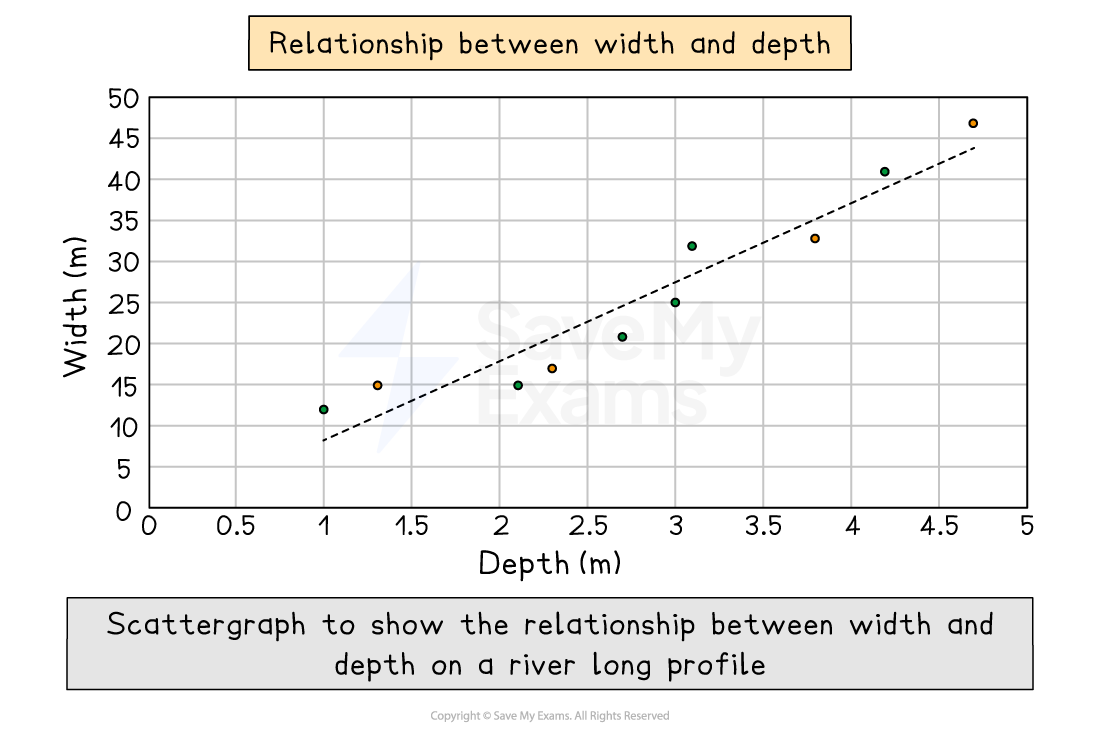
Strengths
Clearly shows data correlation
Shows the spread of data
Makes it easy to identify anomalies and outliers
Limitations
Data points cannot be labelled
Too many data points can make it difficult to read
Can only show the relationship between two sets of data
Correlation cannot be measured without the use of a statistical test (Spearman’s Coefficient of Correlation)
Types of correlation
Positive correlation
As one variable increases, so too does the other
The line of best fit goes from the bottom left to the top right of the graph
Negative correlation
As one variable increases, the other decreases
The line of best fit goes from the top left to the bottom right of the graph
No correlation
Data points will have a scattered distribution
There is no relationship between the variables
Worked Example
Making predictions from a set of data
Study Figure 1 below, which shows the cost against distance travelled
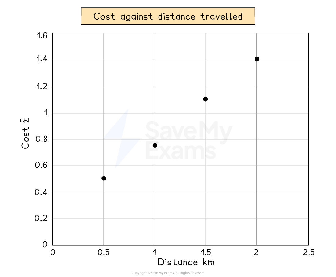
Figure 1
Predict what the cost at would be at 1.75 km
[1 mark]
Answer
Cost is £1.3 [1 mark]
Marking guidance
To predict the cost at 1.75 km, look at the cost at 1.5 km and 2.0 km
Then follow the line of best fit to predict the value at 1.75 km
Common errors
You may be asked to make a prediction for the next step in given data (either table or graph form) in your exam
Study the data carefully
Look at the direction in which the data is going
Are the numbers increasing or decreasing?
Is there a clear pattern forming?
E.g. does the data point value change by 3, 4, 6, etc. each time?
Understand the use of percentiles
Percentiles divide a data set into 100 equal parts
n% of the data values will be less than the nth percentile
e.g. 10% of data values will be less than the 10th percentile (and 90% will be greater than it)
99% of data values will be less than the 99th percentile (and 1% will be greater than it)
Quartiles divide a set of data into 4 equal parts
Percentiles do not need to be whole numbers
The 2.5th percentile is where 2.5% of the data will be less than that (and 97.5% will be greater than it)
Percentiles can be useful for discussing the distribution of data in a data set
For example, a student wanted to compare incomes in the UK
They decided to compare the highest 1% of earners (the ones above the 99th percentile)
with the median income (the 50th percentile)
and then with the lowest 10% of earners (those below the 10th percentile)
Identifying weaknesses in the statistical presentation of data
Some problems with presenting statistical data are:
Using misleading graphs
Picking data that isn't representative (cherry-picking)
Making comparisons that aren't balanced
Making broad conclusions from small samples
Other problems include:
Misrepresenting the statistical significance
Not saying what the study's limitations or funding sources are
Using vague or misleading language to present data
To find these flaws:
Look for graphs that don't make sense
Graphs that are missing context
Graphs/charts with conflicts of interest or claims that are too broad
Always think about where the data came from and how it was collected

Unlock more, it's free!
Join the 100,000+ Students that ❤️ Save My Exams
the (exam) results speak for themselves:

Was this revision note helpful?