Mathematical Skills (WJEC Eduqas GCSE Geography B): Exam Questions

Exam code: C112

39 mins14 questions
1a
1 mark

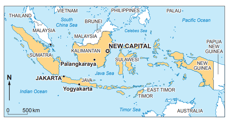
Parts of Jakarta are subsiding (sinking into the ground). Study Figure 3. It shows the location of various sites across Jakarta. Table 1 shows how far on average each site has sunk.
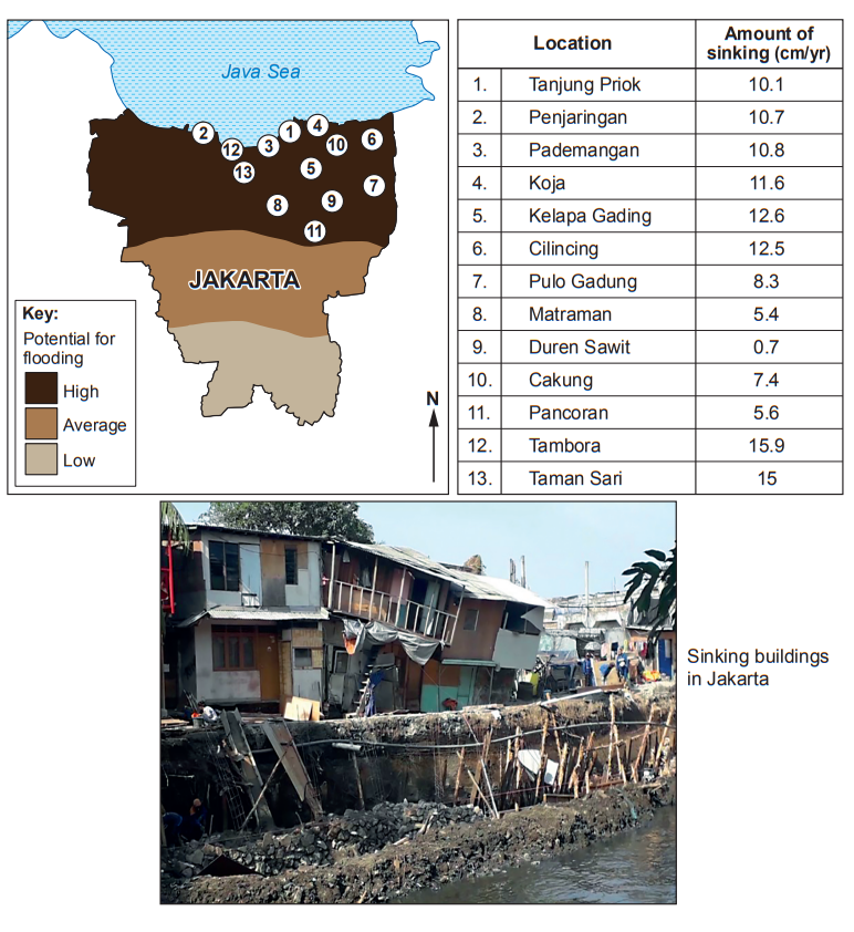
Map of Jakarta showing flooding potential, a table of areas with sinking rates, and an image of buildings in disrepair due to sinking.
Figure 3 – Jakarta is sinking

Table 1

Location

Amount of sinking (cm/year)

1

Tanjung Priok

10.1

2

Penjaringan

10.7

3

Pademangan

10.8

4

Koja

11.6

5

Kelapa Gading

12.6

6

Cilincing

12.5

7

Pulo Gadung

8.3

8

Matraman

5.4

9

Duren Sawit

0.7

10

Cakung

7.4

11

Pancoran

5.6

12

Tambora

15.9

13

Taman Sari

15

Calculate the median value of these measurements.

Show your working in the box.

Answer: ...................................................

1b
2 marks

Explain why the median value may not be regarded as the most appropriate measure of central tendency.

2
2 marks

Study the table below.

Mangrove forest along the coastline in Jakarta, Indonesia over time

Year

Mangrove (km2) along coastline in Jakarta

1980

116.5

2000

16.8

2010

17.1

2016

16.5

There have been 100km2 of mangrove lost from 1980 to 2016.

What percentage of Jakarta’s mangrove forest has been lost from 1980 to 2016?

Show your working in the box.

Answer: ................................................... %

3
2 marks

Option 3:

Retreat the line and build a new capital city. The government is considering whether to defend Jakarta’s coastline at all. If the coastline is not defended it is called “retreat the line”. To relieve some of the pressures on Jakarta, the government is planning on moving to a brand-new city in another part of Indonesia with no risk of flooding.

Study Figure 6. Describe the location of the proposed new capital city in relation to Jakarta.

Map of Indonesia and Southeast Asia showing major islands, capitals Jakarta and Palangkaraya, and the planned new capital on Kalimantan.
Jakarta and the new site
4
1 mark

Study the data table below.

Here is the content formatted into a table without changing any content:

Households with internet access [2019]

Households with potential access to ultra-fast broadband [2019]

Grottole’s region

69%

94%

Northern Italy

74%

98%

Central Italy

73%

82%

Southern Italy

64%

80%

Italy

71%

94%

UK

95%

95%

Give the difference between households with internet access in Grottole’s region and the UK.

..........................................%

5a
2 marks

The students collected secondary data of the rates of more recent erosion along the same stretch of coastline. This data is shown in Table 1.2 below.

Table 1.2 – Recent rates of coastal erosion at Mappleton on the Yorkshire coast 2009–2018

Year

Coastal erosion (m)

2009

1.83

2010

6.93

2011

10.32

2012

9.05

2013

4.39

2014

1.74

2015

5.78

2016

6.03

2017

6.30

2018

3.80

The students decided to compare two 5-year periods of coastal erosion by calculating the mean.

Table 1.3 – Compares two 5-year periods

Mean

2009–2013

6.5m

2014–2018

Calculate the mean value of coastal erosion for 2014–2018.
Show your working.

Answer ........................................................ m

5b
2 marks

Tick (√) two advantages of using the mean to analyse this data.

  • It takes the middle value of the data.

  • It can be affected by outliers

  • The range of the data set is small.

  • It allows comparison of the data between time periods.

  • It shows a clear difference between the highest and lowest values.

5c
4 marks

The students used the mean data in Table 1.3 to draw conclusions about the coastal erosion at Mappleton. What are the limitations of using only this data?

6
2 marks

Study Graph 3.3.

Line graph showing population growth from 1801 to 2011, with steady increase, slight decline in 1911, then sharp rise from 1971 to 2011, reaching 3800.
Graph 3.3 – population data for a UK village between 1801 and 2011

There has been a huge growth in the population of the village.

Calculate the percentage increase of population between 1801 and 2011.

Show your working.

Answer ........................................................ %

7
2 marks

Study Figure 2.

Graph showing monthly precipitation in blue bars and temperature in a red line. Precipitation peaks in January, and temperature peaks in July.
Figure 2 The Climate of San Diego, USA

Calculate the range of temperature for San Diego. Show your working in the space below

The range of temperature for San Diego is: .................................... ○ C

8
2 marks

The table below shows information about the population of three of the cities shown on Figure 1.

All three cities have experienced rapid growth in the last 40 years.

City

Population (in millions)

1979

2019

% increase in 40 years

San Diego

1.5

1.9

26.67%

Perth

1.6

2.1

31.25%

Valencia

1.4

1.726.67%

Calculate the percentage (%) increase for Valencia from 1979 to 2019. Show your working.

The percentage (%) increase for Valencia was ...................................... %

9a
2 marks

The increase in commuters contributes to air pollution in cities. Study the information in the table below.

Table 3.3 – Causes of air pollution from transport in cities

Type of transport

Levels of air pollution (grams of carbon dioxide per person per km)

Car

234

Motorbike

120

Train

29

Tram

20

Bus

18

Bike

0

Walking

0

Use Table 3.3 and the box below.

Complete the paragraph.

The ........................................ is the most polluting of the public transport vehicles. A commuter in a car causes ........................................ times as much air pollution as a commuter in a bus.

train bus tram

13 16 10

9b
2 marks

Calculate the mean air pollution for the types of transport in the table.

Show your workings

Answer ..................................

9c
2 marks

How useful is the mean when analysing this data?

10a
1 mark

Figure 2.2 below shows the amount of potential erosion around Totland Bay in the Isle of Wight. (Potential erosion is the amount of erosion that could occur with no management.)

Figure 2.2 Potential erosion rates around Totland Bay

10 year time periods

Potential erosion in metres

2015-2025

19.41

2025-2035

13.24

2035-2045

14.11

2045-2055

15.23

2055-2065

16.10

The median value for potential erosion is 15.23 m. Give one limitation of using the median as a measure of potential erosion.

10b
2 marks

Calculate the mean of potential erosion rate between 2015 and 2065. Show your working below.

Mean = ........................................................ metres

11
2 marks

Study Figure 3.1 which shows the climate of a hot semi-arid grassland area.

Bar chart showing monthly rainfall in blue and temperature in red. Rain peaks in April; temperature rising from July to September, highest in October.
Figure 3.1 – Climate of an area of hot semi-arid grassland

Calculate the range of temperature in February. Show your working below.

Range = ........................................................ °C

12
1 mark

One student presented their traffic count results on the flow line Map 1.3 below.

Map showing road flow with labels A-G. Thicker lines indicate higher vehicle counts. An incomplete flow line is noted near F. Scale: 0-1 km.
Map 1.3 - Flow line map showing traffic flows in Taunton

Study Map 1.3. What is the vehicle count for survey point B?

13
2 marks

Tick (√) a box below for the one student who has the correct values for the range and median.

Range

Median

Tick (√) one box

Student A

3.3

5

Student B

3.3

4

Student C

4.3

4

Student D

4.3

5

14a
2 marks

Calculate the inter-quartile range. Show your working.

Inter-quartile range .................................

14b
1 mark

Give one reason why you might use the inter-quartile range rather than the range when assessing flood risk.