Interpretation of Data (WJEC Eduqas GCSE Sociology): Revision Note
Exam code: C200

Analysing statistical data
When presenting numerical data, graphs and charts are frequently used, especially when demonstrating trends
A trend refers to the general direction in which statistics move
E.g. the number of marriages or divorces may change
The trend could be rising, falling, or fluctuating (changing up and down a lot)
Bar charts
Data can be represented visually using a bar chart
The data shown on the x-axis of a bar chart is discrete (not continuous), such as
A-level exam entries by gender
'yes' or 'no' answers ticked on a survey
Bar charts have gaps between each category on the x-axis (unlike histograms)
The x-axis shows the categories, such as gender or time period
The y-axis shows the frequency in terms of score, number or percentage

Line graphs
Line graphs are used to represent quantitative data collected on a topic over a specific time period
They are used to represent changes that have occurred over a given period of time
The x-axis usually has a time period over which we would like to measure something
The y-axis shows the frequency in terms of score, number or percentage
A line graph gives a clear picture of an increasing or decreasing trend

Pie charts
A pie chart provides a visual representation of all items of data within a data set
The various items in the data set are represented by the sectors (or slices) of a pie chart; the larger the sector, the more frequently that category of data occurs
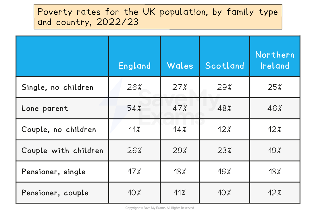
Pie charts are used to represent categorical data, such as the different family types in the UK or the different types of crime committed in the UK
Pie charts are a simple way of presenting data, as each category is easily comparable

Tables
Once quantitative data has been collected and organised, it may be placed in a table
This involves arranging information systematically into rows and columns, providing a structured format for presenting numerical data
Tables are a simple way of presenting data so that comparisons can be made and conclusions can be drawn
Tables tend to be the most common method for presenting analysed data
Worked Example
Here is an example of two knowledge and understanding (AO1) questions that require the interpretation of data:

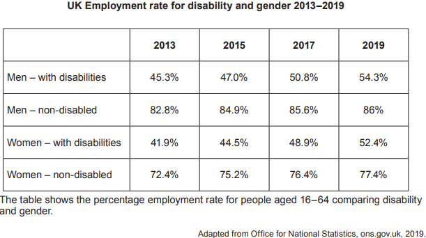
a. Identify the group with the lowest percentage employment rate in 2019.
[1 mark]
b. Identify the group with the largest increase in percentage employment rate between 2013 and 2019.
[1 mark]
Model Answers:
a. Identify the group in the context of the question:
Women with disabilities [1 mark]
b. Identify the group in the context of the question:
Women with disabilities [1 mark]
Worked Example
Here is an example of an application (AO2) question that requires the interpretation of data:
c. Describe two patterns or trends shown in the table, supporting your answer with reference to the statistics in the table.
[4 marks]
Model Answer:
Identify one pattern/trend in the context of the question:
The disability employment gap between men and women with disabilities has become smaller. [1 mark]
Describe the pattern/trend by referring to the statistics in the source:
The disability employment gap in 2013 between men and women was 3.4% and has fallen to 1.9% in 2019. [1 mark]
Identify the second pattern/trend in the context of the question:
Overall employment rates have increased between 2013 and 2019. [1 mark]
Describe the second pattern/trend by referring to the statistics in the source:
The employment percentage has risen for all four groups in the table, such as men without disabilities by 3.2% and as much as 10.5% for women with disabilities. [1 mark]
Examiner Tips and Tricks
If you describe more than two patterns or trends, each will be marked, but only the two best will count towards your final mark. Avoid doing this — it wastes valuable exam time that you could spend on higher-tariff questions.

Unlock more, it's free!
Join the 100,000+ Students that ❤️ Save My Exams
the (exam) results speak for themselves:

Was this revision note helpful?