Syllabus Edition
First teaching 2025
First exams 2027
Graphs (DP IB Psychology): Revision Note

Bar graphs
A type of graphical display can be achieved using a bar graph
The data shown on the x-axis of a bar graph is discrete (not continuous)
E.g., scores on a memory test; number of 'yes' answers ticked on a questionnaire
A bar graph uses categorical data which does not necessarily fall into any particular order
If a researcher had conducted an experiment with three conditions, they could use a bar graph to display the means of each condition
Bar graphs do have gaps between each category on the x-axis (unlike histograms)
The x-axis shows the categories/conditions
The y-axis shows the score/percentage per category/condition

Histograms
On a histogram, the x-axis represents the categories that have been measured, e.g.,
the number of goals scored across one football season
the number of marks in a psychology mock exam across one year group
On a histogram, the y-axis represents the frequencies of each category occurring, e.g.,
the frequency of the number of two goals scored in one match
the frequency of question 5 on the mock exam being awarded full marks
A histogram thus, shows continuous data
Any category with zero frequency is represented by a space (a gap) in the chart
Histograms do not have gaps between the bars; the bars touch each other

Line graphs
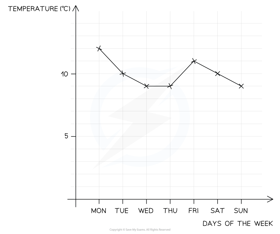
A line graph shows how a quantity (continuous data) changes over time
E.g., How the outside temperature changes during a week (shown below)
This could be of interest to psychologists who wish to investigate the effect of temperature on behaviour
Measurements of the quantity are taken at particular times
Measurements should be taken at regular time intervals
These are then plotted as points on a time series graph and joined together with straight lines
The straight lines help to identify patterns and features in the data
Line graphs can show changes over short or long periods of time
E.g., Changes to the memory scores of participants 30 seconds after being shown a list of words
Or changes in memory scores of one group of people studied over several years
Sometimes a line graph may have more than one data set
E.g., one line for temperature and one line for number of arrests made on that day
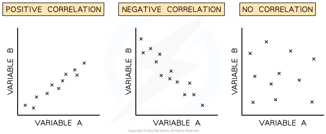
Scatterplots
Scatterplots are used to display the results of correlations
A scatterplot shows the point at which two separate pieces of data meet
Each co-variable can be presented along the x-axis or the y-axis
E.g., a strong positive correlation will be shown regardless of which axis is chosen per co-variable
The arrangement of points on the scatterplot will indicate whether there is a positive correlation, a negative correlation or no correlation

Unlock more, it's free!
Join the 100,000+ Students that ❤️ Save My Exams
the (exam) results speak for themselves:

Was this revision note helpful?