Time Series Graphs (AQA GCSE Maths): Revision Note
Exam code: 8300

Time series graphs
What is a time series graph?
A time series graph is sometimes called a line graph
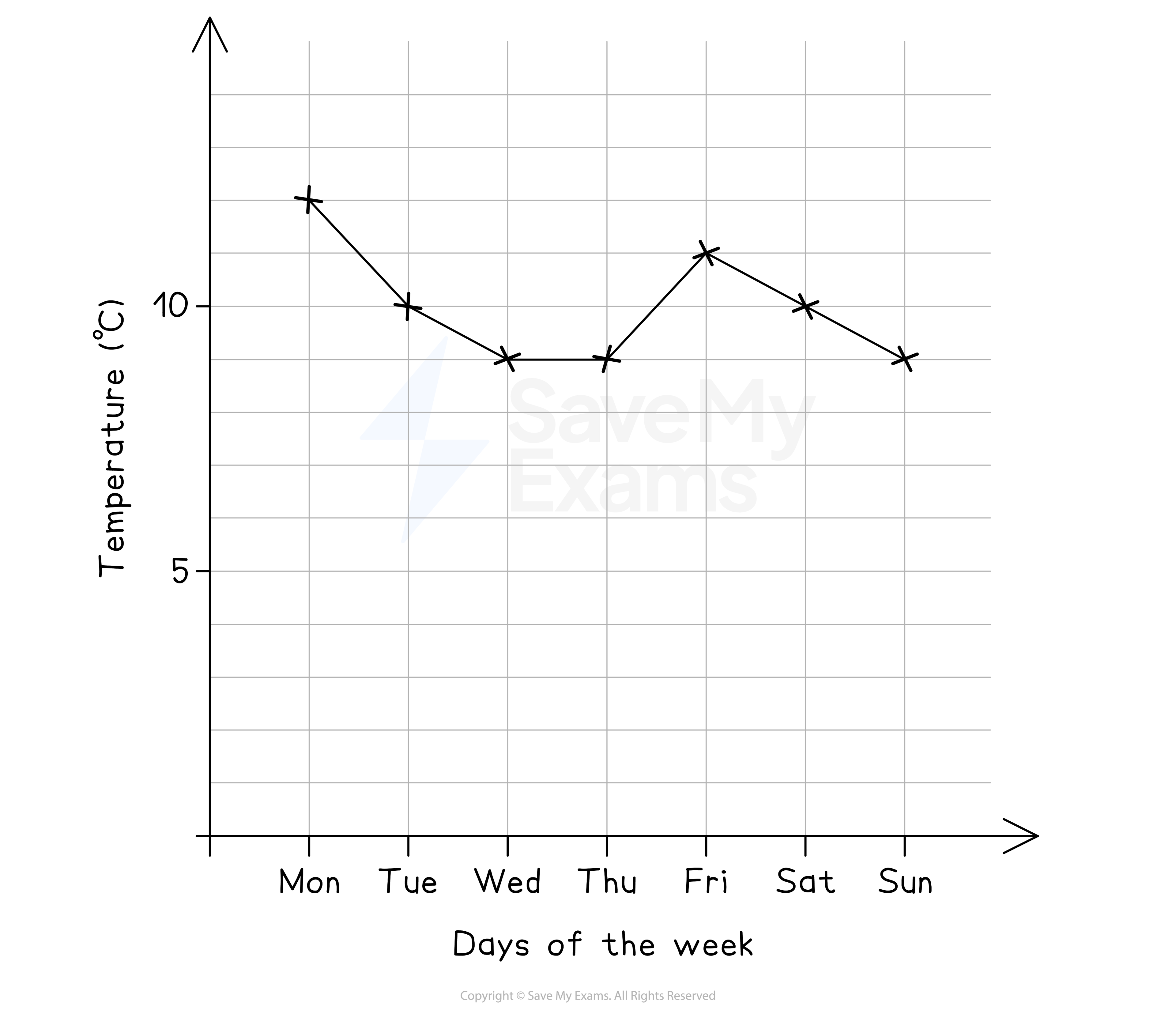
A time series graph shows how a quantity (continuous data) changes over time
e.g. How the outside temperature changes during a week (shown below)
Measurements of the quantity are taken at particular times
Measurements should be taken at regular time intervals
These are then plotted as points on a time series graph and joined together with straight lines
The straight lines help us to identify patterns and features in the data
Time series graphs can show changes over short or long periods of time
e.g. Changes to the temperature of two chemicals for the first few minutes after they've been mixed
Or changes to the temperature of the earth over several years
How do I draw a time series graph?
The horizontal axis (x-axis) will be the time axis
The vertical axis (y-axis) will be the quantity being measured/recorded
Plot the data as a series of points
Join one point to the next, in order, with straight lines
Use a ruler
Sometimes a time series graph may have more than one data set
e.g. one line for car emissions and one line for motorbike emissions
Plot one data set and join the points up before moving on to the second data set
This will ensure you do not muddle the points up
You could use crosses (×) for one set of points, and dots (•) for the other
You could use different colours or dotted/dashed lines when joining the points up
Always include a key in such cases to make it clear which line is which data set
How do I use and interpret a time series graph?
This involves looking at patterns in the data as well as specific points
If a question asks you to interpret or describe a time series graph look for:
A general trend
e.g. The rate of inflation may fluctuate (go up and down) but is generally going down over a decade
Seasonal differences
e.g. Sales are higher in the summer months than winter months
Other things to look for
a horizontal line between points - no change (constant)
the steepest line (gradient) would indicate the greatest change
this could be an increase ('uphill' left to right, like /)
or a decrease ('downhill' left to right, like \)
Unusual 'one-off' readings - 'spikes' or 'dips'
e.g. A spike in mobile phone network activity at midnight on New Year's eve
For line graphs with two (or more) data sets, be clear about which line you are describing
Use the key
Double check which data set is 'higher' or 'lower' (or they may be equal) at a particular time
Intermediate values on the graph (between two data points) may or may not have meaning
E.g. If you are heating water and measuring the temperature every 10 seconds
The value in between 20 and 30 seconds could be a reasonable estimate for the temperature at 25 seconds
If a line chart shows the maximum daily temperature for each day of the week
The value between Monday and Tuesday likely has no meaning
It is unclear what time this would represent
If it was modelled to represent midnight, it is unlikely that the temperature would be between the maximum temperatures of Monday and Tuesday
Examiner Tips and Tricks
If you are asked to describe or interpret a line graph then it may help to:
Draw vertical or horizontal lines on the graph from the respective time or measurement to ensure an accurate reading
Use a ruler to do this!
Highlight any particular points that you mention in your description
Worked Example
The following table records the number of visitors to Wayne’s World of Widgets for 2021, 2022 and the first two quarters of 2023:
Year | 2021 | 2022 | 2023 | |||||||
Quarter | 1 | 2 | 3 | 4 | 1 | 2 | 3 | 4 | 1 | 2 |
Visitors (thousands) | 6.2 | 8.5 | 8.8 | 7.6 | 6.2 | 8.9 | 9.6 | 7.9 | 6.8 | 9.5 |
(a) Draw a time series graph for this data on the following grid.
Answer:
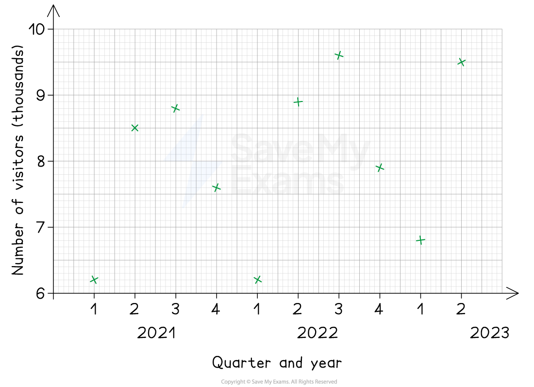
First mark the data points as crosses on the graph
Be sure to check the horizontal and vertical coordinates carefully
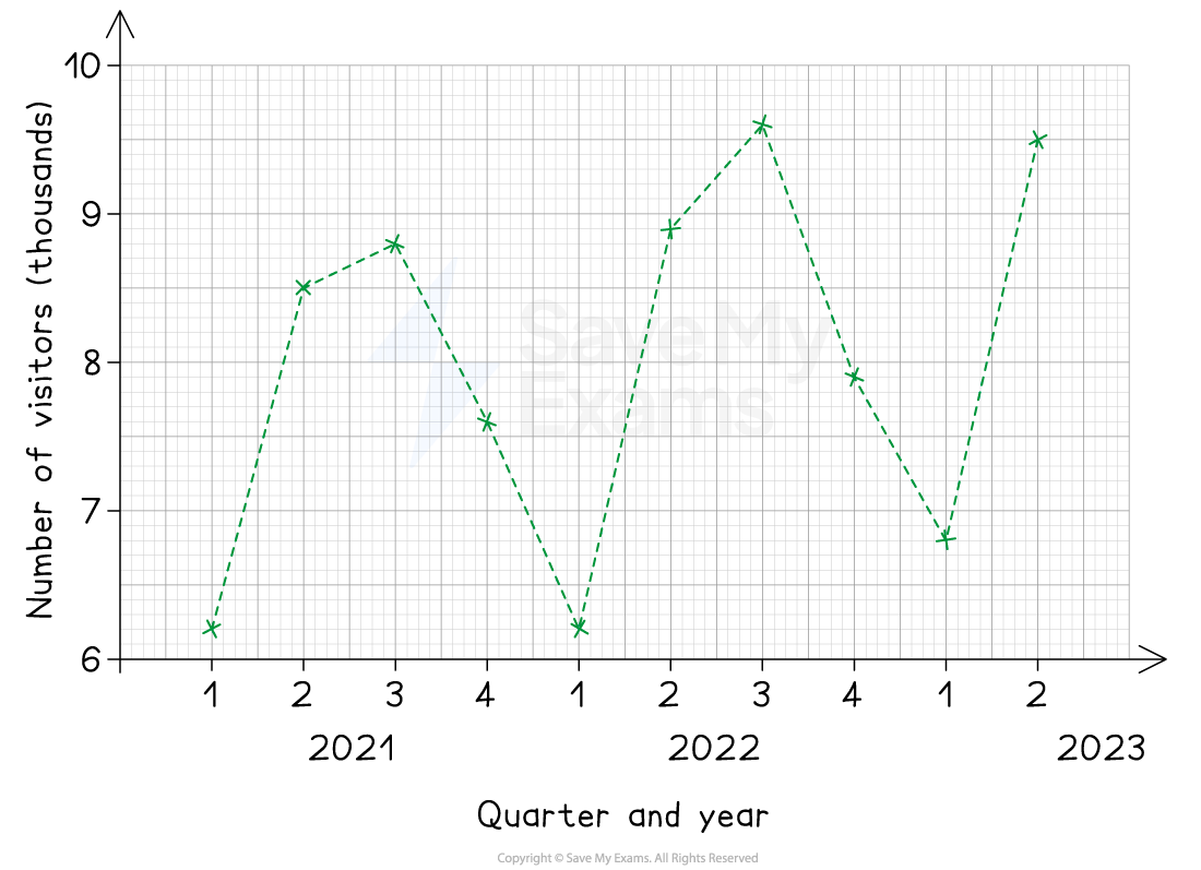
To complete the graph, connect the points with dashed lines from left to right
Use a ruler to make sure the lines are straight
(b) Make two different comments about the trends in the data.
Answer:
Describe the general trend year-on-year
The number of visitors to Wayne's World of Widgets is tending to increase over time
Describe the seasonal differences
More people are visiting Wayne's World of Widgets in the 2nd and 3rd quarters, and fewer people are visiting in the 1st and 4th quarters

Unlock more, it's free!
Join the 100,000+ Students that ❤️ Save My Exams
the (exam) results speak for themselves:

Was this revision note helpful?