Dealing with Data (AQA A Level Biology): Revision Note
Exam code: 7402

Dealing with data
Many students struggle with data-heavy questions, often due to misreading the question, mishandling graphs or calculations, and weak data description
Attention to detail in data questions
Data questions include precise instructions, and marks are often lost when students answer the question they expect rather than the one actually set. When answering these questions:
Match your response to the command word
For example: Describe what the data show; explain or evaluate requires reasons or judgement, not just pattern description
Avoid keyword tunnel vision
Do not write everything you know about a familiar term—check that each sentence answers the full question
Follow all stated constraints
Look for limits such as time periods, “apart from”, or instructions such as “do not include statistical analysis”; ignoring these can invalidate parts of your answer
Evaluate using the data
Present balanced arguments for and against a conclusion
link any evaluative phrases ,such as “correlation does not mean causation”, “small sample size”, or “long-term effects unknown", directly to the data rather than using them generically
Worked Example
Mangrove trees grow near the sea. Sea water surrounds the lower parts of the trees at high tide. Scientists investigated the rate of transpiration in a mangrove tree. Figure 1 shows the scientists’ results.
Figure 1
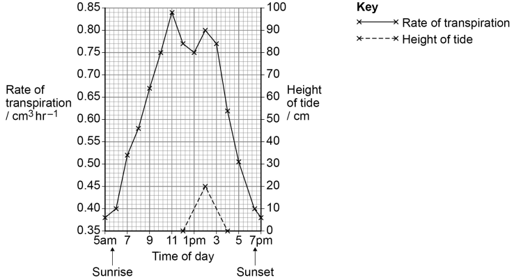
Explain the rate of transpiration between 5 am and midday.
[4]
Mark scheme
Transpiration/evaporation rate increases due to increased temperature / increased light intensity / decreased humidity / increased wind/air movement [1 mark]
This leads to greater water loss as the kinetic energy increases / water potential gradient increases / diffusion gradient increases [1 mark]
Stomata open at sunrise/after 5 am SO allowing gas exchange and/or CO₂ entry [1 mark]
Some stomata close at midday/after ~11 am SO reducing transpiration (accept 11 am as closure time) [1 mark]
Ignore references to tide
Reject the idea that the tide affects transpiration or water potential
Student answers
0/4 marks | 4/4 marks |
|---|---|
From 5 am the rate of transpiration goes up steadily until around 11 am. After this the rate keeps dropping from about 0.84 cm³ hr⁻¹ at 11 am to about 0.4 cm³ hr⁻¹ by 7 pm. The tide height goes up to about 20 cm at around 2 pm and then back down again, which corresponds to a brief increase in the rate of transpiration. Mark: 0/4 Reason for mark: this answer is descriptive; it says that transpiration rate increases and decreases, and then spends time describing in detail what happens after midday, which is outside the time window of the question. It describes tide height changes which are not relevant, and it also makes no attempt to explain any of the changes. | From 5 am to around 11 am the rate of transpiration increases because temperature rises after sunrise [1]. This gives water molecules more kinetic energy [1], so evaporation from the leaves increases and the water diffusion gradient from the leaf to the air becomes steeper. After 5 am it also starts to get light so the stomata open [1] to allow gas exchange, allowing water vapour to diffuse out of the leaves. Between 11 am and midday the rate of transpiration decreases slightly because stomata begin to close [1]. Mark: 4/4 Reason for mark: this answer stays within the 5 am – midday period, and correctly links temperature, kinetic energy, diffusion gradients, light levels and stomatal opening to transpiration rates. |
Mathematics and statistics
Data questions often test your ability to read scales, handle numbers and interpret statistical markers; in these situations marks are often lost for technical mistakes rather than weak biology
Common pitfalls in this area include:
Misinterpreting logarithmic scales
Values on a log₁₀ scale are often read as simple counts (e.g. treating 8 as “8 individuals” instead of 10⁸)
Make sure you know how to convert to and from log values using a calculator
Incorrect use of statistical terminology
Writing that results are simply “significant” is not credited; students must state that a difference is statistically significant
Overlapping standard deviations are often not linked to differences likely being due to chance, and p values are frequently misunderstood
A p value shows the probability that a difference has occurred by chance (e.g. p = 0.05 means less than a 5% probability)
Careless errors in calculations
incorrect rounding
not giving the requested number of significant figures or decimal places
making mistakes in unit conversions
failing to express ratios correctly
Worked Example
Scientists investigated the use of bacteriophages to treat lung infections caused by bacteria. They infected the lungs of mice with a pathogenic species of bacterium. The mice were then divided into two groups, A and B.
The mice in group A were not treated with bacteriophage.
The mice in group B were treated by breathing in a spray containing bacteriophage particles.
After 3 days, the scientists killed the mice and removed their lungs. They washed out each set of lungs with a set volume of liquid. The scientists determined the number of live bacteria in the liquid. Figure 2 shows the scientists’ results. Figure 2 shows the mean and the range of the data about the mean for each group. Standard deviations of the means are not shown.
Figure 2
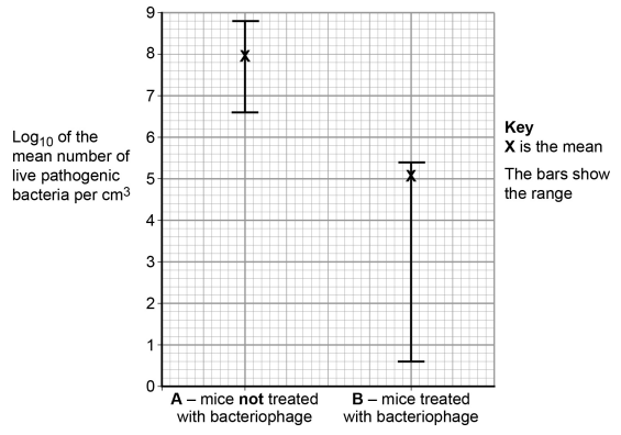
(i) With some samples, the scientists decided they needed to carry out a series of dilutions of the sample before counting the bacteria.
Use evidence from Figure 2 to explain why dilutions were necessary for some samples but not for others.
[2]
(ii) State what can be concluded from these data about the effectiveness of the bacteriophage in treating this lung infection in mice.
Do not consider statistical analyses in your answer.
[3]
Mark scheme
(i) Dilutions were necessary for some samples but not others because:
Log scale is used because bacterial numbers span a very large range / correct values quoted from the graph to illustrate large range [1 mark]
Some samples are too large to count but some are countable / correct values from graph given to illustrate that some samples are too large but some can be counted [1 mark]
Actual numbers or standard form needed for both marking points, not log10 values
(ii) The following can be concluded:
Bacteriophage reduces the number of bacteria [1 mark]
Ranges do not overlap SO the treatment has an effect in all cases / all mice [1 mark]
There is wide variation in response / some mice show larger reductions than others / does not work equally well for all mice OR bacteria are not reduced to zero in any mice [1 mark]
Ignore references to significance
Reject references to standard deviation or standard error
Student answers to (i)
0/2 marks | 2/2 marks |
|---|---|
Some samples needed dilutions because, e.g. in group B there is a wide range in the numbers of bacteria present, so it would be harder to count the largest samples. Some samples don't need diluting because group A only has about 8 bacteria per cm³ compared with about 5 in group B, so those ones would be easy to count without diluting. Mark: 0/2 Reason for mark: in this answer the student bases their explanation on the relative size of the range bar for group B, rather than on the logarithmic scale. In reality group B actually shows a smaller range than group A due to the log₁₀ scale. In addition, the student treats the log₁₀ values on the y-axis as simple numbers (e.g. “8 bacteria per cm³”), so while they have understood the idea that some samples are too big to count while some are not, the numbers quoted to illustrate this are incorrect, so no credit can be awarded. | Figure 2 uses a log₁₀ scale, so the number of bacteria per cm³ in some samples is higher than in others by several orders of magnitude [1]. Mark: 2/2 Reason for mark: in this answer the student recognises that the y-axis is a log₁₀ scale and correctly interprets this as showing that group A has many more bacteria than group B. They then clearly link this to the counting method, stating that very high counts (group A) would be too numerous to count without serial dilution, but the much lower counts (group B) could be counted directly. |
Student answers to (ii)
1/3 marks | 3/3 marks |
|---|---|
The graph shows that treatment with the bacteriophage reduces the number of live bacteria [1] present in lung tissue. The results are significant because the standard deviation bars don’t overlap. Mark: 1/3 Reason for mark: in this answer the student gained credit for observing that treatment reduced the number of bacteria. However the answer talks about “significant” results and “standard deviation bars”. This is incorrect for several reasons:
| Figure 2 shows that mice treated with the bacteriophage have fewer bacteria in their lungs than untreated mice, so the bacteriophage reduces the number of bacteria [1]. The ranges for the two groups do not overlap [1], so the treated group always had fewer bacteria than any of the untreated mice. However, the range bar for the treated group is large, so the bacteriophage effectiveness varies greatly [1] between mice. Mark: 3/3 Reason for mark: in this answer the student also correctly states that the bacteriophage reduces the number of bacteria. It then notes that the ranges for A and B do not overlap, so in every case treated mice had fewer bacteria, which gains the second point. Finally, it comments that there is still a wide range in bacterial numbers, so effectiveness of the treatment varies between mice. |
Data description
Even when a question asks only for a description of the data, students often lose marks by giving vague or unsupported summaries
To maximise marks:
Describe the overall trend between variables
Identify any anomalies or changes in pattern, such as increases, decreases, or plateaus that do not fit the main trend
Support every trend with numerical data, quoting values directly from the table or graph
Keep your description specific to the context given, showing clearly that you are referring to this dataset, not a generic example you expected to see
Worked Example
Some strains of E. coli bacteria have developed resistance to the antibiotic Colomycin. This antibiotic binds to a surface protein called RCP1. If enough Colomycin binds to RCP1 on a bacterial cell, the cell is killed.
A team of researchers studied the relationship between the amount of RCP1 on the surface of E. coli and the percentage of cells killed by Colomycin. Their results are shown in Figure 3.
Figure 3
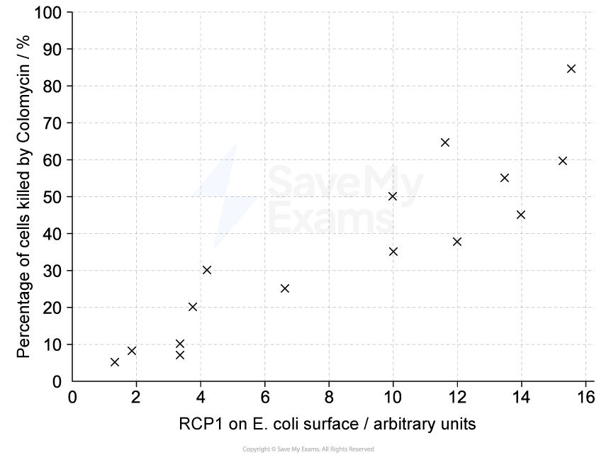
Describe the results shown in Figure 3.
[3]
Mark scheme
Any three of the following:
Higher RCP1 levels correspond to a higher percentage of cells killed OR there is a (weak) positive correlation [1 mark]
Data points from graph that support marking point 1, e.g. at an RCP1 value of 1.8, 9% of cells are killed and at an RCP1 value of 15.2, 60% of cells are killed [1 mark]
Some higher RCP1 values correspond with lower % cells killed OR some lower RCP1 values correspond with higher % cells killed OR there are some data points that do not fit the relationship [1 mark]
Data points from graph that support marking point 2, e.g. at an RCP1 value of 4.2 a higher percentage of cells are killed (30%) than at an RCP value of 6.6 (25%) [1 mark]
Accept approximate values quoted from Figure 1
Student answers
1/3 marks | 3/3 marks |
|---|---|
As the amount of RCP1 increases, more of the E. coli cells are killed by Colomycin. There is a positive correlation [1] between the two variables. Mark: 1/3 Reason for mark: this answer gains credit for stating that there is a positive correlation between RCP1 level and percentage of cells killed. It does not support this with any numerical data from the graph and does not mention that some points do not fit the trend. | There is a weak positive correlation [1], as higher levels of RCP1 on the E. coli surface are usually associated with a higher percentage of cells killed by Colomycin. For example, at an RCP1 value of about 1.8 only around 9% of cells are killed, whereas at an RCP1 value of about 15.2 around 60% of cells are killed [1]. However, some points do not fit the pattern [1]. An example of this is that at an RCP1 value of about 4.2 the percentage of cells killed (around 30%) is higher than it is at an RCP1 value of about 6.6 (around 25%). Mark: 3/3 Reason for mark: this answer first describes the overall pattern as a weak positive correlation between RCP1 and percentage of cells killed. It then backs this up with a pair of approximate values from the graph. Finally, it notes that some data points do not fit the overall trend and it again supports this with another pair of directly quoted values. |

Unlock more, it's free!
Join the 100,000+ Students that ❤️ Save My Exams
the (exam) results speak for themselves:

Was this revision note helpful?