Interpretation and Display of Quantitative Data (OCR GCSE Psychology): Revision Note
Exam code: J203

Frequency tables
Quantitative data can be represented visually using tables, charts, and graphs
These methods help researchers to summarise, compare, and interpret data quickly and effectively
A frequency table shows how often each score, behaviour, or event occurs, e.g.
the number of times litter is dropped
the number of goals scored by each player in one season
the frequency of marks achieved by students on a maths test out of 10
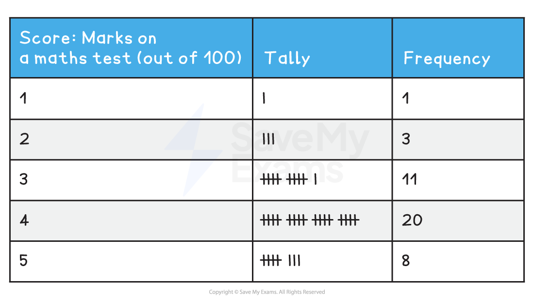
From this data, we can calculate the following:
Mode: 4 (most frequent score)
Median: 5 (middle value)
Mean: (1×1 + 2×3 + 3×11 + 4×20 + 5×8) ÷ 43 = 3.7
Range: 4
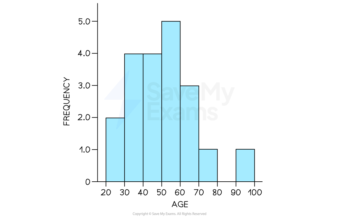
Histograms
A histogram is used to display continuous data
The x-axis shows score intervals or categories
The y-axis shows frequency
Bars touch each other, showing that the data is continuous
Histograms are useful when scores cover a wide range or need to be grouped into intervals
E.g. showing how many participants of different ages took part in a study
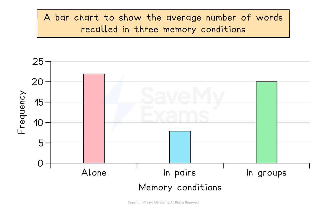
Bar charts
A bar chart is used for categorical data (discrete data that falls into separate groups)
The x-axis shows categories (e.g. “Visual”, “Auditory”, “Semantic”)
The y-axis shows frequency or average scores
Bars have gaps between them to show separate categories
Bar charts are useful for comparing conditions in experiments or categories in surveys
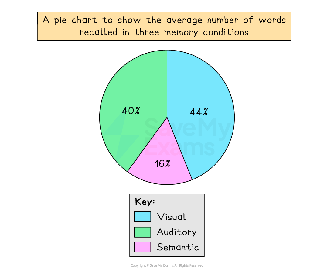
Pie charts
A pie chart presents data as proportions of a whole
Each category is represented by a slice, and the size of the slice reflects its frequency or percentage
Pie charts make it easy to compare categories at a glance
Pie charts are used to represent categorical data, such as the average number of words recalled in three memory conditions
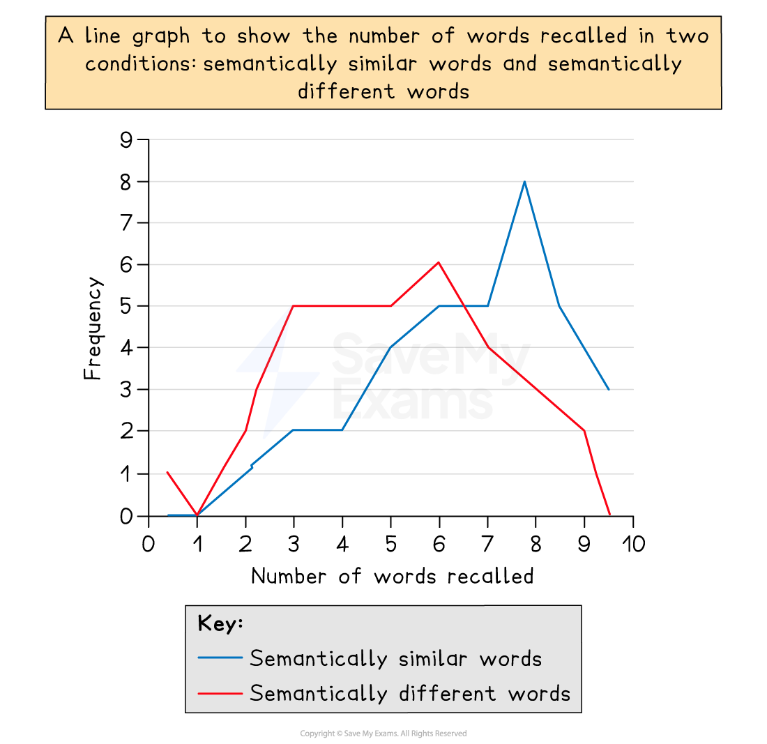
Line graphs
A line graph is used to show changes or trends in quantitative data
The x-axis represents time or a continuous variable
The y-axis represents scores, frequencies, or percentages
Points are plotted and then joined by lines to show trends clearly
Line graphs are ideal for showing progress, improvement, or change — e.g. memory recall scores over several trials
Examiner Tips and Tricks
Students lose easy marks by giving incorrect titles or forgetting to label axes. When you draw a graph, make sure the title includes both variables, and label the x- and y-axes clearly and accurately.
For example, for a scattergram on challenges and depression, the title should be 'A scattergram to show the relationship between number of challenges and depression score'
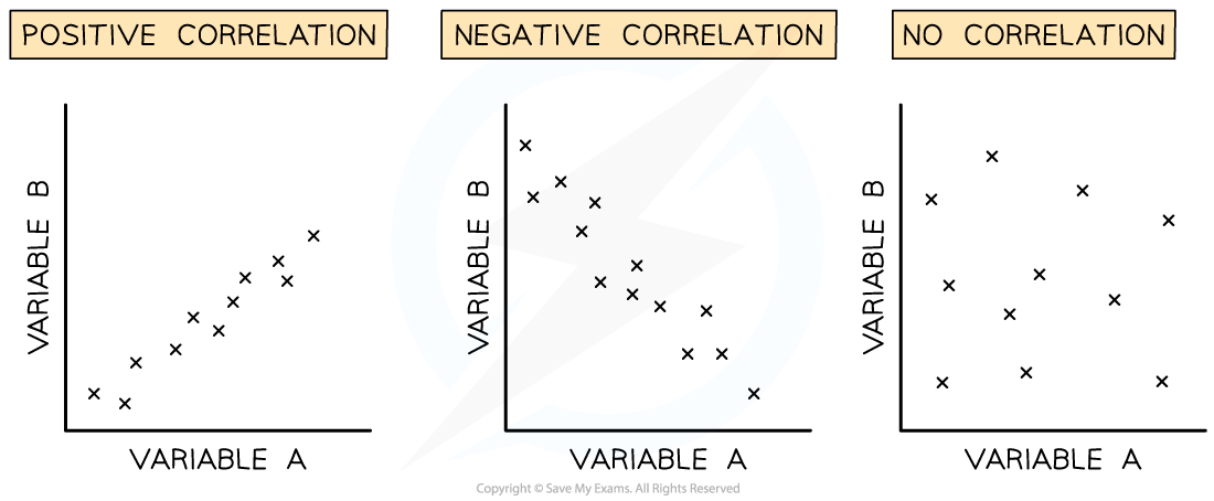
Scattergrams
A scattergram (or scatter diagram) is used to show relationships between two variables (co-variables)
One variable is plotted on the x-axis, the other on the y-axis
Each point represents one participant’s pair of scores
The pattern of points shows whether the relationship is positive, negative, or no correlation
Scattergrams are often used in correlational research to explore associations (e.g. hours of sleep and stress levels)
Examiner Tips and Tricks
You may be asked to either sketch or interpret the results of any of the graph types shown on this page, so make sure you are clear about their different functions and displays.

Unlock more, it's free!
Join the 100,000+ Students that ❤️ Save My Exams
the (exam) results speak for themselves:

Was this revision note helpful?