Interpreting Results in Biology (DP IB Biology): Revision Note

Written by: Ruth Brindle
Updated on
Interpreting results in Biology
This is the "sense-making" phase of your investigation, where you analyse your processed data to find patterns, trends, and relationships
The primary goal is to determine what your results are telling you so that you can answer your research question
This almost always involves creating a graph to visualise the relationship between your independent and dependent variables
Principles of interpretation
Presenting data graphically
A graph is the most powerful tool for interpreting your results
It turns lists of numbers into a clear visual pattern
A correctly formatted scientific graph must include:
A specific title that describes the relationship being investigated
For example, "A graph to show the effect of temperature on the rate of reaction."
The axes must be labelled correctly:
The independent variable is plotted on the x-axis
The dependent variable on the y-axis
Axes should be labelled with quantities and units
The graph should have an appropriate and linear scale for both axes and use at least half of the space
Clearly plotted points, usually as a small 'x' or a point with a circle around it
A line (or curve) of best fit that shows the overall trend in the data
This line does not have to go through every single point
Interpreting graph features
Beyond the line of best fit, other features of a graph provide important information:
The gradient (slope):
Can represent a rate of change, such as the initial rate of an enzyme reaction
The x-intercept:
Can represent a key biological value
In an osmosis experiment, the x-intercept of a graph of % mass change vs. concentration is the isotonic point
A peak or trough (optimum):
The highest point on a curve also can represent a key biological value such as an optimum condition (temperature or pH) for enzyme activity
Error bars:
The size of your error bars (representing standard deviation) gives a visual representation of the variability in your data
Large error bars suggest that the data is widely spread
If error bars for different means overlap, it suggests there may not be a significant difference between those conditions
Identify, describe, and explain patterns and trends
Once you have your graph, you must interpret it
This is a two-step process:
Describe the trend:
State what the graph shows
Use key scientific terms like:
positive correlation
reaches an optimum
the rate plateaus
Explain the trend:
You must use your knowledge of biological principles to explain why the data follows this trend
This is the most important part of the interpretation
Identify and justify anomalous results
An anomalous result, or outlier, is a data point that clearly does not fit the overall trend
You should highlight obvious anomalous results on your final graph

In your analysis, you must justify why it is an anomalous result
Interpret qualitative and quantitative data together
Your qualitative observations are crucial evidence to help explain your quantitative results
For example:
Your quantitative data for an osmosis experiment shows a smaller than expected mass gain in pure water
Your qualitative observation that "the potato cylinders felt soft and flaccid at the start" could explain this, as the tissue may have been dehydrated, affecting its ability to absorb water
Assess accuracy, precision, reliability and validity
These terms have very specific scientific meanings
Using them correctly in your interpretation shows a high level of understanding
Accuracy:
How close your final result is to the accepted or true value
In many biology investigations, there isn't a single "true" value, but you can compare to expected patterns or published studies
Accuracy is affected by systematic errors
Precision:
How close your repeat measurements are to each other
A small standard deviation indicates high precision
Precision is affected by random errors
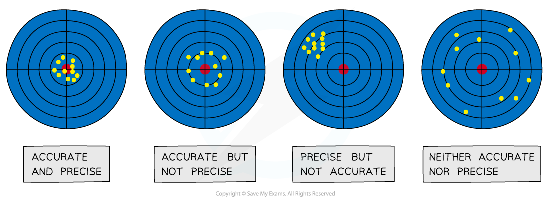
Reliability:
This refers to the consistency of your results
If you collected several precise replicates, your mean result can be described as reliable
Small error bars on your graph indicate high reliability
Validity:
This relates to your experimental method
Your conclusion is valid if you successfully controlled all other significant variables, ensuring the effect you measured was caused only by your independent variable
Worked Example
Research question:
"What is the effect of sucrose concentration on the percentage change in mass of potato cylinders?"
Graph:
After completing the experiment, a graph could be plotted of Mean Percentage Change in Mass / % (y-axis) against Sucrose Concentration / M (x-axis).
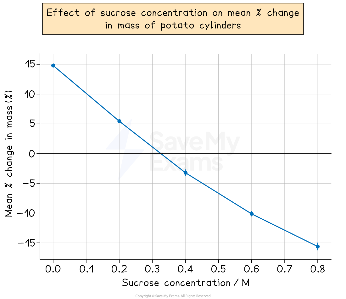
Interpretation:
Description of trend:
The graph shows a strong negative correlation between the sucrose concentration and the mean percentage change in mass of the potato cylinders
As the sucrose concentration increases, the percentage mass of the potato tissue decreases.
The line of best fit crosses the x-axis at 0.35 M
Explanation of trend:
This is consistent with the principles of osmosis
In solutions with a low sucrose concentration (high water potential), the potato cells gained water, increasing their mass
In solutions with a high sucrose concentration (low water potential), the cells lost water, decreasing their mass
The x-intercept at 0.35 M represents the isotonic point, where the water potential of the potato tissue is equal to the water potential of the sucrose solution, resulting in no net movement of water
Worked Example
Research question:
"What is the effect of pH (from pH 4 to pH 10) on the rate of activity of the enzyme trypsin in breaking down casein protein?"
Graph:
A graph of “Rate of Reaction (1/time) / s⁻¹” (y-axis) against “pH (±0.1)” (x-axis) is plotted
The graph shows a clear increase in rate from pH 4.0 up to pH 8.0, followed by a decline at higher pH values
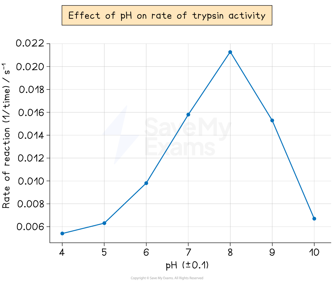
Interpretation:
Description of trend:
As pH increases from 4.0 to 8.0, the mean rate of trypsin activity increases steadily
Activity reaches a maximum at pH 8.0, which represents the enzyme’s optimum pH
Beyond pH 8.0, the rate of reaction decreases sharply
Explanation of trend:
At low pH (acidic conditions), the enzyme is denatured as excess hydrogen ions interfere with the ionic and hydrogen bonds that maintain the enzyme’s tertiary structure
This changes the shape of the active site and reduces the activity of trypsin
As the pH moves closer to the enzyme’s optimum (around pH 8.0), the active site has the correct shape for maximum substrate binding
This allows the enzyme to catalyse the breakdown of casein most efficiently
At higher pH values (above pH 8.0), the enzyme begins to denature as the alkaline conditions alter the charge of amino acid side groups
This changes the shape of the active site, reducing substrate binding and lowering the rate of reaction
Examiner Tips and Tricks
The independent variable always goes on the x-axis
A simple but crucial convention for scientific graphs is that the independent variable is plotted on the horizontal (x) axis, and the dependent variable is on the vertical (y) axis
A line of best fit is not "dot-to-dot"
It is a single, smooth line or curve that represents the overall trend of your data
It should have roughly the same number of points on either side of it
Explain the biology
The most important part of your interpretation is linking the trend in your graph back to the relevant biological theory (e.g., osmosis, enzyme denaturation, limiting factors of photosynthesis)
Talk about your error bars.
Don't just plot them
Use them in your interpretation
State what they show about the reliability of your data
For example, "The small, non-overlapping error bars between 20°C and 30°C suggest a significant difference in enzyme activity between these two temperatures."

Unlock more, it's free!
Join the 100,000+ Students that ❤️ Save My Exams
the (exam) results speak for themselves:

Was this revision note helpful?