Interpreting Results in Chemistry (DP IB Chemistry: HL): Revision Note

Interpreting Results in Chemistry
This is the "sense-making" phase of your investigation, where you analyse your processed data to find patterns, trends, and relationships.
The primary goal is to determine what your results are telling you so that you can answer your research question.
This almost always involves creating a graph to visualise the relationship between your independent and dependent variables.
Principles of interpretation
Presenting data graphically
A graph is the most powerful tool for interpreting your results.
It turns lists of numbers into a clear visual pattern.
A correctly formatted scientific graph must include:
A specific title that describes the relationship being investigated.
For example, "A graph to show the effect of temperature on the rate of reaction."
The axes:
The independent variable is plotted on the x-axis.
The dependent variable on the y-axis.
Axes should be labelled with quantities and units.
The graph should have an appropriate and linear scale for both axes and use at least half of the space.
Clearly plotted points, usually as a small 'x' or a point with a circle around it.
A line (or curve) of best fit that shows the overall trend in the data.
This line does not have to go through every single point.
Beyond the line of best fit, other features of a graph provide important information:
The gradient (slope):
This can represent a key value.
In a rate vs. concentration graph for a first-order reaction, the gradient is the rate constant, k.
The y-intercept:
This shows the value of the dependent variable when the independent variable is zero.
The area under the curve:
This can represent a total quantity, such as the number of particles in a Maxwell-Boltzmann distribution curve.
Error bars:
The size of your error bars gives a visual representation of the precision of your data.
Large error bars suggest significant random error.
If the line of best fit passes through the error bars of all points, it indicates a good fit.
Identify, describe, and explain patterns and trends
Once you have your graph, you must interpret it.
This is a two-step process:
Describe the trend:
State what the graph shows.
Use key scientific terms like:
Linear positive correlation
Inversely proportional
Exponential increase
The rate plateaus
Explain the trend:
You must use your knowledge of chemical principles to explain why the data follows this trend.
This is the most important part of the interpretation.
Identify and justify anomalous results
An anomalous result, or outlier, is a data point that clearly does not fit the overall trend.
You should highlight obvious anomalous results on your final graph.
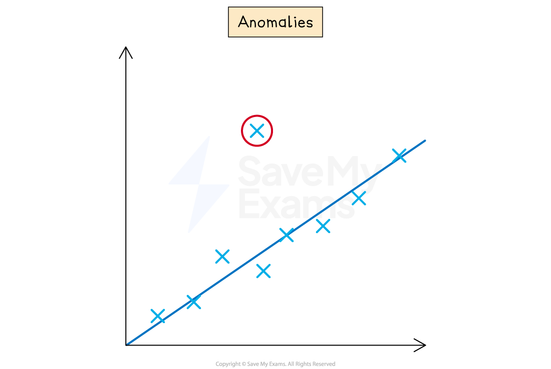
In your analysis, you must justify why it is an anomalous result.
A good justification links the anomalous result to a likely experimental error.
For example:
The result from trial 2 at 60°C was excluded from the average and the graph as it was significantly higher than the other two trials.
This was likely caused by a random error, such as a delay in starting the stopwatch.
Interpret qualitative and quantitative data together
Your qualitative observations are crucial evidence to help explain your quantitative results.
For example:
Your calculated enthalpy of combustion is much lower than the data booklet value.
Your qualitative observation of "black soot (carbon) forming on the base of the calorimeter" is the perfect piece of evidence to explain why (incomplete combustion released less energy).
Assess accuracy, precision, reliability and validity
These terms have very specific scientific meanings.
Using them correctly in your interpretation shows a high level of understanding.
Accuracy:
How close your final result is to the accepted or true value.
You can only comment on accuracy if a literature value is available for comparison.
Accuracy is affected by systematic errors.
Precision:
How close your repeat measurements are to each other.
A small spread in your data (e.g., concordant titres of 23.35, 23.40, and 23.40 cm3) indicates high precision.
Precision is affected by random errors.
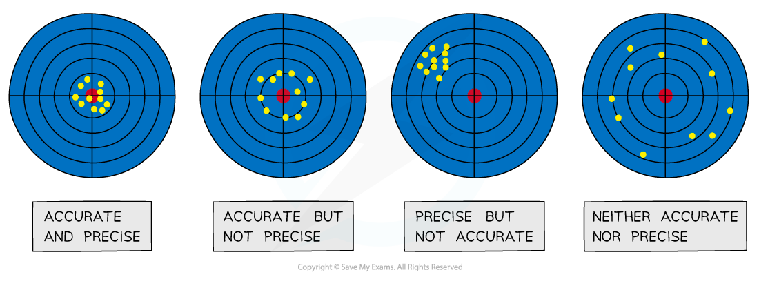
Reliability:
This refers to the consistency of your results.
If you collected several concordant repeat trials, your results can be described as reliable.
Validity:
This relates to your experimental method.
Your results are valid if your experiment was a fair test, meaning you successfully controlled all other significant variables.
Worked Example
Research question:
"What is the effect of temperature on the rate of reaction between sodium thiosulfate and hydrochloric acid?"
Graph:
After completing the experiment, a graph could be plotted of Rate / s-1 (y-axis) against Temperature / °C (x-axis).
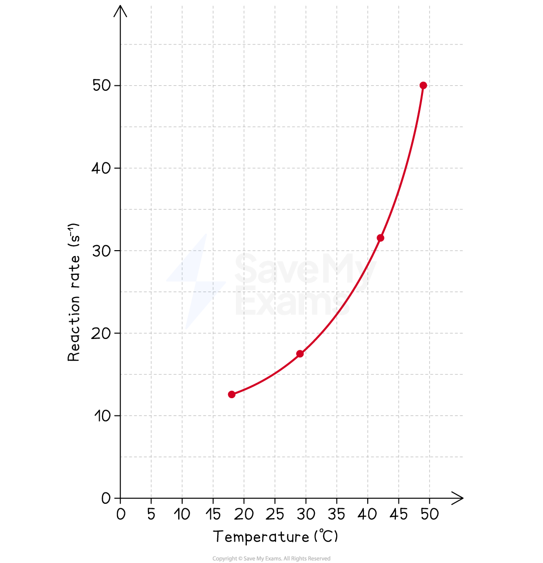
Interpretation:
Description of trend:
The graph shows a clear positive, non-linear correlation between temperature and the rate of reaction.
As the temperature increases, the rate of reaction increases at an accelerating pace.
Explanation of trend:
This is consistent with collision theory.
An increase in temperature increases the average kinetic energy of the reactant particles.
This leads to two effects:
The particles move faster, increasing the frequency of collisions.
More importantly, a significantly greater proportion of particles possess the necessary activation energy for a collision to be successful.
Both factors contribute to the increase in the reaction rate.
Worked Example
Research question:
"What is the concentration of ethanoic acid in commercially sold vinegar?"
Processed data:
The average titre was calculated as 23.38 cm3.
The final calculated concentration was 0.935 mol dm-3.
Interpretation:
Precision and reliability:
The raw titres of 23.40 cm3, 23.35 cm3, and 23.40 cm3 are highly precise, as they are all within ±0.05 cm3 of the mean.
Since three concordant results were obtained, the average titre is considered to be highly reliable.
Accuracy:
A literature search shows that the typical concentration of ethanoic acid in commercial vinegar is around 0.8 – 1.0 mol dm-3.
The experimentally determined value of 0.935 mol dm-3 falls within this range, suggesting that the result is accurate.
Examiner Tips and Tricks
The independent variable always goes on the x-axis.
A simple but crucial convention for scientific graphs is that the independent variable is plotted on the horizontal (x) axis, and the dependent variable is on the vertical (y) axis.
A line of best fit is not "dot-to-dot".
It is a single, smooth line or curve that represents the overall trend of your data.
It should have roughly the same number of points on either side of it.
Explain the chemistry.
The most important part of your interpretation is linking the trend in your graph back to the relevant chemical theory (e.g., collision theory, intermolecular forces, etc.).
This moves your analysis from simple description to scientific explanation.
Use the key vocabulary.
Explicitly use the terms accuracy, precision, and reliability in your interpretation.
This clearly demonstrates to the examiner that you understand the quality of your results.

Unlock more, it's free!
Join the 100,000+ Students that ❤️ Save My Exams
the (exam) results speak for themselves:

Was this revision note helpful?