Syllabus Edition

First teaching 2025

First exams 2027

Graphical Skills (Cambridge (CIE) IGCSE Geography): Exam Questions

Exam code: 0460 & 0976

24 mins8 questions
12 marks

Study Fig. 1.1, which shows information about birth rates and death rates in Mexico (an LIC) between 1900 and 2060 (estimated).

Graph showing birth and death rates per 1000 from 1900 to 2060. Birth rate peaks mid-century, then declines. Death rate decreases steadily.
Fig. 1.1

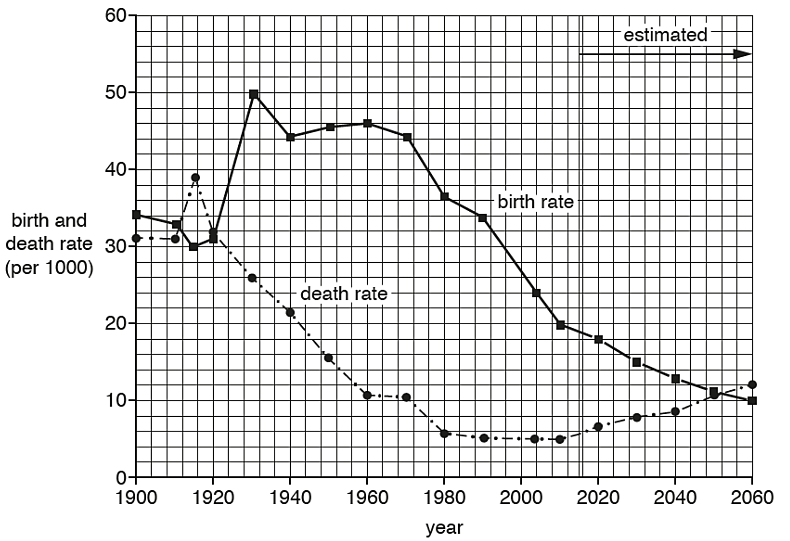
Which two of the following statements are true about birth and death rates in Mexico?

  • The birth rate declined every year between 1900 and 2015.

  • The birth rate was always higher than the death rate between 1900 and 2015.

  • Both the birth rate and the death rate declined overall between 1960 and 2015.

  • Natural population growth was lower in 2015 than it was in 1980.

  • Natural population growth was high between 1900 and 1920.

21 mark

Study Fig. 2.1, which shows information about the sources of air pollution in urban areas in Japan, India and South Korea.

Three pie charts showing air pollution sources in Japan, India, and South Korea, divided into traffic, industry, domestic, electricity, and other.
Fig. 2.1

Complete the graph for South Korea by plotting the following information:

  • electricity generation = 45 %

  • other = 10 %

31 mark

Study Fig. 3.1, which shows information about the problems faced by households after an earthquake in Port-au-Prince, Haiti.

Bar chart depicting household issues; lack of shelter and food are highest at 30%, followed by healthcare, work, roads, education, water, and sanitation.
Fig. 3.1 Nov 2019

Complete Fig. 3.1 by plotting the following information:

  • 13% of households were affected by lack of clean water after the earthquake.

43 marks

Study Fig. 1.2, which shows population pyramids of the structure of Mexico’s population in 1980 and 2010.

Population pyramids for 1980 and 2010 comparing male and female age groups; separated into young dependent, economically active, and old dependent.

Describe the changes in Mexico’s population structure between 1980 and 2010.

53 marks

Study Fig. 5.2, which is a graph showing information about the world production of wheat and rice between 1980 and 2013.

Line graph showing global wheat and rice production from 1980 to 2013. Wheat production is higher, fluctuating between 500-700 million tonnes.
Fig. 5.2

Compare the world production of wheat and rice between 1980 and 2013.

You should use statistics in your answer.

15 marks

Figure 1.1 is a graph showing the value of imports and exports of Jamaica between 1960 and 2021.

Line graph showing Jamaica's import and export values from 1960 to 2021. Imports rise sharply, peaking at $8 trillion, while exports remain steady around $3 trillion.
Figure 1.1

Use Figure 1.1 to compare the value of imports and exports of Jamaica between 1960 and 2021.

24 marks

Using only Fig. 6.1, describe the changes in the number of tourists in Acapulco between 1920 and 2010.

Line graph showing tourist numbers from 1920 to 2010. Rapid increase from 1950 to 1980, then stabilised. X-axis: years, Y-axis: number of tourists.
35 marks

Study the population pyramid for Country X.

Population pyramid showing age distribution by gender, divided into young dependents, economically active, and old dependents, with percentages.

Describe what it shows about the country’s population structure.