Drawing Histograms (OCR GCSE Maths): Revision Note
Exam code: J560

Did this video help you?
Drawing histograms
What is a histogram?
A histogram looks similar to a bar chart, but there are important differences
Bar charts are used for discrete (and sometimes non-numerical) data
In a bar chart, the height (or length) of a bar determines the frequency
There are usually gaps between the bars
Histograms are used with continuous data, grouped into class intervals (usually of unequal width)
In a histogram, the area of a bar determines the frequency
This means it is difficult to tell anything simply from looking at a histogram
Some basic calculations will be needed for conclusions and comparisons to be made
There are no gaps between the bars
How do I draw a histogram?
Drawing a histogram first requires the calculation of the frequency densities for each class interval (group)
Use
format('truetype')%3Bfont-weight%3Anormal%3Bfont-style%3Anormal%3B%7Dtext%7Bfill%3A%23000000%3B%3C%2Fstyle%3E%3C%2Fdefs%3E%3Ctext%20font-family%3D%22Times%20New%20Roman%22%20font-size%3D%2218%22%20text-anchor%3D%22middle%22%20x%3D%2236.5%22%20y%3D%2230%22%3Efrequency%3C%2Ftext%3E%3Ctext%20font-family%3D%22Times%20New%20Roman%22%20font-size%3D%2218%22%20text-anchor%3D%22middle%22%20x%3D%22102.5%22%20y%3D%2230%22%3Edensity%3C%2Ftext%3E%3Ctext%20font-family%3D%22math17f39f8317fbdb1988ef4c628eb%22%20font-size%3D%2216%22%20text-anchor%3D%22middle%22%20x%3D%22136.5%22%20y%3D%2230%22%3E%3D%3C%2Ftext%3E%3Cline%20stroke%3D%22%23000000%22%20stroke-linecap%3D%22square%22%20stroke-width%3D%221%22%20x1%3D%22147.5%22%20x2%3D%22230.5%22%20y1%3D%2223.5%22%20y2%3D%2223.5%22%2F%3E%3Ctext%20font-family%3D%22Times%20New%20Roman%22%20font-size%3D%2218%22%20text-anchor%3D%22middle%22%20x%3D%22189.5%22%20y%3D%2216%22%3Efrequency%3C%2Ftext%3E%3Ctext%20font-family%3D%22Times%20New%20Roman%22%20font-size%3D%2218%22%20text-anchor%3D%22middle%22%20x%3D%22166.5%22%20y%3D%2241%22%3Eclass%3C%2Ftext%3E%3Ctext%20font-family%3D%22Times%20New%20Roman%22%20font-size%3D%2218%22%20text-anchor%3D%22middle%22%20x%3D%22208.5%22%20y%3D%2241%22%3Ewidth%3C%2Ftext%3E%3C%2Fsvg%3E)
Exam questions often ask you to finish an incomplete histogram, rather than start with a blank graph
Once the frequency densities are known, the bars (rectangles) for each class interval can be drawn
with widths being measured on the horizontal (x) axis
and the height of each bar (the frequency density) being measured on the vertical (y) axis
As the data is continuous, the bars will be touching
Examiner Tips and Tricks
Always work out and write down the frequency densities.
It is easy to make errors and lose marks by going straight to the graph.
Method marks may depend on showing you know to use frequency density rather than frequency.
Worked Example
A histogram is shown below representing the distances achieved by some athletes throwing a javelin.
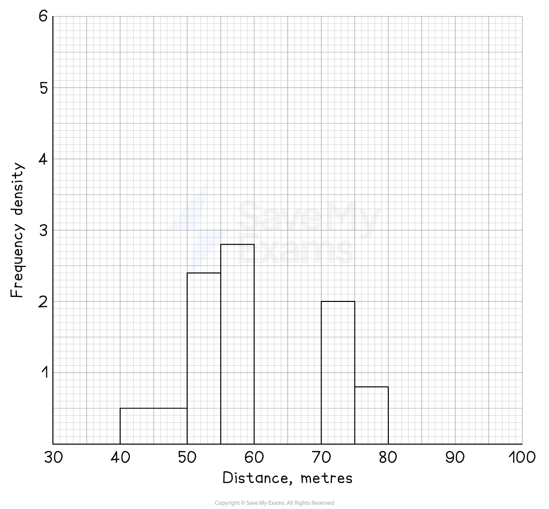
There are two classes missing from the histogram.
These are:
Distance, | Frequency |
| 8 |
| 2 |
Add these to the histogram.
Answer:
Before completing the histogram, remember to show clearly you've worked out the missing frequency densities
Distance, | Frequency | Class width | Frequency density |
| 8 | 70 - 60 = 10 | 8 ÷ 10 = 0.8 |
| 2 | 100 - 80 = 20 | 2 ÷ 20 = 0.1 |
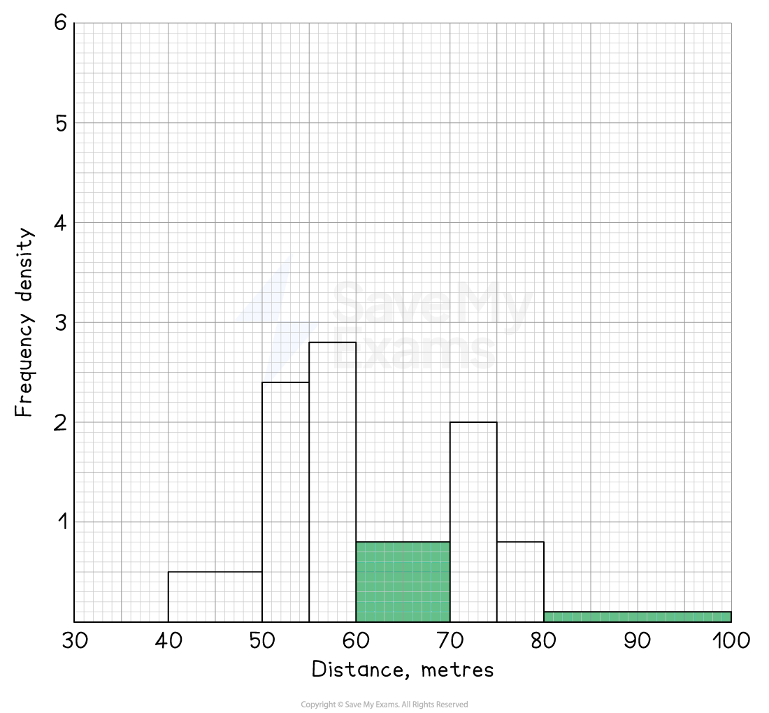
Now the bars can be drawn on the histogram
They should stretch along the x-axis from the start to the end of the class interval
The heights will be equal to the frequency densities

Unlock more, it's free!
Join the 100,000+ Students that ❤️ Save My Exams
the (exam) results speak for themselves:

Was this revision note helpful?
