Correlation & Regression (Edexcel A Level Maths: Statistics): Exam Questions

Exam code: 9MA0

2 hours24 questions
1a
1 mark

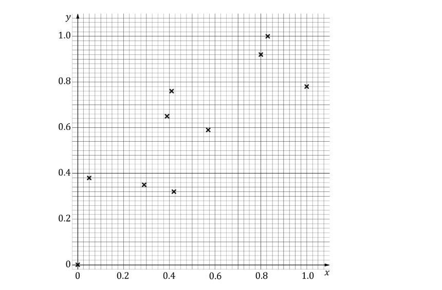
Marc took a random sample of 16 students from a school and for each student recorded

  • the number of letters, x, in their last name

  • the number of letters, y, in their first name

His results are shown in the scatter diagram.

Scatter plot on a grid with points at various coordinates, displaying data distribution patterns; x-axis ranges 0-12, y-axis 0-10.

Describe the correlation between x and y.

1b
1 mark

Marc suggests that parents with long last names tend to give their children shorter first names.

Using the scatter diagram comment on Marc’s suggestion, giving a reason for your answer.

2
3 marks

A teacher is interested in the relationship between the number of hours her students spend on a phone per day and the number of hours they spend on a computer. She takes a sample of nine students and records the results in the table below.

Hours spent on a phone per day

7.6

7

8.9

3

3

7.5

2.1

1.3

5.8

Hours spent on a computer per day

1.7

1.1

0.7

5.8

5.2

1.7

6.9

7.1

3.3

 (i) Plot a scatter diagram of this data on the axes below.

(ii) Describe the linear correlation shown in your diagram.

(iii) Interpret the correlation in the context of the question.

Blank graph with X-axis labelled "Hours spent on a phone per day" and Y-axis labelled "Hours spent on a computer per day," both ranging from 0 to 8.
3
3 marks

The table below shows data for a sample of 8 people comparing the maximum number of pull-ups they are able to complete, x, with the maximum number of press-ups, y.

Number of pull-ups (x)

5

10

8

3

6

8

1

4

Number of press-ups (y)

24

34

36

18

30

35

11

19

 (i) Plot a scatter diagram on the axes below.

(ii) Describe the type of correlation shown in your scatter diagram.

Graph with a grid layout showing the number of pull-ups on the x-axis and the number of press-ups on the y-axis. Axes are labelled with arrows.
4a
1 mark

The following table shows data comparing the length of time a cake was baked for, t minutes, with the mass of the cake once it has cooled, m grams. Each cake in the sample weighed the same before being baked.

t

37

35

36

31

30

28

36

m

825

868

812

943

947

997

837

State which variable is the explanatory (independent) variable and which is the response (dependent) variable.

4b
Sme Calculator
2 marks

The equation for the regression line of m on t is m = 1531 - 19t.

(i) Use the regression line to estimate the mass of a cake if it is baked for 32 minutes.

(ii) Comment on the validity of your estimate in part (b)(i).

4c
Sme Calculator
2 marks

(i) Use the regression line to estimate the mass of a cake if it is baked for 80 minutes.

(ii) Comment on the validity of your estimate in part (c)(i).

5a
1 mark

Isla is investigating whether the number of deep-fried chocolate bars a person eats has an impact on his or her level of fitness. She takes a sample of 10 people and records how many deep-fried chocolate bars they eat during a month, c, and then times how long it takes them to complete a 100-metre sprint, t seconds, at the end of the month.

She plotted the data in a scatter diagram and found the equation of the regression line of t on c to be t = 5c + 12.

Find an estimate for the 100-metre sprint time for a person if they eat two deep-fried chocolate bars in a month.

5b
2 marks

Describe the type of linear correlation you would expect to see on Isla’s scatter diagram and state which value in the regression equation tells you this. 

6
2 marks

Terrence has collected data comparing how many adverts, A, he sees whilst watching TV for different lengths of time, t hours. With this data, Terrence plotted the scatter diagram shown below.

Scatter diagram of number of adverts A against time watching TV t with points showing a positive linear trend

(i) Describe the linear correlation shown in this scatter diagram.

(ii) What does the correlation suggest about the relationship between the number of adverts Terrence sees and the length of time he watches TV?

7a
Sme Calculator
2 marks

Two liquids are mixed and heated to a particular temperature.  The time, in seconds, it takes the two liquids to react is recorded.  The scatter diagram below shows the results.

Scatter graph showing reaction time in seconds versus temperature in degrees Celsius. Data points trend downward, indicating faster reactions at higher temperatures.

(i) Identify the two outliers shown on the scatter diagram.

(ii) Clean the data by removing these outliers and find the mean reaction time.

7b
2 marks

(i) Describe the correlation shown by the scatter diagram.

(ii) A student says that if the mixture is heated to 60 °C the two liquids will react almost instantly.  Explain why the student may be incorrect.

8
2 marks

A teacher collected the maths and physics test scores of a number of students and drew a scatter diagram to represent this data.

q1-medium-2-4-correlation-and-regression-edexcel-a-level-maths-statistics

Describe the correlation shown by the scatter diagram, and interpret the correlation in context.

1a
1 mark

Fred and Nadine are investigating whether there is a linear relationship between Daily Mean Pressure, p hPa, and Daily Mean Air Temperature, t °C, in Beijing using the 2015 data from the large data set.

Fred randomly selects one month from the data set and draws the scatter diagram in Figure 1 using the data from that month.

The scale has been left off the horizontal axis.

Scatter plot showing daily mean air temperature (°C) against daily mean pressure (hPa), with points clustered between 20-30°C and overlapping pressure values.
Figure 1

Describe the correlation shown in Figure 1.

1b
1 mark

Nadine chooses to use all of the data for Beijing from 2015 and draws the scatter diagram in Figure 2.

She uses the same scales as Fred.

Scatter plot showing the relationship between daily mean air temperature (°C) and daily mean pressure (hPa), displaying a negative correlation.
Figure 2

Explain, in context, what Nadine can infer about the relationship between p and t using the information shown in Figure 2.

1c
1 mark

Using your knowledge of the large data set, state a value of p for which interpolation can be used with Figure 2 to predict a value of t.

1d
1 mark

Using your knowledge of the large data set, explain why it is not meaningful to look for a linear relationship between Daily Mean Wind Speed (Beaufort Conversion) and Daily Mean Air Temperature in Beijing in 2015.

2a
1 mark

A random sample of 15 days is taken from the large data set for Perth in June and July 1987.

The scatter diagram in Figure 1 displays the values of two of the variables for these 15 days.

Scatter plot with points scattered across a grid, having x-axis ranging from 0 to 20 and y-axis marked from 0 upwards, displaying a downward trend.
Figure 1

Describe the correlation.

2b
2 marks

The variable on the x-axis is Daily Mean Temperature measured in °C.

Using your knowledge of the large data set,

(i) suggest which variable is on the y-axis,

(ii) state the units that are used in the large data set for this variable.

3a
2 marks

The table below shows data from the United States regarding annual per capita cheese consumption (in pounds) and the divorce rate (number of divorces per 1000 people) for ten years between 2000 and 2018:

Year

2000

2002

2004

2006

2008

2010

2012

2014

2016

2018

Cheese consumption (pounds)

32.1

32.8

33.6

34.8

34.5

35

35.5

36.2

38.5

40

Divorce rate (number per 1000 people)

4

3.9

3.7

3.7

3.5

3.6

3.4

3.2

3.0

2.9

Draw a scatter diagram to represent this data, with per capita cheese consumption on the horizontal axis and divorce rate on the vertical axis.

3b
2 marks

(i) Describe the correlation between per capita cheese consumption and divorce rate.

(ii) A newspaper reports the following statement:

"Eating more cheese reduces the chances of getting a divorce."

Comment on the validity of the statement.

4a
Sme Calculator
2 marks

Priya has been applying different voltages (v, measured in volts) to an electrical circuit in her lab and recording the resulting currents (i, measured in amps). The smallest voltage she applied was 0.5 volts, and the largest voltage she applied was 120 volts.

She found the equation of the regression line of i on v to be i = 0.056 + 0.332v.

(i) Interpret the value 0.332 in this context.

(ii) Use the equation to predict the current for a voltage of 70 volts.

4b
2 marks

Explain why it would not be sensible to use the regression equation to work out:

(i) the current resulting from a voltage of 2000 volts

(ii) the voltage corresponding to a current of 20 amps.

5a
Sme Calculator
2 marks

The following table shows the height, h cm, and weight, w kg, for each of eleven students at a sixth form college.

h

167

182

176

173

17

174

177

178

172

170

169

w

51

62

69

65

65

56

64

62

51

55

58

The following statistics were calculated for the data on height:

mean = 159.5 cm, standard deviation = 45.3 cm

An outlier is an observation which lies more than 2 standard deviations from the mean.

(i) Show that h = 17 is an outlier.

(ii) Explain why this outlier should be omitted from the data.

5b
Sme Calculator
3 marks

With the outlier data excluded, the equation of the regression line of w on h is w = -87.6 + 0.845h.

(i) Exclude the outlier from the recorded measurements and draw a scatter diagram to represent the data for the remaining ten students.

(ii) Draw the regression line on your diagram.

6a
1 mark

The table below shows data from the large data set on the daily mean pressure, p (hPa), and daily total sunshine, s (hrs), in Camborne for a random sample of 12 days in 2015.

p

1007

1023

1011

1022

1011

1019

1017

1016

1022

997

1030

1023

s

0

6.3

2.4

6.2

1.7

8.4

1.9

6.7

7.7

2.3

10.3

4.1

The equation of the regression line of s on p is s = -270.5 + 0.271p.

Give an interpretation of the value of the gradient of the regression line.

6b
2 marks

Explain why it would not be reliable to use this regression equation to predict:

(i) the daily total sunshine on a day with a mean daily pressure of 980 hPa

(ii) the mean daily pressure on a day with 5.6 hours of total sunshine.

7a
2 marks

A maths teacher randomly selects 10 students from a class of 30 to answer a survey. The survey asks students how many practice questions they completed when revising for a recent test, Q, and their percentage score in that test, S %. Summary statistics for Q are shown below.

\bar{Q} = 21, range of Q = 20

The equation of the regression line of S on Q is S = 34 + 2Q.

Explain which variable is the response variable.

7b
2 marks

Comment on the reliability of using the regression equation to:

(i) estimate the scores of the other students in the maths class,

(ii) estimate the scores of this cohort of students in a science class.

8a
1 mark

Ella measures how the extension, x mm, of a thin piece of metal wire varies with the force applied to it, F kN. She records her results in the table below.

F

15

32

49

76

99

106

112

124

132

x

0.2

0.4

0.6

0.9

1.4

1.5

1.6

1.8

1.8

Ella calculates the regression line of F on x to be F = 0.004 - 69.3x.

Explain why this equation must be wrong.

8b
1 mark

The correct equation for the regression line of F on x is F = 6.16 + 67.6x.

Interpret the value of 67.6 in this context.

8c
2 marks

Using the correct regression line, Ella estimates that if she applies a force of 1000 kN then the wire will show an extension of 14.7 mm. 

Give two reasons why Ella’s estimate may not be accurate.

9a
3 marks

A ride-sharing app collected data on the time, t minutes, taken to complete a journey of distance, d miles. Data from a random sample of 8 journeys is detailed in the table below.

d

3.9

6.6

8.5

1.3

1.7

3.7

7.4

6.1

t

25

36

39

6

8

19

38

32

By plotting a scatter diagram of t on d for this data, explain whether or not it is appropriate to use a linear regression model on this data.

9b
1 mark

Using a new random sample of thousands of journeys, the ride-sharing app calculated the regression line of time on distance to be t = -1.8 + 5.9d.

The regression equation predicts that for journeys less than 0.3 miles the time taken will be less than zero minutes.  What is the most likely reason that the regression equation gives this false prediction?

10a
Sme Calculator
2 marks

An ice cream shop owner in Camborne is trying to use data from the large data set alongside their own past sales data to help them estimate future sales. The mean daily temperature per month, T °C, is shown with the mean daily number of ice creams sold per month, I, from 2015 in the table below.

Month

May

June

July

August

September

October

T

11.2

13.8

15.7

15.4

13.6

12.2

I

57

132

259

227

133

101

The equation for the regression line of I on T is I = -429.5 + 42.5T.

Find an estimate for the expected total number of ice creams sold in the month of July if the average daily temperature for that month is 14.9 °C.

10b
1 mark

Suggest one other variable from the large data set which could be used to improve this model.

10c
1 mark

The ice cream shop owner claims that there is a causal link between I and T, and so if the shop sells more ice cream, the month will be hotter. 

Comment on this claim.

1a
1 mark

The relationship between two variables p and t is modelled by the regression line with equation

p equals 22 – 1.1 t

The model is based on observations of the independent variable, t, between 1 and 10.

Describe the correlation between p and t implied by this model.

1b
1 mark

Given that p is measured in centimetres and t is measured in days, state the units of the gradient of the regression line.

1c
2 marks

Using the model, calculate the change in p over a 3‐day period.

1d
1 mark

Tisam uses this model to estimate the value of p when t equals 19.

Comment, giving a reason, on the reliability of this estimate.

2a
3 marks

The table below shows a comparison of the average house price, H (£1 000), and the average yearly income, I (£1 000), for different areas around the UK in 2021.

Area

H

I

Conwy

155.1

26.4

Perth and Kinross

181.3

27.9

Richmondshire

190.3

25.1

Monmouthshire

232.6

31.4

Trafford

260.2

32.0

Gwynedd

148.5

23.6

Basingstoke and Dean

297.7

33.7

Daventry

259.2

29.5

(i) Plot a scatter diagram of I against H, and

(ii) describe the correlation shown.

2b
2 marks

The equation of the regression line of I on H is calculated to be I = 0.06H + 15.92.

A news reporter uses this to claim that if you want a salary of £50 000, all you need to do is buy a house that costs £568 000.

Comment on the validity of the news reporter's claim.

3a
2 marks

Two researchers, Alwyn and Beth, are working on a project collecting data about the self-reported happiness of students on a scale from 0 to 10, H, and the number of exams sat by those students, n. After collecting data from 1000 students, they construct a scatter diagram and find the equation of the regression line of H on n to be H = 7.63 - 0.82n.

Explain what correlation the data is likely to show in the scatter diagram.

3b
1 mark

What information about the original data set would need to be checked before using the regression line equation to estimate the self-reported happiness of a student sitting 8 exams?

3c
2 marks

After calculating the equation of the line of regression, Alwyn accidentally deletes all the data collected about the self-reported happiness scores.  Alwyn says it’s not a problem since he can use the regression line and the number of exams sat to recalculate all the values. Beth says that Alwyn is wrong and the original data is lost forever.

Explain which researcher is correct.

4a
Sme Calculator
1 mark

A consultant is trying to improve the efficiency of how a factory making chewing gum operates.  To help them do this, they collect many types of data about the factory workers.  One such type of data is the number of chewing gum packets made per shift.  The list below shows the number of chewing gum packets made by a particular worker (Worker 1) during the last 10 shifts worked.

392

414

536

474

212

396

427

545

459

234

Calculate the mean number of chewing gum packets made per shift by Worker 1 to the nearest whole number of packets.

4b
3 marks

The table below shows the mean number of chewing gum packets, N, made by various workers along with how many hours of training, T hours, they have received.

Worker

1

2

3

4

5

6

7

8

9

N

512

499

359

393

432

456

520

475

T

18

24

22.5

15

16

20

21

22

21

(i) Including your answer from (a), plot a scatter diagram of the data in the table above.

(ii) Given that the equation of the regression line of N on T is N = 18T + 95, add the regression line to your scatter diagram.

4c
2 marks

The consultant then goes on to collect even more data on other factory workers and records some of it in the table below.

Worker

10

11

12

13

14

15

16

17

18

N

600

598

584

602

593

585

591

601

605

T

29

28.5

32

29

34.5

30.5

37

31

30

Without adding this new data to your scatter diagram, what advice could the consultant give to the factory to improve the efficiency of their workers?

5a
Sme Calculator
4 marks

Paige takes a sample of 9 cities throughout the UK to compare the percentage of people living in a city who identify as vegan, V %, and the percentage of restaurants offering vegan options in that same city, R %.

The regression line of R on V is calculated, and it is used to predict values of R for V = 1.35 and V = 1.03. The values returned are R = 70.73 and R = 50.314 respectively.

Find the equation of the regression line of R on V.

5b
Sme Calculator
2 marks

In one of the cities, 1.16% of people were vegan and 55.9% of restaurants offered vegan options.

Use the equation of the regression line of R on V to estimate the percentage of restaurants offering vegan options in a city in which 1.16% of people are vegan. Give your estimated value of R to 3 significant figures. Compare this to the information above.

5c
2 marks

Paige discovers that in one city every restaurant offers vegan options. Paige suggests that the equation of the regression line of R on V can be used to find the percentage of people in this city who identify as vegan. Explain why Paige is likely wrong.

6a
Sme Calculator
2 marks

An owner of a beach resort is comparing parasol sales, £p, and sun cream sales, £s, at the resort over a period of eleven days. The data is standardised by coding the variables using x = \dfrac{s - 153}{103} and y = \dfrac{p - 32}{37}. The values for the first ten days are plotted on the scatter diagram below.

On the eleventh day, the resort sold £246 worth of sun cream and £69 worth of parasols. Use this information to complete the scatter diagram.

Scatter plot with 10 data points on a grid. X-axis and Y-axis range from 0 to 1. Points vary in positions, mostly clustered around Y = 0.4 to 1.0.
6b
Sme Calculator
5 marks

The equation for the regression line of y on x is y = 0.19 + 0.83x.

(i) Show that by using the regression line of y on x and the coding equations above, the regression line of p on s can be written in the form p = a + bs, where a and b are constants to be found to 3 significant figures.

(ii) Hence, or otherwise, find an estimate for the amount of parasol sales on a day where there are £170 of sun cream sales.