Graphs in the Media (WJEC GCSE Maths & Numeracy (Double Award)): Revision Note
Exam code: 3320

Graphs in the Media
How are graphs used in the media?
Graphs and infographics are often used to present data in the media
Read the Infographics, Tables & Charts revision note to find out more about infographics
This could be online e.g. on social media, in advertisements, or in articles
or in printed media like newspapers, leaflets, or posters
Ideally data should always be presented accurately and honestly, without bias
However there are reasons why individuals, companies, and organisations may wish to present a particular viewpoint
This is usually because they want to persuade you in some way
E.g. to buy a particular product
How might graphs be misleading?
There are some common methods that might be used to make a graph misleading or to emphasise a certain viewpoint
These include:
The vertical scale (on say, a bar chart) does not start at zero
This can exaggerate differences between values, making small changes look more significant
The scale used on an axis (or axes) is inconsistent
For example, the intervals might change size across the axis
For grouped data, the chart might use groups that are too big
This can hide important details or trends within the data set
The graph is not drawn with all the given data
Missing data points can distort the overall picture or trend
For bar charts, the bars may not all be the same width
If a bar representing a value is visually wider, it can make that value appear larger or more significant than the height alone suggests
Worked Example
A car dealership publishes a bar chart comparing the sales figures of three different vehicle types (Saloon, SUV, and Hatchback) sold last month.
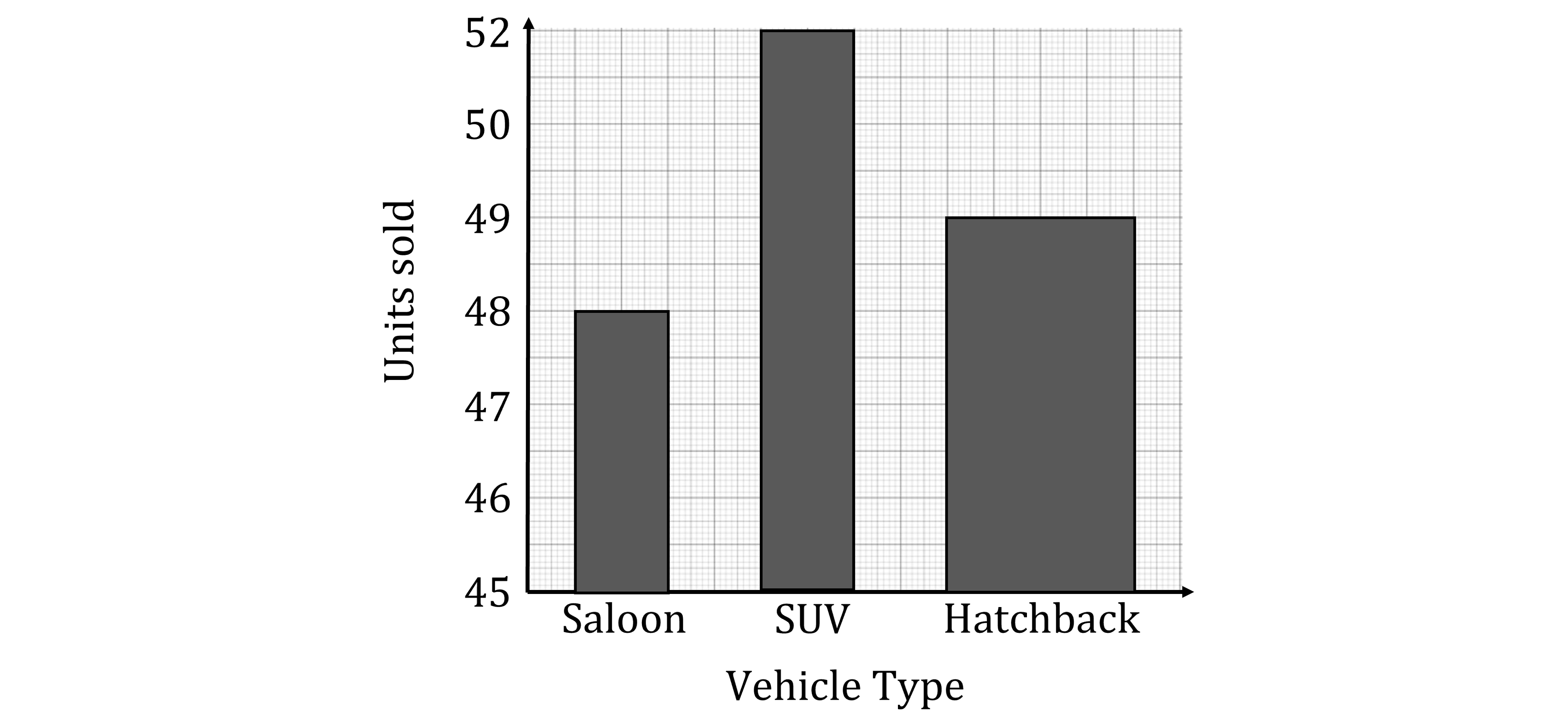
The CEO of the dealership made the following two statements based on the visual appearance of this chart:
Statement 1: "The graph clearly shows that our SUV sales are about double our Saloon sales"
Statement 2: "Hatchback sales make up a significantly larger proportion of our sales than saloon sales"
The CEO’s statements are both incorrect.
Give one explanation for each statement that has led the CEO to make these incorrect statements.
Answer:
Notice that the vertical axis does not start from zero
For statement 1, it appears that twice as many SUVs were sold than saloons as the graph does not start from zero on the vertical axis.
This exaggerates the difference in sales. The difference was actually only 4 (52 compared to 48, so only 8% more)
Notice that the bar for hatchbacks is twice as wide as the other bars
For statement 2, the bar for hatchbacks is much wider than the other bars.
This gives the impression that the bar represents a larger number of sales than it really does. The difference between hatchback sales and saloon sales was only 1.

Unlock more, it's free!
Join the 100,000+ Students that ❤️ Save My Exams
the (exam) results speak for themselves:

Was this revision note helpful?