Data Presentation (AQA A Level Maths: Statistics): Exam Questions

Exam code: 7357

2 hours23 questions
1a
3 marks

The box and whisker diagram below shows the train journey times, in minutes, between March and Peterborough on a weekday.

Box and whisker diagram showing weekday train journey times in minutes between March and Peterborough, with whiskers extending from approximately 17 to 25 minutes and a box from 18 to 21 minutes

(i) Find the median journey time.

(ii) Find the lower and upper quartiles.

(iii) Find the interquartile range.

1b
2 marks

The box and whisker diagram in part (a) shows the journey times on a weekday. The table below summarises the times for the same journey on a Saturday.

Journey time (minutes)

Fastest

16

Lower quartile

18

Median

19

Upper quartile

20

Slowest

25

On the grid below, draw a box plot for the information given in the table.

Blank grid with a horizontal axis labelled 'Train journey times (mins)' showing tick marks at 15, 20, and 25
2a
3 marks

In a paper aeroplane competition, 55 contestants flew their paper aeroplanes in the airtime pre-eliminations round. The flight times achieved by the contestants' paper aeroplanes are shown in the table below.

Time, t seconds

Frequency f

0t<4

12

4t<8

25

8t<12

16

12t<16

2

On the grid below, draw a cumulative frequency graph for the information in the table.

Blank cumulative frequency grid with x-axis labelled 'Time (seconds)' from 0 to 20 and y-axis labelled 'Cumulative frequency' from 0 to 60
2b
1 mark

Use your graph to estimate the median time.

3a
3 marks

The heart rates, in beats per minute (bpm), of 60 randomly selected athletes during a training session were recorded. The data are summarised in the table below.

Heart rate, b (bpm)

Frequency

140b<160

10

160b<170

20

170b<175

20

175b<180

10

On the grid below, draw a histogram to represent these data.

Blank histogram grid with x-axis labelled 'BPM' from 130 to 190 and y-axis labelled 'Frequency density' from 0 to 4
3b
2 marks

Use the histogram to estimate the number of athletes with a heart rate less than 150 bpm.

4a
1 mark

A company recorded the commute times, in minutes, for a sample of 15 employees travelling to work one morning. The times are given below.

4

8

12

9

7

14

6

5

8

7

9

10

7

3

6

Find the median commute time.

4b
2 marks

Find the interquartile range of the commute times.

4c
1 mark

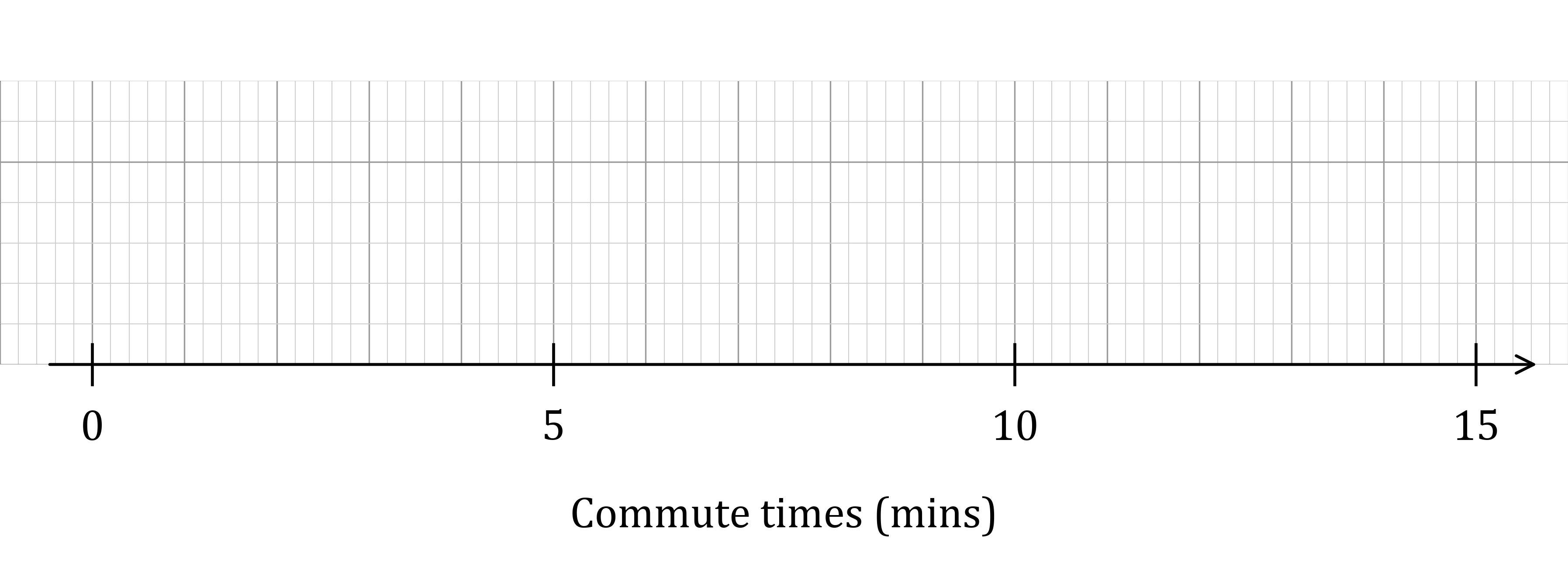
On the grid below, draw a box plot for the commute times.

Blank horizontal number line from 0 to 15 minutes, labelled “Commute times (mins)” with major ticks at 0, 5, 10 and 15 and a right arrow.
5a
2 marks

To quality-control the elasticity of elastic bands, a company selects random elastic bands from the end of their production line and has a machine stretch them until they snap. The length, in millimetres, of an elastic band at the moment it snaps is recorded. The histogram and frequency table below show the results, but each is incomplete.

Incomplete histogram showing the snap length distribution of elastic bands; bars for the classes 100–150, 150–175 and 175–200 mm are drawn with frequency densities 0.1, 0.4 and 0.8, but no bars are drawn for 200–225 mm or 225–275 mm

Snap length, l (mm)

Frequency

Frequency density

100l<150

5

0.1

150l<175

0.4

175l<200

0.8

Use the histogram to complete the frequency table.

5b
2 marks

Use the frequency table below to complete the histogram by drawing the missing bars for the classes 200l<225 and 225l<275.

Snap length, l (mm)

Frequency

200l<225

15

225l<275

10

Incomplete histogram showing the snap length distribution of elastic bands; bars for the classes 100–150, 150–175 and 175–200 mm are drawn with frequency densities 0.1, 0.4 and 0.8, but no bars are drawn for 200–225 mm or 225–275 mm
6a
3 marks

In a paper aeroplane competition, 40 contestants flew their paper aeroplanes in the distance pre-eliminations round. The distances achieved by the contestants' paper aeroplanes are shown in the cumulative frequency diagram below.

Cumulative frequency diagram for the distances thrown, with the horizontal axis showing distance in metres from 0 to 60 and the vertical axis showing cumulative frequency from 0 to 40. The curve rises slowly to about cumulative frequency 8 by 25 metres, then steeply through about (33, 20) before levelling off near (50, 40)

Use the cumulative frequency graph to estimate

(i) the median distance

(ii) the interquartile range.

6b
2 marks

The contestants whose paper aeroplanes flew the furthest 9 distances qualified for the super finals. Use the graph to estimate the minimum distance a paper aeroplane needed to fly to qualify for the super finals.

7
2 marks

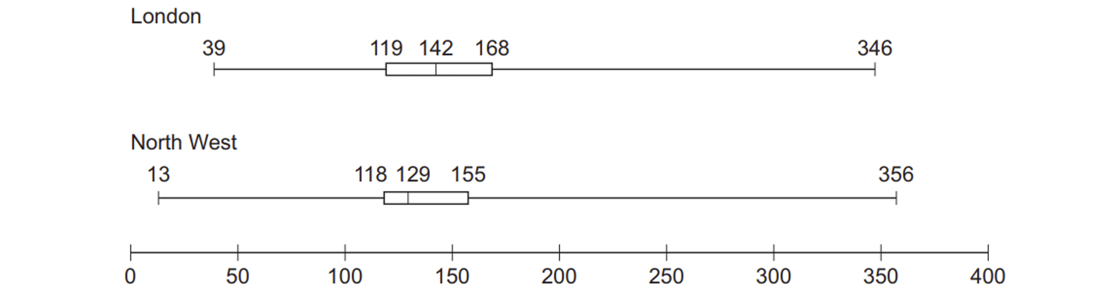
The box plot below summarises the CO2 emissions, in g/km, for cars in the Large Data Set from the London and North West regions.

Boxplots comparing London and North West data: London 39–346, quartiles 119–168, median 142; North West 13–356, quartiles 118–155, median 129.

Using the box plot, give one comparison of central tendency and one comparison of spread for the two regions.

1a
1 mark

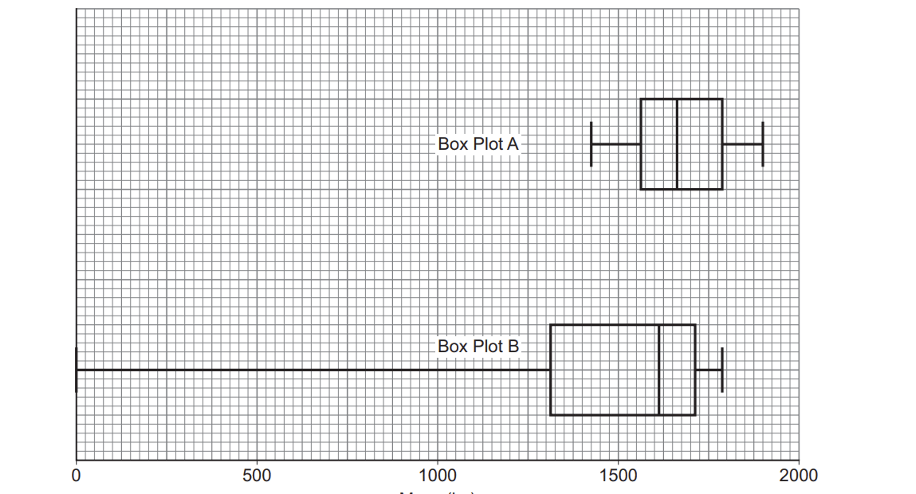
A comparison of the masses (in kg) of convertible cars was made using the Large Data Set. A sample of 20 masses was chosen from both the 2002 data and the 2016 data. The masses of the 20 cars in each sample were used to create a box plot for each year. The box plots were labelled Box Plot A and Box Plot B as shown in the diagram below.

Two box-and-whisker plots drawn on a grid, both measured against a horizontal scale running from 0 to 2000, marked at intervals of 500. The upper plot, labelled "Box Plot A", is compact and sits entirely on the right-hand side: its whiskers stretch from roughly 1400 to 1900, with a box spanning about 1550 to 1750 and a line inside the box at around 1670. The lower plot, labelled "Box Plot B", has a very long left whisker beginning at 0 and reaching across to about 1300, where a box runs from roughly 1300 to 1750 with a line inside at about 1620, and a short right whisker ending near 1800.

Estimate the median of the masses from Box Plot A.

1b
2 marks

It is claimed that Box Plot B must be incorrectly drawn.

(i) Give a reason why this claim was made.

(ii) Comment on the validity of this claim.

1c
1 mark

It is claimed that Box Plot B must be from the 2002 data. Give a reason why this claim is correct.

2a
3 marks

A biologist studying otter populations records the mass, in grams, of each baby otter at a research centre. The data is illustrated in the box and whisker diagram below.

Box and whisker diagram showing the masses in grams of baby otters, with whiskers extending from approximately 95 to 136 grams and a box from 104 to 120 grams

(i) Find the median mass of the otters.

(iii) Find the interquartile range.

2b
3 marks

The same otters are weighed monthly to track their growth. Summary data on the masses, in grams, of the otters after one month is shown in the table below.

Mass (g)

Smallest mass

125

Range

48

Median

152

Upper quartile

164

Interquartile range

33

On the grid below, draw a box plot for the information given above.

Blank grid with a horizontal axis arrow for drawing a box plot of otter masses
3a
3 marks

120 competitors enter an elimination race for charity. Runners set off from the same start running as many laps of the course as possible. Their total distance is tracked and the competitor who runs the furthest over a 6-hour period is the winner.

The distances runners achieved are recorded in the table below.

Distance, d (miles)

Frequency,  f

25d<30

8

30d<35

10

35d<40

32

40d<45

54

45d<50

10

50d<55

6

On the grid below, draw a cumulative frequency graph for the information in the table.

Blank cumulative frequency grid with horizontal axis distance in miles from 25 to 55 and vertical axis cumulative frequency from 0 to 130
3b
3 marks

Use your graph to estimate

(i) the median distance run

(ii) the interquartile range.

4a
Sme Calculator
3 marks

The total amount of time cleaners spent dealing with unplanned incidents in a supermarket was recorded each day. Data collected over 49 days is summarised in the table below.

Time, t (minutes)

Frequency,  f

0t<90

9

90t<120

24

120t<200

12

200t<250

4

On the grid below, draw a histogram to represent this data.

Blank histogram grid with horizontal axis labelled time in minutes and vertical axis for frequency density
4b
2 marks

Estimate the number of days that cleaners spent longer than 3 hours dealing with incidents.

5a
2 marks

Filmworld cinemas collected data on the ages of visitors to their cinemas during a 24-hour period. The incomplete histogram and frequency table show some of the information they collected.

Incomplete histogram showing four drawn bars on age intervals 0-5, 5-10, 10-20, and 20-30 with no bars yet drawn for 30-50 and 50-60

Age, a (years)

Frequency,  f

0a<5

15

5a<10

10a<20

20a<30

12

30a<50

18

50a<60

7

Use the histogram to complete the frequency table.

5b
2 marks

Use the frequency table to complete the histogram.

6a
1 mark

Safety officers check the speed of vehicles travelling along a stretch of highway. The cumulative frequency curve below summarises the data for the speeds, in kmph, of 80 vehicles.

Cumulative frequency curve showing speed in kmph on the horizontal axis from 0 to 100, with cumulative frequency on the vertical axis from 0 to 80

Use the graph to estimate the median speed.

6b
Sme Calculator
3 marks

The speed limit for this section of road is 80 kmph.

Vehicles travelling above the speed limit are issued with a speeding ticket. Those travelling more than 10% over the speed limit are pulled over.

Use the graph to estimate the percentage of vehicles that the safety officers pull over.

1a
Sme Calculator
5 marks

The histogram below shows the masses, in grams, of 80 apples.

Histogram showing the masses of 80 apples in grams, with frequency density on the vertical axis and mass on the horizontal axis from 40 to 140

Use the histogram to find an estimate for

(i) the median mass

(ii) the interquartile range.

1b
3 marks

Given that the lightest apple weighs 41 g and that the range of masses is 97 g, draw a box plot to show the distribution of the masses of the apples.

Blank grid with a horizontal axis arrow for drawing a box plot of apple masses
2a
1 mark

The amounts of time engineers spent dealing with individual faults in a power plant were recorded to the nearest minute. Data on 30 different faults is summarised in the table below.

Time, t (minutes)

Frequency, f

90 – 129

6

130 – 169

8

170 – 199

12

200 – 249

4

Give a reason to justify the use of a histogram to represent these data.

2b
3 marks

On the grid below, draw a histogram to represent the data.

Blank histogram grid for plotting frequency density against time in minutes
2c
Sme Calculator
3 marks

Use your histogram to estimate the proportion of individual faults on which engineers spent longer than three hours.

3a
3 marks

A teacher took 19 students on an international trip. The incomplete box plot below shows part of the summary of the weights, in kg, of the luggage brought by each student. Each student's luggage weighed a different amount.

Incomplete box plot showing the median at 20 kg, the upper quartile at 23 kg, and the right whisker extending to 28 kg, with the left half of the box and the left whisker missing

The median weight is 4 kg more than the lower quartile, and the range of weights is three times the interquartile range.

Use this information to complete the box plot.

3b
1 mark

Calculate the proportion of luggage weights which were less than 20 kg.

3c
2 marks

Students had to pay an additional fee if the weight of their luggage exceeded 23 kg.

Find the number of students who had to pay the additional fee.

4a
1 mark

A biologist times how long it takes each of 80 mice to find the exit to a maze. Every two and a half minutes she records the number of mice which have found the exit, which she then represents as a cumulative frequency curve.

Cumulative frequency curve showing time in minutes on the horizontal axis from 0 to 35 and cumulative frequency on the vertical axis from 0 to 80, with the curve starting at (2.5, 0) and rising to (35, 80)

Based on the graph, state an inequality for the time, t, taken by the fastest mouse.

4b
3 marks

The biologist also recorded the actual times taken by the fastest and slowest mice. She has used this information to begin constructing a box plot to represent the data.

Use the cumulative frequency curve to complete the box plot for the times.

Partial box plot showing only the left whisker tip at 4 minutes and the right whisker tip at 33 minutes, with no box or median line drawn
5a
Sme Calculator
1 mark

An annual cheese-rolling contest involves participants chasing a 4 kg round of cheese down a steep 200 yard long hillside. A group of 60 friends participated in the contest and the table below summarises the distances travelled by each before first falling over.

Distance, d (yards)

Frequency, f

0d<40

23

40d<80

11

80d<120

9

120d<160

7

160d<200

6

Find how many of the 60 friends made it to the bottom without falling over.

5b
3 marks

On the grid, draw a cumulative frequency graph for the information in the table.

Blank cumulative frequency grid with horizontal axis distance in yards from 0 to 200 and vertical axis cumulative frequency from 0 to 60
5c
2 marks

The steepest part of the hill is between 100 and 140 yards away from the start.

Use your graph to estimate the number of people who fell during this section of the hill.

1a
4 marks

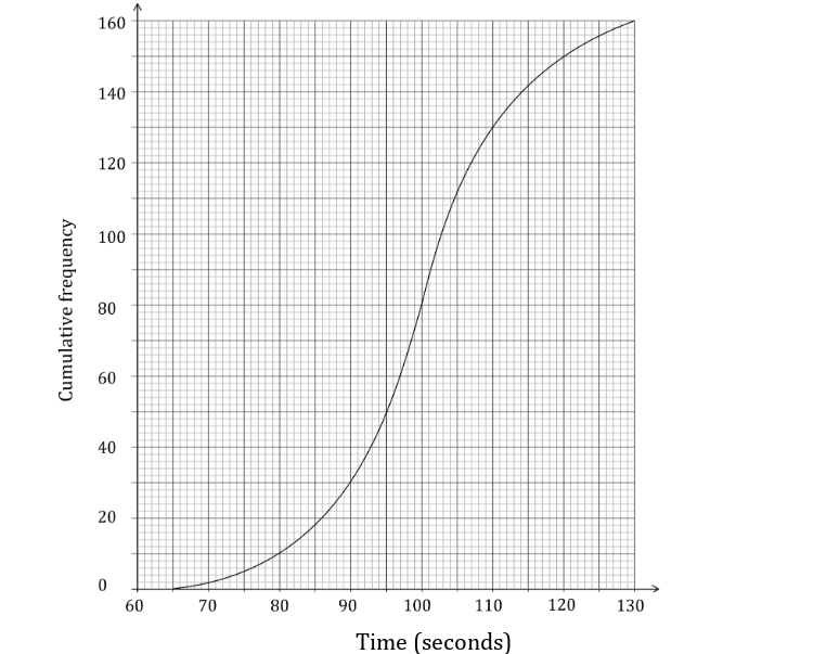
The cumulative frequency graph below shows the times, in seconds, taken by 160 employees of a company to complete a training task.

Cumulative frequency graph showing the time in seconds on the horizontal axis from 60 to 130, and cumulative frequency on the vertical axis from 0 to 160

Use your graph to estimate the number of employees whose time is within 5 seconds of the median time.

1b
2 marks

The fastest 10% of employees are invited to join an advanced project.

Estimate the highest time of an employee who is invited.

1c
2 marks

The slowest 5% of employees are offered additional support.

Estimate the lowest time of an employee who is offered support.

2a
1 mark

There are 180 dogs at a vet's clinic. The histogram below shows the highest sound level reached by each individual dog's bark, measured in decibels (dB).

Histogram showing the highest sound levels in decibels reached by 180 dogs' barks, with frequency density on the unlabelled vertical axis and sound level on the horizontal axis from 90 to 110 dB

State what is represented by the area of each bar in a histogram.

2b
Sme Calculator
4 marks

Use the histogram to estimate the number of dogs which had a bark with a highest sound level between 99 dB and 107 dB.

3a
Sme Calculator
3 marks

Mr Shapesphere, a history teacher, records the time, to the nearest minute, it takes him to mark each student's essay. The times were summarised in a grouped frequency table and an extract is shown below.

Time, t (minutes)

Frequency, f

0 – 10

7

11 – 30

16

31 – 35

4

A histogram was drawn to represent these data. The 1130 group was represented by a bar of width 6 cm and height 4.5 cm.

Find the width and height of the bar for the 010 group.

3b
Sme Calculator
3 marks

The total area under the histogram is 60.75 cm2.

Find the number of essays which Mr Shapesphere recorded as taking longer than 35 minutes, to the nearest minute.

4a
3 marks

The grouped frequency table below contains information about the lengths of time of Susie's calls with her customers. The table was used to draw the cumulative frequency curve also shown below.

Time (minutes)

4<t8

8<t12

12<t16

16<t20

Frequency

16

a

b

c

Cumulative frequency curve showing time in minutes on the horizontal axis from 0 to 20 and cumulative frequency on the vertical axis from 0 to 160

Use the graph to find the values of a, b and c.

4b
3 marks

Use the graph to estimate the interquartile range of times for Susie's calls.

4c
Sme Calculator
2 marks

Use the graph to estimate the percentage of customers whose calls lasted longer than 10 minutes.

5a
Sme Calculator
5 marks

Crystal is given an incomplete box plot showing the lengths of 99 unicorn horns. She also knows that the median length is the midpoint of the minimum and maximum lengths, and that the range is 2.5 times as big as the interquartile range.

Complete the diagrams below to show that there are two possible distributions given the information above.

Two identical incomplete box plots showing a box from 56 to 72 with the right whisker tip at 81 cm, and the median and left whisker missing
5b
2 marks

The box plot below shows the masses of the 99 unicorn horns.

Box plot showing the masses of 99 unicorn horns in kg, with whisker low at 3 kg, lower quartile at 7.6 kg, median at 9.2 kg, upper quartile at 10.2 kg and whisker high at 11.2 kg

Crystal discovers that two masses were recorded incorrectly: 11 kg should have been 8 kg, and 9 kg should have been 10 kg.

Explain why at most one feature of the box plot will need to change.

5c
1 mark

Explain why it is possible that the box plot will remain unchanged when it is fixed.