Representation of Data (Cambridge (CIE) A Level Maths: Probability & Statistics 1): Exam Questions

Exam code: 9709

3 hours27 questions
1a
3 marks

The times, in minutes, taken by a train to complete a particular journey on weekdays are represented by the box-and-whisker plot below.
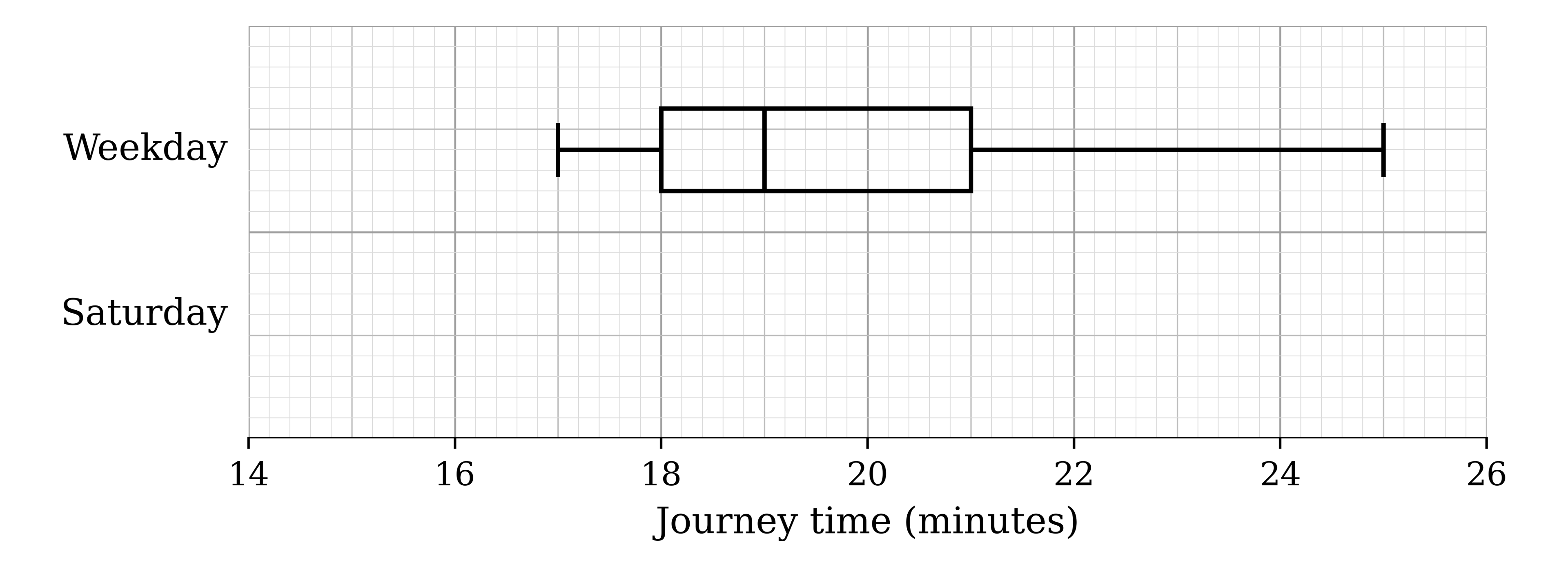
Grid with a scale of journey time from 14 to 26 minutes. A box-and-whisker plot labelled Weekday: whiskers from 17 to 25, box from 18 to 21 with the median line at 19. A second row labelled Saturday is empty

Find the median and the interquartile range of the journey times on weekdays.

1b
3 marks

The times, in minutes, for the same journey on Saturdays are summarised in the table.

Fastest

Lower quartile

Median

Upper quartile

Slowest

16

18

19

20

25

On the same diagram, draw a box-and-whisker plot to represent the journey times on Saturdays.

Grid with a scale of journey time from 14 to 26 minutes. A box-and-whisker plot labelled Weekday: whiskers from 17 to 25, box from 18 to 21 with the median line at 19. A second row labelled Saturday is empty
1c
2 marks

Make two comparisons between the journey times on weekdays and the journey times on Saturdays.

2a
3 marks

The flight times, t seconds, of the paper aeroplanes of 55 contestants in a paper-aeroplane competition are summarised in the table.

Time (t seconds)

0≤t<4

4≤t<8

8≤t<12

12≤t<16

Frequency

12

25

16

2

On the grid, draw a cumulative frequency graph to illustrate the data.

Blank grid of 2 mm squares with no axes or scales
2b
1 mark

Use your graph to estimate the median flight time.

3a
4 marks

The tempos, b beats per minute, of 60 randomly chosen drum 'n' bass songs are summarised in the table.

Tempo (b beats per minute)

Frequency

140≤b<160

10

160≤b<170

20

170≤b<175

20

175≤b<180

10

On the grid, draw a histogram to represent this information.

Blank grid of 2 mm squares with no axes or scales
3b
2 marks

Estimate the number of these songs with a tempo of less than 150 beats per minute.

4a
3 marks

The manager of an ambulance service records the response times, in minutes, to 15 emergency calls. The times are as follows.

4

8

12

9

7

14

6

5

8

7

9

10

7

3

6

Find the median and the interquartile range of these response times.

4b
3 marks

On the grid, draw a box-and-whisker plot to represent these response times.

Blank grid of 2 mm squares with no axes or scales
5
5 marks

A company tests elastic bands by stretching them until they snap. The length, in millimetres, of each band at the moment it snaps is recorded.

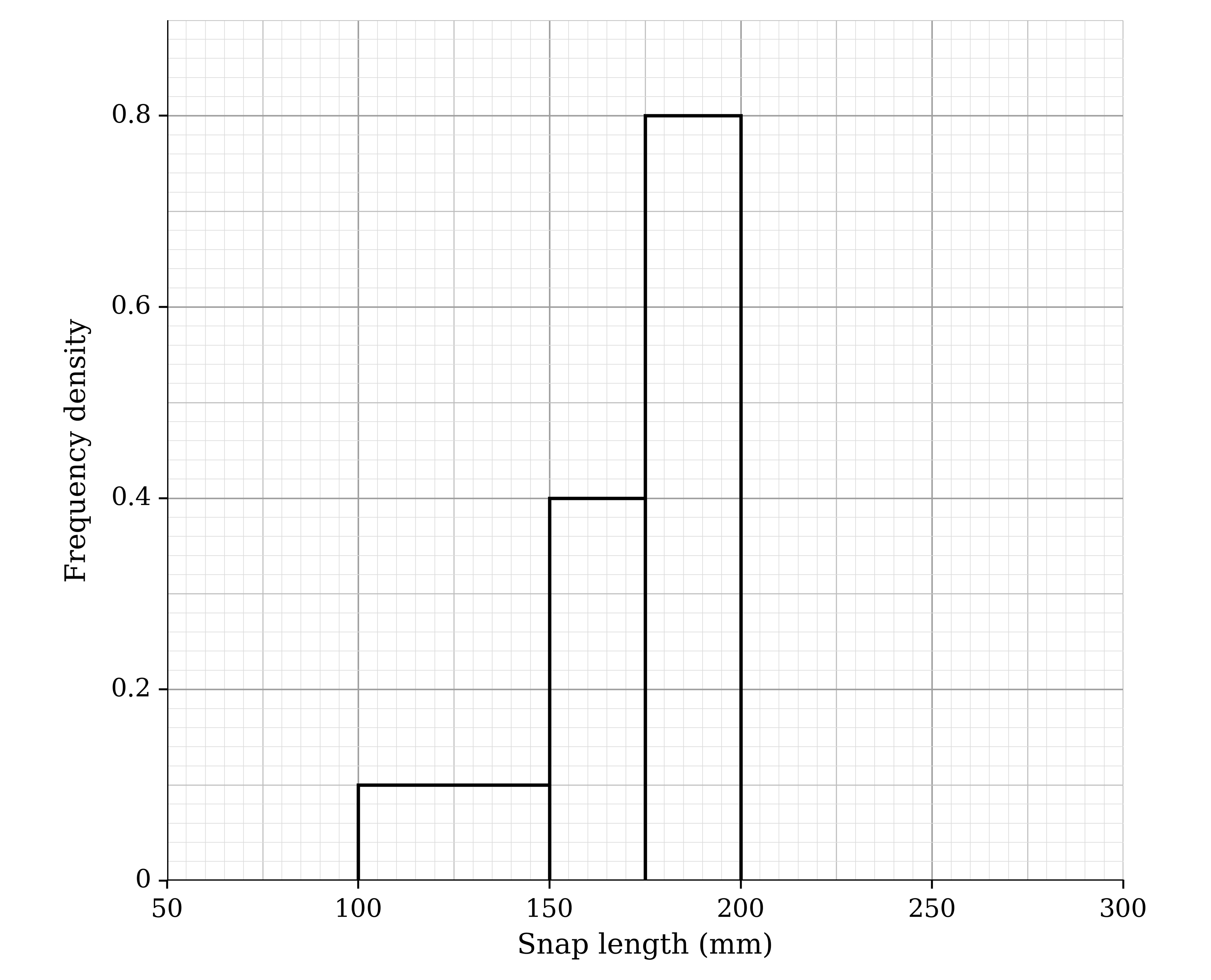
The incomplete histogram and frequency table below show the results.

Incomplete histogram with snap length in millimetres from 50 to 300 on the horizontal axis and frequency density from 0 to 0.8 on the vertical axis. Bars: 100 to 150 height 0.1, 150 to 175 height 0.4, 175 to 200 height 0.8. No bars are drawn above 200

Snap length (l mm)

Frequency

Class width

Frequency density

100≤l<150

5

50

0.1

150≤l<175

0.4

175≤l<200

200≤l<225

15

25

225≤l<275

10

Use the information to complete both the histogram and the frequency table.

6a
3 marks

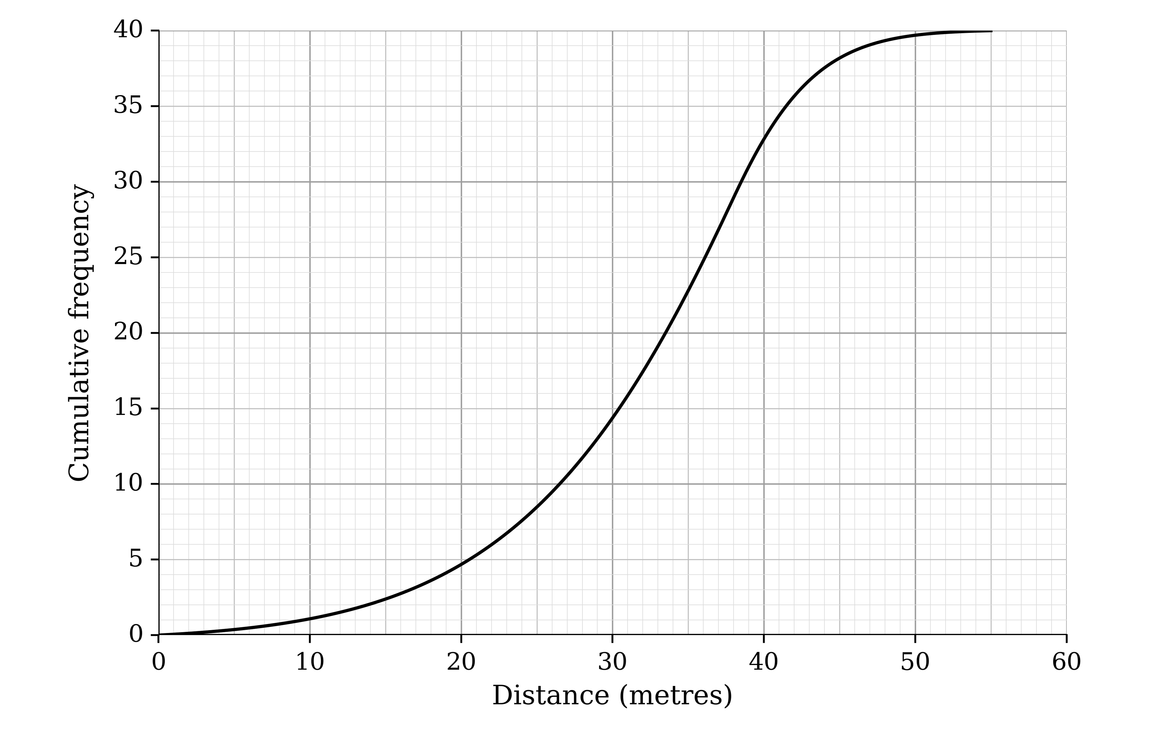
The distances, in metres, flown by the paper aeroplanes of 40 contestants in a paper-aeroplane competition are represented in the cumulative frequency graph.

Cumulative frequency graph with distance in metres from 0 to 60 on the horizontal axis and cumulative frequency from 0 to 40 on the vertical axis. A smooth S-shaped curve rises slowly from (0, 0) to about (25, 8), steeply to about (40, 32.5), then levels off to (55, 40)

Use the graph to estimate the median and the interquartile range of the distances.

6b
2 marks

The 9 contestants whose aeroplanes flew the furthest qualify for the final.

Use the graph to estimate the least distance that a contestant's aeroplane must fly in order for the contestant to qualify.

7a
3 marks

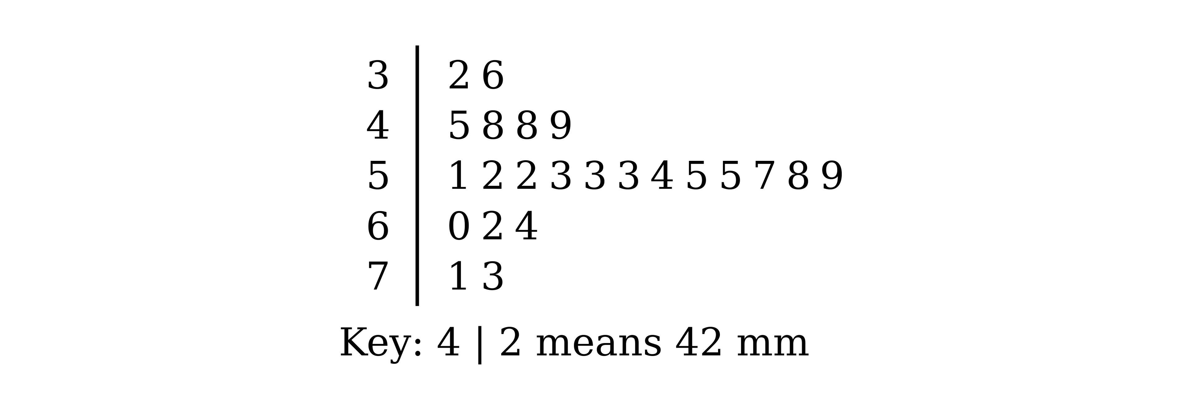
Kungawo measures the lengths, in millimetres, of 23 earthworms that he finds in his garden. His results are shown in the stem-and-leaf diagram.

Stem-and-leaf diagram with stems 3 to 7. 3: 2 6. 4: 5 8 8 9. 5: 1 2 2 3 3 3 4 5 5 7 8 9. 6: 0 2 4. 7: 1 3. Key: 4 | 2 means 42 mm

Find the median and the interquartile range of the lengths.

7b
1 mark

State one advantage of using a stem-and-leaf diagram, rather than a box-and-whisker plot, to represent these data.

8a
2 marks

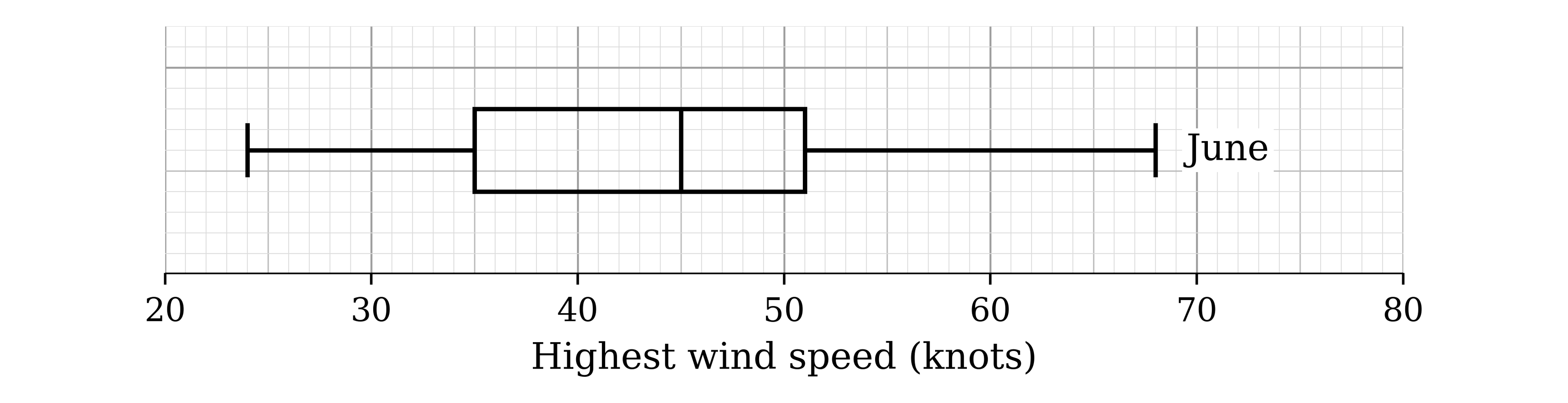
A meteorologist records the highest wind speed each day, in knots, at a weather station. The box-and-whisker plot shows the results for 15 days in June.

Box-and-whisker plot labelled June on a scale of highest wind speed from 20 to 80 knots: whiskers from 24 to 68, box from 35 to 51 with the median line at 45

(i) Give one reason why a box-and-whisker plot is a suitable way to represent these data.

(ii) The highest wind speed recorded in June, 68 knots, is an extreme value. Give a reason why the median is likely to be more suitable than the mean as a measure of the average wind speed in June.

8b
2 marks

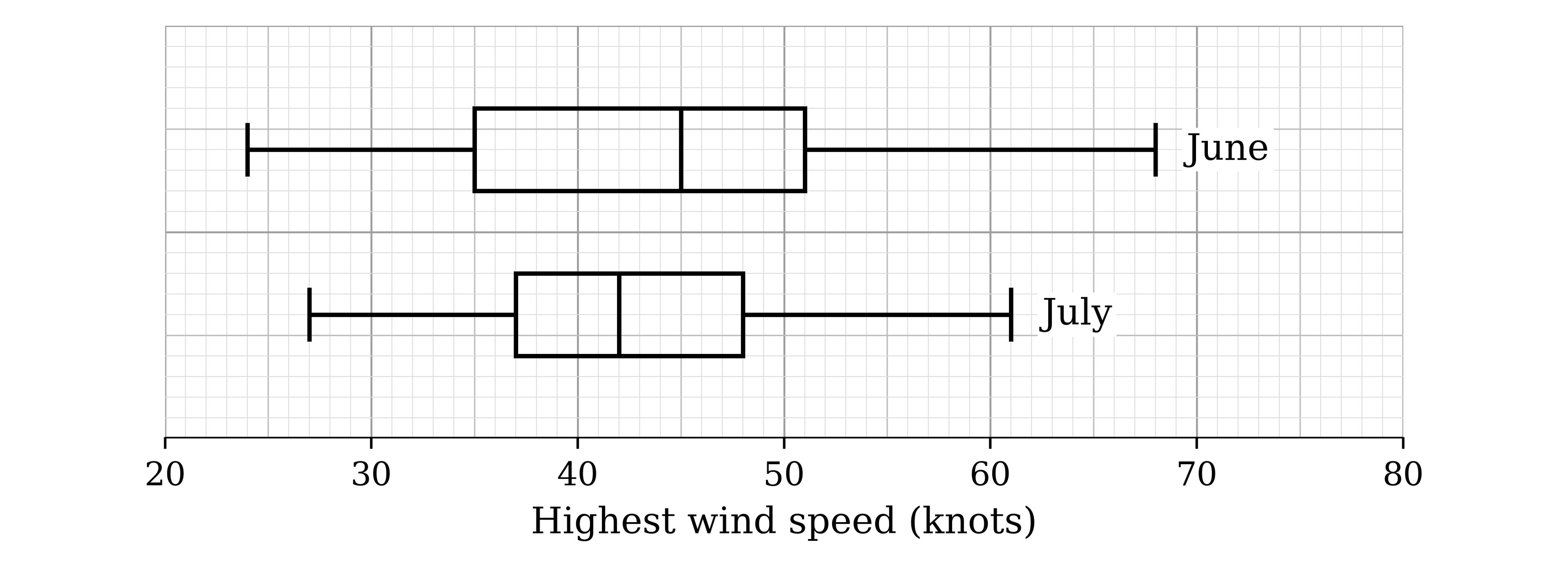
The box-and-whisker plot for 15 days in July has been added to the same diagram.

Two box-and-whisker plots on a scale of highest wind speed from 20 to 80 knots. June: whiskers 24 to 68, box 35 to 51, median 45. July: whiskers 27 to 61, box 37 to 48, median 42

Make two comparisons between the highest wind speeds in June and the highest wind speeds in July.

9a
5 marks

The total time, t minutes, that cleaners in a supermarket spent dealing with unplanned incidents was recorded each day for 49 days. The results are summarised in the table.

Time (t minutes)

Frequency

0≤t<90

9

90≤t<120

24

120≤t<200

12

200≤t<250

4

(i) State a reason why a histogram is a suitable diagram to represent these data.

(ii) On the grid, draw a histogram to represent these data.

Blank grid of 2 mm squares with no axes or scales
9b
2 marks

Calculate an estimate for the number of days on which the cleaners spent less than 30 minutes dealing with unplanned incidents.

1a
3 marks

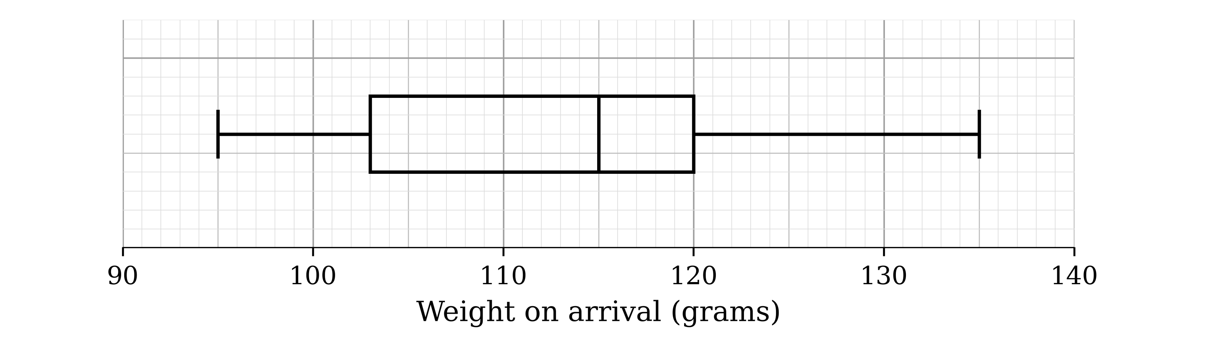
A charity records the weight, in grams, of each rescued otter when it first arrives. The weights are represented by the box-and-whisker plot.

Box-and-whisker plot on a scale of weight on arrival from 90 to 140 grams: whiskers from 95 to 135, box from 103 to 120 with the median line at 115

Find the median and the interquartile range of the weights on arrival.

1b
3 marks

The otters are weighed again after one month. The weights, in grams, are summarised in the table.

Smallest weight

Range

Median

Upper quartile

Interquartile range

125

48

152

164

33

On the grid, draw a box-and-whisker plot to represent the weights after one month.

Blank grid of 2 mm squares with no axes or scales
2a
3 marks

In a charity race, 120 runners each run as far as they can in 6 hours. The distances run, d km, are summarised in the table.

Distance (d km)

Frequency

25≤d<30

8

30≤d<35

10

35≤d<40

32

40≤d<45

54

45≤d<50

10

50≤d<55

6

On the grid, draw a cumulative frequency graph to illustrate the data.

Blank grid of 2 mm squares with no axes or scales
2b
3 marks

Use your graph to estimate the median and the interquartile range of the distances.

3a
3 marks

A taxi company records the times, to the nearest minute, that customers wait for their taxis to arrive. The times for a random sample of 20 customers are as follows.

6

7

16

30

24

27

20

7

5

8

20

24

27

12

34

32

31

6

19

14

Find the median and the interquartile range of these waiting times.

3b
3 marks

On the grid, draw a box-and-whisker plot to represent these waiting times.

Blank grid of 2 mm squares with no axes or scales
4
4 marks

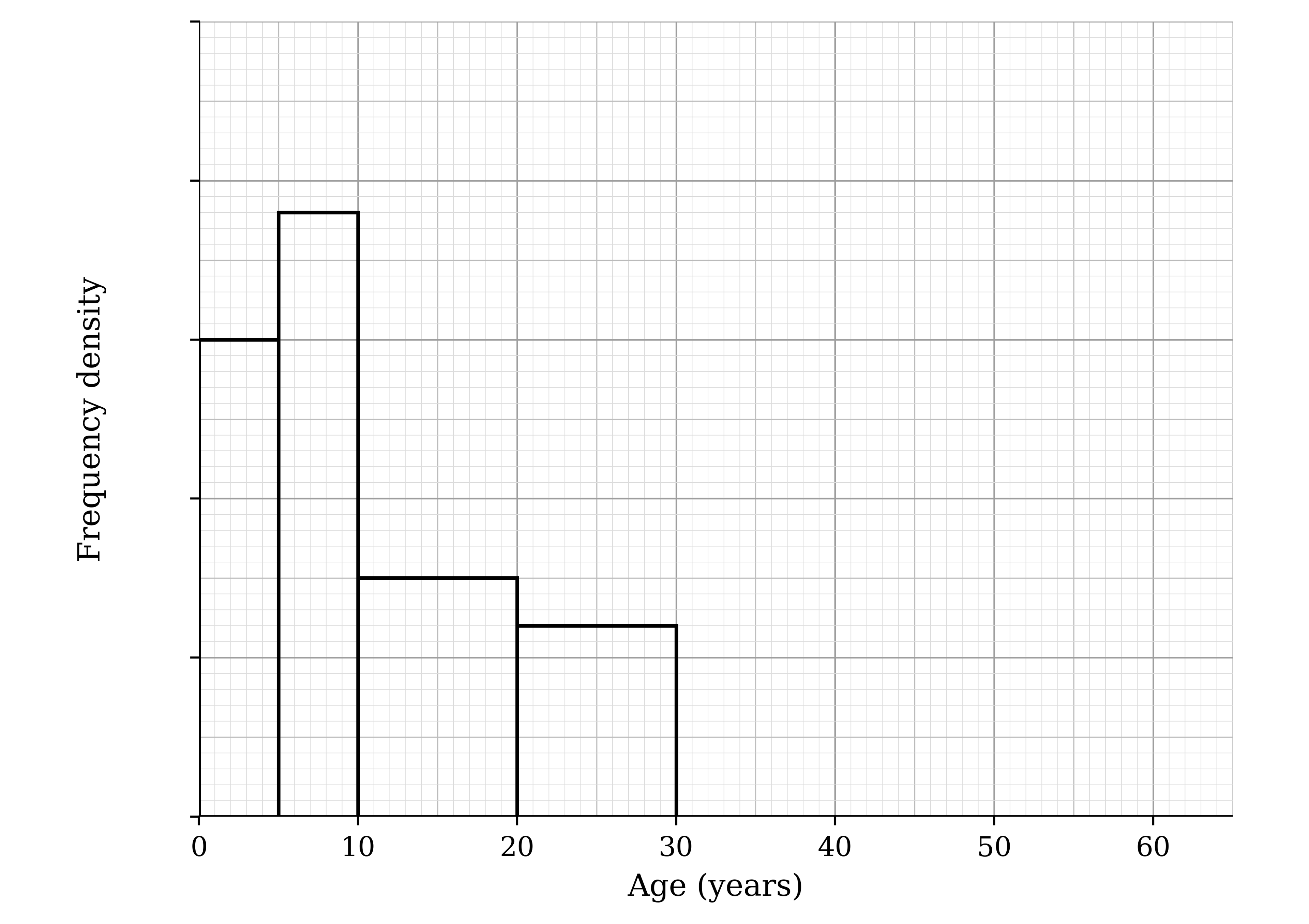
A cinema recorded the ages of its visitors during one day. The incomplete histogram and frequency table show some of the information collected.

Incomplete histogram with age in years from 0 to 65 on the horizontal axis and frequency density on the vertical axis, with tick marks but no numbers on the frequency density scale. Four bars are drawn: 0 to 5, 5 to 10 (the tallest), 10 to 20 and 20 to 30. No bars are drawn above 30

Age (a years)

Frequency

0≤a<5

15

5≤a<10

10≤a<20

20≤a<30

12

30≤a<50

18

50≤a<60

7

Use the information to complete the histogram and the frequency table.

5a
2 marks

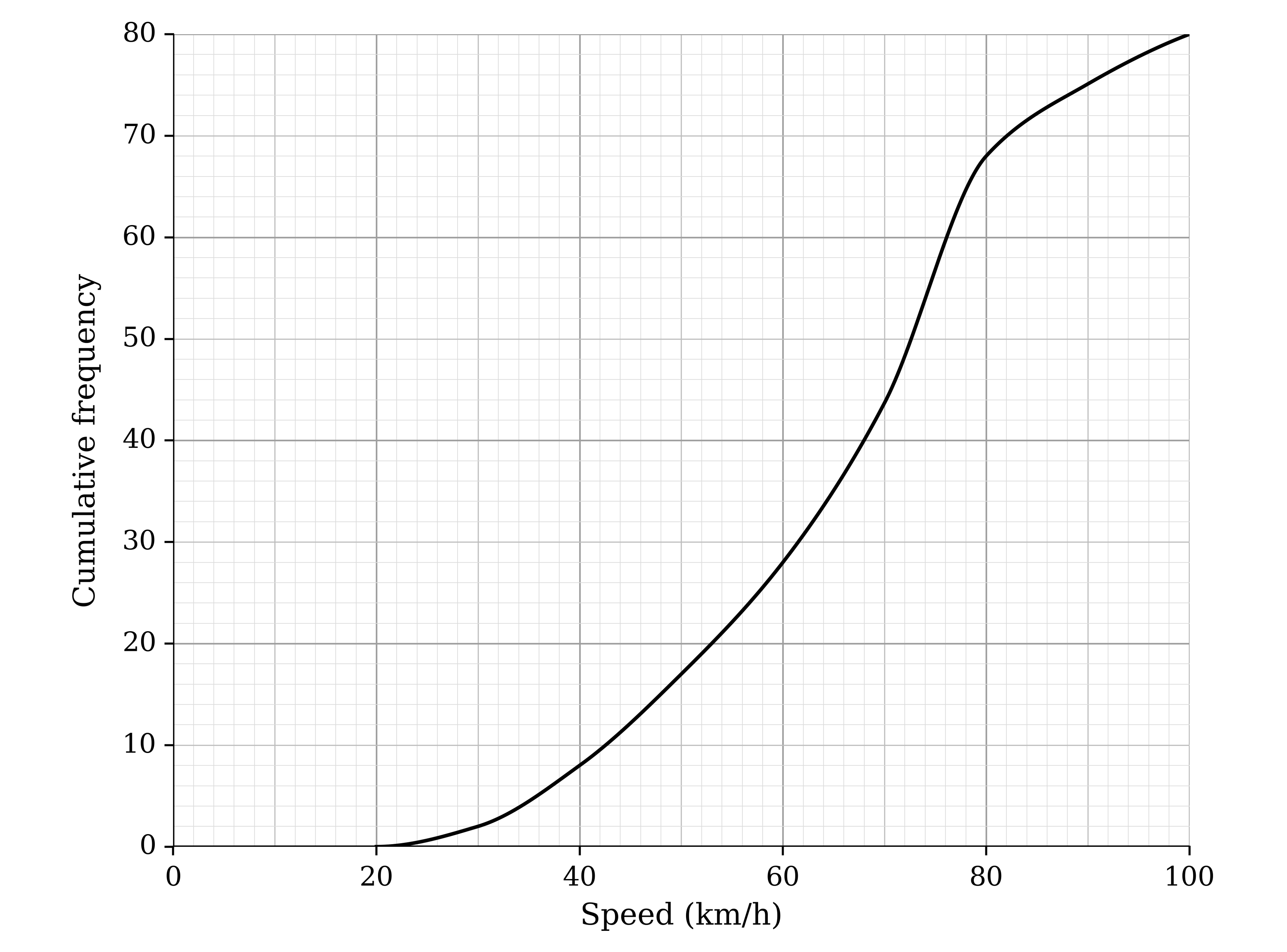
The police record the speeds, in km/h, of 80 vehicles on a stretch of road. The results are represented in the cumulative frequency graph.

Cumulative frequency graph with speed in km/h from 0 to 100 on the horizontal axis and cumulative frequency from 0 to 80 on the vertical axis. A smooth curve starts at (20, 0), rises gradually to about (60, 28), steeply to about (80, 68), then levels off to (100, 80)

Use the graph to estimate the median speed.

5b
3 marks

The speed limit on this road is 80 km/h. The police stop every vehicle that is travelling at more than 10% above the speed limit.

Use the graph to estimate the percentage of these vehicles that the police stop.

6a
3 marks

A charity shows an advert on TV at the same time every weekday for four weeks. The manager records the number of donations received in the hour after the advert each day. The results are as follows.

21

27

24

31

17

22

25

26

27

9

32

29

25

24

40

23

22

19

12

14

Represent these data in a stem-and-leaf diagram.

6b
2 marks

The manager decides that the advert is only worth continuing if the median number of donations in the hour after the advert is at least 25.

Determine whether the manager should continue to run the advert.

6c
1 mark

Give one advantage of using a stem-and-leaf diagram, rather than a grouped frequency table, to represent these data.

7a
1 mark

The times, in minutes, that engineers spent dealing with 30 faults at a power station were recorded to the nearest minute. The results are summarised in the table.

Time (minutes)

90 – 129

130 – 169

170 – 199

200 – 249

Frequency

6

8

12

4

Give a reason why a histogram is a suitable diagram to represent these data.

7b
4 marks

On the grid, draw a histogram to represent these data.

Blank grid of 2 mm squares with no axes or scales
7c
3 marks

Estimate the proportion of these faults on which the engineers spent longer than three hours.

8a
1 mark

In a cheese-rolling contest, people chase a round cheese down a steep hillside 200 metres long. A group of 60 friends take part. The table summarises the distance, d metres, that each friend travelled before first falling over.

Distance (d metres)

Frequency

0≤d<40

23

40≤d<80

11

80≤d<120

9

120≤d<160

7

160≤d<200

6

Find the number of these friends who reached the bottom of the hill without falling over.

8b
3 marks

On the grid, draw a cumulative frequency graph to illustrate the data in the table.

Blank grid of 2 mm squares with no axes or scales
8c
3 marks

The steepest part of the hill is between 100 metres and 140 metres from the start.

Use your graph to estimate the number of friends who fell over for the first time on this part of the hill.

9a
2 marks

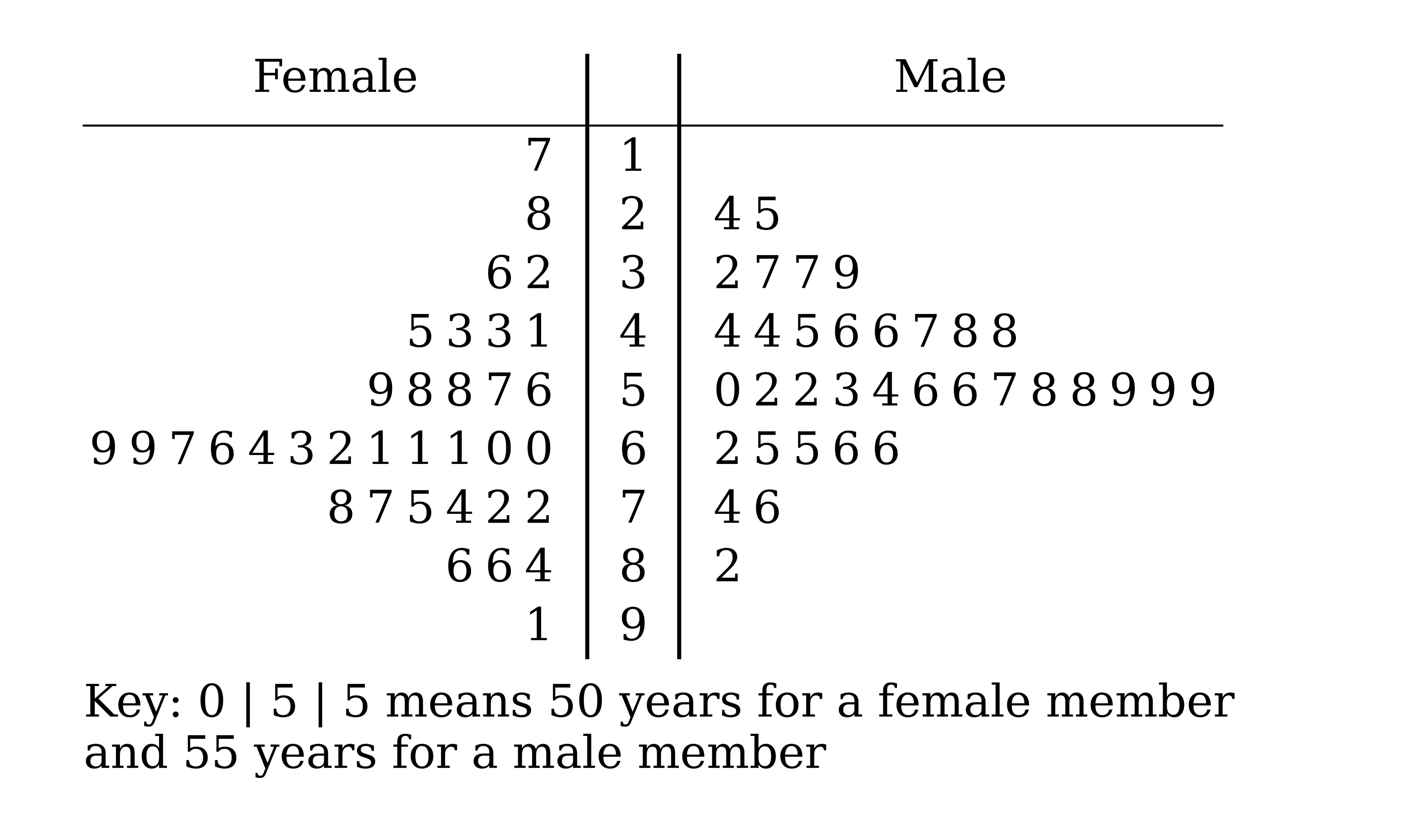
Aggie runs a bowls club. She chooses 35 female members and 35 male members of the club at random and records their ages, in years. The ages are shown in the back-to-back stem-and-leaf diagram.

Back-to-back stem-and-leaf diagram with Female on the left and Male on the right, stems 1 to 9. Female leaves: 1: 7. 2: 8. 3: 6 2. 4: 5 3 3 1. 5: 9 8 8 7 6. 6: 9 9 7 6 4 3 2 1 1 1 0 0. 7: 8 7 5 4 2 2. 8: 6 6 4. 9: 1. Male leaves: 2: 4 5. 3: 2 7 7 9. 4: 4 4 5 6 6 7 8 8. 5: 0 2 2 3 4 6 6 7 8 8 9 9 9. 6: 2 5 5 6 6. 7: 4 6. 8: 2. Key: 0 | 5 | 5 means 50 years for a female member and 55 years for a male member

(i) Give a reason why a stem-and-leaf diagram is suitable for these data.

(ii) The diagram shows no male members under 20 years old. Give a reason why there may still be male members of the club under 20 years old.

9b
4 marks

By finding the median and the interquartile range of the ages for each group, make two comparisons between the ages of the female members and the ages of the male members.

1a
3 marks

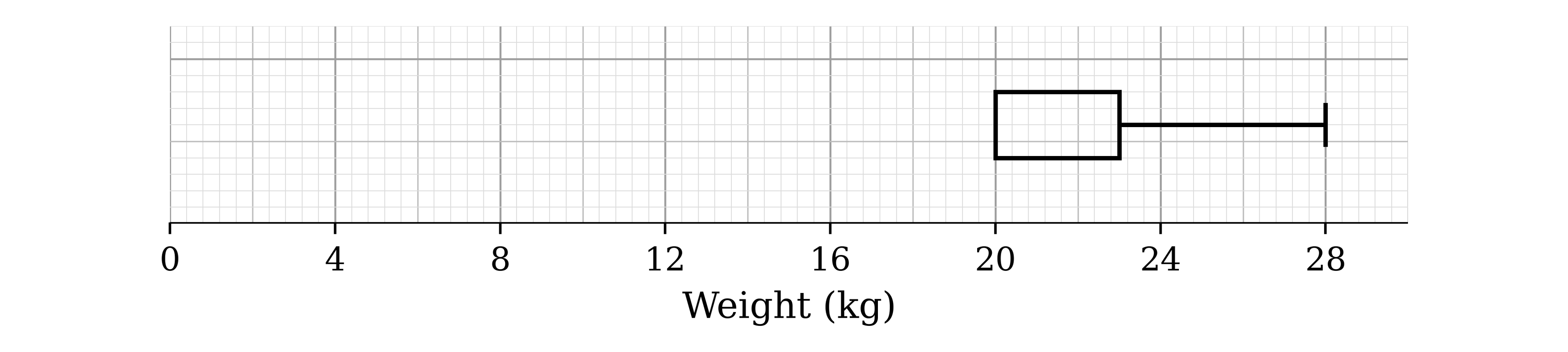
A teacher took 19 students on a trip abroad. The weights, in kg, of the students' luggage were all different. The incomplete box-and-whisker plot shows part of a summary of these weights.

Incomplete box-and-whisker plot on a scale of weight from 0 to 30 kg. A box is drawn from 20 to 23 with a whisker from 23 to 28. Nothing is drawn below 20

It is given that

the median weight is 4 kg more than the lower quartile

the range of the weights is three times the interquartile range.

Use this information to complete the box-and-whisker plot.

1b
2 marks

Find the proportion of the luggage weights that were less than 20 kg.

1c
2 marks

Students had to pay an extra fee if their luggage weighed more than 23 kg.

Find the number of students who had to pay the extra fee.

2a
2 marks

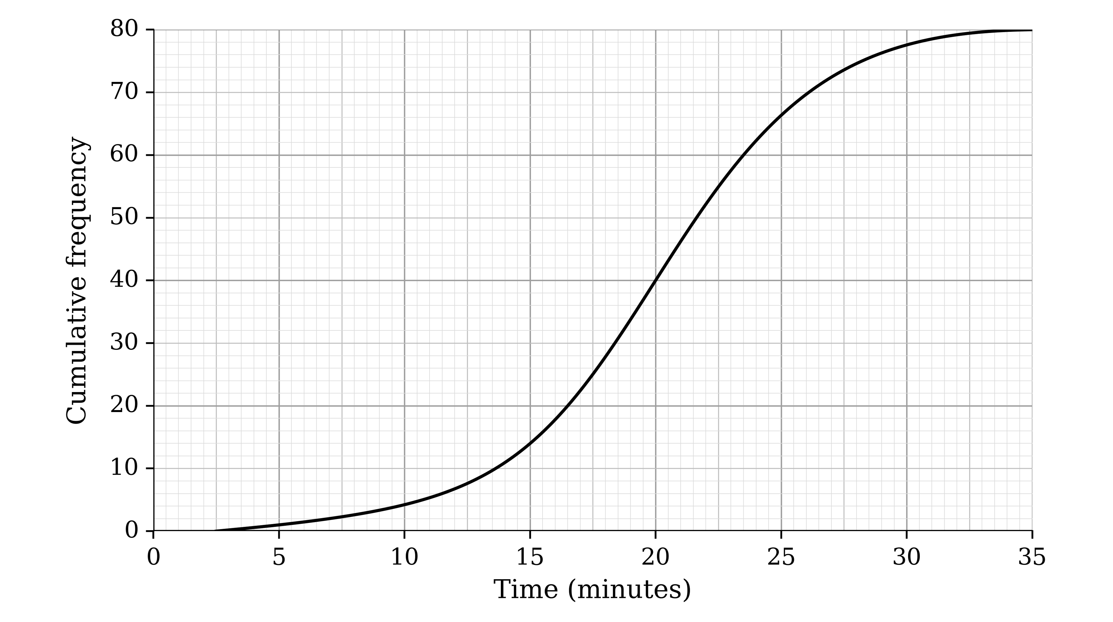
Remy records how long each of his 80 rats takes to find the exit of a maze. Every 2.5 minutes he records the number of rats that have found the exit. His results are shown in the cumulative frequency graph.

Cumulative frequency graph with time in minutes from 0 to 35 on the horizontal axis and cumulative frequency from 0 to 80 on the vertical axis. A smooth S-shaped curve starts at (2.5, 0), rises slowly to about (15, 15), steeply to about (25, 65), then levels off to (35, 80)

The time taken by the fastest rat is t minutes. Use the graph to write down an inequality satisfied by t.

2b
3 marks

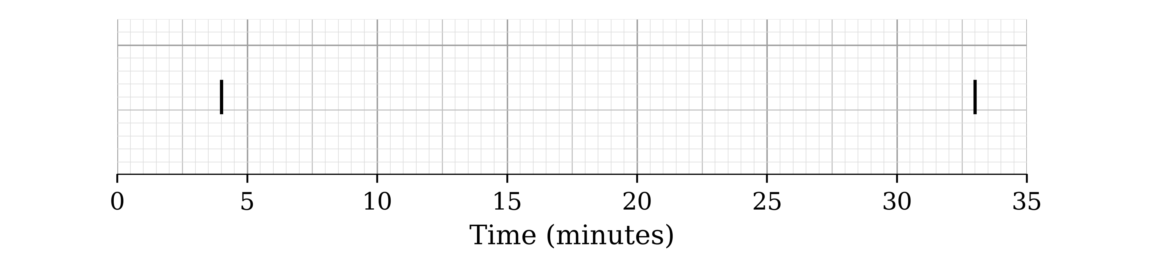
The fastest time was 4 minutes and the slowest time was 33 minutes. These have been marked on the grid below.

Grid with a scale of time from 0 to 35 minutes. Two short vertical lines mark 4 and 33. Nothing else is drawn

Use the cumulative frequency graph to complete the box-and-whisker plot.

3
4 marks

Wendy collects the running times, in minutes, of 199 movies. She finds the following information.

When the running times are placed in order, the 50th running time is one hour.

The longest running time is two and a half hours.

The interquartile range of the running times is 63 minutes.

The median divides the interquartile range in the ratio 3 : 4.

The range of the running times is 123 minutes.

On the grid, draw a box-and-whisker plot to represent the running times.

Blank grid of 2 mm squares with no axes or scales
4a
4 marks

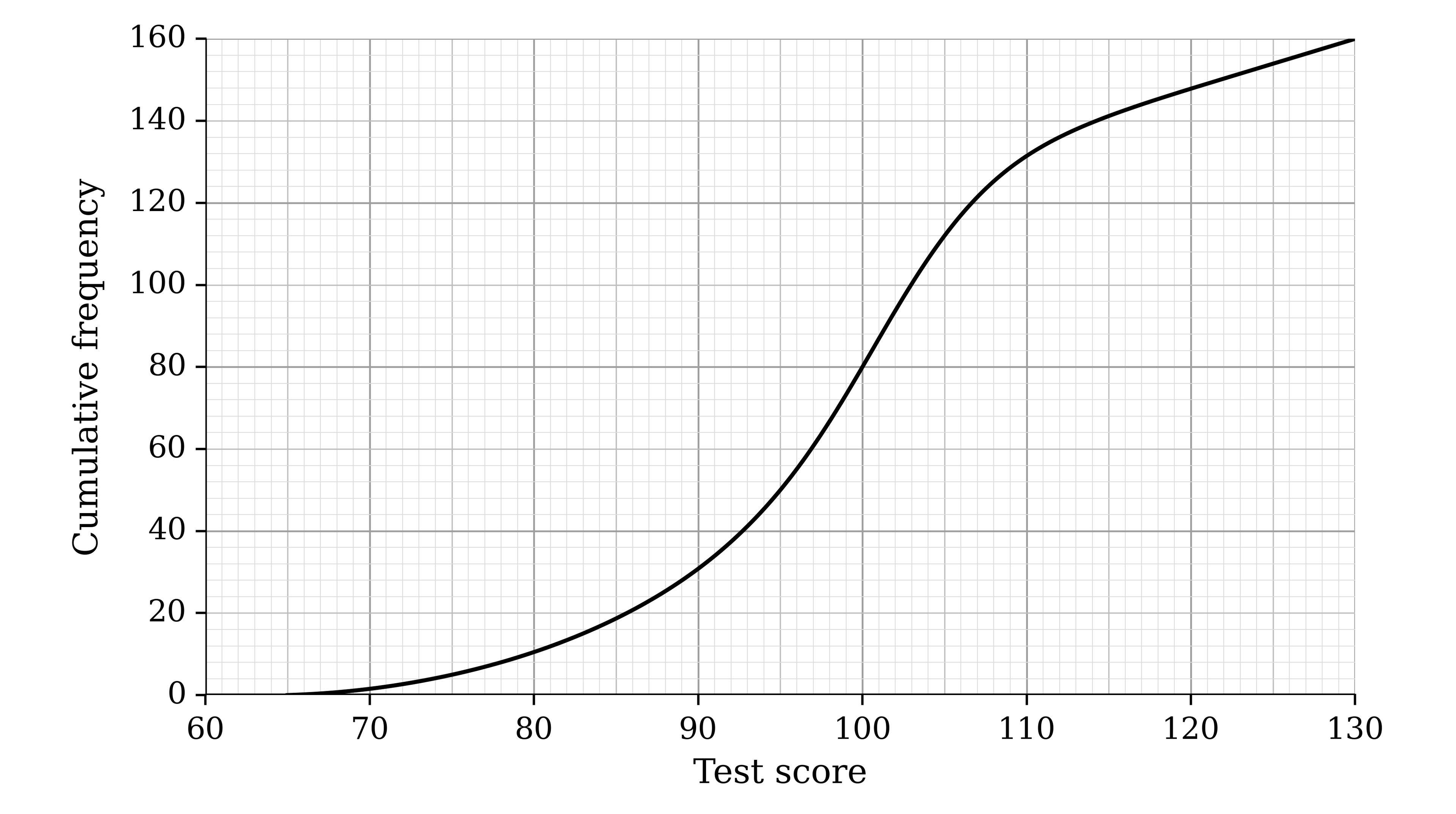
The scores of 160 employees of a company in an aptitude test are represented in the cumulative frequency graph.

Cumulative frequency graph with test score from 60 to 130 on the horizontal axis and cumulative frequency from 0 to 160 on the vertical axis. A smooth S-shaped curve starts at (65, 0), rises slowly to about (90, 30), steeply to about (105, 112), then levels off to (130, 160)

Use the graph to estimate the number of employees whose score is within 5 of the median score.

4b
2 marks

The employees with the top 10% of scores are offered a management training course.

Use the graph to estimate the lowest score of an employee who is offered the course.

4c
2 marks

The employees with the bottom 5% of scores are offered extra support.

Use the graph to estimate the highest score of an employee who is offered extra support.

5a
3 marks

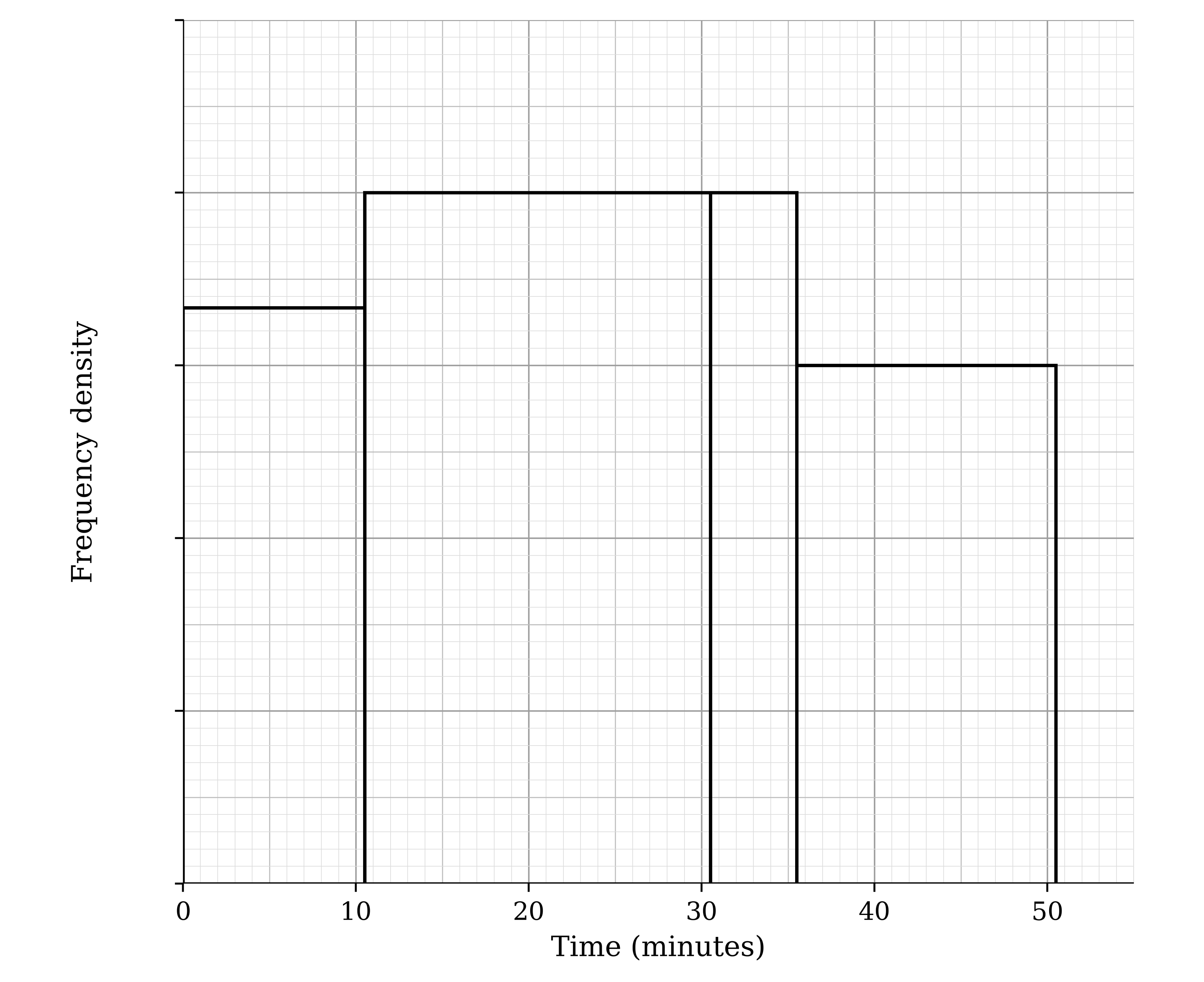
Mr Shapesphere, a history teacher, records the time, to the nearest minute, that it takes him to mark each of his students' essays. The table shows some of the results.

Time (minutes)

0 – 10

11 – 30

31 – 35

36 – 50

Frequency

7

16

4

The histogram represents all of the times. No scale is shown on the frequency density axis.

Histogram with time in minutes from 0 to 55 on the horizontal axis and frequency density on the vertical axis, with tick marks but no numbers. Bars from 0 to 10.5, 10.5 to 30.5, 30.5 to 35.5 and 35.5 to 50.5. The bars from 10.5 to 30.5 and 30.5 to 35.5 are the same height; the bar from 35.5 to 50.5 is three quarters of that height

Find the number of essays that took him from 36 to 50 minutes to mark.

5b
3 marks

Estimate the number of essays that took him between 20 and 40 minutes to mark.

6a
3 marks

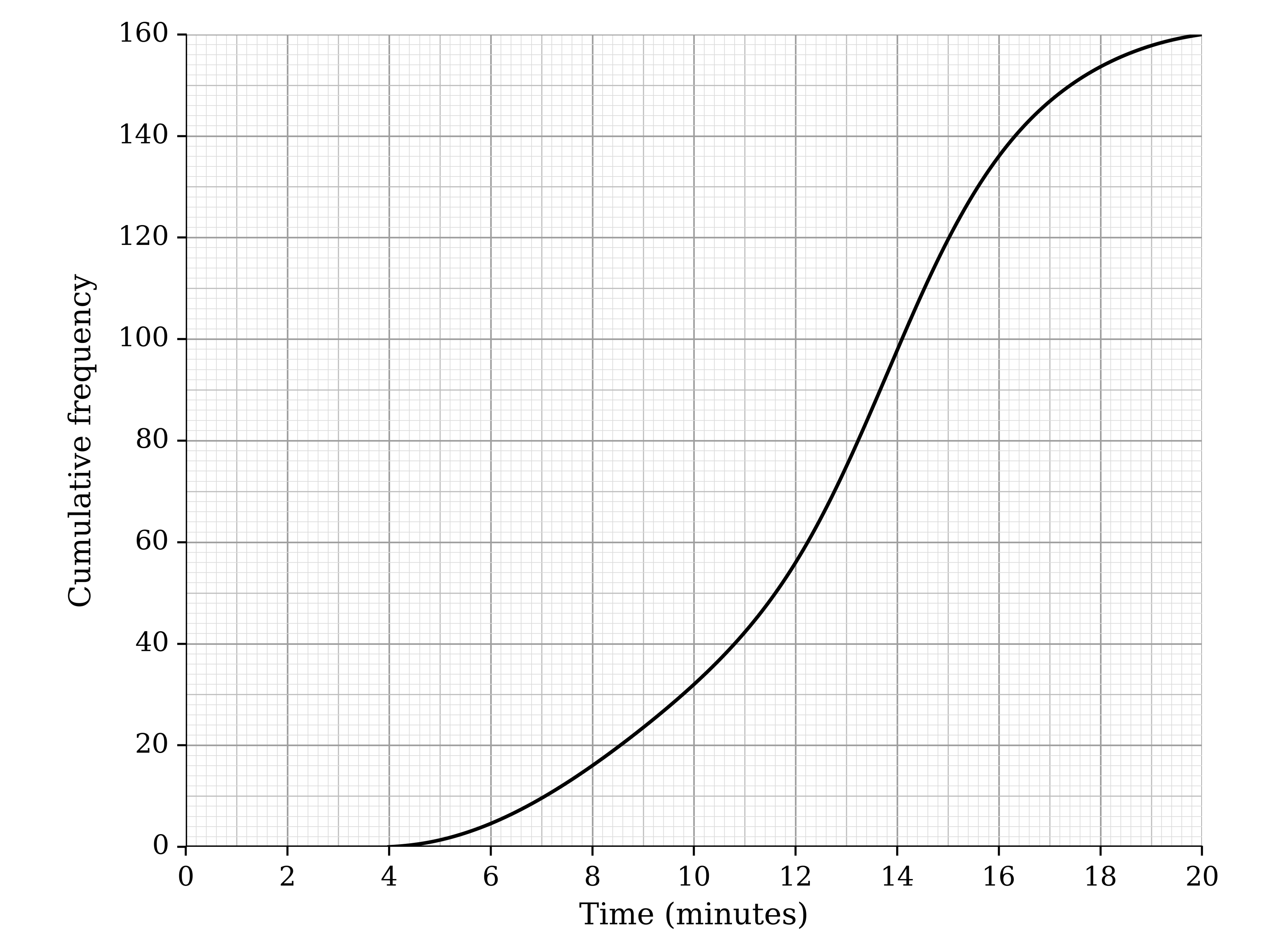
The lengths of time, t minutes, of Susie's calls with her customers are summarised in the table, where a, b and c are unknown frequencies.

Time (t minutes)

4<t≤8

8<t≤12

12<t≤16

16<t≤20

Frequency

16

a

b

c

The table was used to draw the cumulative frequency graph.

Cumulative frequency graph with time in minutes from 0 to 20 on the horizontal axis and cumulative frequency from 0 to 160 on the vertical axis. A smooth curve starts at (4, 0), rises slowly to about (8, 16), steeply to about (16, 136), then levels off to (20, 160)

Use the graph to find the values of a, b and c.

6b
3 marks

Use the graph to estimate the interquartile range of the times of Susie's calls.

6c
2 marks

Use the graph to estimate the percentage of Susie's calls that lasted longer than 10 minutes.

7a
4 marks

The numbers of goals scored by the champions of the Premier League football competition in each of 29 seasons, from its launch in 1992 up to the 2020–21 season, are as follows.

67

80

80

73

76

68

80

97

79

79

74

73

72

72

83

80

68

103

78

93

86

102

73

68

85

106

95

85

83

(i) Give a reason why a stem-and-leaf diagram is suitable for these data.

(ii) Draw an ordered stem-and-leaf diagram with stretched (split) stems to represent these data.

7b
3 marks

The median number of goals is 80 and the mean is 81.3, correct to 3 significant figures.

(i) State what feature of the distribution accounts for the mean being greater than the median.

(ii) State, with a reason, which measure of central tendency would be most appropriate for these data.

1
5 marks

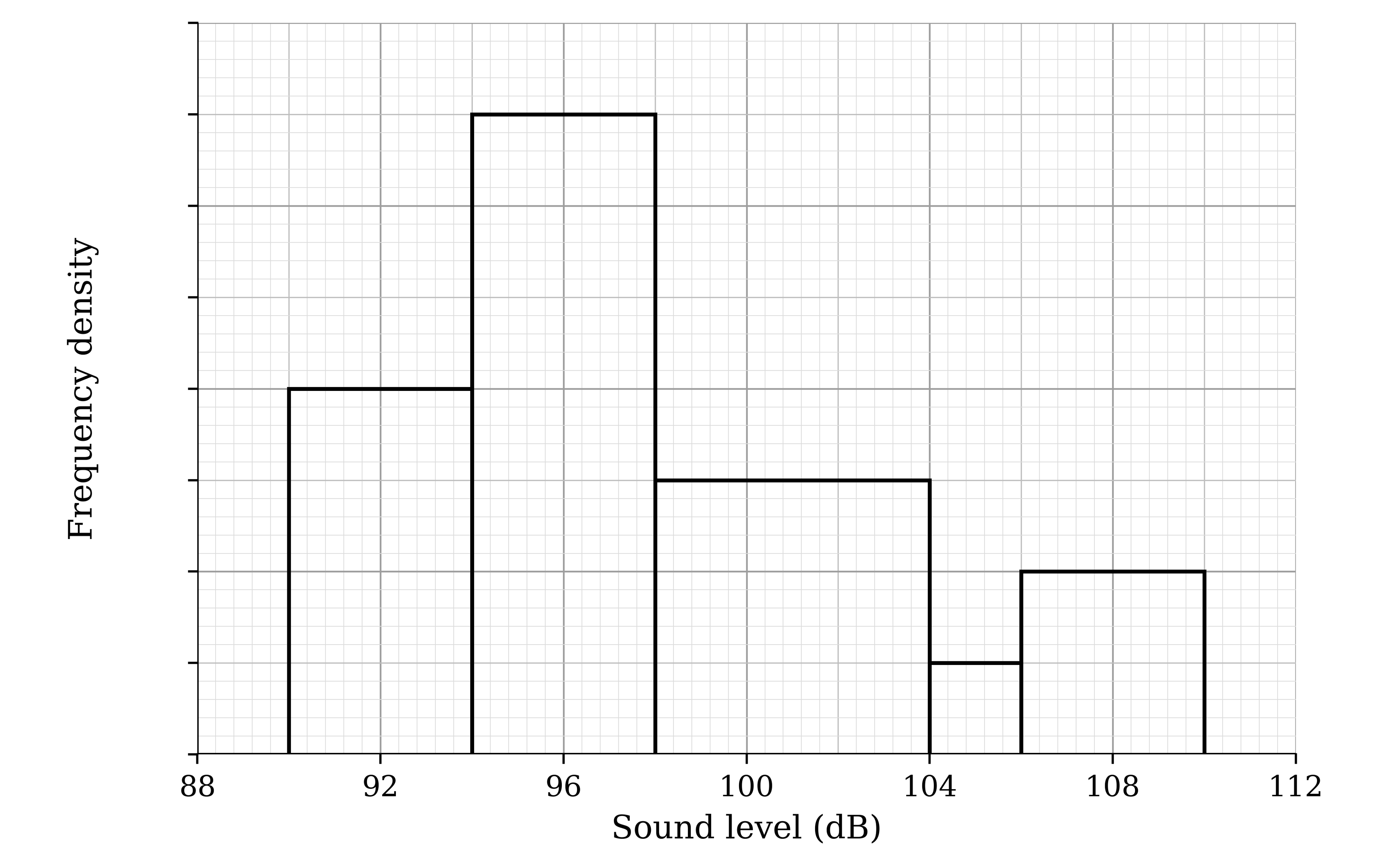
The histogram shows the loudest sound level, in decibels (dB), reached by the bark of each of the 180 dogs at a rescue centre. No scale is shown on the frequency density axis.

Histogram with sound level in dB from 88 to 112 on the horizontal axis and frequency density on the vertical axis, with tick marks but no numbers. Bars: 90 to 94, 94 to 98 (the tallest), 98 to 104, 104 to 106 (the shortest) and 106 to 110

Estimate the number of these dogs whose loudest bark was between 99 dB and 107 dB.

2a
5 marks

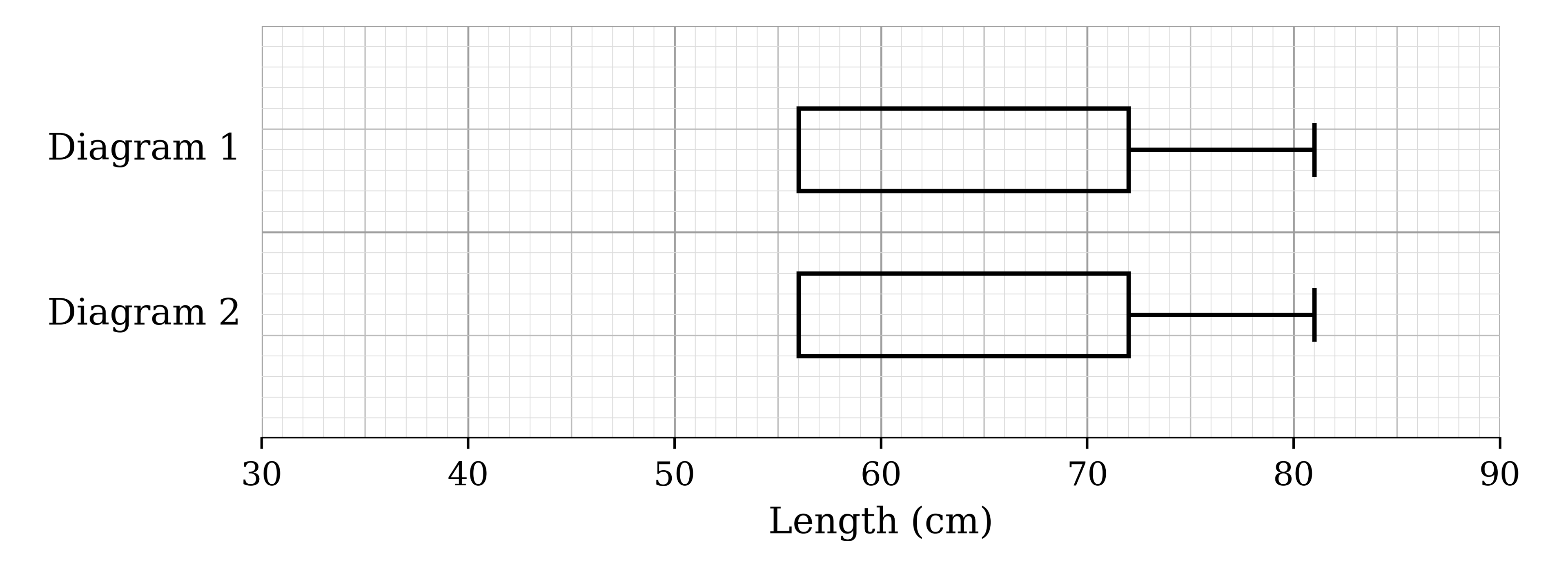
Crystal is given an incomplete box-and-whisker plot of the lengths of 99 unicorn horns. She also knows that

the median length is halfway between the minimum and maximum lengths

the range is 2.5 times the interquartile range.

Complete the diagrams below to show that there are two possible box-and-whisker plots that fit this information.

Two identical incomplete box-and-whisker plots, labelled Diagram 1 and Diagram 2, on a scale of length from 30 to 90 cm. Each shows a box from 56 to 72 with a whisker from 72 to 81, with no median line and no lower whisker
2b
3 marks

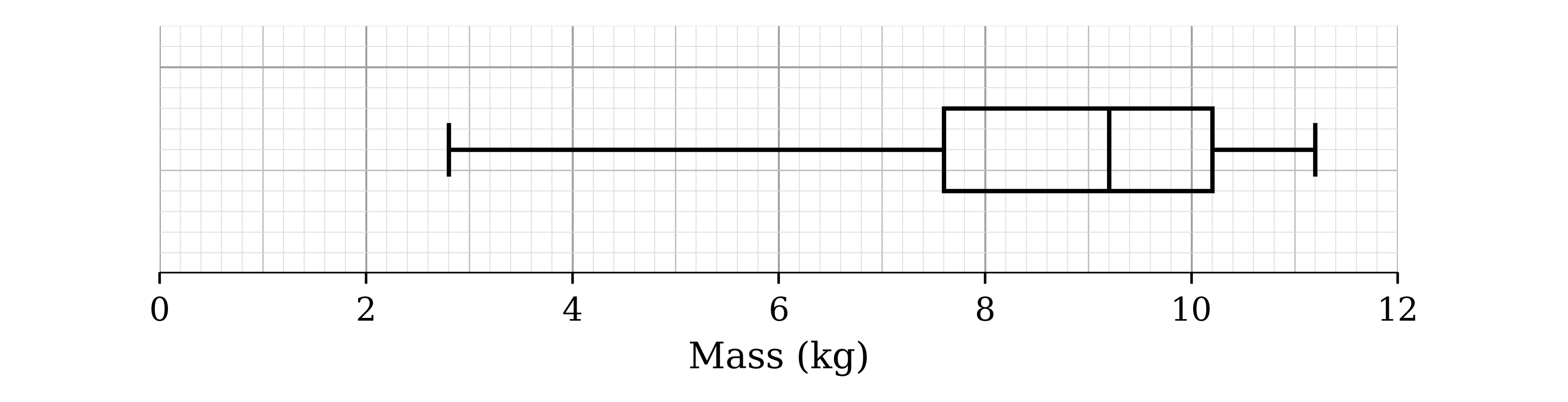
The box-and-whisker plot below shows the masses, in kg, of the 99 unicorn horns.

Box-and-whisker plot on a scale of mass from 0 to 12 kg: whiskers from 2.8 to 11.2, box from 7.6 to 10.2 with the median line at 9.2

Crystal discovers that two masses were recorded incorrectly: 11 kg should have been 8 kg, and 9 kg should have been 10 kg.

Explain why at most one of the five values on the box-and-whisker plot will need to be changed.

2c
2 marks

Explain why it is possible that the box-and-whisker plot will not change when the masses are corrected.