Bar Charts: Introductions & Overviews (IELTS Academic: Writing): Study Material

Bar charts: introductions & overviews
Rephrasing the question
In IELTS Writing Task 1, you may have to describe a bar chart. A bar chart might show change over time or only compare categories.
A typical bar chart that shows change over time looks like this:
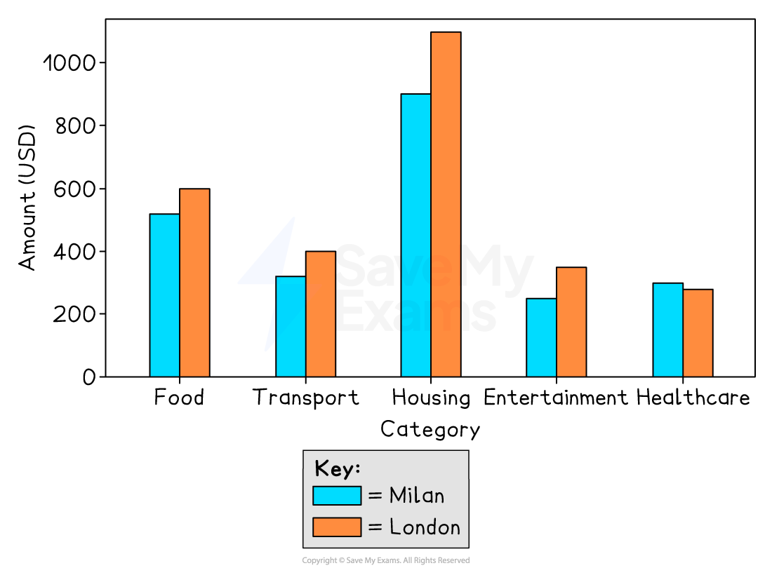
A typical bar chart comparing categories looks like this:
A good introduction usually includes two parts:
An introductory sentence that rephrases the task question (one sentence)
An overview describing the main features of the chart (two sentences)
First, check what the bar chart is showing
Make sure you understand the chart before you start writing the introduction
Identify the main parts of the chart clearly: vertical axis, horizontal axis, categories and groups
Your introductory sentence should not copy the task question
You will lose marks in “Task Achievement” if you simply copy the task question
To avoid that, use the task question as your starting point and circle the keywords in it
Think of synonyms for those keywords and use them to paraphrase the task question
Make sure your paraphrase keeps the same meaning as the question
You do not need to paraphrase every single word (terms like “bar chart” can stay the same)
In your introductory sentence, do not include detailed data or comparisons
Example of a good introductory sentence
Task question:
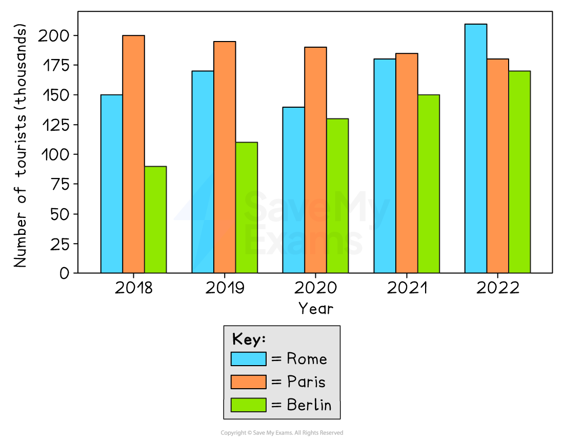
The bar chart shows the number of tourists visiting Rome, Paris and Berlin between 2018 and 2022
A possible introduction:
The chart provides information about holiday makers in three European cities between 2018 and 2022, measured in thousands
Bar charts: finding the overview
After your first introductory sentence, you need to write the overview
This is the part where you give an overview of the main features shown in the bar chart
Your overview should show that you understand the big picture, so focus on overall patterns
Avoid describing small details
Look for the highest and lowest values, because these are often key features
What you should look for:
Whether the differences between categories are large or small
Whether some categories have similar figures
Any clear groupings (e.g. two high and two low categories)
Example of a good overview
Task question:
The bar chart shows the number of tourists visiting Rome, Paris and Berlin between 2018 and 2022
A possible overview:
Overall, Paris recorded the highest figures at the beginning of the period, whereas Rome became the most visited city by 2022. Berlin had the lowest number of tourists throughout, although its figures increased steadily
Examiner Tips and Tricks
You do not need to include numbers in the overview. You can do that in the body paragraphs
Sign up now for IELTS Academic
or
Was this study material helpful?