Pie Charts: Introductions & Overviews (IELTS Academic: Writing): Study Material

Pie charts: introductions & overviews
Rephrasing the question
In IELTS Writing Task 1, you may have to describe and compare data from multiple pie charts. These can show numbers and percentages, and they might show change over time or groups and categories.
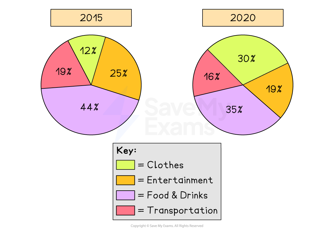
Typical pie charts that show change over time look like this:
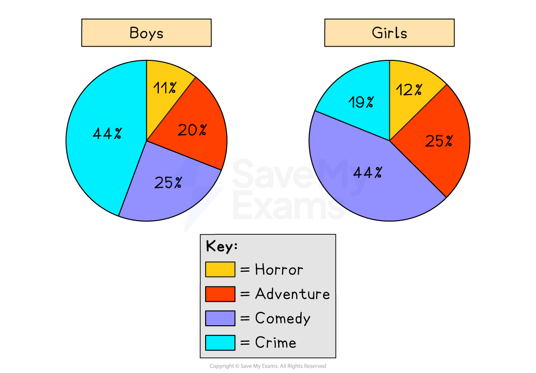
Typical pie charts comparing categories look like this:
The introduction usually includes two parts:
An introductory sentence that rephrases the task question (one sentence)
An overview describing the main features of the charts (two sentences)
First, check what the pie charts are showing
Make sure you understand the charts before you start writing the introduction
Identify the main parts of the chart (categories, groups, times, colours)
Remember that your introductory sentence should not copy the task question
You will lose marks in Task Achievement if you simply copy the task question
To avoid that, use the task question as your starting point and circle the keywords in it
Think of synonyms for those keywords and use them to paraphrase the task question
Make sure your paraphrase keeps the same meaning as the task question
You do not need to paraphrase every single word (terms like “pie chart” can stay the same)
In your introductory sentence, do not include detailed data or comparisons
Example of a good introductory sentence
Task question:
The pie charts show teenagers’ favourite movie types in the UK, divided by gender
A possible introduction:
The charts compare the preferences of teenage boys and girls in the UK regarding different movie genres
Finding the overview
After your introductory sentence, you need to write the overview
This is the part where you give an overview of the main features shown in the pie charts
Your overview should show that you understand the big picture, so look for big similarities and differences between data sets
Avoid describing small details
Aim to write two clear sentences
What you should look for:
Whether the differences between categories are large or small
Whether some categories have similar figures
Any clear groupings (e.g. two high and two low categories)
Which categories dominate the charts
Any evident opposite patterns
Example of a good overview
Task question:
The pie charts show teenagers’ favourite movie types in the UK, divided by gender
A possible overview:
Overall, crime and comedy were the most popular types of film among teenagers, whereas horror accounted for the smallest shares in both groups.
Sign up now for IELTS Academic
or
Was this study material helpful?