Frequency Polygons (WJEC GCSE Maths & Numeracy (Double Award)): Revision Note
Exam code: 3320

Did this video help you?
Frequency polygons
What are the key features of a frequency polygon?
Frequency polygons are a very simple way of showing frequencies for continuous, grouped data and give a quick guide to how frequencies change from one class to the next
Apart from plotting and joining up points with straight lines there are 2 rules for frequency polygons:
Plot points at the MIDPOINT of class intervals
Unless one of the frequencies is 0 do not join the frequency polygon to the x-axis, and do not join the first point to the last one
The result is not actually a polygon but more of an open one that ‘floats’ in mid-air!
You may be asked to draw a frequency polygon and/or use it to make comments and compare data
How do I draw a frequency polygon?
This is easiest shown by an example
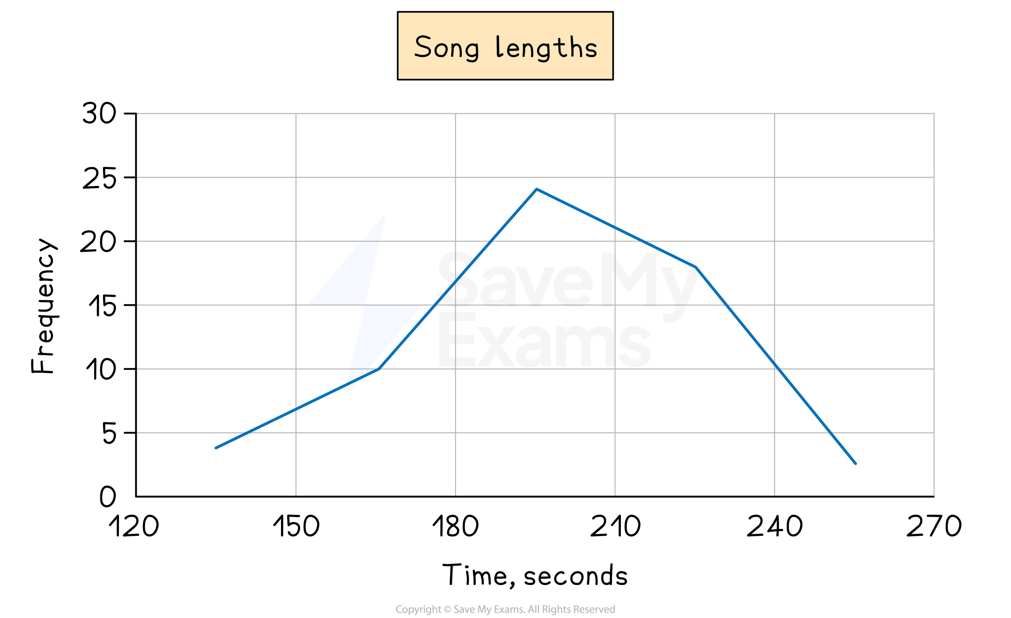
e.g. The lengths of 59 songs, in seconds, are recorded in the table below
Song length | Frequency |
120 ≤ t < 150 | 4 |
150 ≤ t < 180 | 10 |
180 ≤ t < 210 | 24 |
210 ≤ t < 240 | 18 |
240 ≤ t < 270 | 3 |
Frequencies are plotted at the midpoints of the class intervals
so in this case we would plot the points (135, 4), (165, 10), (195, 24), (225, 18) and (255, 3)
Join these up with straight lines (but do not join the last to the first!)
How do I use and interpret a frequency polygon?
Think about what you could you say about the data above, particularly by looking at the diagram only?
The two things to look for are averages and spread
The modal class is 180 ≤ t < 210
It would be acceptable to say that 195 seconds is (an estimate of) the modal song length
The diagram (rather than the table) shows (an estimate of) the range of song lengths is 255 – 135 = 120 seconds
If 2 frequency polygons are drawn on the same graph comparisons between the 2 sets of data can be made
Examiner Tips and Tricks
Jot down the midpoints next to the frequencies so you are not trying to work them out in your head while also concentrating on actually plotting the points.
Worked Example
A local council ran a campaign to encourage households to waste less food.
To compare the impact of the campaign the council recorded the weight of food waste produced by 30 households in a week both before and after the campaign.
The results are shown in the table below.
Food waste | Frequency | Frequency |
1 ≤ w < 1.4 | 3 | 5 |
1.4 ≤ w < 1.8 | 4 | 8 |
1.8 ≤ w < 2.2 | 8 | 14 |
2.2 ≤ w < 2.6 | 10 | 3 |
2.6 ≤ w < 3 | 5 | 1 |
(a) On the same diagram, draw two frequency polygons, one for before the council’s campaign and one for after.
Answer:
Remember to include a key to show which frequency polygon is which
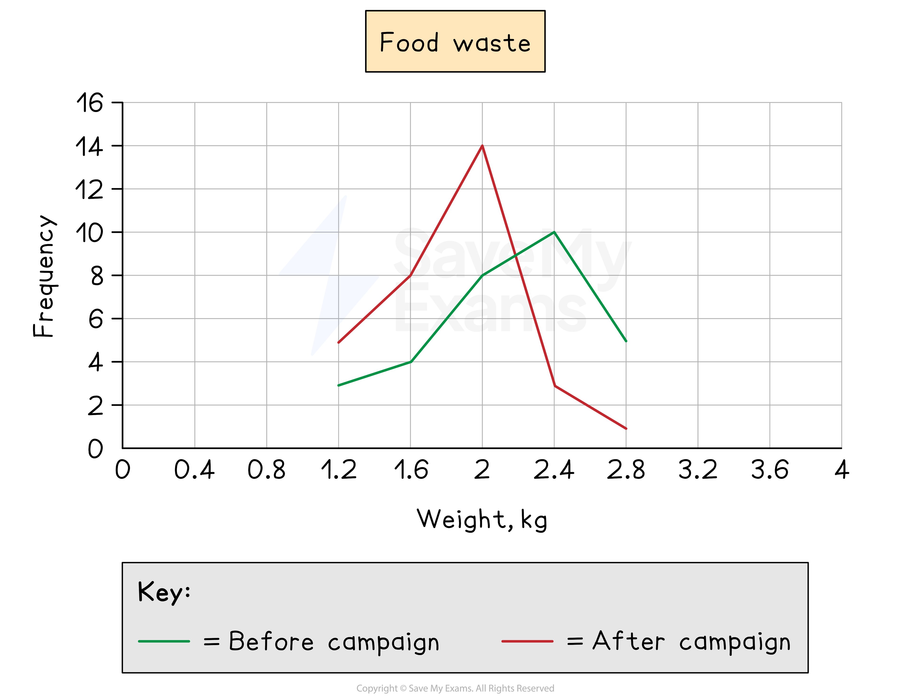
(b) Comment on whether you think the council’s campaign has been successful or not and give a reason why.
Answer:
Look for average(s) and/or spread - the mode (average) is appropriate in this case
The council campaign has been successful as the modal amount of waste has reduced from 2.4 kg of food waste per week to 2 kg

Unlock more, it's free!
Join the 100,000+ Students that ❤️ Save My Exams
the (exam) results speak for themselves:

Was this revision note helpful?
