1
4 marks
Outline a strategy used to manage energy consumption.
Was this exam question helpful?
Exam code: 7037
Outline a strategy used to manage energy consumption.
Was this exam question helpful?
Which of the following has the correct examples of primary and secondary sources of energy in the correct columns?
[1]
| Primary energy | Secondary energy |
A | A water wheel powered by a river used to drive machinery in a factory. | Releasing radiation from uranium to convert water to steam for electricity powering a town. |
B | Burning coal and wood in a multi-fuel stove for heat in the home. | Gas transfer by pipeline to power a gas cooker in the home. |
C | Production of petrol from crude oil to drive cars. | Conversion of biogas from organic decomposition of animal waste. |
D | Electricity generated from an HEP scheme used to power a field centre. | Geothermal power heating ground water supplies directly into the home. |
Was this exam question helpful?
Which of the following is a correct list of gases that are major contributors to the enhanced greenhouse effect?
Methane, helium, oxygen
Methane, hydrogen, hydrofluorocarbons
Methane, hydrofluorocarbons, carbon dioxide
Methane, carbon dioxide, hydrogen
Was this exam question helpful?
Describe the changes in the UK energy mix between 2000 and 2023.
Was this exam question helpful?
Outline the causes and effects of acid rain.
Was this exam question helpful?
Figures 12a and 12b are maps showing GNI per capita and Energy consumption per capita.
Figure 12a

Figure 12b

Using Figure 12a and Figure 12b, analyse the relationship between GNI per capita and Energy consumption per capita.
Was this exam question helpful?
Figure 13 shows trends in nuclear power and hydroelectricity consumption from 1987-2012.
Figure 13

With reference to Figure 13 and your own knowledge, assess the success of strategies to increase energy supply through developing nuclear power and renewable energy.
Was this exam question helpful?
Figure 9a shows the location and amount of economically viable oil reserves at different oil prices in 2016.
Figure 9b shows the average oil price between January 2004 and January 2020.
Figure 9a
The location and amount of economically viable oil reserves at different oil prices in 2016

Note: Viable oil reserves are those that can be profitably extracted.
Figure 9b

Inflation adjusted oil price graph - average oil price between January 2004 and January 2020
Analyse the data shown in Figure 9a and Figure 9b.
Was this exam question helpful?
Figure 10a shows information produced by the Canadian government about greenhouse gas emissions and tar sand developments producing oil in Canada.
Figure 10b shows a tar sand oil production area in Alberta, Canada.
Figure 10a

Information produced by the Canadian government about greenhouse gas emissions and tar sand developments producing oil in Canada
Figure 10b

Using Figure 10a, Figure 10b and your own knowledge, to what extent do you agree that the environmental impacts of the development of a major energy source such as this are always negative?
Was this exam question helpful?
Figure 9a shows the world’s top ten coal producing countries in 2015. Figure 9b shows coal consumption in the top ten coal consuming countries and the rest of the world in 2015. Figure 9c shows a Spearman’s rank calculation used to study whether there is a relationship between production and consumption of coal in the countries shown in Figure 9a.
Figure 9a
The world’s top ten coal producing countries in 2015

Figure 9b
Coal consumption in the top ten coal consuming countries and the
rest of the world in 2015

Figure 9c
The null hypothesis is: ‘There is no relationship between production of coal and consumption of coal.’
Rs Value | 0.806 |
|---|---|
Critical Value at 0.05 significance level(n = 10) | 0.648 |
Analyse the data shown in Figures 9a, 9b and 9c.
Was this exam question helpful?
Figure 10a shows the renewable and nuclear energy mix of selected European countries in 2012.
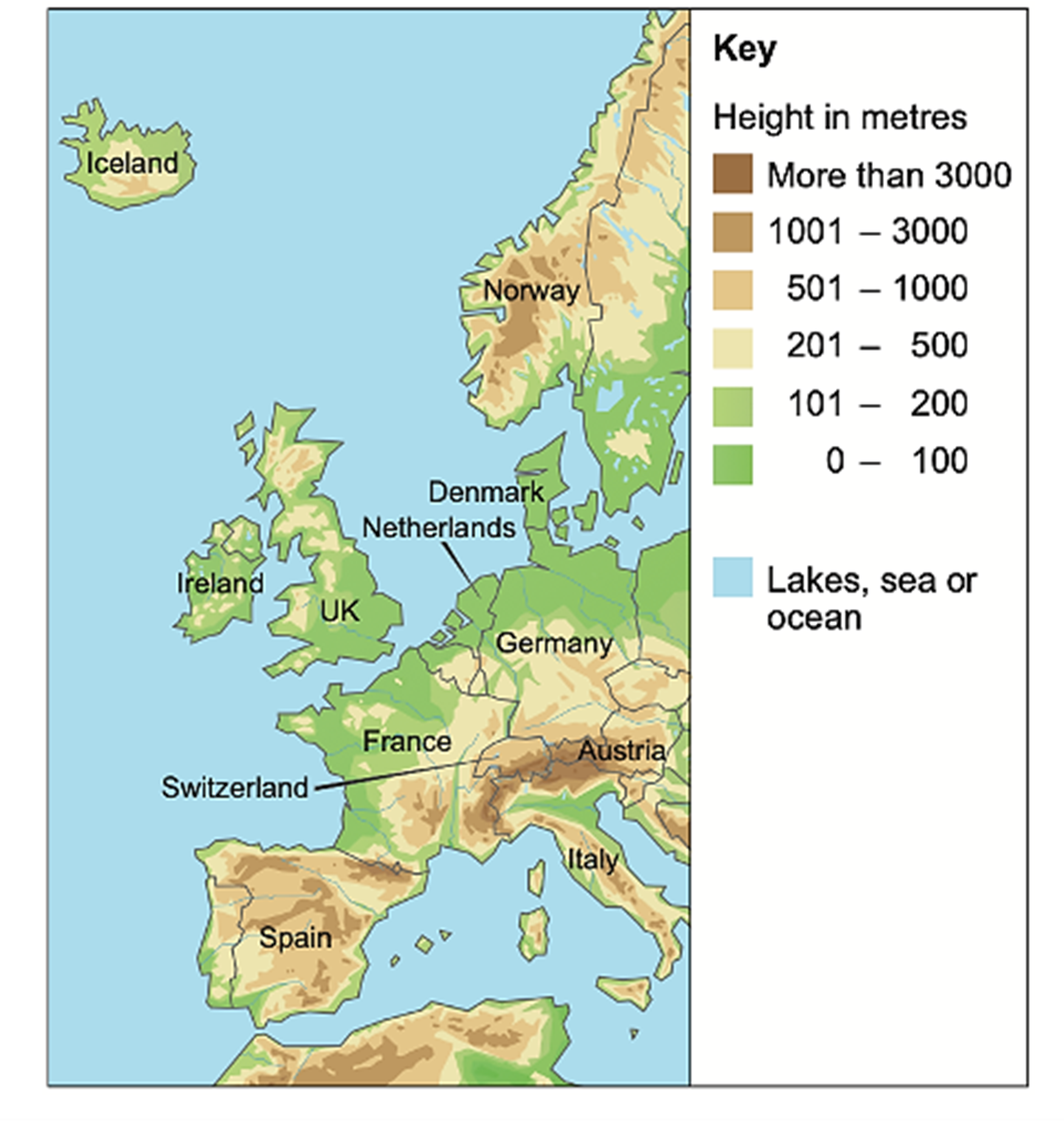
Figure 10b is a relief map of Europe.
Figure 10c shows average annual precipitation.
Figure 10a
The renewable and nuclear energy mix of selected European countries in 2012

Figure 10b
A relief map of Europe

Figure 10c
Average annual precipitation

Using Figures 10a, 10b, 10c and your own knowledge, assess the relationship between energy supply and physical geography.
Was this exam question helpful?
Figure 10a shows a hydro-electric scheme in Scandale Beck, an upland river in the Lake District.
Figure 10b shows electricity generation for the scheme in selected months between 2015 and 2017.
Figure 10a

Figure 10b
Month | Potential output (MWh) | Actual output (MWh) |
|---|---|---|
November 2015 | 653.04 | 646.00 |
April 2016 | 653.04 | 217.00 |
August 2016 | 674.81 | 276.00 |
November 2016 | 653.04 | 268.00 |
January 2017 | 674.81 | 181.00 |
MWh = Megawatt-hours, a measure of electricity generation
Using Figure 10a, Figure 10b and your own knowledge, assess the extent to which renewable energy can be used to achieve energy security.
Was this exam question helpful?
Study Figure 2, which shows the sources of UK electricity generation in 2022.
Figure 2: UK electricity generation by source, 2022 (%)
Source | Share of UK electricity generation (%) |
|---|---|
Natural gas | 38 |
Wind (offshore + onshore) | 25 |
Nuclear | 15 |
Biomass | 5 |
Solar | 5 |
Imports | 5 |
Coal | 2 |
Hydroelectric | 2 |
Other | 3 |
Source: National Grid ESO / BEIS, 2022.
Analyse the data shown in Figure 2.
Was this exam question helpful?
Figure 9a shows the renewable and nuclear energy mix of selected European countries in 2012.
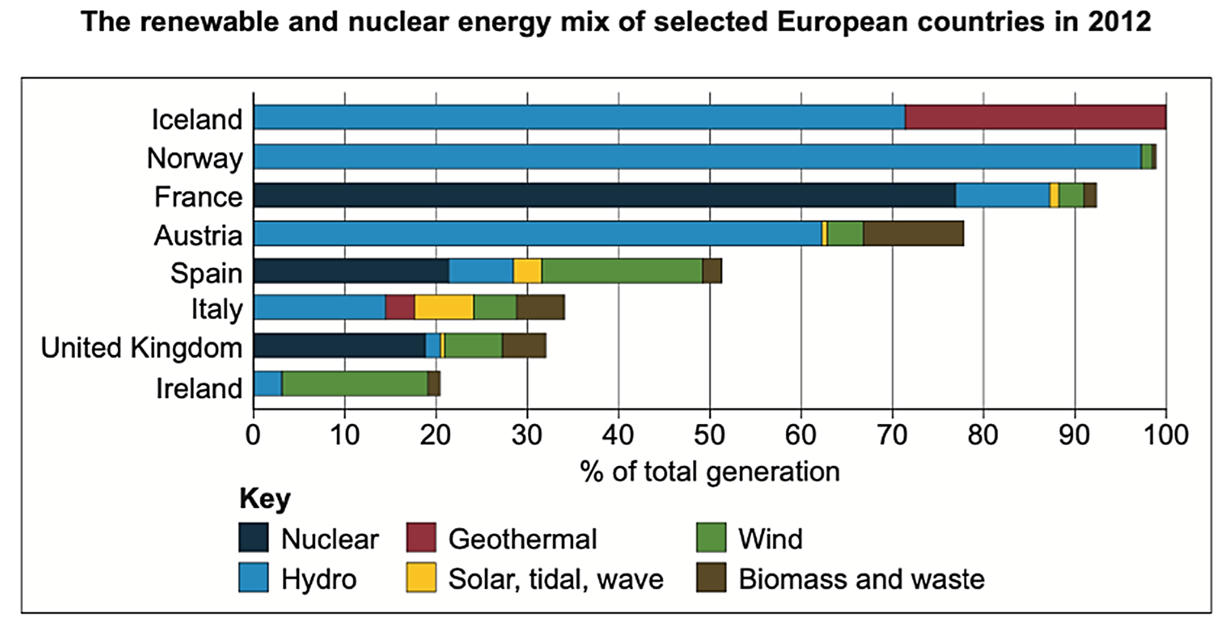
Figure 9b is a relief map of Europe.
Analyse the data shown in Figures 9a and 9b.
Was this exam question helpful?
Figure 10 shows solar power capacity in world regions in 2021.
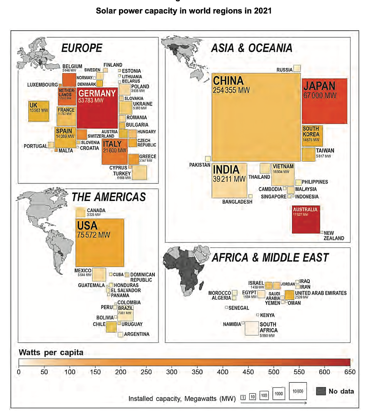
Using Figure 10 and your own knowledge, assess regional variations in solar energy production.
Was this exam question helpful?
To what extent is there a link between the physical geography and energy mixes in contrasting areas you have studied?
Was this exam question helpful?
Figures 9a and 9b are in the insert. Figure 9a shows the percentage land area affected by drought in Montana, USA, between May 2017 and January 2018. Figure 9b shows the energy sources of electricity generation in Montana, 2012-2017.
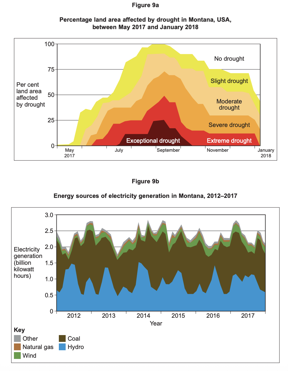
Analyse the data shown in Figure 9a and Figure 9b.
Was this exam question helpful?
Figures 10a and 10b are in the insert. Figure 10a shows information produced by West Cumbria Mining about a proposal to mine coal in the area. Figure 10b shows a local protest about the proposal to open a coal mine in West Cumbria.

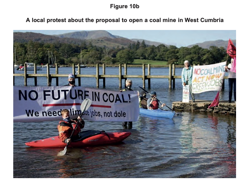
Using Figure 10a, Figure 10b and your own knowledge, discuss why there may be conflict between resource security and human welfare.
Was this exam question helpful?
Assess the view that nuclear power is the best way for a country to achieve energy security.
Was this exam question helpful?
Assess the view that renewable energy is the most effective way to achieve a sustainable energy future.
Was this exam question helpful?
Assess the view that the economic benefits of developing new energy sources outweigh their environmental costs.
Was this exam question helpful?