The term superbug is used to describe disease-causing (pathogenic) bacteria that are no longer killed by certain antibiotics. These bacteria have developed antibiotic resistance.
Image 9.1 shows the actual deaths from superbugs in the world in 2014 and the predicted deaths in 2050.
Image 9.1
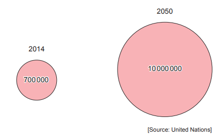
(i) Use the equation below to calculate the percentage increase in predicted deaths from superbugs in the world between 2014 and 2050.
Give your answer to the nearest whole number.
[3]
Percentage increase in deaths = ..........
(ii) State the main reason for the increase of antibiotic resistance in some pathogenic bacteria.
[1]
Health scientists were experimenting on the effect of the antibiotic methicillin on three different species of pathogenic bacteria. They used a triple compartment Petri dish in their experiment.
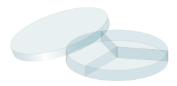
The method they used is shown below:
Each compartment was filled with a nutrient jelly (agar), which allows bacteria to grow.
Bacteria species A, B and C were each placed in a different compartment.
A disc of filter paper containing the antibiotic methicillin was placed in the centre of each compartment.
The Petri dish lid was used to close the dish. The dish was then placed in an incubator at 37 °C.
After two days the Petri dish was examined.
Image 9.2 shows the surface view of the Petri dish after 2 days. The shaded areas show where bacteria were living. The clear areas show where there were no bacteria remaining.
Image 9.2
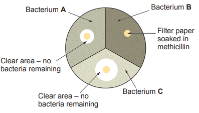
(i) Use Image 9.2 to identify which bacterium is the superbug MRSA.
Circle your answer.
[1]
A B C
(ii) Explain your answer.
[1]
..........
Sir Alexander Fleming discovered penicillin, the first antibiotic, in 1928. However, it was not used on a patient until 1942. There is still a long delay between the discovery of new drugs and their use in treating disease today.
(i) State the source of the penicillin discovered by Sir Alexander Fleming.
[1]
..........
(ii) State one reason for the long delay between the discovery of new drugs and their use in treating disease in humans.
[1]
..........
(iii) Suggest why it is important to medical science that global biodiversity is maintained.
[1]
..........
Was this exam question helpful?
![[Figure: photograph of surgeons performing heart surgery on a patient]](https://cdn.savemyexams.com/cdn-cgi/image/f=auto,width=3840/https://cdn.savemyexams.com/uploads/2026/08/19393-5-a.png)
![Graph 8.1
![Figure: line graph, "Deaths per million" from smallpox, x-axis years 1860-1930, showing a line with markers for "Mandatory vaccination enforced" and "Mandatory vaccination repealed"]
Graph 8.2
![Figure: line graph, "Deaths per million" from polio, x-axis years 1950-1964, with markers for "Vaccine introduced" and "Cases of polio caused by vaccine"]
Graph 8.3
![Figure: line graph, "Deaths per million" from diphtheria, x-axis years 1910-1970, with a marker for "Vaccine introduced"]
Graph 8.4
![Figure: line graph, "Deaths per million" from typhoid fever, x-axis years 1890-1960]](https://cdn.savemyexams.com/cdn-cgi/image/f=auto,width=3840/https://cdn.savemyexams.com/uploads/2026/08/40762-8.png)
![[Figure: Photograph showing a child receiving the MMR vaccine]](https://cdn.savemyexams.com/cdn-cgi/image/f=auto,width=3840/https://cdn.savemyexams.com/uploads/2026/08/53024-5a.png)
![[Figure: Graph 5.1 — a line graph of the percentage of children vaccinated (65%–100%) against year (1990–2015), showing a 95% target line, a marker for when the MMR vaccine was introduced, and a marker for the date of the (1998) report]](https://cdn.savemyexams.com/cdn-cgi/image/f=auto,width=3840/https://cdn.savemyexams.com/uploads/2026/08/198-7-2.png)
![[Figure: Image 8.1 — a bacterium (about 1000 nm) with cell membrane, cytoplasm, genes, cell wall and flagellum labelled, and a virus (about 20 nm) with genes and a protein coat labelled]](https://cdn.savemyexams.com/cdn-cgi/image/f=auto,width=3840/https://cdn.savemyexams.com/uploads/2026/08/63923-8-1.png)
![[Figure: Diagram of a pathogen showing labelled structures: genes, antigens, and protein coat]](https://cdn.savemyexams.com/cdn-cgi/image/f=auto,width=3840/https://cdn.savemyexams.com/uploads/2026/08/27761-3a.png)
![[Figure: Image 5.1 — a white blood cell shown engulfing several micro-organisms in the bloodstream]](https://cdn.savemyexams.com/cdn-cgi/image/f=auto,width=3840/https://cdn.savemyexams.com/uploads/2026/08/58510-5-1.png)
![[Figure: Graph 5.2 — antibody concentration (arbitrary units, 0–7) plotted against time (days, 0–90), with vaccination marked at day 0, a slow rise in antibody concentration over the first 20 days, then a plateau, then a very rapid rise between days 45 and 65 marked with a point X, followed by a decline]](https://cdn.savemyexams.com/cdn-cgi/image/f=auto,width=3840/https://cdn.savemyexams.com/uploads/2026/08/63291-5-2.png)
![[Figure: Graph 5.3 — a bar chart of MMR vaccine coverage (%, 72–94) against year (1996–2010), showing coverage falling from around 92% in 1996 to a low around 80% in the early-to-mid 2000s before recovering]](https://cdn.savemyexams.com/cdn-cgi/image/f=auto,width=3840/https://cdn.savemyexams.com/uploads/2026/08/29690-5-3.png)
![[Figure: Diagram of a bacterial cell with three unlabelled structures marked A, B, and C for the candidate to identify]](https://cdn.savemyexams.com/cdn-cgi/image/f=auto,width=3840/https://cdn.savemyexams.com/uploads/2026/08/18635-8.png)
![[Figure: Six test tubes showing the results of the antibiotic investigation — tubes 1-3 show cloudy solution and tubes 4-6 show clear solution]](https://cdn.savemyexams.com/cdn-cgi/image/f=auto,width=3840/https://cdn.savemyexams.com/uploads/2026/08/12220-8b.png)
![[Figure: Micrograph photograph of E. coli bacteria]](https://cdn.savemyexams.com/cdn-cgi/image/f=auto,width=3840/https://cdn.savemyexams.com/uploads/2026/08/31854-5a.png)
![[Figure: Diagram showing foreign antigens encountered for the first time, leading via a blood vessel to a clone of lymphocytes which secrete antibodies, and a clone of memory cells which remain as memory cells]](https://cdn.savemyexams.com/cdn-cgi/image/f=auto,width=3840/https://cdn.savemyexams.com/uploads/2026/09/65261-7a.png)
![[Figure: Diagram showing two populations at the start and during an outbreak of measles. A key distinguishes: not vaccinated but still healthy; vaccinated and healthy; not vaccinated, sick and able to spread disease. Population 1 (not vaccinated) shows many people becoming sick during the outbreak; Population 2 (vaccinated) shows most people remaining healthy]](https://cdn.savemyexams.com/cdn-cgi/image/f=auto,width=3840/https://cdn.savemyexams.com/uploads/2026/09/23320-7b.png)