Year 11 students investigated the effect of age on reaction time. They used the following method:
Five teachers of different ages were selected.
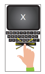
Each teacher sat at a computer waiting for the letter X to appear on the screen.
When the X appeared, the teacher pressed the space bar.
The time taken for each teacher to react was recorded by the computer.
The results are shown in Graph 4.
Graph 4
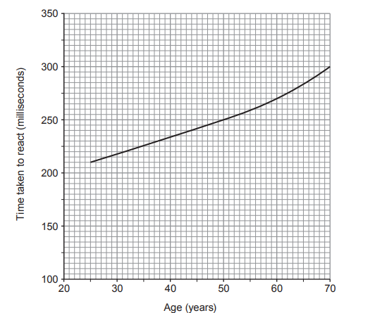
State the conclusion that can be made from the results shown in Graph 4.
State two variables that should have been controlled to make this a fair test.
1.
2.
State what the students should do to have more confidence in their results.
(i) State the stimulus being detected in this investigation.
[1]
..........
(ii) State how information travels along neurones.
[1]
..........
(iii) State the two parts of the central nervous system.
[2]
..........
..........
Was this exam question helpful?
![[Figure: Original layout shows the sense organs (nose, tongue, ear, eye) and stimuli (sound, chemicals in the air, light, chemicals in food and drink) as two columns joined by straight lines, with ear–sound already joined as the example]](https://cdn.savemyexams.com/cdn-cgi/image/f=auto,width=3840/https://cdn.savemyexams.com/uploads/2026/08/38437-1a.png)
![[Figure: diagram of a reflex arc showing the spinal cord and the neural pathway from a receptor through sensory, relay and motor neurones to an effector, labelled "spinal cord"]](https://cdn.savemyexams.com/cdn-cgi/image/f=auto,width=3840/https://cdn.savemyexams.com/uploads/2026/08/22086-5-1.png)
![[Figure: diagram of the ruler-drop reaction time experiment, showing a person's hand holding a ruler above another person's hand positioned to catch it, alongside a Distance to Time Converter scale for converting the ruler-drop distance into a reaction time in seconds]](https://cdn.savemyexams.com/cdn-cgi/image/f=auto,width=3840/https://cdn.savemyexams.com/uploads/2026/08/44602-5-2.png)
![![[Figure: Image 2.1 — a cross-section diagram of human skin with three unlabelled structures A, B and C pointed to by lines, along with a hair, sweat duct and sweat pore]](https://cdn.savemyexams.com/uploads/2026/08/37432-2.png){width=579 height=300}](https://cdn.savemyexams.com/cdn-cgi/image/f=auto,width=3840/https://cdn.savemyexams.com/uploads/2026/08/8400-2.png)

![[Figure: line graph, x-axis "Time (hours)" 0 to 8, y-axis "Level of substance (arbitrary units)" 0 to 170; three lines plotted for glucose, insulin and glucagon, with glucose and insulin fluctuating together between roughly 70 and 110 arbitrary units, and glucagon rising during the 1st hour then falling as glucose/insulin rise after a meal]](https://cdn.savemyexams.com/cdn-cgi/image/f=auto,width=3840/https://cdn.savemyexams.com/uploads/2026/08/14716-7-b.png)
![[Figure: diagram of a cross-section through human skin, unlabelled]](https://cdn.savemyexams.com/cdn-cgi/image/f=auto,width=3840/https://cdn.savemyexams.com/uploads/2026/08/62355-7-1.png)
![[Figure: line graph with x-axis "Air temperature (°C)" from −20 to 40, left-hand y-axis "Mean skin temperature (°C)" from 20 to 40, right-hand y-axis "Mean core body temperature (°C)" from 35 to 39; the mean core body temperature line is already plotted, and the first two mean skin temperature points (at −20°C and −10°C) are already plotted]](https://cdn.savemyexams.com/cdn-cgi/image/f=auto,width=3840/https://cdn.savemyexams.com/uploads/2026/08/4614-7-3.png)
![[Figure: Image 3.1 — a flow diagram showing homeostasis of normal blood glucose level at the centre. On one side: blood glucose level increases → box 1 releases insulin into the blood → body cells absorb glucose → blood glucose level decreases → back to homeostasis. On the other side: blood glucose level decreases → box 2 releases glucagon into the blood → box 3 converts glycogen to glucose → blood glucose level increases → back to homeostasis]](https://cdn.savemyexams.com/cdn-cgi/image/f=auto,width=3840/https://cdn.savemyexams.com/uploads/2026/08/34697-3-1.png)
![[Figure: Graph 3.2 — glucose and insulin in blood plasma (arbitrary units) plotted against time (0–150 minutes) for both Anwen and Rhys, showing four curves: Anwen glucose, Rhys glucose, Anwen insulin and Rhys insulin. Anwen's glucose curve starts higher, falls more slowly and does not return to the starting level; Anwen's insulin curve stays lower than Rhys's throughout]](https://cdn.savemyexams.com/cdn-cgi/image/f=auto,width=3840/https://cdn.savemyexams.com/uploads/2026/08/24474-3-2.png)
![[Figure: Diagram of a cross-section through human skin with arrows pointing to two unlabelled structures for the candidate to identify]](https://cdn.savemyexams.com/cdn-cgi/image/f=auto,width=3840/https://cdn.savemyexams.com/uploads/2026/09/40748-6a.png)
![[Figure: Diagram of a colour scale showing cobalt chloride paper changing from blue to purple to pink with increasing absorption of water vapour, labelled 'Colour standard']](https://cdn.savemyexams.com/cdn-cgi/image/f=auto,width=3840/https://cdn.savemyexams.com/uploads/2026/09/4733-6b.png)
![[Figure: Graph 7.2 — James' blood glucose level (a.u., 60–200) plotted against time (12.00 midday to 7.00 pm), with a maximum normal blood glucose level line and a minimum normal blood glucose level line both shown, and the curve rising from 85 to a peak of 130 at 4pm then falling back to 85 by 7pm]](https://cdn.savemyexams.com/cdn-cgi/image/f=auto,width=3840/https://cdn.savemyexams.com/uploads/2026/08/29633-7-2.png)
![[Figure: Drawing of a white blood cell, with a line labelled A to A1 drawn across its width]](https://cdn.savemyexams.com/cdn-cgi/image/f=auto,width=3840/https://cdn.savemyexams.com/uploads/2026/09/10613-5b.png)
![[Figure: Diagram of a cross-section through the skin, with structures X and Y labelled]](https://cdn.savemyexams.com/cdn-cgi/image/f=auto,width=3840/https://cdn.savemyexams.com/uploads/2026/08/25118-4a.png)
![[Figure: Diagram of two 250 cm3 conical flasks (A and B) each containing water and a thermometer through a cotton wool bung. Flask A is wrapped in dry towelling; Flask B is wrapped in towelling soaked in water]](https://cdn.savemyexams.com/cdn-cgi/image/f=auto,width=3840/https://cdn.savemyexams.com/uploads/2026/08/36439-4b.png)
![[Figure: Grid with axes 'Temperature of flask (°C)' (y-axis, 0–90) against 'Time (min)' (x-axis, 0–10), with flask A's line already plotted]](https://cdn.savemyexams.com/cdn-cgi/image/f=auto,width=3840/https://cdn.savemyexams.com/uploads/2026/08/49853-4bi.png)
![[Figure: Diagram showing an experimenter holding a 30 cm ruler above the open hand of a seated subject]](https://cdn.savemyexams.com/cdn-cgi/image/f=auto,width=3840/https://cdn.savemyexams.com/uploads/2026/08/9750-6a.png)
![[Figure: Photograph of a person's hand holding an e-cigarette]](https://cdn.savemyexams.com/cdn-cgi/image/f=auto,width=3840/https://cdn.savemyexams.com/uploads/2026/08/8838-5b.png)
![[Figure: Bar chart titled 'Effect on number of cigarettes smoked after trying e-cigarettes', showing percentage of people (y-axis, 0-40%) for four categories (x-axis): smoked fewer (approximately 25%), smoked more (approximately 5%), smoked the same (approximately 36%), and stopped smoking (approximately 34%)]](https://cdn.savemyexams.com/cdn-cgi/image/f=auto,width=3840/https://cdn.savemyexams.com/uploads/2026/08/50530-5bi.png)