Ecosystems, Nutrient Cycles & Human Impact on the Environment (WJEC GCSE Science (Double Award): Biology): Exam Questions

Exam code: 3430

1 hour12 questions
1a
1 mark

Fertilisers used by farmers can accidentally enter lakes.

In 2016, Natural Resources Wales reported that 12 lakes contained high levels of nitrates from fertilisers.

Suggest how the fertilisers accidentally entered these lakes.

1b
6 marks

Students used a computer to model the effect of fertiliser on dissolved oxygen content and bacteria numbers in a lake, after adding fertiliser.

The results are shown in Graph 2.1.

Graph 2.1
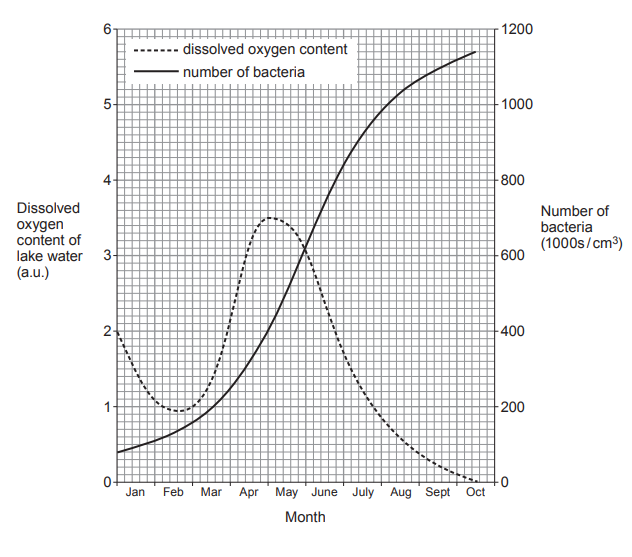
Graph showing lake dissolved oxygen dipping to a minimum around February/March, peaking around April/May, then falling to zero by October, while bacterial numbers rise steadily from January, levelling near 1150k in October

(i) Calculate the percentage increase in dissolved oxygen from the start of March to the start of May.

[2]

Increase = ................................... %

(ii) Explain why the dissolved oxygen content and number of bacteria change from May to September.

[3]

(iii) Suggest why the increase in the number of bacteria was slow in January and February.

[1]

2
1 mark

Kelp is of commercial importance. It is harvested for many reasons including as a source of iodine and other chemicals for the pharmaceutical industry. Conservationists are concerned that in some parts of the world kelp harvesting is reducing the number of other organisms living in the kelp forests.

[Figure: Photo of people harvesting kelp from the shore in Canada]

Using only the information given, what could you, as a scientist, say to the conservationists that would help them understand that a certain level of kelp harvesting could be maintained?

3a
4 marks

Image 7.1 and Image 7.2 show examples of two methods of farming hens for egg production.

Image 7.1 – Intensively farmed chickens

[Figure: photograph of intensively farmed chickens kept closely together in a shed]

Image 7.2 – Free-range chickens

[Figure: photograph of free-range chickens with access to outdoor space]
  • Intensive farming methods maximise production by controlling the conditions in which farm animals are kept. Inside animal sheds, temperatures may be kept high and each animal is given limited space.

  • In 2015, a survey of 2000 people (OnePoll) found that 80% of those questioned always or often bought free-range eggs, even though they were more expensive.

Table 7.3 shows egg production in the UK by intensive and free-range methods between 2006 and 2016.

Table 7.3

Year

Egg production (billion)

intensive

free-range

2006

4.1

1.9

2008

4.0

2.1

2010

3.8

2.8

2012

3.5

3.4

2014

3.9

3.3

2016

3.8

3.8

(a) Use Table 7.3 and the information above to answer the following questions.

(i) Calculate the percentage increase in the production of free-range eggs between 2006 and 2016.

[2]

Increase = .......................................... %

(ii) Give one way that intensive farming methods minimise energy loss from farm animals. Explain your answer.

[2]

3b
2 marks

Suggest two reasons why many people buy free-range eggs, even though they are more expensive than eggs produced by intensive farming methods.

3c
4 marks

(i) State one possible pollutant from intensive farming methods and explain how it could damage the environment.

[2]

(ii) Farmers in Wales who plan to develop intensive methods of food production on rural land must first submit their plans to biologists at Natural Resources Wales.

Describe the role of the biologists at both the planning stage and when the intensive farm is operating fully.

[2]

Planning stage ..........................................

When operating fully ..........................................

4
5 marks

Killer shrimp fact file:

Environment

Freshwater reservoirs and lakes in UK. Cannot live in water with a salt content > 2.5%

Native range

Black Sea, Russian Far East

Invasion pathway into UK

Unknown

Feeding

Predator

Status in UK

Established

Date of first record in UK

2010

Speed of spread

Downstream 124 km/year; Upstream 35 km/year

Predators

Trout, perch, aquatic birds

Body length of adult

Up to 30 mm

Reproduction

Females lay about 50 eggs which hatch into young about 1.8 mm in length

The map below shows the spread of the killer shrimp westwards along the rivers and canals of Europe. It also shows the dates at which the killer shrimp was first recorded at various points.

[Figure: Map of Europe showing rivers and canals (Danube, Rhine, Rhone, Loire, Seine, Ludwig Canal, Dnieper, Don, Black Sea, English Channel) where killer shrimp are found, with dates when they were first recorded at various points along each waterway]

(i) Use the map to suggest the route by which the killer shrimp travelled from the River Danube to the River Rhine and state the date when this occurred.

[1]

(ii) The salt content of the English Channel is 3.4–3.5%. State why the killer shrimp could not have travelled to Great Britain through the waters of the English Channel.

[1]

(iii) As a trainee research biologist working for Natural Resources Wales you have been asked to study all the information in detail. Suggest one way by which the killer shrimp could have arrived in Great Britain.

[1]

(iv) The River Taff rises in the Brecon Beacons and flows through Merthyr Tydfil to Cardiff Bay. Travelling along the River Taff, Merthyr Tydfil is 55.1 km from Cardiff Bay. If the killer shrimp were to travel up the River Taff from Cardiff Bay, calculate, to two significant figures, how long it would take to reach Merthyr Tydfil.

time taken to reach Merthyr Tydfil = ………....................……… years

5a
5 marks

Image 6 appeared on the BBC news website in 2018.

Image 6

Florida powerless to stop killer algal bloom.

In Florida, the uncontrolled growth of toxic algae known as "red tide" has caused an emergency. The sea waters are now a dark red colour. The red tide has left tonnes of dead animals, affected local businesses and worried the inhabitants. The abundance of the toxic algae has devastating effects all the way along food chains. More than 5 tonnes of dead fish have been reported, and the death of many dolphins. Shellfish such as clams, oysters and mussels are not affected but have been found to contain toxins produced by the algae.

[Figure: news photograph showing dark red "red tide" waters off the coast of Florida]

Use the information in Image 6 to answer the following questions.

(i) Red tide has been suspected of causing poisoning in humans. Whilst the poisonings have not been fatal many individuals have been admitted to hospital.

Suggest how humans were poisoned.

[2]

(ii) The recent red tide has killed approximately 500 turtles, as they ingest the algae when they feed on sea grasses. Prior to this, the population of turtles in Florida waters was estimated at 51 000. Calculate the percentage of turtles that have died as a result of red tide. Give your answer to two significant figures.

[3]

Percentage of turtles killed = ....................................................... %

5b
5 marks

Dead zones are areas of water with reduced oxygen levels. Some scientists have argued that the red tide can lead to dead zones forming in the sea. Explain how the increase in algal growth described in the article could lead to dead zones.

6a
3 marks

Image 3.1 shows part of a marine food web.

Image 3.1

[Figure: Image 3.1 — a marine food web diagram showing plant plankton, animal plankton, sand eels, shrimps, large fish, puffins, skua and gulls with arrows showing feeding relationships]

Use the food web in Image 3.1 to complete a food chain below which includes puffins.

plant plankton → ......................................... → ......................................... → puffins → .........................................

6b
2 marks

(i) State the source of the energy that enters the plant plankton.

...................................................................

[1]

(ii) Energy is used by the organisms in the food web.

State one way energy is used by organisms.

..........................................................................................................................

[1]

6c
5 marks

Read the following information about puffins.

  • Puffins are seabirds.

  • Each year, puffins spend eight months at sea. The other four months are spent on land during the breeding season.

  • Puffins nest on the ground where there may be many predators such as foxes and rats.

  • Natural factors cause puffin numbers to vary. However, oil pollution and rising sea temperatures from climate change have reduced puffin numbers in most areas.

  • Some puffins breed on the Welsh island of Skomer. Here, their numbers increased from 14 000 in 2013 to 31 000 in 2018.

[Figure: Photograph of Skomer Island, source: walesonline.co.uk]

Use the above information to answer the following questions.

(i) Explain why the Welsh Wildlife Trusts prevent rats from being introduced onto Skomer.

[1]

(ii) Complete the table by writing true or false for each statement about puffins.

[4]

Statement

True or False

Puffins face predators only at sea.

False

Puffin numbers are affected by variations in natural factors.

............................................

Puffin numbers generally are rising.

.........................................

Puffin numbers on Skomer increased by over 100% between 2013 and 2018.

...........................................

Puffins are at risk from climate change.

..........................................

Puffins spend only one third of the year at sea.

.........................................

7a
3 marks

Image 3.1 represents a five-stage food chain drawn as a pyramid of biomass. The energy retained or stored in the form of new biomass in trophic levels 1 and 2 is represented as a percentage.

Image 3.1

[Figure: Image 3.1 — a pyramid of biomass with five trophic levels (Trophic Level 1 at the base to Trophic Level 5 at the top), with Trophic Level 1 labelled 100% and Trophic Level 2 labelled 10%, and Trophic Levels 3, 4 and 5 labelled with blank percentages]

State:

(i) the source of energy for this food chain.

...................................................................................................

[1]

(ii) the scientific term used to describe the organisms found at trophic level 1.

...................................................................................................

[1]

(iii) a term that can be used to describe the organisms at trophic levels 2–5.

...................................................................................................

[1]

7b
4 marks

The efficiency of energy transfer between one trophic level and the next is 10%.

(i) Calculate the percentage of the energy entering trophic level 1 that reaches trophic levels 3, 4 and 5. Write your answers in the pyramid in Image 3.1.

Space for working.

[2]

(ii) Suggest why the food chain represented by the pyramid of biomass in Image 3.1 could not sustain a trophic level 6.

[1]

(iii) State one way in which energy is lost from a food chain.

...................................................................................................

[1]

7c
1 mark

Underline one correct statement about pyramids of biomass from the following list.

As you go up most pyramids of biomass from one trophic level to the next the:

  • size of the organisms decreases and their numbers increase.

  • size of the organisms decreases and their numbers decrease.

  • size of the organisms increases and their numbers increase.

  • size of the organisms increases and their numbers decrease.

8a
1 mark

Lichens can be used as indicators of the level of air pollution.

There are three types of lichen – bushy, leafy and crusty.

The photograph shows the three types of lichen.

[Figure: Photograph of three types of lichen — bushy, leafy and crusty]

The table below shows how the presence (✓) or absence (x) of each type of lichen in an area allows an assessment to be made of the level of air pollution.

Type of lichen

No pollution

Low pollution

Moderate pollution

High pollution

bushy

✓

x

x

x

leafy

✓

✓

x

x

crusty

✓

✓

✓

x

Sharon examined several trees in her school grounds. She used the photograph above to identify each type of lichen she found. She found only leafy and crusty lichens.

State the level of air pollution indicated by Sharon's findings.

................................................................

8b
7 marks

The drawing shows two woods, A and B, separated by a factory.

[Figure: A drawing showing wood A on the west side and wood B on the east side, separated by a factory, with an arrow showing the usual direction of wind blowing from west to east]

Sharon investigated air pollution in the woods. She made the following hypothesis:

'Air pollution is higher in wood B than in wood A'.

(i) State the evidence in the drawing that Sharon used to make her hypothesis.

[1]

(ii) Using lichens on trees as indicators, design an investigation to test the hypothesis:

'Air pollution is higher in wood B than in wood A'.

Explain how you would use the results to support or disprove the hypothesis.

[6 QER]

9a
5 marks

The photograph shows an insect called an aphid (Aphis).

[Figure: Photograph of an aphid on a plant stem]

Aphids damage crops such as barley, by making holes in the leaves. They then suck out sugar solution through the holes. A thick layer of fungi can then grow on the damaged leaves, so they absorb less light energy.

Farmers may use pesticides on their crops. Pesticides are effective, but may also be toxic to harmless organisms. Another approach is to release insects such as ladybirds onto the crop. Ladybirds are secondary consumers that are common in many food chains. They target pests such as aphids and so reduce their numbers.

Using only the information above, give the evidence that:

(i) barley is photosynthetic;

[1]

(ii) aphids are primary consumers;

[1]

(iii) ladybirds are carnivores;

[1]

(iv) using ladybirds is less likely to damage the environment than using pesticides.

[2]

9b
3 marks

(i) A farmer growing barley aims to harvest 8.0 tonnes/hectare.

Aphids reduce her harvest by 15%.

Calculate the loss due to the aphids in tonnes/hectare.

loss = ............................. tonnes/hectare

[2]

(ii) The farmer is paid £117.00 per tonne for her barley.

Use your answer to (i) to calculate how much money the farmer loses per hectare due to aphid damage.

loss = £........................... per hectare

[1]

10a
5 marks

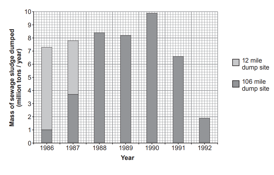
In the past, many countries, including the UK, have disposed of sewage sludge in the open ocean. A famous example of this practice is the '106 mile' dump site in the North West Atlantic. This site, 106 miles off the east coast of the USA, served the populations of New York and New Jersey. Prior to the use of the '106 mile' dump site, sewage sludge was disposed of at the '12 mile' dump site.

[Figure: Map 1 showing the east coast of the USA, with New York and New Jersey labelled, together with the locations of the former '12-Mile Site', the former '106-Mile Industrial Waste Site', and the '106-Mile Site' in the Atlantic Ocean. (All data from the US Environmental Protection Agency Report to Congress, Sept 1995)]

Map 1 showing the east coast of the USA together with disposal sites

[Figure: Graph showing the annual disposal of sewage sludge (in million tons/year) at the '12 mile' and '106 mile' dump sites from 1986 to 1992]

Graph showing the annual disposal of sewage sludge at the ‘12 mile’ and ‘106 mile’ dump sites from 1986 to 1992.

Bar chart of sewage sludge dumped at 12‑ and 106‑mile sea sites, 1986–1992, showing shift from nearshore to offshore and overall decline after 1990

(i) Calculate the total mass of sewage sludge disposed of at the '12 mile' dump site in 1986 and 1987.

total mass of sewage sludge = .........................million tons

[2]

(ii) What was the final year in which sewage sludge was disposed of at the '12 mile' dump site?

[1]

(iii) The US Environmental Protection Agency released buoys into the ocean at the 106 mile dump site. They used satellites to track the movement of the buoys between 1989 and 1992.

[Figure: Map 2 showing the movement of drifting buoys tracked by satellite from the '106-Mile Site', with New York, New Jersey, and the former '12-Mile Site' also labelled]

Use the information in map 2 to suggest why it was decided to select a sewage dump site 106 miles off the east coast of the USA and to close the '12 mile' dump site.

[2]

10b
3 marks

Of the sewage sludge which is dumped, 20–70% reaches the sea bed. Here the oxygen consumed by living organisms increases greatly. Explain why this happens.

10c
1 mark

Close to the '106 mile' sewage dump site is the former '106 mile' industrial waste dump site. (See map 1.) Name one group of industrial wastes which you would expect to find at this site.

...................................................................................................................

11a
4 marks
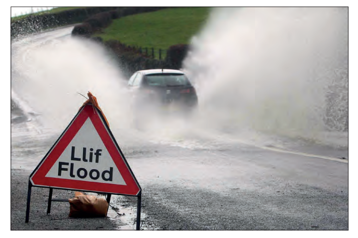
Photograph of a flooded road with a car driving through deep spray; a triangular warning sign in the foreground reads “Llif Flood”.

Following flooding in parts of Wales in 2015, environmental scientists investigated nitrate pollution in three different streams. They counted the numbers of eight different indicator species in equal lengths of the three streams, on the same day. The indicator species they counted are shown in the chart below.

[Figure: Chart showing indicator species (Mayfly nymph, Caddis fly larva, Freshwater shrimp, Stonefly nymph, Hoglouse, Bloodworm, Worm (Tubifex), Rat-tailed maggot) grouped into pollution level groups A-E: Group A = little or no pollution, Group B = slight pollution (if none from A), Group C = medium pollution (if none from A or B), Group D = high pollution (if none from A, B or C), Group E = very high pollution (no live animals found)]
[Figure: Bar graph titled 'Graph showing the number of indicator species found in each of the streams 1, 2 and 3', showing number of indicator species (y-axis, 0-1000) for Mayfly nymph, Stonefly nymph, Caddis fly larva, Freshwater shrimp, Hoglouse, Bloodworm, Worm (Tubifex), and Rat-tailed maggot (x-axis), with separate bars for Stream 1, Stream 2, and Stream 3]

(i) Using the graph above and the chart on the opposite page, state the pollution level in each of the three streams.

stream 1 ........................................................................................

stream 2 ........................................................................................

stream 3 ........................................................................................

[2]

(ii) Suggest two possible sources of nitrate pollution in streams.

........................................................................................

........................................................................................

[2]

11b
1 mark

Name one type of indicator species which could be used to assess levels of air pollution.

........................................................................................

12a
1 mark

The diagram below shows a food web for a woodland.

[Figure: Food web diagram for a woodland showing oak trees, trees and bushes, herbs (trophic level A - producers) connected to beetles, insects, moths, other leaf eaters (trophic level B - primary consumers), connected to shrews, voles, small birds (trophic level C - secondary consumers), connected to owls, weasels (trophic level D - tertiary consumers)]

The food web shows four different trophic levels. Give the term used to describe each of the trophic levels.

A ........................................................................................

B ........................................................................................

C ........................................................................................

D ........................................................................................

12b
5 marks

The diagrams below show a pyramid of numbers and a pyramid of biomass for a food chain in this food web.

[Figure: Pyramid of numbers (numbers / 0.1 hectare) and pyramid of biomass (grams / 0.1 hectare) for a food chain in this food web. The pyramid of numbers shows trophic level A as a very large number of individuals despite representing very few actual organisms in the pyramid of biomass, where trophic level A has a biomass of 5 139 000 g/0.1 hectare and trophic level B has a biomass of 2 500 g/0.1 hectare]

(i) Calculate the percentage of biomass passed from trophic level A to trophic level B.

Percentage of biomass = ............................................................ %

[2]

(ii) Explain why the trophic level labelled A is such a different width in the two pyramids.

[2]

(iii) State one way in which energy is lost between trophic levels.

[1]