Comparing Univariate Graphs (College Board AP® Statistics): Revision Note

Comparing univariate graphs
What is a univariate graph?
In statistics, univariate means there is one variable
This variable may be categorical or quantitative
A univariate graph shows data for one variable
Types of univariate graphs include
bar charts
histograms
dotplots
stem-and-leaf plots
cumulative graphs
A scatterplot is not a univariate graph
because it shows two variables
How do I compare univariate graphs?
You may be given two graphs for two different data sets with the same context
You need to compare four different things:
The centers of the data
either visually or using means, medians and modes
The spread (variability) of the data
either visually or using ranges, interquartile ranges and standard deviations
The shape of the distributions
the skew (or any symmetry)
Any unusual features of the graphs, in particular any
outliers
gaps
clusters
or multiple peaks (unimodal, bimodal or uniform)
Examiner Tips and Tricks
In the exam, always remember to:
use numbers from each graph in your comparisons,
explain clearly which part of the graph you are talking about,
relate any numbers or calculations back to the context of the question.
Examiner Tips and Tricks
If the graphs do not have any unusual features, you should still write "no unusual features" to show the reader that you have checked for these.
Worked Example
The number of books bought during the opening week of a new bookshop is shown below. The shopkeeper wants to investigate shopping patterns between male and female customers.
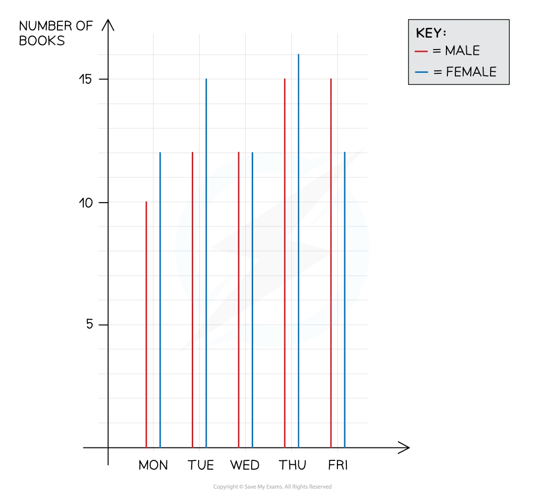
(a) Compare the number of books bought by male and female customers during the opening week.
(b) Give one reason as to why the shopkeeper should not use the data shown to predict future shopping patterns.
Answer:
(a)
You need to compare:
the centers of the data (either a mean, median or mode)
the spread of the data (either a range, interquartile range or standard deviation)
the shape of the distributions (skew, symmetry)
and any unusual features (outliers, gaps, clusters, multiple peaks)
Calculate the mean for both males and females
Males: books per day
Females: books per day
Comparing the centers of the data, the average number of books per day for males is 12.8 which is smaller than the average number of books per day for females, which is 13.4
This suggests that on average, females bought more books
Comparing the spread of the data, the number of books bought by male customers has a range of 15 - 10 = 5 whereas the number of books bought by female customers has a range of 16 - 12 = 4, which is lower than that of male customers
This suggests that male customers have a greater variability in the number of books bought
The trend suggests that males buy more books as the week progresses
Comparing any unusual features, neither graph has any outliers or gaps
The number of books bought by male customers is always either increasing or staying the same, rising to a peak that spans both Thursday and Friday
The number of books bought by female customers has two peaks (bimodal) that form slight clusters around Tuesday and around Thursday
(b)
Reread the sentences at the beginning of the question
This data is for the opening week of the bookshop only
State that this is unrepresentative of a normal week
Give a specific real life example
The data shown is for the opening week of the bookshop, so it is unlikely to be representative of a normal week
Over time, the number of books bought may increase as the bookshop becomes more popular, or decrease if the customers lose interest
Worked Example
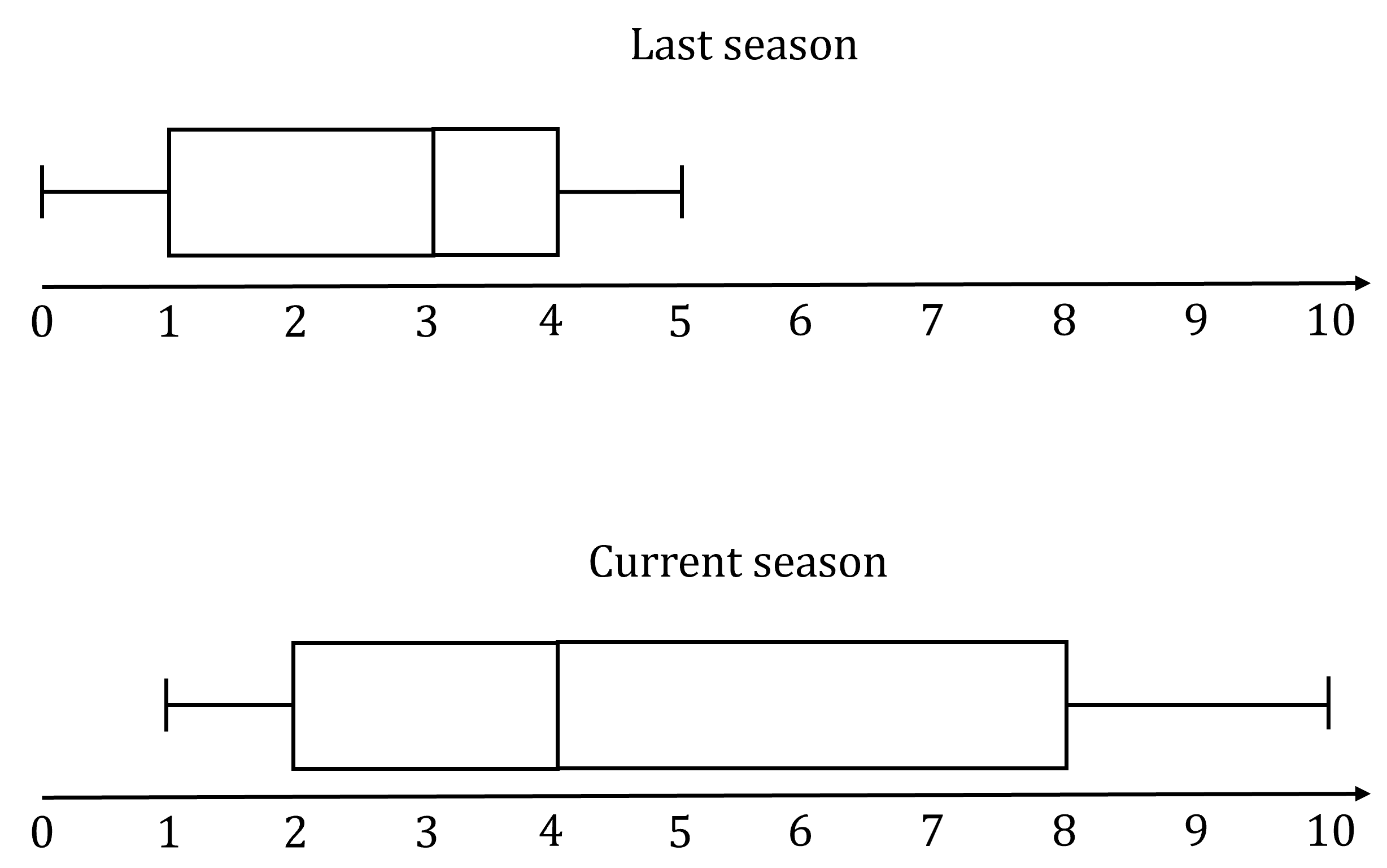
The number of goals scored per game by a soccer team throughout the soccer season is recorded. The results from the last season and the results from the current season are shown in the boxplots below. Compare the performance of the team last season with the performance of the team this season.
Answer:
You need to compare
a measure of the centers of the data sets (the medians)
the spread of the data (either the range or the interquartile range)
the shape of the distributions (skew or symmetry)
and any unusual features (e.g. outliers)
The median of goals scored per game last season is 3 goals per game
This is less than the median of goals scored per game this season, 4 goals per game
So, on average, the number of goals scored per game has increased
This suggests the team has improved
The interquartile range of goals scored per game last season is 4 − 1 = 3 goals
This is less than the interquartile range of goals scored per game this season, 8 − 2 = 6 goals
So, the number of goals scored per game this season is more spread out compared to last season
This suggests the team was playing more consistently last season than this season
For last season, the median is closer to the third quartile, giving a negative (left) skew of goals scored per game
This season, the median is closer to the first quartile, giving a positive (right) skew of goals scored per game
There were no outliers or unusual features last season and there are no outliers or unusual features this season
This suggests that the team's performance is better in the current season compared to the last season

Unlock more, it's free!
Join the 100,000+ Students that ❤️ Save My Exams
the (exam) results speak for themselves:

Was this revision note helpful?
Build on this topic
