Analysing Magazine Covers (DP IB English A: Language and Literature: SL): Revision Note

Analysing Magazine Covers
Paper 1 asks you to analyse unseen non-literary texts. A non-literary text broadly means a text that is not a novel, poetry, drama or literary non-fiction (such as a memoir). While you cannot predict what type of text will come up in the exam, it is a good idea to practise analysing common text types so that you are familiar with typical features and conventions of a variety of texts.
One type of text you may be asked to analyse is magazine covers.
Here, we will cover these aspects of analysing magazine covers:
Overview of magazine covers
Magazine covers: genre norms
How to analyse magazine covers
Magazine covers: Paper 1 model answer
Overview of magazine covers
A magazine cover is a multi-modal text that combines visual and textual elements to attract the audience to the magazine and entice them to read it.
The style and structure of the cover will vary according to the magazine, context and audience. In order to convincingly analyse a magazine cover, you need to be able to make detailed, specific claims about what it is trying to do and why (see more in Approaching Unseen Non-Literary Texts: Purpose, Audience, Context).
Purpose
Usually, magazine covers have the same purpose: to attract the audience to the magazine to buy or read it.
They may also have secondary purposes. Other possible purposes to consider include:
Raising topic awareness
Aligning the magazine with a trend or issue
Confirming the magazine’s brand
Persuading the audience to support, feel or think something
Audience
The intended audience of a magazine cover is who the magazine is targeted at and who it was made for. To effectively identify the intended audience of the cover, ask yourself:
Who is the magazine cover aimed at?
What type of person would notice/pay attention to/be interested in/be impacted by the cover?
Consider age, gender, demographics, interests, lifestyle, values, and concerns
Magazine covers are generally aimed at existing readers (subscribers) and potential new readers
Context
The context is the facts of time and place that influence how and why a magazine cover was made in the way that it was. To effectively identify the context of the magazine cover, ask yourself:
When was the text made?
Where was the text made?
What economic/political/cultural/social factors influence how the text was made and how it might be received (i.e., the context of production and the context of reception)?
What is going on in the photographed figure’s life that makes them a suitable choice for the magazine cover?
Examiner Tips and Tricks
Honing the skill of identifying specific purposes, audiences and contexts can help you score well on multiple criteria: Criterion D: Language, because you are using effective, accurate and precise vocabulary for textual analysis; Criterion A, because you are showing understanding of the text; and Criterion B, because you can make convincing analytical claims by evaluating how a specific textual feature allows the writer to achieve their specific purpose on a specific audience in a specific context.
Magazine covers: genre norms
Criterion B in Paper 1 assesses your ability to analyse how a text achieves a purpose or has an impact on the audience. While many textual features can be found across text types, some are specific to certain text types.
Here, we will examine some genre norms and techniques that are frequently found in magazine covers.
Examiner Tips and Tricks
Criterion D assesses your use of effective and appropriate language. One good way to do well in this is to use subject-specific vocabulary when naming textual features. However, overly using technical language without fully understanding its meaning is not effective. Use the list below to examine magazine covers and understand how they are constructed. Ensure you understand the terms and build a dictionary with definitions that make sense to you.
Magazine covers are multi-modal texts, that is, they make use of both visual and textual elements. You need to be able to interpret how these elements work and how they work together.
Not all of these stylistic features are found in all magazine covers, but it is a good idea to look out for them as you begin to annotate and analyse any magazine cover.
Stylistic feature | What to look out for |
Masthead/title, and cover lines |
|
Photograph of figures |
|
Gaze |
|
Colour scheme |
|
Visual pathway |
|
Typography |
|
Icons and symbols |
|
Anchoring |
|
How to analyse magazine covers
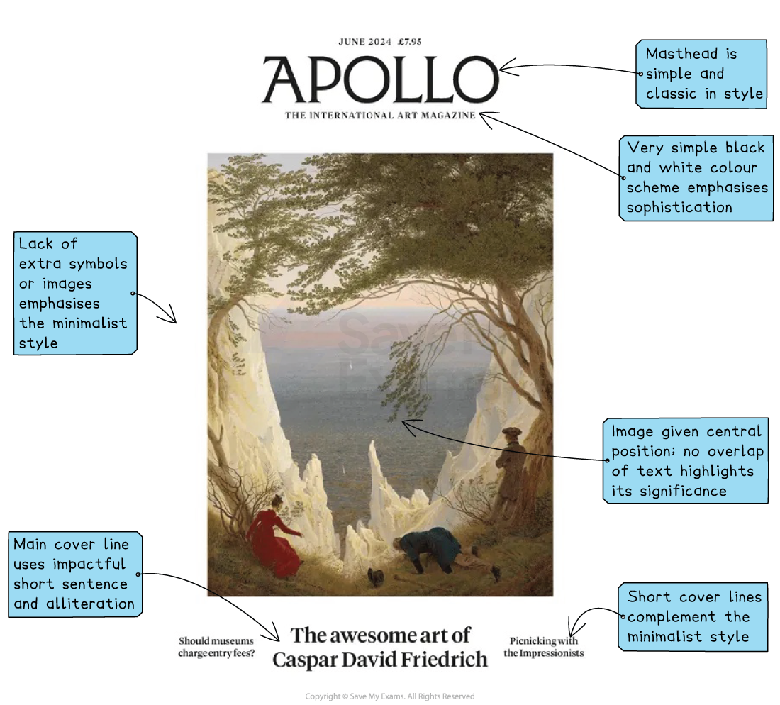
Before you write an answer to any Paper 1 question, it is important that you select the best evidence from your source text. A great way to do this is to identify the focus of the guiding question, and then annotate your text with this focus in mind.
Here is an example of how you might annotate a magazine cover in the exam:
Magazine covers: Paper 1 model answer
Below is a top-mark answer to the following Paper 1 question on a magazine cover. We’ve included where the answer has hit the assessment criteria to show you exactly why it would achieve full marks.
Source: Beyonce Vogue magazine cover, September 2018 Question: Discuss how the interplay of visual and textual features is used to entice the reader to engage with this magazine. |
The September 2018 issue of Vogue magazine entices readers through a well-crafted depiction of a celebrity and the promise of reading her opinions and enjoying fashion news.
The magazine cover capitalises on the level of fame the brand enjoys by playfully partially covering the masthead with an enormous headpiece. The burnished gold lettering appears between the flowers, and the reader subconsciously fills in the missing letters. Together, these stylistic features make “Vogue” feel famous, special, and glamorous.
The focal point is the centred photograph of Beyoncé. Soft lighting from the right highlights the beauty of her skin tone and facial features while creating a shadow behind her that adds mood and texture to the cover. She looks directly at the audience with an almost sleepy gaze and untensed facial expression. Her body language is poised but relaxed. The softness conveyed in these choices is emphasised in her clothes: a high-necked, ruffled, white dress and bare legs connoting natural beauty and easy style.
The evocation of natural beauty is carried throughout the cover with the colour scheme and the symbolism of the headdress. The flowers are worn like a crown, symbolising Beyonce’s status as “Queen Bey” of the music industry, but they are also a symbol of natural beauty and fertility. Beyoncé is represented as regal and sensual as a mother, black woman and artist. The muted creams and whites of the background and her dress are contrasted with the blush tones of the flowers and Beyoncé’s matte lipstick, anchored in the red font for the main cover line and paler red cover line. Together with the burnished gold of the masthead, the colour scheme gives a sense of calmness, natural, earthy beauty, and confidence in the power of both the brand and the celebrity that do not need brashness to attract.
This underlying sense of quiet power is picked up in the main cover line. The typography of white text in all caps against Beyoncé’s shadow makes the words stand out and feel unapologetic. The quote “Everyone’s voice counts” alludes to Beyoncé speaking out on racial issues in America and the music industry. The caption “in her own words” lures the reader because it offers a chance to hear the private singer speak out on important topics like race, motherhood, the music industry and her relationships.
Sources
Vogue (2018), Vogue US, September 2018 cover (featuring Beyoncé Knowles-Carter, photographed by Tyler Mitchell) [Magazine cover], Condé Nast.
Apollo Magazine (2024), Apollo — The International Art Magazine, June 2024 cover (featuring Caspar David Friedrich, Chalk Cliffs on Rügen, 1818) [Magazine cover]. Available at: https://commons.wikimedia.org/wiki/File:Apollo_magazine_June_2024_cover.webp (opens in a new tab) (Public domain).

Unlock more, it's free!
Join the 100,000+ Students that ❤️ Save My Exams
the (exam) results speak for themselves:

Was this revision note helpful?