Analysing Infographics (DP IB English A: Language and Literature: HL): Revision Note

Analysing Infographics
Paper 1 asks you to analyse unseen non-literary texts. A non-literary text broadly means a text that is not a novel, poetry, drama or literary non-fiction (such as a memoir). While you cannot predict what type of text will come up in the exam, it is a good idea to practise analysing common text types so that you are familiar with typical features and conventions of a variety of texts.
One type of text you may be asked to analyse is infographics.
Here, we will cover these aspects of analysing infographics:
Overview of infographics
Infographics: genre norms
How to analyse infographics
Infographics: Paper 1 model answer
Overview of infographics
An infographic is multi-modal, which means that it combines visual and textual elements. It is an informative text that combines visuals and text to present information in a visually pleasing way.
The topic being presented will vary according to author, context and audience. In order to convincingly analyse an infographic, you need to be able to make detailed, specific claims about what it is trying to do and why (see more in Approaching Unseen Non-Literary Texts: Purpose, Audience, Context).
Purpose
Usually, infographics have the same purpose: to inform on a topic by presenting complex or detailed information in a concise and easy-to-understand way. To begin analysing infographics, ask yourself:
What topic is being presented?
What is the writer trying to make the audience feel/think/do?
While it seems logical to conclude that infographics inform the audience, they may also have secondary purposes.
Other possible purposes to consider include:
Raising topic awareness
Encouraging the audience to take action
Persuading the audience to support, feel or think something
Audience
The intended audience of an infographic is who the infographic is targeted at and who it was made for. To effectively identify the intended audience of the infographic, ask yourself:
Who is the infographic aimed at?
What type of person would notice/pay attention to/be interested in/be impacted by the infographic?
Consider age, gender, demographics, interests, lifestyle, values, concerns
Context
The context is the facts of time and place that influence how and why an infographic was made. To effectively identify the context of the infographic, ask yourself:
When was the text made?
Where was the text made?
Where might it appear?
What economic/political/cultural/social factors influence how the text was made and how it might be received (i.e., the context of production and the context of reception)?
Examiner Tips and Tricks
Honing the skill of identifying specific purposes, audiences and contexts can help you score well on multiple criteria: Criterion D: Language, because you are using effective, accurate and precise vocabulary for textual analysis; Criterion A, because you are showing understanding of the text; and Criterion B, because you can make convincing analytical claims by evaluating how a specific textual feature allows the writer to achieve their specific purpose on a specific audience in a specific context.
Infographics: genre norms
Criterion B in Paper 1 assesses your ability to analyse how a text achieves a purpose or has an impact on the audience. While many textual features can be found across text types, some are specific to certain text types.
Here, we will examine some genre norms and techniques that are frequently found in infographics.
Examiner Tips and Tricks
Criterion D assesses your use of effective and appropriate language. One good way to do well in this is to use subject-specific vocabulary when naming textual features. However, overly using technical language without fully understanding its meaning is not effective. Use the list below to critically examine infographics and understand how they are constructed. Ensure you understand the terms and build a dictionary with definitions that make sense to you.
Infographics are multi-modal texts, that is, they make use of both visual and textual elements. You need to be able to interpret how these elements work and how they work together.
Not all of these stylistic features are found in all infographics, but it is a good idea to look out for them as you begin to annotate and analyse any infographic.
Title and subheadings |
|
Informative statistics |
|
Colour scheme |
|
Graphics, pictograms, charts |
|
Visual pathway |
|
Typography |
|
Icons and symbols |
|
Anchoring |
|
How to analyse infographics
Before you write an answer to any Paper 1 question, it is important that you select the best evidence from your source text. A great way to do this is to identify the focus of the guiding question, and then annotate your text with this focus in mind.
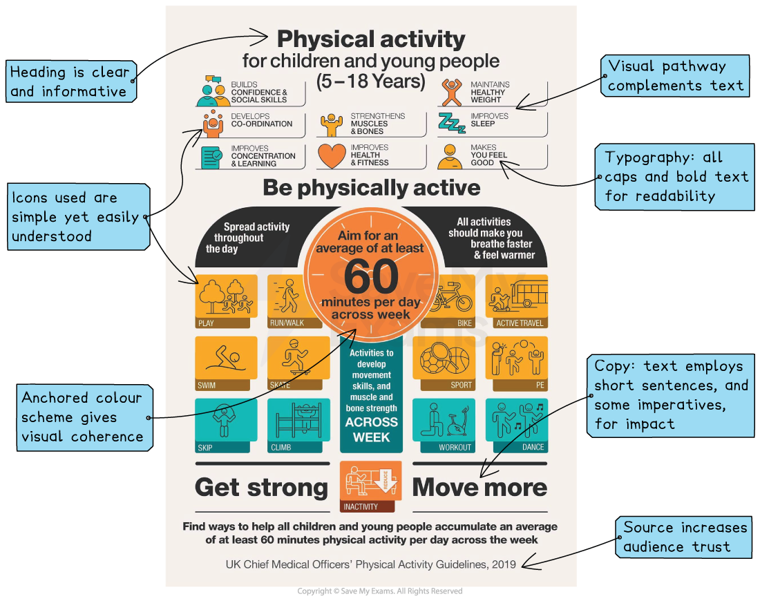
Here is an example of how you might annotate an infographic in the exam:
Infographics: Paper 1 model answer
Below is a top-mark answer to the following Paper 1 question on an infographic. We’ve included where the answer has hit the assessment criteria to show you exactly why it would achieve full marks.
Source: Infographic produced by UK Chief Medical Officers, 2019 Question: Comment on how the interplay of text and images is used to encourage parents to engage with the topic of children's exercise. |
The infographic created by the Chief Medical Officers of the UK uses an instructional but encouraging tone to encourage a healthy lifestyle. The text promotes the benefits of exercise for young children with the use of icons, colours and structuring. These techniques help the audience of parents of young children understand the importance of exercise at a young age and persuade them to get their children to be physically active.
Visually, the infographic uses a clear visual pathway with simplistic icons to maintain a lighthearted tone on an important topic. The information on the benefits and types of exercise is chunked in boxes, making them seem manageable and achievable. This readability is further enhanced by the use of icons and simple stick-figure graphics. Although emanata or detailed facial expressions are not included on the infographic, the familiarity of the activities and the meanings of hearts and dancing movements conveys the enjoyment of physical exercise concisely and memorably. This almost child-like energy is continued in the colour scheme. The orange, yellow and green connote energy and happiness, but the chosen tones of these colours are not too garish or bright, thus striking the balance in conveying enthusiasm about an important health issue.
The copy fits unobtrusively around these visuals to keep the emphasis on fun exercise. The text uses an authoritative and confident tone to offer reliable recommendations, such as, “All activities should make you breathe faster and feel warmer”. The credibility and reliability of the infographic are also supported by the reference to the “UK Chief Medical Officers’ Physical Activity Guidelines”. Thus, the audience of parents interested in raising healthy children is likely to have confidence in the validity of the information.
Sources
UK Chief Medical Officers / Department of Health and Social Care (2019), UK Chief Medical Officers’ Physical Activity Guidelines (5–18 years) [Infographic]. Available at: https://www.gov.uk/government/publications/physical-activity-guidelines-children-and-young-people-5-to-18-years (opens in a new tab) (Reused under the Open Government Licence v3.0).

Unlock more, it's free!
Join the 100,000+ Students that ❤️ Save My Exams
the (exam) results speak for themselves:

Was this revision note helpful?